


It’s easy to fall into a rut with optimization and testing.
Over time, as you discover which tactics and best practices get results, and then apply them to other channels or pages ad infinitum, you can get lulled into a false sense of security.
There’s a time to apply best practices and follow the rules. But there’s also a time to break with them, take calculated risks, and expand your learning in pursuit of even greater gains.
Our December 17 clinic explored how you can use both approaches to your advantage, in conjunction with a point-by-point Marketing Blueprint for 2009.
In addition to the print–friendly research brief below, you can:
Part I: Giving credit to best practices
There’s a reason why many optimization strategies and tactics are considered best practices. If these practices improve results in even a few instances, they tend to be applied more broadly.
From there, the practices are shared in a variety of ways and with enough exposure they evolve into “best practices” that are commonly accepted and widely used.
For instance, our research shows that adding testimonials to a page often helps conversion rate. And we’ve seen countless sites and landing pages with testimonials — some of which are certainly seeing a conversion rate increase due to using them (and may not even be aware of it).
Let’s look at a case study that demonstrates the potential gains that can be achieved with best practices like testimonials and other credibility indicators.
Case Study 1: Sign-Ups
This research partner is a company offering Web hosting and related services for businesses and consumers. Their goal was to increase service sign-ups for their hosting packages.
Primary research question: Which landing page would produce the highest conversion rate?
Approach: Strategy included support the value proposition, prioritize information, and emphasize credibility. Test performed was an A/B/C Split test.
Additional Observations: Treatment 1 was designed by the partner using MarketingExperiments’ best practices principles for optimizing value propositions and reducing friction and anxiety.
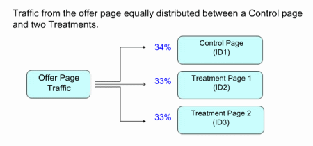
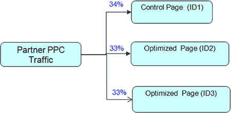
We divided traffic from the offer page equally between a control (which received 34% of the traffic) and two treatments (each treatment received 33%).
Test Design:
With this radical redesign, we tested changing multiple elements on the treatment pages.
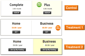
Control and Treatments 1 and 2:

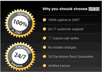
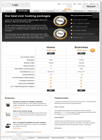
In Treatment 1, the partners design implemented MarketingExperiments best practice of alleviating anxiety by using seals and a bulleted list to address visitor concerns such as quality of service, customer support availability, money-back guarantees, and security.
(Detail of Treatment 1)
All the pagescontrol and treatmentsaided the customer in the decision making process by using a features matrix to compare the benefits of the two service plans.

(Detail of Treatment 1)
However, the ambiguous product description of the service plans (Complete and Plus) was changed in both treatments to more understandable and more easily differentiated titles (Home and Business).
Optimizing copy continued by strengthening the headline so it clearly expressed the offer and capabilities of the partner.

After reviewing details of the test, we asked our clinic audience to predict which page performed best. Votes were split, but most slightly favored the treatments, with comments indicating that those pages expressed the offer more clearly and the credibility indicators increased trust.
Results:
| Web Hosting Offer Page |
Conv. Rate |
|---|---|
| Control | 1.31% |
| Treatment 1 | 3.44% |
| Treatment 2 | 2.05% |
| Relative CR Difference (Control vs. T1):162% |
|
What you need to understand: While both treatments outperformed the Control, Treatment 1 yielded a 162% higher conversion rate (and a 128% increase in revenue per visit).
Conclusions:
The success of Treatment 1 was rooted in best practices, which used three guiding principles in the MarketingExperiments’ Optimization Sequence: reducing friction, relieving anxiety, and following congruence.
Treatment 1’s simplified the eye-path, credibility indicators, and reordered information matched the sequence of thoughts most prospects had when arriving at this page. As discussed in the 2008 research brief, Clarity Trumps Persuasion, prospects ask themselves three questions when arriving at a site or landing page:
- Where am I?
- What can I do/get/buy here?
- Why should I participate?
The information on this page answers those three crucial questions in order, reducing much of the friction a prospect might encounter. In addition, the service seals, customer support information, money-back guarantee, and credible testimonials (first and last name of purchaser) mitigate the concerns prospects might have.
Part II: Which best practices are credible?
Case studies and results like those above suggest that one could easily assemble a list of best practices that would guarantee a page’s success. Yet no such (credible) list exists.
In fact, it can be perilous to confuse best practices with common practices.
When well-known companies or websites adopt a technique, others often imitate it until its use is so widespread that it seems canonical and gains authority through the status of its users and the frequency with which it is used. Is that a best practice, or simply a common practice? Let’s look at an example.
According to MarketingSherpa research, nearly 80% of large B2B organizations’ websites use a layout similar to this template:

In addition, 53% of smaller B2B organizations use a similar layout, and numerous B2C and ecommerce sites also use variations of this theme.
Although this layout is commonly used, research shows it is not optimal for users or conversions.
The large billboard image distracts or confuses prospects, blocking navigation and eye-path. As the eye naturally scans vertically, the 3-4 column design works against that process. Plus, this common layout depends heavily on large graphics which are largely ignored by prospects.
Best practices: Keeping up with the Amazons
Marketers who assume that modeling their sites and methods on those of successful organizations will automatically improve results may be putting the shopping cart before the horse. Amazon is a perfect example. Over the years, we’ve seen several changes at Amazon.com reappear on other ecommerce sites in varying degrees of similarity.
Instead of falling into the “If Amazon does it, then it must work, so I should do it too” trap, consider that best practices for your situation may be quite different from theirs.
Let’s look at a case study that illustrates the potential fallibility of applying best practices.
Case Study 2: Increasing Sign-Ups
This partner is a publisher of electronic marketing information and related services. The goal of our tests was to increase registrations for a free email newsletter.
Primary research question: Which sign-up page will yield the highest conversion rate?
Approach: Strategy included variable cluster testing including changes in style (personal vs. impersonal), headline, credibility indicators, and images.
Additional Observations: This was an A/B/C split test.
Test Design:
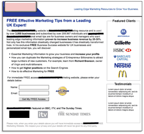
Control:

(Original Page and detail of registration form)
The original page follows some of MarketingExperiments’ best practices. First, the page has strong clarity. The text is plain copy, with no distracting graphics, headline bullets, short sign-up form, and button with call-to-action (FREE Access). The page also works to relieve anxiety by citing names from leading media outlets to establish authority and credibility.
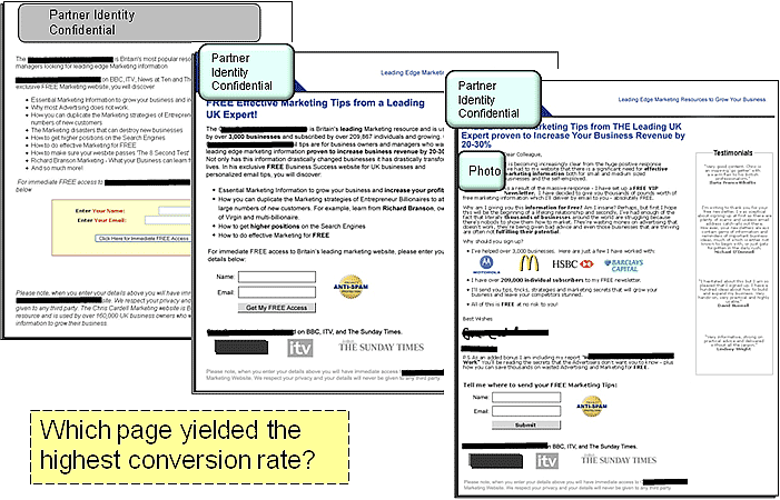
Treatment 1:
Treatment 1 was optimized with additional best practices:
- Client logos and testimonials were added to establish more credibility
- Brand was emphasized with new header and logo
- Logos to increase authority (ITV, Sunday Times) added below call-to-action
- Anti-Spam seal added next to sign-up form to overcome anxiety
- Revised copy uses specific data points to support claims
Treatment 2:
Our analysts’ team developed this second treatment. This treatment focuses on developing a more personalized approach, using a letter from the founder and right-column testimonials.

Like Treatment 1, client logos and testimonials were added to enhance credibility.
However, differences in this treatment included:
- A photo, accompanied with letter-style copy and a signature, frames the offer with a more personal approach
- Sign-up offer also emphasizes the free bonus report incentive
- Different calls-to-action were tested above the form and on the submit button
Each treatment maintained the consistency of the message. However, each treatment also emphasized practices which past research and anecdotal experience suggest will enhance a landing page’s success.
So which page yielded the highest conversion rate?
Control and Treatments:
Results:
When we asked our clinic audience to predict the winning iteration, the two treatments got the vast majority of the votes. But the actual results were very surprising.
| Treatment | Conversion Rate |
|---|---|
| Control | 14.11% |
| Treatment 1 | 7.11% |
| Treatment 2 | 7.42% |
| Relative CR Difference -49% | |
What you need to understand: The control outperformed both experimental treatments –- even though they used a variety of widely accepted and research-tested best practices, including testimonials and other credibility indicators.
Conclusions:
In this case, the addition of testimonials and third party logos actually reduced conversion.
Even though the treatments were arguably more eye-catching, using logos and testimonials to specifically address friction and anxiety, the plain control outperformed the more elaborate treatments.
The credibility indicators may have been less effective because they softened the urgency and intimacy generated by the simpler form.
- The control has a person-to-person information-sharing feel, while the treatments emphasize corporate brands and suggest “selling” or persuasion.
- The control describes the product as immediate access to a source of deep information, while the treatments refer to “tips,” eliciting a perception of lower value information.
- The copy, call-to-action and design changes of the treatment intended to eliminate anxiety instead altered the way many prospects perceived the offer itself.
Adding specific page elements does not guarantee a lift in clickthrough or conversion. Simply put, using best practices will not guarantee specific results; they must fit the context of the page and offer—and be tested.
After the control trounced the treatments, we focused our testing in a different direction.
Case Study 3: Return to Sign-Up
The failure of the first test raised a significant question: When a radical redesign fails, what to test next?
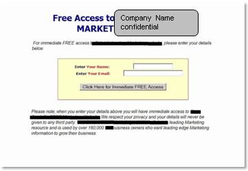
Since adding elements produced a negative effect, in a follow-up test, we stripped away elements. The goal was to evaluate how an extremely minimalist treatment would perform. In this instance, the control did not use the long copy block above the sign-up form. The treatment used even less information on the page.
Control:

Treatment:

In the minimalist treatment, the anxiety alleviating paragraph was reduced to a single sentence in the email capture form. As one of our analysts pointed out, “We have now reached the tipping point where we cannot remove any more elements.”
Results:
| Registration Page | Conv. Rate |
|---|---|
| Control | 19.87% |
| Treatment | 32.93% |
| Relative CR Difference:65.77% | |
What you need to understand: The treatment outperformed the control by 65.77%
The minimalist treatment not only outperformed the control, but it defied the conventional wisdom and best practices that worked so well in the first case study covered here (and many others).
Case Study 4: Further Testing
After we stripped the page to its most austere elements, we tested the winning minimalist treatment against the original control that had outperformed our previous “best practice” treatments.
Control:

This is the control that outperformed the first two treatments. Since it performed so well against more heavily optimized redesigns, we were curious to see how it would perform against one of the pared-down treatments.
Treatment:
The single addition to this treatment is the return of the more detailed privacy statement.
Results:
| Registration Page | Conv. Rate |
|---|---|
| Control | 7.10% |
| Treatment | 9.64% |
| Relative CR Difference:35.77% | |
What you need to understand: In this iteration of the test, the treatment outperformed the control by 35.77%.
After two successive tests, it was apparent that prospects for this partner were most motivated by clear, streamlined offers.
If, after the first test, we had simply stopped testing or continued to test combinations of best practices, we might not have learned as much as we did by shifting our testing in the minimalist direction. Are the minimalist pages attractively designed? Not at all. Would most marketers –- or their design teams –- set out to create an offer page like that? Highly unlikely. But in the end, the ugly duckling designs produced double-digit gains.
Summary
“Fortune favors the bold.” – Virgil
Consider these suggestions as a foundation for your 2009 Marketing Blueprint:
- No page-design tactic or specific practice is guaranteed.
- It is not enough to grasp a handful of rules and fling them at a page.
- Many broadly accepted “best practices” are instead simply common practices which, while effective in some situations, cause confusion when they are misapplied.
- Knowing the “what” does not mean that you know the “why,” and if you do not know the “why” then you may not know “when” a given rule applies in a given situation.
- It is important to be able to distinguish between Fundamental optimization principles and Situational tactics and practices.
- Optimization wisdom falls into two broad categories:
- Fundamental—enduring, broadly applicable principles
- e.g., Clarity trumps persuasion
- Overcorrecting for sources of anxiety
- Other foundational principles of Conversion Analysis
- Situational—practices and tactics whose efficacy is situation specific
- Industry or product category
- Channels or prospect motivation
- Economic or seasonal conditions
- Competitive strategy
- Fundamental—enduring, broadly applicable principles
- Test using “radical redesign” to discover why and when specific rules apply.
You can learn from both positive and negative results. While positive results may confirm best practices, negative results can lead to true discovery. What’s essential is that you don’t stop at the data, but think about the meaning behind the numbers, try to extract meaning and insights, and apply them to your ongoing marketing efforts.
Part III: Marketing Blueprint for 2009
Ideally, optimizing your marketing follows this process: product, presentation, channels. While this may not be feasible in every instance, for the year ahead, we’ve assembled the marketing blueprint below with links to relevant research briefs and tools.
Optimize the Product:
- Refine your value propositionPowerful Value PropositionsPowerful Value Propositions, IIValue Proposition Assessment Tool
- Conduct a competitive market analysisFinding Ideal Price PointsOnline Competitive Analysis TestedPrice Testing Analysis
- Plan your lifetime growth strategy for your product and your programA Proven Playbook for Growing Your LeadsFilling the Pipeline
Optimize the Presentation:
- Optimize your home/landing pagesClarity Trumps PersuasionOptimizing ecommerce websitesImproving Website Conversion
- Revise website copyOptimizing HeadlinesOptimizing Headlines and Subject Lines
- Implement metrics and testing platformsSimple Tests, Significant GainsMetrics Dashboard ToolData Sample Stats
- Prioritize your analyticsMeasuring What MattersEssential Metrics for Online Marketers
- Maintain momentum in your conversion processLessons LearnedEcommerce Holiday Playbook
- Develop email captureEmail Capture Tested
- Enhance your credibility indicatorsUsing Testimonials Effectively
Optimize the Channels:
- Develop keywords for PPCOptimizing PPC AdsOptimizing PPC Ads, IIPay-Per-Click Analysis Tool
- Adapt your best performing headlines for SEOOptimizing HeadlinesOptimizing Headlines and Subject Lines
- Nurture email lists through relevant communicationEmail Marketing StrategyEmail Marketing Strategy, II
- Social media: explore linking strategies and viral spreadHarnessing Social MediaCan Viral Video Clips Drive Targeted Traffic?
- Utilize alternative channels: press releases, affiliate programsThe ROI on PPC vs. Affiliate Marketing
Special Offer – Save $190 on the MarketingExperiments Compendium
At the end of the clinic we offered one more resource to help you in 2009: We’ve released the sold-out MarketingExperiments Compendium in a PDF Edition. The Compendium PDF Edition includes 247 pages of our research and test results, examples, charts and action steps, plus a suite of tools to help you optimize your marketing. Learn more or order your copy here.
Credits:
Managing Editor — Hunter Boyle
Writer(s) — Anna Jacobson
Contributor(s) — Flint McGlaughlin
Jimmy Ellis
Bob Kemper
Production — Austin McCraw
Cliff Rainer
Amanda Mehlhoff
Testing Protocol(s) — TP1063
TP1092
TP1123
TP1115