

Subscriptions have been the lifeblood of almost every media publication since the conception of the industry.
But imagine for a moment that you were trying to subscribe to your favorite newspaper and you were presented with something that looked like the page below.
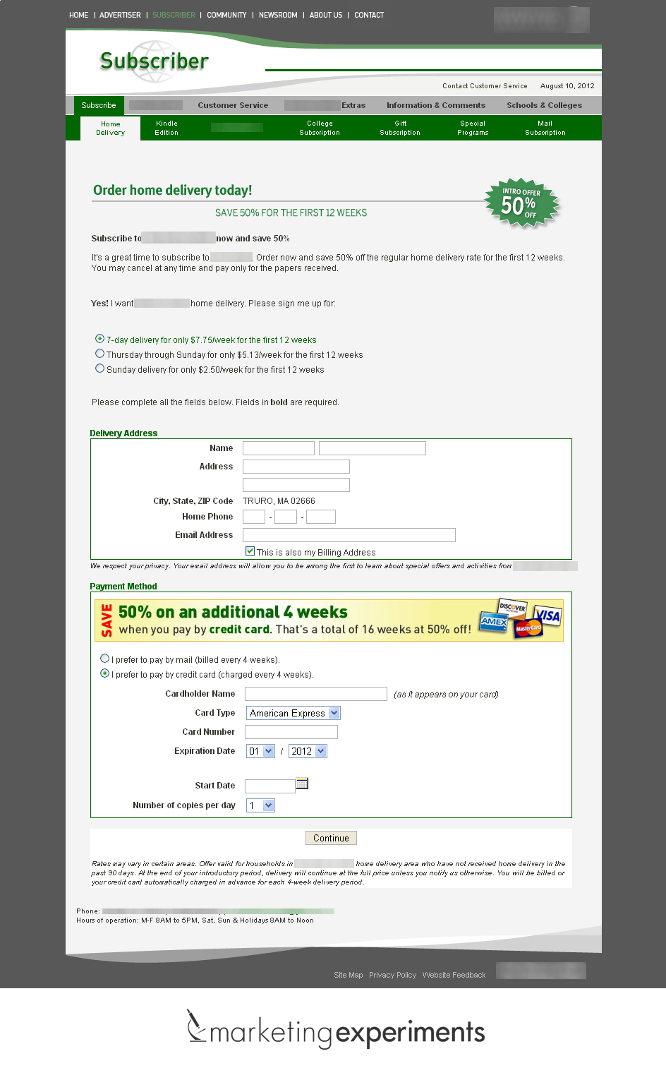
Experiment #1. Reworking disconnected, confusing pages

This was the first step in the checkout process for subscribing to a large media publication.
Editor’s Note: To protect their competitive advantage, we have blurred their identity.
Once a customer entered their ZIP code to determine whether this publication could be delivered to their area, they were taken to this page. Put yourself in the mind of the customer and think about how this page would have been received.
That is precisely what the marketing team did. What they saw was a very disconnected page that gave the customer almost no reassurance that they were still buying from the well-known media publication.
- The publication logo was almost entirely missing from the page.
- The colors on the page did not match the brand of the company.
- The two levels of navigation at the top of the page provided multiple opportunities to click away.
- The entire process seemed complicated to the customer.
Though there were a number of things the team wanted to change on this page, they needed a new page that changed only a few elements. Every day this page was live on the site, the publication was losing potential revenue from customers finding the process too difficult to complete. A long, arduous Web redesign was not an option. They needed to recover some of that revenue as fast as possible.
So the team ran an experimental treatment in an online test that they thought would require the least amount of time and resources and still achieve a high return on investment. The treatment is displayed below.

There were only a few changes to the page:
- The publication logo was added to the top of the page.
- The green and grey color scheme was eliminated in favor of a simple design.
- The distracting navigation was removed from the page entirely.
Unfortunately, it was not enough to design a more aesthetically pleasing page; they needed to run the test in a controlled experiment comparing its performance to the older page.
When the team conducted that experiment, the results were fairly surprising. By simply changing a few elements on the page, the team achieved a 40% increase in subscriptions.

Experiment #2. Performance testing accordion-style checkouts
As Peter Drucker once said, “Adequacy is the enemy of excellence.”
The team was not satisfied with a 40% gain. They had only slowed the bleeding on the page and there was still revenue to be gained.
However, because some of the urgency had been mitigated by the win, the team needed to determine whether the process was in the right checkout category.
There are many different approaches a marketer can take when designing an online shopping cart. In this case, the team decided to test the most popular approach to the cart on the Web – the accordion cart.
Essentially, it was the same cart approach that Apple was using at the time of this test. Every step of the cart process was on a single page, but as you went through the process, the sections of the cart expanded to show the step the customer filled out to proceed.
Using this approach, the team designed the cart you see below.

It’s helpful to see the two processes side-by-side to compare the steps. Below, you can see the winning treatment from the first experiment displayed with the final step in the cart process. The treatment below it is the new accordion cart with the steps that corresponded to the original process.

The most interesting detail of this experiment is the reputation the accordion cart has for online marketers. Because Apple was using it on its site at the time, it essentially became a best practice for shopping carts across the Web overnight.
As Flint McGlaughlin, Managing Director, MECLABS, parent company of MarketingExperiments, says, “Best practices are mostly pooled ignorance.”
So rather than implementing the cart right away, the team ran another experiment comparing the two processes.
What they found after the test validated was also a surprise. The accordion cart decreased the order rate by nearly 30%.

It’s not enough to see a valid result for a test. As marketers, we need to ask “why?”
It was clear that the original checkout page was already doing many things right.
But why?
Why was it that the accordion cart didn’t work for customers when it seemed to be working for everyone else, even Apple?
After reflection, the team hypothesized that the accordion checkout required too much thinking for nontechnical readers. So after a few follow-up tests to verify their hypothesis, the team created a new treatment.
Experiment #3. Simple, clean design leads to better experience
This new treatment was a clean, simple design that moved every step onto a single page and showed the process without any technical expanding and contracting sections.

Compared to the winning page from the first two experiments, this treatment changed several elements:
- New copy and images were used to emphasize the value proposition of the offer.
- Boxes that interrupted the eye-path flow of the page were removed.
- Call-to-action was clearer and implied value.
- Credibility indicators (TRUSTe) and satisfaction guarantees were added.
What was the result when we compared the conversion rate of this page with the conversion rate of the winning treatment in the first experiment? It was a compounding lift of nearly 24%.

When the team put itself in the mind of a customer, complicated Web processes, whether they are slick accordion carts or old cart setups, are the last thing someone looking to buy this particular publication wanted to deal with.
Through testing, we can discover the most optimal checkout process for our processes, and gain increases in conversion that would have otherwise abandoned the purchase.
You might also like
E-commerce: Moving beyond shopping cart abandonment nets 65% more checkout conversions [Case study]
E-commerce: Why a forced checkout registration is never a good idea [More from the blogs]
Less is More: Maximize conversion by removing website distractions [More from the blogs]
Ecommerce Research Chart: Overall conversion rates [MarketingSherpa Research Chart]