Through my experiences of turning test ideas into wireframes, I have come across problems at times with how to communicate those ideas from an aesthetic point of view.
This can be a little problematic because when you think about it, the aesthetic components of a test idea often play a huge role in a page’s performance.
Unless your customers are using the Internet wearing a blindfold, they will interact with what they see, so really, aesthetics are your marketing.
When it comes time to create a wireframe for an upcoming test, it’s easy to become lost in the focus on key performance indicators, and not the overall idea.
In today’s MarketingExperiments Blog post, we will reveal three tips to help you keep aesthetics in mind when creating wireframes and designs for testing.
Tip #1. Know your target audience
What are the demographics of your target audience and how can your aesthetics appeal to them?
You can learn more about your visitors by using any analytics program. It is crucial you review your data on a regular basis, as this is just another way of how you will learn more about your visitors and customers.
Also, what devices are your target audiences using the most?
This can be especially important to review in your data between test cycles, as obtaining a better grasp on what types of devices your visitors are using, such as desktops, smartphones and tablets, will very likely impact future test designs.
Or, will a responsive page be the most effective way to go about testing?
Another question you might ask yourself is what if I am testing a variety of elements or testing a radical redesign – will I see a lift by designing individual pages for different devices?
Which leads me to my second point …
Tip #2. Become friends with your design team
I have learned the importance of consulting with design.
Designers have another perspective on viewing websites. It is easy to become engulfed in the test idea, so it is important to step outside of the box and think about it from a customer’s perspective.
It’s crucial to provide as much information about the test in order to receive an optimal design.
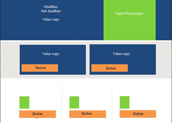
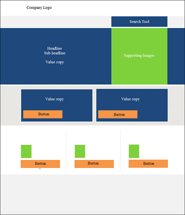
Mockup landing page
I am a visual person, so when I talk with the design team, I ask for them to mock up a few different designs for certain aspects of the page. This allows us to explore other ideas I did not think about when planning the test and creating a wireframe.
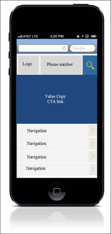
Mobile mockup
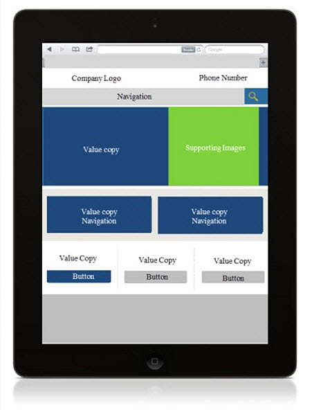
Going back to my device example from earlier, one element may look aesthetically pleasing on a particular device, but not on another device. In addition, functionality of different elements on a page is also something to think about and consult with your design team about.
Tablet mockup
Most importantly, this is done in order to make sure the test and design work hand in hand in order to help gain a learning or a lift when it comes time for testing.
Tip #3. Test, review, revise
You never know what will happen until you test.
From a business prospective, financial gain is important, but it’s also essential to keep in mind that all tests lead to discovery. In the end, testing comes down to learning about your customers’ aesthetic preferences and points of anxiety.
Ideally, you want to build on that knowledge, so this is where follow-up tests come into play.
After a test is completed, dig deeper into the test. Try to understand why you received the type of results that you did. Explore the data from the test and any other information you have.
Use this information from the test and conduct a brainstorming session for a follow-up test. There are always opportunities to learn more about your customers. Testing is a never-ending process.
What are some design elements you consider when designing a test or creating follow-up test ideas? Please feel free to share your thoughts below in the comments section.
Related Resources:
Landing Page Optimization: Simple pop-up overlay increases conversion 63%
Landing Page Optimization: Simple color change increases conversion 10%
Website Optimization: 5 mistakes marketers and designers make with color


