

We’ve all got that one friend. If you went to high school with Paul Rudd, he’s personal friends with Paul McCartney. If you just got back from St. Louis, he’s bragging about his tan from St. Barts. I call this the 1up effect. And it is prevalent on web pages as well – where each element is trying to outdo the other.
Sure, we can cite many reasons for it. Designing a functional and attractive page can be quite a task. In most cases, we have many things to consider and people to please. The sales team wants us to collect lead information with a capture form. Legal wants visible terms and conditions. Corporate wants branded images. We want our call to actions, great copy, and killer headlines. And the list goes on.
So if you’re not careful, the elements on your page may be competing against each other instead of working in sync to guide your visitors to conversion. I recently commented on this 1up effect in the latter portion of the October 28 web clinic. It boils down to is a simple question – are elements on your page competing so much for attention that you are overwhelming users and losing sight of your main goals?
A great example of this is a TV commercial from Tide. A gentleman was interviewing for a job, but the hiring manager is literally focusing on a shouting stain on the poor applicant’s shirt. Because of this stain, the interviewer misses the conversation completely:
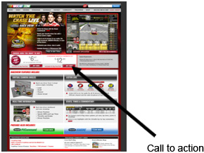
In the same way, strong elements of the page can shout so much that users have trouble using the page for its main goal/purpose. Below is an actual web page submitted by NASCAR.com that we reviewed on the October 28 web clinic. The page seeks to draw attention to a service for watching the races live:

As you can see, color is splashed throughout the page. If you make support items very colorful, you must then use even more color to 1up the support items and make your main goal stand out. However, as you can see in the picture, the main call to action (boxed in red) is totally lost on the page with all of the color and elements shouting for attention. I know that we are all in the hunt to have great-looking, impactful sites, but marketers take heed:
“In the pursuit of cutting-edge websites and pages, do not lose sight of primary page principles.”
A clear and easy to identify goal for the user on the page is a must. Consider the path some users take to arrive at your page. Traffic coming from search and PPC has just seen a list of alternatives (other company listings). If they arrive at your page and do not find a way to engage with your message (buy a product to fix their problem, learn more about the offer, etc), then they click the back button or close the tab and to your competitors they go.
Even if a user does not leave shortly after arriving, support elements that stand out too much can cause users’ eyes to bounce around the page. This can cause them to potentially miss the juicy parts of your copy, product features, testimonials, awards, value proposition, or a whole host of other things.
Plan out your pages with your main goal always in the forefront, then keep support items just as they are supposed to be – SUPPORT items. Use size, shape, color, position, and motion with caution to ensure you are not creating aspects of the page that are in a shouting match for the user’s attention and overwhelming them as a result.
Your challenge is to create a page with elements that work together as a team, not elements that continually try to 1up each other – leave that to your friend who just got back from St. Barts.
P.S. The Tide To Go Stick works pretty well.