

To wrap up our email response optimization trilogy, today’s free web clinic will focus on live optimization of audience-submitted emails.
Our roundtable of research analysts will use your peers’ email messages to share transferable principles that you can use to improve the ROI of your email sends. To give you a firm understanding about what the MarketingExperiments methodologies are based on, we’ll begin the clinic with the below experiment.
As always on web clinic day, we’re giving you an opportunity to use your experience and intuition to see if you can guess which treatment won…
Background: An established financial institution offering online savings accounts
Test Design: This was an A/B/C/D multi-factorial test that pitted three treatments against the control. While we also split traffic between different landing pages to test which combination produced the highest conversion rate, today we’ll focus on which email increased click-through rate. Here are the email versions (out of courtesy to the Research Partner, we have anonymized these email messages):
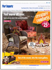
(click to zoom in)
Control

Treatment 1

Treatment 2

Treatment 3

Results: Before we reveal the results, here’s a chance to test your own marketing intuition and be regarded as an online marketing leader! Use the comments section to let us know which email message you think delivered the highest click-through rate.
Which email generated the highest click-through?
* Control
* Treatment 1
* Treatment 2
* Treatment 3
We’ll post the name of the marketer who guessed the winning email and came closest to the click-through rate gain, so make sure to include your name, title, company, Twitter handle or any other info you would like to include.
The winner and results for this experiment will also be announced live this afternoon at 4 p.m. EST during our free web clinic – The Five Best Ways to Optimize Email Response (Part 3): Special live optimization web clinic.
Congratulations to Stefanie Kelly of Pathway Medical Staffing, the only marketer with the intuition to guess what our tests have confirmed – Treatment 1 delivered the highest click-through rate.
This copy-rich email outperformed the control by 42% by synchronizing to the decision patterns of the recipient through a commonality of language. This email carries a very personal feel and is crafted to capture the recipients’ attention and convince them to click through to the landing page.
My vote is for treatment 1.. although it’s not as graphically pleasing, the plain text is what makes me think it had the best CTR. This email feels more transactional in nature, leading me to believe the reader will be more likely to click thru b/c there is an established relationship with the company vs. the other treatments that feel more promotional and sales-like. The email also clearly and quickly explains why I should click thru right up front.
This treatment also has two very clear click-thru points so my eyes aren’t bouncing around to a bunch of graphics trying to figure out what I should do next as in the control, treatment 2 and treatment 3.
My guess would be a 200% increase in CTR.
Treatment 2–get in touch with your inner saver is compelling to me. Simple, clear, compelling.
Control is too wierd. Header is unclear at quick glance.
Treatments 1 and 3 are too boring.
First impression of the control: “Fight Off Aggressive Upholstery with Kung-Fu”
Treatment 2 – Looks like the other 42 emails I get each day.
Treatment 3 -OK, except the crate-furniture stencil in the header doesn’t sell banking to me.
Treatment 4 – Perhaps is boring, but the 100% certificate stops my attention. The solid header and footer reinforce “solid” feeling. Almost an FDIC approval without saying go.
Treatment 3 gets my vote! No Minumum and No Fee are graphically presented in the Header.That is more important to a no bank saver than anything!
I’m going to say Treatment 2. Why?
> Clear and precise header (when images are allowed to load)
> bullets are scannable and
> call for action is clear according to me
Treatment 2 gets my vote.
– Clear call to action
– Good “What’s in it for me” content
– Repeating important concepts in the banner and in the list
control gets my vote but since I am in Europe, maybe it is the European view.
I’m going with #1 for at least 3 key reasons. Guessing about a 20-30% CTR.
I’m reading this after the results were released, so benefit from hindsight.
The plain text has a very trust building first line:
“Thank you for being a … account holder”
It would have been very intersting to see treatment 2 with this opening line built into the messaging. Or a test of treatment 1 without this line.
The subject lines aren’t mentioned above, I’m assuming the same line was used on each.