


During our May Web clinic, “Does Fear-Based Marketing Work? How one company saw a $45 million increase in revenue by changing their messaging tone,” we capped off the webinar as we usually do – by live optimizing a page submitted by you, the fine MarketingExperiments reader.
This month, we offered feedback on a page sent in by a reader named Chris. Chris’s page was for Walking Inside, a self-help and life coaching service offered by Emotional Intelligence Coach Anne Beaulieu.
Even though the page does a lot of things right, we were quite critical of the submission in our analysis (thanks for the thick skin, Chris!), as we felt it a classic example of company-centric marketing.
At MarketingExperiments, we have spent nearly two decades urging marketers to try to distance themselves from their own companies and biases and try to see their marketing material primarily through the eyes of the customer. It’s easy to get so wrapped up in our own companies and campaigns sometimes that it can be difficult to take an important step back to look at the page as a prospect.
With that said, let’s look at three common pitfalls to avoid that we see regularly on landing pages.
Pitfall #1. Emphasizing yourself, rather than the value that customers derive from your product or service
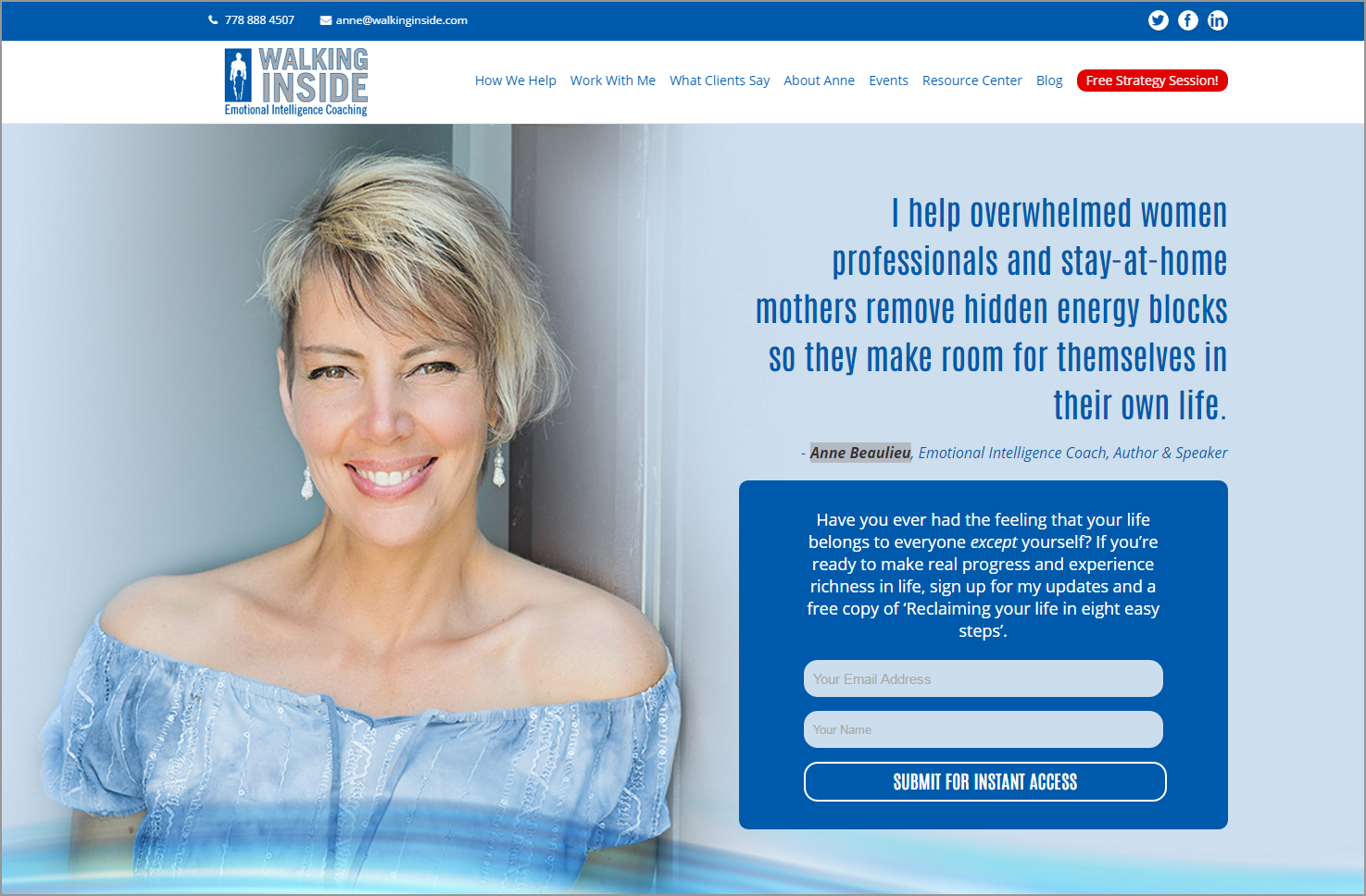
The very first thing that the team — and many of the MarketingExperiments readers who joined us live and offered their feedback on the page — picked up on was that the choice of imagery. Half of the above-the-fold real estate is taken up with an image of life coach Anne Beaulieu. Though the image is well-composed and inviting, it probably isn’t aligned with the deeply personal, self-centered motivations of the customer.
There may be situations where this could conceivably make sense — for example, if inbound customers are coming from an infomercial, YouTube video or related media that heavily features Anne, such imagery may make sense for continuity purposes. But, assuming that visitors aren’t necessarily arriving as Anne Beaulieu super fans, such a prominent photograph may at best hold little value for Walking Inside prospects, and at worst present Anne in an ego-centric light that likely isn’t a true reflection of herself.
When we’re designing a page, and especially if we’re designing a page for someone else, we often subconsciously design something that we think will please them. Who doesn’t like seeing a big, beautiful picture of themselves on a webpage? But ultimately, the long-term success of a highly-effective, customer-centric webpage should please any business owner more than the short-term boost in pride that a company-centric page may provide.
For a page like this, we would suggest heavily de-emphasizing the company-centric visuals and instead use that precious above-the-fold real estate in a way that provides more value and clarity of the offer to the customer. Whether that’s more supporting copy, testimonials or even lifestyle imagery depicting a customer living their life stress-free. Based on what we’ve seen in our past research, I would wager that, if tested, all of those options would beat out the existing imagery.
Pitfall #2. “I-based” Messaging

Though I’m a vocal proponent of counseling, seeking help can be an understandably sensitive subject matter for many people. Usually, if someone decides to take the step of reaching out for assistance, something in their life is causing them stress, anxiety or depression. As we often hear, admitting to yourself that something isn’t right and asking for help is often the most difficult step in recovery.
Thus, when a customer comes to us asking for help, we need to empower them and help them feel safe.
Unfortunately, as we move past the imagery to the headline, the copy ignores the outstretched hand of the prospect seeking help and continues with the company-centric messaging.
Anne says, “I help overwhelmed professionals and stay-at-home mothers remove hidden energy blocks so they make room for themselves in their own life.”
At MECLABS Institute, parent company of MarketingExperiments, we’ve observed that customers have become increasingly jaded and desensitized to hype, and fail to respond to marketing that cannot quickly effectively answer one simple question: “So what?”
When I read this headline, where Anne talks in first-person about her job, the first thing that pops into my mind is, “So what?”
I don’t mean that as an insult to Chris or Walking Inside — it’s a wonderful service that Anne is providing. I simply believe that this page would perform much better, and better reassure stressed out clients, if the script was flipped, and instead of being centered on what Anne does, it be centered on what customers receive from working with her.
Encouragingly, just a little bit further down the page, Chris and his team do a much better job connecting with the needs of the customer. Simply by changing the messaging tone from “I” (i.e., the company) to “you” (i.e., the customer), we connect more deeply with the prospect and his or her needs.

Pitfall #3. Don’t assume that customers already know the value of your product; avoid asking too much, too soon
The final pitfall that the team saw on this page — and something we see across the board on many, many pages — is asking for too much, too soon. As businesses, we often make the mistake of assuming that customers reading our pages know as much about our product or service as we do. In reality, before we ask anything of them, we need to provide them with enough clarity about and confidence in our product to proper them into taking that next step.
Though the specific ask on this landing page isn’t that big (sign up for emails), it’s still an ask that has to be earned. I would argue that at this point on the page, Walking Inside simply hasn’t provided enough specificity to convince visitors who aren’t already highly motivated to sign up.

Further down the page, Walking Inside does a really good job detailing, in a customer-centric way, some of the services that Anne and her team offer. I would suggest including similar value copy further up the page to provide more detailed specifics to prospects before asking them to sign up.

One final note on the call-to-action. As Steve, a Web clinic attendee, commented during the event, “What person, especially an empowered woman ‘submits’?”
“Submit” is a powerful word, and something softer like “Get Instant Access” or “Start Getting Help” might better align with customer motivation.
Thanks again Chris for bravely submitting the page. We’d love to hear if you test any of these suggestions.
Want more?
If you’re interested in seeing the team optimize more pages live, or if you’re interested in having your own page analyzed by a team of MECLABS optimization experts, register for our one-hour live optimization webinar this Thursday.
You might also like
Join us for May’s Live Optimization Webinar [From MECLABS Institute, parent company of MarketingExperiments]
Site Banner Optimization Webinar replay [From MECLABS Institute, parent company of MarketingExperiments]