

Thank you to Nature.org for submitting the carbon footprint calculator page for an optimization review. We hope you find this diagnosis helpful for testing new ideas and improving results.
Nature.org is a site for environmentalists and people interested in all things green. For over 50 years, the Nature Conservancy has been raising awareness and money to protect ecologically important lands and waters.
The challenge: not enough people know their carbon footprint, nor are they calculating it when given the chance. This not only has an impact on environmental awareness, but for Nature.org, it can also translate to an impact on the organization’s support and fundraising.
Let’s look at a key page — the carbon footprint calculator page — to diagnose some problem areas and offer solutions for increasing calculator completions.
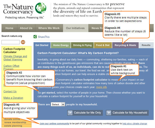
Here’s the carbon footprint calculator landing page:

Conversion diagnosis: 5 ways to improve this page’s results
1. Use dark text on white background
As online marketers, our goal is to make it as easy as possible for people to perform the action we want them to, whether it is buying a product, creating an account, or calculating their carbon footprint. Even though there is a high contrast between the text and background, this text is still difficult to read. Adding difficulty or friction to your web page, whether moderate or high, causes an undue intensity of effort to complete.
There’s a good reason that few books use white fonts on dark pages: the dark background overpowers and eventually absorbs the white text. It might be legible, but tests have shown that it’s easier to read and engage with dark text on a light background, and that’s the result you want from this page and process.
2. Communicate the page’s value proposition
For many visitors, simply knowing their carbon footprint may not present a high enough value to continue through a six-step process. A long process is a huge source of annoyance and fatigue. Your visitors have to make the decision to give up valuable time that could be spent elsewhere. So the page must clearly communicate the benefits of knowing the carbon footprint and ensure that the perceived value of those benefits outweighs the time commitment involved in the process.
Tell me that knowing my carbon footprint will allow me to do x, y, and z. Tell me how knowing my carbon footprint directly relates to saving the Earth. And remember, specificity converts!
At the same time, it’s important not to overwhelm the visitor with so much information that they get distracted from the main objective of the page. The information must be provided in a quickly accessible format that matches the prospect’s thought process. Consider using bullet points that are easy to scan and guide the visitor’s eyepath toward the button.
3. Clarify the length of the process
Let’s assume I’m motivated to find out what my carbon footprint is and you’ve convinced me of the value that information provides. Next I want to know how much work is involved to get there, that is, the number of steps and time commitment. That information is difficult to ascertain on the current page.
- The color and shape make the tabs look like separate content instead of a progression.
- The copy does not indicate how long it will take or how many steps there are.
- On the second step, the visitor may be surprised at unexpected work and decide to exit.
Consider indicating in the copy how long the carbon calculator will take. For example, “The carbon calculator takes less than 2 minutes to complete.” Also, use a progress bar or graphics that visitors will recognize as indicating successive steps. For example:

With a progress bar, consider design characteristics such as keeping all tabs the same color except for the current step (highlighted with a new color or shade) and using directional arrows or similar visual cues to indicate that there is a progression of steps.
4. Reduce the number of steps

A six-step process, whether it’s a carbon footprint calculator or a checkout process, is intimidating. The perceived length may cause many people to reconsider and drop out before completion. Even if a process is actually fast and easy to complete, the impression of length the visitor already has in their head is difficult to overcome (like first impressions).
Review the required questions and determine if there is an easier way (fewer questions?) to calculate the carbon footprint. This may reduce the accuracy of the results, but you have to ask yourself, “Are we willing to give up a little accuracy in order to get a lot more completions?”
If you haven’t already done so, you should also consider installing a metrics platform to see where visitors are dropping out of the process. This information is vital for determining how to streamline the process. For example, if you have a high clickthrough rate on steps 1-3, but 81% of visitors exit on step 4, then you’ve found the step you need to focus on to improve completions.
5. Avoid giving your visitor multiple objectives
After reading the introductory paragraphs and preparing to click on the “calculate” button, several visitors might get distracted by the links for “Join the online community” and “help stop climate change” just beneath the calculate buttons. All of the forward momentum created by the calculator copy is interrupted by confusion surrounding where to click next.
I’m sure Nature.org wants visitors to take both of those actions, but right now? At the very point where I’m about to proceed to step 2 of the carbon footprint calculator?
Strategically position these objectives in the best place. In this case, that would be when visitors receive their carbon footprint score, realize the impact they’re making on the planet, and feel compelled to take action. As soon as they read their score, place a big, bright button that says something like, “Offset your carbon footprint” — and send them on to the next step on the journey.