


Our June 25 Web Clinic looked beyond our various formulas and heuristics and focused on one vital principle: clarity trumps persuasion.
While we used case studies from three subscription sites to illustrate this deceptively simple principle, the truth is it applies equally to any type of website, email, or other marketing communication channels.
This brief examines the results of those three tests and explores how applying clarity to your site pages can increase conversion and revenue.
Editor’s Note: The clinic also featured a live optimization session. Pages were submitted in advance for a critical analysis conducted by MarketingExperiments Director, Dr. Flint McGlaughlin; Director of Optimization Research, Jimmy Ellis; and Director of Channels Research, Aaron Rosenthal.
The audio from the Web clinic on this topic can be downloaded here:
Clarity Trumps Persuasion: How to improve results by 59% or more
Overcoming a Marketing “Inferiority Complex”
In marketing, we often feel that if we just knew the right word combination for a headline or if we could just discern the absolute best call to action, then we could push our results over the top.
But our research shows you don’t need to be a master of persuasion if you can simply take the time to study your site and develop it to achieve genuine clarity.
The bottom line is: clarity trumps persuasion. Admittedly, that sounds almost too simple and we don’t doubt that most marketers understand the importance of being clear. That said, understanding the practical application of this principle in your pages and processes can lead to enormous gains, as the following case studies demonstrate.
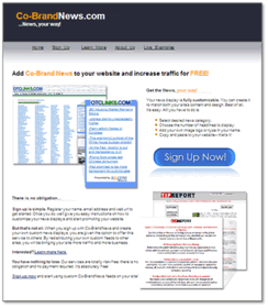
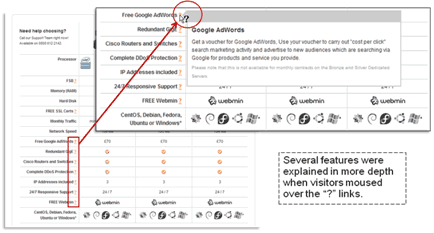
CASE STUDY 1: Free News Feed
For our live optimization Web Clinic on February 6, 2008, Eric Stevenson of Co-BrandNews.com submitted the company’s webpage for a review and critique by the MarketingExperiments team. He also submitted the following value proposition:
“We offer a fully customizable news headline feed, which we permit users to include their logo in creating it — for free. This provides users a chance to make news feeds that by including their logo gives them the opportunity to create branding tools for their own site (even though the click-through goes to a news site). This is a preliminary program in advance of a hosted solution we will launch this fall in which the users’ page will be hosted by us and the custom headline feed they create would open on it (it will remain free to users).”
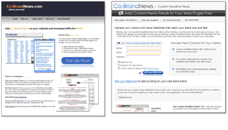
Our optimization team recommended several changes and tests to improve the page’s conversion rate for visits to sign-ups, including:
- Eyepath: “Make it vertical. Don’t ask visitors to read side-to-side. With a strong image on both the left and the right, visitors are confused about how to read the page.”
- “Increase the size of the font.”
- “It’s not immediately clear what you are doing. State what the product is in the headline, rather than the brand.”
- “Test something like ‘Increase Traffic Today’ or ‘Get Your Feed Now’ for the call to action.”
- “Add credibility indicators. There are no testimonials convincing me of the value.”
- “The next page has a simple four-field form to set up the process. Don’t make them click to get there. Include the form on the landing page.”
- Cleaner eyepath
- Better use of benefits and value proposition
- Stronger calls to action
- Testimonial
Results
After testing the changes for two months, Stevenson emailed our optimization team with the results of the designed page:
- “Conversion rate rose from 3.9% to 6.6% (30-day results).” [This reflects a 69% relative increase.]
- “[Also] . . . we took the opportunity to target our paid-click advertising on those keywords which were more relevant — and cut out those which were not productive. That reduced our ad spend by 60% yet increased conversion 200%.” [emphasis added]
Clarity and the Pitfalls of Persuasion
When anyone comes to a Web page, there are three cognitive voids in the visitor’s mind. Your site or landing page must address these questions in order:
- “Where am I?”
- “What can I do/get/buy here?”
- “Why should I participate?”
Our research shows that if pages can’t answer these first two questions in about three seconds, conversions will suffer significantly.
For example, clicking an ad and arriving at a page that’s supposed to offer a free trial, but features several credit card logos, has numerous required form fields that aren’t actually necessary, and “free trial” is not emphasized in the copy.
People don’t buy from Web pages; people buy from people. When they come to your page, there’s a question on their mind. That’s the opportunity for you to establish a conversation. And the first thing your page should help them understand is, “Where am I?” You need to answer that, and as you do, you need to help them understand very quickly what you can do for them, or what they can do for themselves at your site. Only then can you move to answer, “Why should I participate?”
This sequence is where many sites have a problem and fall victim to three pitfalls of persuasion:
- Our tendency is to rush into “why” before we have answered “what” or “where.”
- Our tendency is to answer “why” before we have made the question, itself, relevant. (We often don’t intensify the problem.)
- Our tendency is to answer “why” with presumed authority (bragging) rather than actual credibility (third-party testimonials; specific, quantifiable claims).
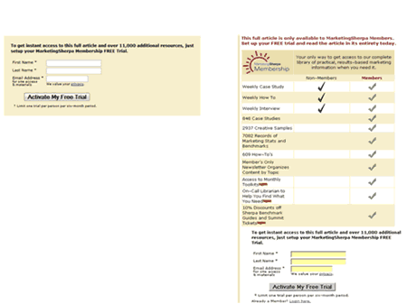
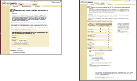
Case Study 2: Article Barrier Page
MarketingSherpa membership offers marketers unlimited access to articles, case studies, research databases, creative samples, and other features not available to visitors.
Using an A/B slit test, our research objective was to discover whether or not a “feature matrix” on the barrier page would improve conversion to free trial sign-up.
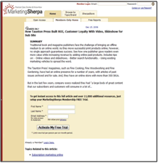
The control page used a simple call to action and a form requiring a minimal amount of customer information.
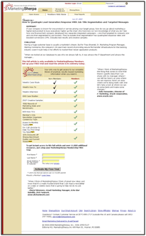
The treatment’s feature matrix allowed users to compare the features in an instant — and leads the eye to the sign-up form. A testimonial from a member was also added to the right of the form.
| Sign-Up Page | Conv. Rate |
|---|---|
| Control |
1.12%
|
| Treatment |
1.97%
|
| Relative CR Difference |
75.89%
|
What you need to understand: The treatment page with the feature matrix increased conversion by 75.89%.
The feature matrix emphasizes membership benefits in a quick-scan format and reinforces the vertical eyepath to the sign-up form. The testimonial adds third-party credibility and help to reduce Anxiety about signing up.
Even though the matrix added length and created additional Friction, by answering the three key questions, the changes also added clarity to the page – enough to overcome the Friction and help mitigate Anxiety.
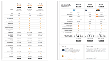
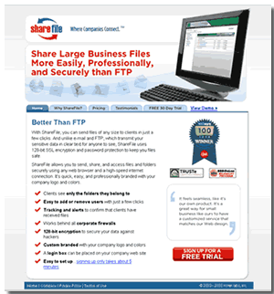
Case Study 3: Subscription Sign-Up
We performed a test with a Web hosting provider offering subscriptions to selected hosting packages.
The research objective was to increase conversion-to-sale and revenue through offer page optimization.
We designed a variable cluster optimization test, whereby several page elements were changed and tested at once.
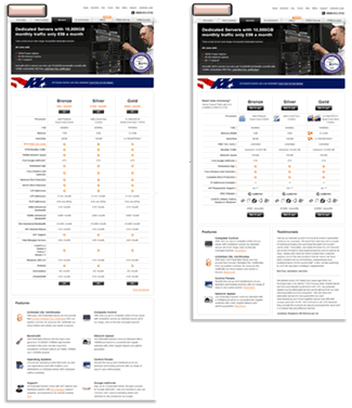
The treatment design included these changes:
- Shorter, more concise features matrix
- Pricing de-emphasized
- New calls to action
- Hover-over links for more information on key features
- Testimonials
| Web Hosting Offer Page | Conv. Rate |
|---|---|
| Control |
.50%
|
| Treatment |
.68%
|
| Relative CR Difference |
45.69%
|
What you need to understand: The treatment page increased conversion by 37.57% and revenue by 29.80%.
Both the original and treatment helped users navigate the decision-making process by effectively organizing information on the page. However, the treatment further reduced Friction with a shorter page, hover-overs to explain features, and fewer list items to consider. The treatment also reduced Anxiety by placing customer testimonials near the call to action.
Review of Submitted Sites
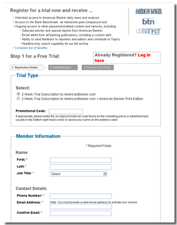
NEJM.org (New England Journal of Medicine) Sign-Up Page
Analysis (Jimmy Ellis)
- The reasons for buying are below the Call to Action. All of the information that will help visitors decide whether or not to subscribe should be higher. Move the benefits above the actual call to action or even duplicate them.
- If you know who is coming to this page based on a certain channel, say, if it was a student or professional, I would absolutely include that in the headline.
- Also, I would absolutely test some sort of an incentive on this page.
Analysis (Aaron Rosenthal)
- It looks like this is going to be a long process with steps one, two, three, four, five. How many people are you losing on each one of those steps? There must be some ways to reduce the number of steps. Look at your channels and determine the motivation for people coming to this page; you may want to test different versions of this landing page for each segment of your market.
- If you understand where the different types of subscribers are coming from, it will help you tailor your landing pages to that market. If you have a very highly motivated segment, you may not have to sell them as hard with all the benefits for subscribing.
- You also need to capture a piece of information, such as an email address or phone number, so you can remarket to individuals if they abandon the process.
Analysis (Flint McGlaughlin)
- Every single page of the order process should be advancing the sale through a conversation. There is no dialogue. Dialogue should begin on the other page driving the traffic and continue on these pages. Adding bullet points in a box, equally rated side by side in a two column scenario means there is no conversation here.
Analysis (Aaron Rosenthal)
- You’re hiding the headline in the logo and wasting a lot of screen real estate on this computer image and some background graphics. The headline should scream that you have a free trial here.
- You are also making them click through to go to the next step before you actually get a bit of personal information. So whatever you are making them do to sign up for the free trial, accomplish that on the first page.
- You’ve got some good credibility indicators over on the right hand side and the testimonials. I’d like to suggest that with testimonials, use as much personal information about that individual as possible. It makes it feel more credible and makes it feel real. If it’s a third-party credibility indicator, like this C-Net badge, if they wrote an article or a blog post about you, I would quote them. That’s going to be more powerful than just slapping a logo over on the right hand side.
Analysis (Jimmy Ellis)
- I would take the free trial form and put it on this page if you can. Just by not making them click, you’ll get at least a handful more free trial subscribers.
Analysis (Flint McGlaughlin)
- Don’t stack your headline in red, in three lines, as you have done here. Red on white is a very bad headline choice color based on testing. Also, when you stack a single headline three lines deep it becomes very difficult to read. You cannot instantly grasp what this paragraph is saying. This would be a much better headline if you had, say, one powerful line and then a good sub-header that explains further.
- Another thing is I think there may be too many red check marks down here, too many items down here. Three to five items should be enough to persuade most visitors to take a free trial. Don’t make visitors work too hard to understand what it is or why it is. Some of these things could be added on other pages within the process or added in subsequent support information that they can click on to get, like hyperlink tech support that doesn’t take them off of that page.
- I don’t like the sign up for a free trial button on the far right hand side. I want the process to flow laterally, with the button underneath the copy so my thoughts are sequential and linear and I move in order right down to the sign-up for free trial.
- And the other issue is your TRUSTe certified privacy and BBB Online. At the present moment visitors are not committed enough to be worried about whether or not you have TRUSTe certified privacy or use a BBB Online Reliability. They are not buying anything yet, so move those to that part in the thought process when they are actually worried about such issues, when they’re ready to make a purchase and are asking if it’s safe.
Analysis (Jimmy Ellis)
- You absolutely you have to make “free trial” stand out more. Also, no one likes the word “register.” Simplify every bit of information on this form to make it as short and simple as possible. Right now there is a lot of information on here.
Analysis (Aaron Rosenthal)
- You give step one for free trial, which is really good, then I get down to the trial type, select the trial type, and that’s fine, but then you ask for a promotional code. If I’m getting a free trial, I don’t understand this.
Analysis (Flint McGlaughlin)
- Again this is site flow interrupt. You are asking me to put a code in for a free trial which indicates a) this is something I am actually going to have to pay for or b) I am on the wrong page. You are going to lose people in that process, right there at that step.
- Clarity trumps persuasion.
- Your pages must communicate your value proposition clearly and answer three key questions for visitors:
- “Where am I?”
- “What can I do/get/buy here?”
- “Why should I participate?”
- Obstacles to beware of in your sub-path pages:
- Your page tries to answer the “why” before the “what”
- Your page presents a solution before the problem is clear
- Your page uses presumed authority (bragging) instead of credibility (testimonials; specific, quantitative information)
Related Marketing Experiments Reports
- Simple Tests, Significant Gains: How our partner increased revenue by 130% with small changes
- Improving Conversion by 162% — How to Overcome Value Inhibitors
- 2008 Internet Marketing Strategy
- Marketer’s Intuition Revisited: Is There a Place for Intuition in Web Page Optimization?
- Ideal Subscription Path Tested
As part of our research, we have prepared a review of the best Internet resources on this topic.
Rating System
These sites were rated for usefulness and clarity, but alas, the rating is purely subjective.
* = Decent | ** = Good | *** = Excellent | **** = Indispensable
- Website Usability Leads to Conversions **
- Evaluating Web Sites **
- Do You Want to Inform or Persuade? **
- Clarity in Web page design *
- Web Site Clarity *
Credits:
Managing Editor — Hunter Boyle
Copy Editor — Frank Green
Contributor(s) — Flint McGlaughlin
Aaron Rosenthal
Jimmy Ellis
Bob Kemper
Tony Valcarcel
Boris Grinkot
Andy Mott
HTML Designer — Cliff Rainer
Mel Harris
Email Designer — Holly Hicks
(Test Protocol 1097)
(Test Protocol 1088)