

Banners take up precious space on landing pages and too often don’t do enough to turn prospects into customers. Yet marketers are forced to work within their constraints.
The latest MarketingExperiments Web clinic outlined how to make every banner a conversion-driving opportunity, because even the smallest changes can make an impressive difference. To prove it, Mike Loveridge, Head of Digital Test and Learn, Humana, Inc., a healthcare insurance provider, presented banner tests from his organization. Take a short break and find out what he discovered here: Site Banners Tested: How minor changes led to a 433% increase in clickthrough for Humana.
Here’s the boon and the bane of banners: They’re often the very first thing that people see when they arrive on the landing page. That means if they aren’t optimally presented, you’re going to lose customers immediately. But optimized banners can drive more prospects than ever before, and it doesn’t take much effort.
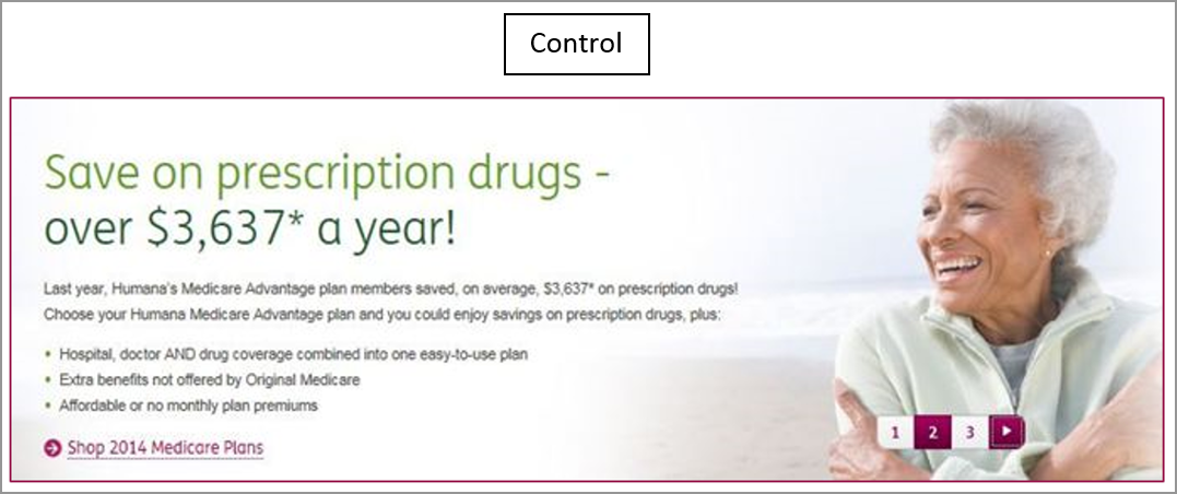
Consider this banner that was on Humana’s homepage. 
Loveridge advises approaching banner design like a billboard. Communicate the message at a quick glance. Saying too much at once confuses and distracts.
Still, it can be tempting to jam copy into a small space. Resist temptation. Instead, make it obvious to the prospect what you want them to do. Save the details for the next step in the funnel and provide a clear call to action so that the prospect takes it. This is where the control falls down.
- It has too much copy
- It doesn’t have a strong call-to-action
- It doesn’t have a clear, concise message
In contrast, the Treatment is focused. It’s clear to the prospect what she is expected to do and how she can do it. It has just enough copy to clearly communicate the message. 
Result
The Treatment achieved 433% more clickthrough than the Control. 
But Loveridge didn’t stop testing, regardless of the impressive lift. Instead, he made the winning Treatment the new Control. Now that he had clarified and simplified the message, he wanted to see if he was accurately gauging customer motivation.
Typically, asking for a lesser commitment, like “explore” wins more clickthroughs. That’s because earlier in the funnel softer calls-to-actions like “explore” better match what customers want to do at that stage in the sales process.
In this case, however, the window to sign up for Medicare is very limited. People have to make a decision between mid-October and early December, and then the opportunity to sign up is gone for the year. Consequently, they’re ready to move forward fast. That’s why Loveridge decided to try more of a hard-sell approach and invite them to shop.

The result was another 192% increase in clickthrough — proof that the revised call-to-action better matched customer motivation.
So how do you apply these concepts to your own marketing? Keep the checklist below handy and refer to it whenever you’re up against a banner:

You can follow Andrea Johnson, Copywriter, MECLABS on Twitter @IdeastoWords.
You might also like
Live From MarketingSherpa Summit 2016: Humana on the power of iterative testing
Banner Blindness: Optimize your online display advertising to stick out (or blend in)