There’s a myth being propagated across the Internet as we speak …
It’s the myth of “one variable at a time” testing.
And it’s mostly bunk.
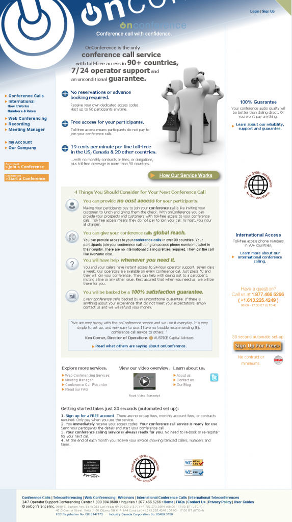
Well, at least in the way most marketers think about testing “one variable at a time.” Usually the result of testing one thing at a time is a page that looks like this:
This page was submitted by Jerry Everett, a marketer from our Web clinic audience. When our researchers provided live optimization suggestions, Jerry asked us to review his page in depth. We thought it would be the perfect opportunity to illustrate this point.
While Jerry didn’t necessarily test only one thing at a time to get to this page, he did a redesign based on specific variables in the page design. He was focused on the individual headline, the bullet points, the button, etc.
It looks as though it may have been designed by a committee (even if it wasn’t).
The problem with Jerry’s (and most marketers’) approach to landing page treatment design stems from a misunderstanding of the term “variable.”
Usually, marketers think of variables as single elements on a webpage, e.g., a headline, a button, a layout, etc.
When we view variables as physical elements on a page, we miss the bigger picture.
In reality, variables do not occur on a webpage; they occur in the mind of the customer. When a customer views your landing page, they don’t see particular elements on a page. They see a means to an end.
And, the elements they see to get them to that end are not necessarily related to individual headlines, buttons and layouts.
Part of our jobs as evidence-based marketers is to name the variables in the mind of the customer.
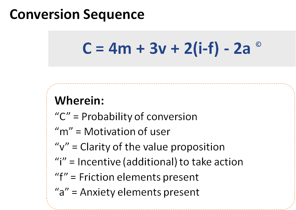
To help us do that, we developed the Conversion Sequence heuristic.
Each of the elements in the MarketingExperiments Conversion Sequence heuristic tends to correspond with variables in the mind of the customer.
When we look at those variables, and adjust them accordingly, we can come up with effective treatments. Here is what our researchers developed when looking at the page with customer-centric variables in mind:
Stay tuned to the MarketingExperiments blog for part 2 of this post where we’ll dig into why we made the changes we did.
In the meantime, help Jerry and his team out. What do you think will work better in the current wireframe? What do you think won’t work at all? Let us know in the comments.
Related Resources:
Common Landing Page Mistakes: Form fields that stop selling value
Quick Win Clinic (Part I) – The 5 easiest changes to make to your landing pages right now
Landing Page Contest: So you think you have a good lead gen page?
Landing Page Optimization: Improving Conversion 50-60% by Applying Continuity and Congruence


I love you guys but I have to say I’m not a huge fan of the new wireframe. Here are a few things I noticed at a very quick glance.
Negatives: To me it’s really hard to read. I can’t even tell what the headline is, and the text looks all jumbled into one. There’s nothing that pulls you into it to start reading or that breaks it up for easier reading.
I also think the CTA needs to be pulled into focus more. It’s “slightly” hard to find. The color makes it stand out but the positioning doesn’t.
Positives: It looks like pretty good copy. I also like that you have it focused on the CTA, but then have a little more information at the bottom for those who aren’t quite at that stage in the buying process yet.
Overall: I think the new one will win, but can still be improved quite a bit 😉 I hope you take it as constructive criticism and not a
Jeremy Reeves
http://www.JeremyReeves.com
P.S. The random twitter button looks awkward.
Hey Jeremy,
We absolutely take it as constructive criticism. I should probably have qualified somewhere in the post, however, that it definitely needs a designer’s touch. The seals, for instance are simply icons we took from iconfinder.com. Also, the image is directly from Facebook’s homepage. All of those are there simply as placeholders for what a designer could take to the next level. So yes, I agree that the wireframe isn’t pretty, but hopefully the main ideas are present.
@Paul Cheney
Ha, sorry! I didn’t realize it was a mock up before the designer got his/her hands on it.
For some aspects, I do agree with Jeremy. I’ve always love the clear aspect of your web pages, guys, but I like when the VP is emphasised with colours. I thinks it stands out well.
And what about trust symbols? Have they been replaced by testimonials?
Anyway, I read a very good copy, as usual. Love it!