

Editor’s Note: A few days ago, one of our Twitter followers sent us a tweet asking what we thought of her new page. At first, we were tempted to try a landing page optimization in 140 characters or less. But when Adam Lapp, aka Dr. Optimize, gets started, the knowledge he imparts could fill volumes. We limited him to one short blog post. And here’s what he had to say…
First I wanted to thank @jilbackstrom for asking our opinion. It takes a lot of guts to put your work out there for the critique of others. We never seek to tear down our audience’s work, only give them the ideas and tools to further build things up to newer heights.
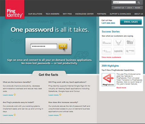
OK, now that that’s out of the way, it’s time for Dr. Optimize to sharpen his scalpel. Here’s the page @jilbackstrom wanted us to take a look at:

The Wager
I’m not a betting man, but if I had a hundred dollars I’d have to put it all on the primary image of Ping Identity getting the majority of clicks on a heat map. Not only does it take up most of the real estate, but the drop shadow, the arrow, and the button all make me want to click.
Here’s what the heat map would look like:

Misguided Clicks
Index finger to the left button is such an easy movement and our primary goal. After all, clicks ultimately lead to revenue. But if that click is in the wrong place on your website, you’ve got some work to do. Of course, the worst place to misdirect this action is that “x” at the top right of your page. But if someone clicks in the wrong place – where you don’t necessarily want them to click – then it might as well be a click on the “x.” And on this page, the first few things I want to click on are simply not clickable. Odds are, many visitors will simply lose interest and bounce.
To add to the challenge, the headline is more of a “teaser” than a clear and articulate description of the product. Well, teasers usually lead people somewhere…like dangling a carrot from a stick. But in this case, there is no carrot for me to grab. There’s no place for me to click in order to learn more. How do I proceed from here?
The Mom Test
The Mom Test…a quick and easy usability criterion we should always consider when designing web pages, even for B2B sites. A simple question, “How easy is this site for my mom to use?” Sure, you don’t want to use a 30-point font. And you don’t have to, it’s not the “grandma” test. But you do need to have a site that is easy for the general Internet user to engage with.
Would my mom understand what you mean by “Email Sales” in the top-right corner? There’s no implied action such as “Learn More.” And does “email” mean to email Ping Identity about a purchase or do you have an email product? Forget my mom, I don’t even know.
Cart Before the Horse
Here are several actions the page asks the visitor to take:
- Call toll free
- Email us about sales
- Read success stories
These are all good, particularly customer testimonials to reduce anxiety, but you need to have a conversation with the visitor and convey your value proposition before offering these possibilities. If I don’t know what you are selling, does a bystander telling me “It’s great!!” really mean anything? I’d say no.
Testing Ideas
So what do you do next? Well, I don’t have a silver bullet, but I do have some testing recommendations that I firmly believe will provide you with better results.
- Better headline – Needs to communicate what it does and why I should buy it. For example, “Log In to Every Website with One Password, Safe and Secure” or “Too Many Passwords? Ping Lets You Login Once and Get to Work.”
- Tell me “who” you are – With the nature of the Internet enabling anybody and their brother to put up a site, you’ve got to separate yourself with copy and images that tell me I can trust you. For example, here is some buried treasure I found on the About Us page:
- In business since 2002
- Serves hundreds of enterprise companies and governments (If you use this, consider being more specific by stating the total number of licenses – for example, one government agency may have tens or hundreds of licenses)
- Serves 40 of the Fortune 100
- Give me something to click – Tell me what it is, why I should use it, and then give me a place to click. Whether it’s “learn more” or “try for free,” for the amount of real estate the main image has been allotted on the homepage, it must deliver a return on its investment. That return comes in the form of a click forward.
- Try for free – This is a perfect product for a free trial. Allow a business to try it for free for a period of seven or 30 days. Give them a license then let them get hooked. Of course, request the credit card up front so it’s not a complete impulse buy.
A free trial is powerful. It reduces anxiety associated with product quality (“Hey, if it’s no good I can cancel”), but it also communicates confidence in the product. If you test a free trial, the entire page should scream “free trial”…banner, headline, intro copy, and button.
I hope this feedback gives you new test ideas, @jilbackstrom. If you try any of them, be sure to let us know the results.
What other ideas do you think @jilbackstrom should test? Leave your advice in the comments section.
Fascinating. What I love about this post is that the information is so clear and actionable. True of just about everything on the ME site.
Excellent post. I especially like your point “Well, teasers usually lead people somewhere…like dangling a carrot from a stick. But in this case, there is no carrot for me to grab”
I cannot imagine how sites can’t have learn more or some other link leading to people dying to know what the heck site is about. You throw big words and headlines to catch attention but what you do with that attention ultimately determines your revenues. You get only 5 seconds of attention, better guide it.
Thanks Dr. O! I am taking your suggestions back to the team. Looking forward to hearing from others tool.
Jil Backstrom