There’s a lot of bunk information out there about copywriting. The barrier to entry for being an “expert copywriter” is pretty low and some of those crossing that barrier are simply wrong when they give advice.
Don’t get me wrong, there are some great copywriters out there. What’s funny though is that most of us here at MarketingExperiments wouldn’t claim to be one of them (even the great Daniel Burstein).
But what we lack in copywriting prowess, we gain in mountains of research on copy that works and doesn’t work. We’ll be sharing a bit of that research with you on Wednesday in our copywriting web clinic (educational funding provided by HubSpot) if you’d like to learn more. But, throughout that research, we’ve picked up on a few commonalities in the mistakes copywriters make.
With the help of Austin McCraw’s unused slides from the Optimization Summit, I went ahead and took some of those commonalities and compiled them into a list of common mistakes marketers make when they’re writing copy.
After every mistake, there’s an example of how we fixed it and got dramatic lifts in each case. No bunk copywriting advice included. Just data.
Mistake #1: Headlines with no value
It seems like anytime someone writes about headlines, they use this quote from David Ogilvy:
“On the average, five times as many people read the headline as read the body copy. When you have written your headline, you have spent eighty cents out of your dollar.”
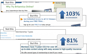
Of course, clichés get to be clichés because they’re true. When it comes to grabbing your reader’s attention, nothing works better than a solid value-based headline. Your headline should offer the reader a reason to read that first paragraph in your body copy.
Example:
Mistake #2: Action-centric calls-to-action
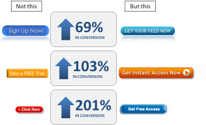
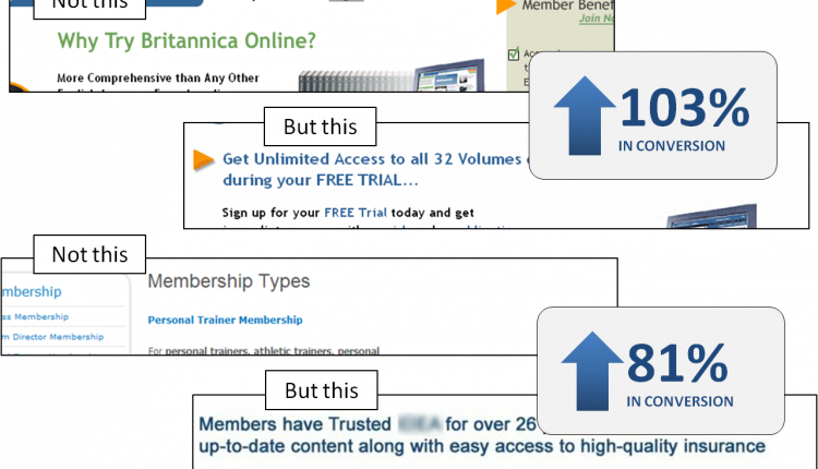
“Action words” or “power verbs” get touted a lot by copywriters the world over as the ultimate tool for getting prospects to buy. But our research suggests that focusing on the action that you want your visitors to take hurts conversion.
It’s not about the action itself, it’s about the value they’re going to get as a result of taking that action. Getting that right in your CTA can give you dramatic lifts with very little effort.
Example:
Mistake #3: Saying too much
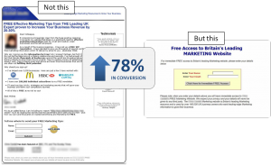
If you are, or ever have been married, you know exactly how this hurts conversion. Assuming conversion means getting to sleep in your bed rather than the couch, saying too much can take you from a 99.9% to somewhere around a .01% conversion rate.
The same is true for your copy. Depending on where your reader is in their thought process, you could be saying way too much when all they want to do is take action. That’s exactly what we found was the case in this experiment…
Example:
Mistake #4: Saying too little
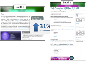
If you thought you were safe on that last one, try this one on for size. Again, depending on where the reader is in their thought process, saying too little is just as bad as saying too much. Your reader needs exactly the right amount of copy to get them to make the decision on the page.
Sometimes that takes 30 pages of long copy, sometimes it takes a few words. In the following experiment, we found that we weren’t giving the visitor enough information to make a decision. Because they were in a different place in the thought process, they needed longer copy.
Example:
Mistake #5: Misplacing your tone
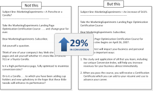
Your audience expects to be spoken to in a certain way. You don’t usually speak to an adult like they’re a toddler and vice versa. A lot of times, copywriters miss the mark a little in their tone. It might not be as dramatic as speaking in baby-talk to paying customers, but it could mean rubbing them the wrong way, even a little with not just what you say, but how you say it.
Example:
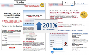
Mistake #6: Visual intimidation
An unclear eye-path in your copy that doesn’t match the thought sequence in your reader almost always hurts conversion. Heavy text without any highlighting, bullets, or bold text to pull the eye through the page is a great example of making this mistake. It also happens with the ever-popular design tactic: evenly weighted columns.
Example:
Mistake #7: Disconnected images
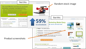
Good copywriters know that images are as much a part of the copywriting process as anything else. Images can support the overall value of the action you want your visitors to take on the page, but they can also cause confusion.
When a reader sees an image that makes her think, it forces her to use extra effort in understanding your offer. That’s the last thing you want your reader doing on a landing page.
Example:
Bonus Mistake: Not testing your copy
The biggest mistake you can make in your copy is not testing. You can read all the blog posts you want on the 7 mistakes to avoid, or strategies to consider, or phrases that sell, but until you’ve tested it for your own audience, you’ll never know for sure how your copy is actually doing.
Example:
So with that in mind, I’m going to run a little unscientific test on the copy in this blog post. When I sent this post to my editor, Daniel, I gave him an alternate opening. I expected him to pick one for me to publish, but instead he suggested I test it.
However, since we don’t yet know of a way to A/B test a blog post in a scientifically valid way, we’d like you to vote in the comments about which is the better writing. Again, this isn’t very scientific, but it will help to settle a little bet.
Here’s the alternate beginning:
[Every once in a while, Austin McCraw, Daniel Burstein and I disagree about what gets posted on this blog. Daniel and I tend to be very giving. We always try to over-deliver when we write our posts. Austin, on the other hand, likes to hold back his best content for our Web clinics.
Ever championing your cause, dear blog reader, Daniel and I decided to steal some of Austin’s great content on copywriting and post it here without asking! We’re hoping that asking for forgiveness is better than asking permission in this case. 😉
So without further ado, here are 7 common mistakes most copywriters make when writing copy for their campaigns. After each mistake, there’s an example from our research detailing how we turned those mistakes into sizable lifts in conversion:]
Now, if you would, please vote for the opening you like the best. I’ve got a lot on the line in this one, so I’d appreciate your input.
Related Resources:
Copywriting on Tight Deadlines: How ordinary marketers are achieving 200% gains with a step-by-step framework (Web clinic on Wednesday with educational funding provided by HubSpot.)
Copywriting: How your peers write effective copy on short deadlines
Headline Optimization: 2 common headline mistakes and how to make them work


Great article. I particularly agree with mistakes #2 and #7. Personally, I vote for the opening you chose to start with (i.e. top of page not half way down) as better, more impactful and engaging writing. Thanks!
Thanks for the vote Claire! Looking forward to hearing what others have to say.
Also, while we’re being unscientific, I’ll go ahead and vote for the second opening because it makes me look like a hero. I’m always up for a little self-promotion at Austin’s expense. 🙂
Fantastic article! Very helpful as always! I like your second opening because I love that kind of writing style, but to be honest, I would have to go for the first opening. It was helpful to find out that not all copywriters know what they are doing so that I don’t trust everybody with the title ‘copywriter.’ I especially like the point you made that you guys don’t consider yourselves great copywriters but that your research tells you everything you need to know. While the first was more fun to read, the second was more valuable information that I really needed to know. Thanks!
The chosen opener was much more engaging. This is the first time I have been through this blog so not being part of the in crowd… your second opener made me feel like an outsider. Plus I thought the second opener had a more disparaging tone towards Austin than a positive message about why I should read the rest of the post.
Good article. I especially liked #2. We will test it out. I liked the first intro. Thanks!
Completely agree with DC’s comment above me.
One of the best blog post in a long time, very good information.
Thanks here from Denmark
I personally like the one that you went with. I seem to have developed “hype” radar over time reading to much marketing copy. Anything that smacks of “secret knowledge revealed here” puts me
off. The message that you went with gave credit and sounded a lot
more like the process that I go through each day. Collect – Analyze
– Summarize – Act.
Correction: I meant the second was more fun to read but the first was more valuable.
Good stuff, Paul. Write on!
I didn’t even read the opening. I skipped from the headline to the first mistake. After you asked me to vote on the opening I went back and read it. I think you made the right choice. I HATE articles that open up with a personal story. That’s what fiction is for (or facebook stuff). I want to go back to the days of journalism when an article started with a lead (or lede) that gave all the pertinent facts. To me that’s the value proposition that tells me if it’s worth my time to read more.
I vote for the lede you used, not the italicized one after point seven. I saw “copywriting” in the headline and I gave you a little time to show you had something for me, even though I somewhat mistrusted your opening: that is, I said to myself Duh! of course there’s a lot of bunk — but why is it any different on this blog. So I gave you a chance. If I’d seen a phony, patently so, opening about “stealing” ideas from a colleague, I would have felt extremely worked. I would not have believed you for a minute. And I presume that’s a bad thing in copywriting.
The definitive vote (in my estimation) has to be: it depends.
What is the tone of your site? What is your corporate voice? Either one can work, but it has to fit with who you are and how you communicate with your audience.
Great summary article Paul – thanks.
Re: which intro copy, I vote for the first one because of the #5 factor: misplacing tone.
In your live presentations, I find humour works exceptionally well, and that’s where it’s appreciated & even become expected – the presentations benefit from a tone that keeps things engaging & entertaining while they inform.
On your site / in your copy, this does not translate – I’ve come to expect the meat only. When I get ‘inside’ humour here, it dilutes the humour in the presentations, and makes me have to work through the copy. To me, this produces the opposite effect of what was likely intended.
Thanks guys!
Paul,
Let me propose a third alternative:
==============
“Every once in a while, I can’t think of anything good to write about on this blog. So, for inspiration I go to the content guru of our organization, Austin McCraw. He always has 1,000 amazing ideas in the works for the infamous MarketingExperiments’ Web clinics.
He so kindly and graciously offered up some recent content that he had worked on for a potential upcoming Web Clinic so I could have something valuable to say on this blog. He is truly an inspiration for me, as he constantly advocates for the audience, and is always pushing to give away more and more of our research. He is really the “robin hood” of MarketingExperiments.
For a brief moment, I thought about creating an alternative introduction that would poke fun at him. However after giving it some additional thought, I realized how much the audience wouldn’t buy it, how much they love Austin, and how much I can’t live up to his reputation. So I wrote this introduction in praise of him instead.
So with that, I turn your attention to some amazing content on copy writing that only could come from the pen of Austin McCraw”
===================
Just a thought 😉
Great post, man!
I like the opening you used. It gets to the point more quickly. The alternate opening gives too much “back story” up front. And, thank you for this post; I have distributed the link widely among the writers and copy editors around here.
Re point #2, the ‘better’ alternatives starting with ‘get’ are a really ugly use of English, and I wouldn’t click on them for that alone!
Thank you all so much for the comments! Excellent points all around. And so far it looks like the first opening is winning by a long shot.
Of course, had @Austin McCraw‘s opening been posted, I’m sure it would have out-performed them both. I hereby raise my glass to MarketingExperiment’s true “Man in Tights” (tight tights) and concede the defeat of my sub-par alternate opening.
Great article, as usual!
But I’d like to ask you a question: is there a “perfect” lenght for an headline? How many words should it be written with?
Sometimes I think it’s better a persuasive headline rather than a long, point first one. Anyway I think it clearly depends on what your selling, what you’re offering and where the headline is collocated (a landing page, an article, a website page, etc.). What do you think?
@Valentina
Hi Valentina,
The direct answer to your first question is no. There is no perfect length.
To answer your your second question: I think you’re right…it depends. There is probably a point where a headline ceases to be a headline b/c of it’s length.
But I think most of the research we’ve done suggests that the most important aspect of the headline is not length, but how well it communicates value and works to get the reader into the first paragraph.
Length certainly has something to do with that, but only as it relates to communicating the value quickly and effectively enough to make the reader want more.
I’d love to get a research analyst on here to clarify a little further, but I hope this helps until then.
The opening you went with by far…
Agree with DC, the second opener also made me feel like an outside as I am new to this blog. The first opener said to me “I am going to tell you what IS right, rather than repeating all that innacurate and poorly written rubbish out there”. The second para (Don’t get me wrong…) was particularly engaging, it gave a human side to the post.
Funnily enough, Daniels article that you link to in that para didn’t grab me (no offense Daniel, just constructive criticicsm 😉 ). I think it may have been the very long hyperlink in the 3rd para which is very ‘in your face’. When reading on the web people will ‘scan’ and links that long aren’t ‘scan-friendly’. It seemed to get in the way of the rest of the text and I found it difficult to focus on what was being said.
Love Austins comment above… humorous and makes me want to go looking for what he’s written.
Calum B… what would you suggest as an alternative for Option 2’s “GET” lines? Is there a better word or would you rephrase it completely? It may not be a pretty word, but in this instance it is practical and conveys the message appropriately (IMHO).
Stick with the paras you used. Excellent post and thanks for sharing the results.
good article – professional
We will never know will we? We only know what works looking back. But what made me click and read was the great headline.
Opening paragraphs are, after all, simply expanding on the headline benefit.
This is one of the best articles I have read on copy, and thanks for giving it out free. Much appreciated!
The opening you used is much better. The alternative is too much off topic and too long getting to the point.
Hi,
You just gotta love Austin’s alternative! The world is a sad place without humor.
When it comes to your two openings, I like the second one. I could not avoid reading the whole article, if you had started with this one. But then again, I read the article even with the current opening 🙂
Nikki,
Don’t go looking…here’s everything he ever wrote on this blog:
https://www.marketingexperiments.com/blog/author/austin
It’s a gold mine (Stolen from the rich).
Thank you very much Paul.
I’m writing you from Italy and I can tell you that readers are so-oh lazy here. It’s very difficult to minimize the bounce rate when you tries to keep an eye on content.
That’s why I’ve asked you if there’s a perfect lenght, although I know it’s difficul to be “perfect” when communicating something to someone. Many clients, many timese, ask me to “Cut here, cut there”, when they see a headline a little lenghty.
It would be interesting to make the same experiment on a landing page for italian readers and american. Maybe we’ll find out we’re all super lazy, LOL
Anyway, thank you very much for replying me.
Excellent post with clear examples.
As to which beginning… I actually didn’t read the introductory paragraphs when first coming to this post. I immediately skipped to “mistake #1” to start reading. It was only when I came to the end and had to choose, that I skipped back up to read the original beginning.
So maybe consider a third, shorter, option?
Great article! Clear examples with concise explanations.
I, like, John didn’t even read the opening but skipped to the first mistake. After getting to the bottom, I re-read both. I think the one at the top of the page is better because the tone seems better geared to the audience.
Keep up the good work!
I like the first opening better. It gave a better pretext explanation for what followed. In the second one I feel cheated, holding out the good stuff for the web clinics. See how you are!
With too little time and too much to do, I avoid opening email from marketing “gurus” with the seven-secrets-for-making-millions-a-month-from-home approach. Since I find your content excellent, I tend to glance at the email to see whether the topic being discussed is one I need to know at the moment and then read more.
Similarly, I am currently writing sales pages and when I opened the blog today, I wanted to know what the “real experts” advise. So I didn’t particularly pay attention to the opening, but looked for the first mistake, in case that was one I am making. Agree with those above who feel that an opening statement that makes a person feel left out doesn’t work well.
Thank you much for your examples. I will pass them on to my Sales Copy Mastermind Group.
Unfortunately, I was busy during the time of the discussion yesterday on the copywriting framework teleseminar. Will that be repeated or is it available another way, as in a recorded format?
@Arlene Harder
Hi Arlene,
Thanks for the comment. Yes, there will be a replay. It should be available sometime late next week. If you are subscribed to our newsletter, you’ll be one of the first to know when it’s available.
Very interesting case studies. Can you share more details about how you collected the data? For example, how many users/clicks/views were these case studies based on? How long did you track each design for your comparisons? What did you consider a conversion for each case study? Thanks!
Perhaps the real question is how many people read the intro, and how many just looked to see what the 7 issues were?
Like several of the other commenters I didn’t read the intro paragraph until I got to the end and then went back and read it. However my vote is for the version that was used. The main reason is that I don’t know who Austin, Daniel you are are(yet) so as a newbie to this blog the second version lost me on the first sentence.
@Janelle
Hi Janelle,
Most of these case studies have been covered in-depth in our research directory. You can find that here:
https://www.marketingexperiments.com/research-topics/research_archive.html
I vote for the lead you used. It doesn’t resonate with readers when content begins with a reference to something (or someone) that the reader may not be familiar with. By leading with this sentence: “Every once in a while, Austin McCraw, Daniel Burstein and I disagree about what gets posted on this blog. Daniel and I tend to be very giving.” you are making the assumption that the reader 1. knows who those people are 2. knows who you are 3. reads your blog all the time
I DO read your blog and I DO attend your webinars, but I don’t know who Austin and Daniel are. By using their names as the lead in the blog post, I would have felt like I stepped into a private club where I didn’t know anyone and the conversation was already going on…without me.
Definately the opening you started with. The alternate was to simple [paragraph 2] and seemed to almost question my intelligence [paragraph 3]. As today is my birthday, I am taking your blog post as my present and hope its a gift that keeps on giving. Thank you!
Your lead, hands down. I love your use of the word “bunk,” which reflects what a lot of us are feeling about “expert advice.” This opening “talks” to me, not at me, just like you said in Mistake #5. Nice job.
Interesting – the focus on the opening.
Interesting also that I did not initially read the opening.
The subject line was “7 Mistakes”; that’s what brought me to the blog and that’s what I focused on.
It wasn’t until the alternate entry discussion came up and I went back to read the opening that I even realized an “opening” existed.
I like the intro that you actually used MUCH better than the alternate. The alternate seems less relevant – what’s with all those names? Am I supposed to know who those people are? If I don’t, am I dumb? So now I’m dumb and I don’t care about what you’re saying. Plus, personally I don’t like it when marketers tell me they’re doing something for me “against the rules” – it makes me trust you less and also makes it seem like I’m now shouldering the burden of deceit (not to sound dramatic or anything).
Two points:
– Maybe an eighth mistake should be finishing with a call to action but then failing to make clear how one should respond. I see ‘vote’ and I instantly look for a mini vote tool at the side of the screen. Asking a reader to ‘vote’ without providing the most natural tool with which to act on the call to action undermines the call to action itself.
– I prefer the opening that was actually used. I tend to read these posts based on what calls out to me from the emails I receive from you guys. As such, I’m not necessarily familiar with who Austin and Daniel are. Without wishing too sound too cynical, who they are isn’t particularly important to me so an post starting out in this way. It doesn’t get better in the second paragraph – quite frankly, its indulgent and seems to be more about a private joke for the author and his buddies. While all of this may be fine if the main aim of the blog is to cater to an established readership, it’s less fine if the intention is build out on that readership. Had the alternate opening been used, I probably would have left after the second paragraph or scanned down to where the numbered entries start. The opening used is stronger because there is a stronger link between the link I clicked on an what I immediately see. What’s more, within the first two paragraphs, I know the blog is going to be research based, which is what I come to Marketing Experts for – solid, research-based findings, presented in a very friendly, easily understandable way.
Looking through the comments, I’m guessing this was a bluff experiment more than anything else – experiment to see who actually confessed to not reading the intro and just skipped onto the 7 mistakes.
I think you got it right with the one you used. As much as I’m a fan of being laid back in tone, the second has too much name dropping that new readers probably won’t care about and will click on. As it is, the article is very informative as always. Cheers.
I vote for the heading used. I probably wouldn’t have continued reading with the alternate copy.
Hi Kris. I can assure you that the purpose of the experiment was not…
We’re not that clever. 🙂 The purpose of the experiment was to start a discussion on different approaches to writing copy.
My preference is the selected content, not the alternate. I prefer direct, concise lead-ins without a lot of ‘chatter’ or fluff. This will be a very useful article for me. I work as a marketing copywriter for a company, and I also own/operate my own business, a fitness center. I am in the process of recreating our website for the fitness center (current one is bad beyond measure) and also a new blog. I enjoy your newsletters and find them quite useful. Thank you.
You know, the second intro without its opening paragraph is better to me; just to disagree with everyone :p
I like the article. Made me think. Thanks.
The first opening for sure. With all due respect—I’m sure you’re all great guys—I don’t know the cast of characters and the alternate opening is frankly fluff. It violates all your best copywriting advice.
@Paul Cheney
My comment was very much tongue in cheek 🙂
Not a bad idea, though. There’s a lot of good insight in the comments about how many people skipped the opening altogether – I certainly learned a lot from reading those comments.
@Kris Grzegorczyk
There certainly is a lot of great insight. We should test some blog posts without intros altogether. 🙂
I liked the beginning that you actually used. Don’t want to throw your teammates under the bus!
I prefer the first opening. The second one tells me too much about how you interact with your co-workers. I like the idea that you borrowed Austin’s great content though I don’t need to know that he wasn’t aware of it.
The first opening is stronger because it’s more reader-inclusive. Which is, I suppose, when you plumped for it. Thanks for the article. I’m forwarding this to my publishers.
s
The first opening. More relevant.
No question. The first one. It hooked me. I read the whole post. I’m not sure I would have with the alternate. It’s boring. As Shelley said, I don’t know the players, so the blather about them is meaningless to me.
The first one was better. Got me interested to see what you thought was bunk. Also, the second suggested lack of respect for each other which rubbed me the wrong way.
Great article….always looking for ways to keep things fresh in my mind.
The first one hands down however, I confess that I didn’t read it initially. The header piqued my interest and I immediately jumped to Mistake #1.
Great post. Thanks for the valuable tips.
Add: and underlying great copy is the architecture of solid, clear design.
Spacing, typography, color harmony, balance, and clarity — whether simple or bold — cannot be extracted from great copywriting.
$.02
The first one is better, though honestly I usually skip over the intro paragraph and go to the first subhead when I click a link from an email to an article I already know I’m interested in. I read a lot of articles.
The second intro also sounds like you indulge in unethical practices, even if it’s in jest. Copyright infringement isn’t cute.
The first opening. I particularly like the second and third paragraphs highlighting the importance of research.
The first opening is the best. Unless the reader cares about you guy having a tiff about copywriting…
I prefer the first, the second might have lost me as I don’t know the people well enough to engage at that level.
I prefer the opening you used. It certainly caught my attention, and I read on. Since I don’t know you and your colleagues very well, I’m not sure the alternative would have grabbed me.
The first lead is the best…I don’t want to be making copywriting mistakes, so if your audience is writers like me, you got my interest with this opening. The alternate opening has nothing to do with me.
The first opening is more reassuring to me as a copywriter. It’s also comforting to know the folks I consider experts do not consider themselves experts, but constantly learning how to do it better. The first opening created a bond of understanding between you and the reader.
First one is better. The 2nd one uses too many words and goes into things that have no bearing on the promise in the title.
I think the intro you’re using right now is a lot better. The alt. intro is too personal while the one being used jumps to the point. Thanks for the tips though, I’m going to pass them on to my writers.
Wouldn’t it be possible to test blog posts with regular tracking links and a script that throws out 2 versions of the post with it being fed to an RSS feed to see which gets the most activity…?
Must admit, I had initially skipped the intro because the title of the article was so powerful my eyes went straight to the next bold text “Mistake #1” 🙂
My vote actually goes for the intro 2 (the personal touch). It gave me a feeling of something exclusive, as if I’m going to receive something I’d otherwise get only via a web clinic.
That being said, the text was way too personal and bordered on Mistake #5 in the tone and content. Perhaps you could add some bits of information from the intro 1 into intro 2, right before the statement “So without further ado, here are 7….”.
So you want me to tell you my subjective choice for an opening? Well I like the third one, now you just have to write it.
I think experiments are great, but I think this because they are not subjective. That is, people are not thinking about a choice, they just react to what is in front of them. Asking us what we think is not an experiment because their is no control – you are just taking a poll and it’s not the same thing.
Try this experiment: Set up an experiment with a, b, and maybe c choices. Get a lot of people to vote on their selections, then test the same thing on people that don’t know they are being tested. See if the results match, but I would be surprised if they do.
I like both openings, but if you are testing for conversions, this is a bad experiment. Why? Because I wanted to read about the 7 mistakes and my conversion was already assured. The only way I would not convert is if you did a bait and switch and told me to get the information would cost me $14.95. 🙂
Nice portfolio pitching what you can do. Let me just say that for most of these before/after examples, the reasoning behind the success of the change may be flawed. #1 – well, I’ll spot you that one. #2 – without the context of the text around these buttons, there’s no way to say for sure if it was the button text or other design elements. #3 and#4 – give me a break…now you’ve got everybody paranoid. #5 – I actually found the humorous tone more readable, but if your audience is dull, then maybe the copy should be, too. #6 – Chaise lounges on the Titanic. Maybe SEO made that page work better. #7 – It’s not the stock image, it was diminishing the “take the tour” button so that people didn’t just run off looking at samples.
As for the first or alternative intro, I would offer Mr. McCraw’s 3rd version as the best alternative, as the writing is crisp, and the logic flawless. 😉
Definitely the first one – the second is too woolly and I have to agree with Elzabeth at number 13 about inappropriate practices.
I liked the first opening. It grabbed my attention and I wanted to learn more. The comparisons gave the reader concrete examples. Great information, thanks!
@Mike Knight
Yes it’s possible, but…
1. Based on the amount of traffic and the number of comments we usually get, there’s probably no way for a test like that to be statistically significant.
2. We wouldn’t have provoked such a lively discussion! 🙂
The second–fun–but not professional. The first–cleaner and straight to the jugular.
Thanks for the info!
I really like the first opening. When admitting that you do not claim to be an expert copywriter, I feel myself associating with you more and I can see the “real person” behind the post. It makes you not only more believable, but sets the stage for how you make it work without being an expert “…we gain in mountains of research on copy that works and doesn’t work” and also leads in nicely to a plug for the copywriting web clinic.
Good list of things to keep an eye at. True, there are far too many “expert copywriters” and this is why the web is so messy. I wonder if there’s a test in your database on focused vs. unfocused narrative. There are one too many examples where copywriters try to cover too many keywords, say too many things with a single post, and they end up producing an un-SEOed text that actually says nothing.
I recently wrote a post on how
to write good web copy which I think many copywriters should read. Writing for the web is similar to public speaking, you better know what you want to say, and you better state what your main point is, or people may miss it altogether and wonder off in unsupervised thinking, as Dr. Flint says.
Several things are in my head from your blog:
1) Forgivemy saying, but both choices in item #5 are awful. one is slick and not relevant, and the other is sophomoric (“Certification Certificate”???)
2) The 1st intro is far better. It let’s me know what I’m going to read (and therefore why to continue). The other has no relevancy for me, no offers of what I might get by reading, and alienates me by ongoing reference to people I don’t know or care about (sorry, luvs).
3) this whole blog is very well set up for marketing your services and capturing our info for future reference and use. But…
4) A “Post” button would be better than whatever I’m seeing down there now.. is it “Join the conversation”? That makes me wary of joining something more than just this posting. I have no idea what to click to post this comment! Here’s hoping…
I’m sad to say I had to scroll back up to read the opening when you asked for our vote. I skipped right over it and went straight to the “meat.” I do like the one you used and didn’t care for the alternate. But it’s a good reminder that people open a link for the “gift” of the 7 tips and not for all the clever verbiage we put in front of them.
I like reading blogs with good advice, no matter how they are formatted. I would rather read one good post a month like yours than slog through daily posts that have little to offer.
Great content! Thanks! (Oh, and BTW, notice how long it took me to get to the party… some of us take months to get through our reading. But that doesn’t mean we didn’t like the headline or didn’t want to read it… also good to know.)
Maybe no intro is the best choice. When I was reading the actually published intro — and I did read it before skipping to Mistake 1 — I remember thinking “Let’s get on with it.” The second opening was fun — perhaps because I had just read the whole post and was starting to get to know you. I’m not sure how I would have reacted if I had read that introduction before reading your fine seven points. It might have tainted my reading. My suspicion: I would have been intrigued to find out more about Austin and why he thinks differently than his colleagues and less interested in copywriting mistakes.
@Judith Gotwald
Ha! Thanks for the comment Judith. I’m so glad I was able make Austin seem more intriguing.
Neither was necessary. I just wanted the info. The title by itself was enough to get me to read. The second alternative intro was great at the end as an explanation (if I wanted it). The first one dissed copywriters (even if somewhat warranted). I don’t think any copywriter intentionally sets out to do a poor job. So if you want to help copywriters improve their writing by using your principles, you may not have made any friends among those who need it most. Guess it just depends on the target audience for your post. 😉
Okay, in all honesty, I read the original opening and didn’t retain a thing except for something about unused slides. Enjoyed the meat of it and then got to the end, where you had the alternate. So…uhhhh…what was that original intro? Scroll back up. Read. Ehh. Okay. Scroll back down. Read alternate intro. Laugh. That said, while the second made me laugh, the first probably was more appropriate. And since I’m not a subscriber–I came to your blog by way of HubSpot–I think I’ll subscribe to it. So there you have it. Whatever it is…
Great post!
I think you deliberately put the second intro to be so contrasting so we vote for the first one, which was actually chosen and prove how good writer you are. 🙂
BTW, the post benefits from your pretty picture as well but I am sure you are quite aware of that 🙂
@Milena K,
And here I was thinking I was going to get away with it… 🙁 Whelp, guess there’s no use hiding. You’re right. I’m completely brilliant, beautiful, and aware. 😉
@Paul Cheney Good for you and shame on me for stating the obvious, apparently 🙂 Let’s pretend that your honestly makes up for the lack of humility and gains you a fan 😉
The first one definitely and I have read the whole post which I found enlightening. In the second intro I switched off and was bored.
Just a slightly off topic question;
In slide #7 for the email marketing campaign, the numbers look a little “off” to me…
Instead of $10 per month fee, did they ever test CONVERSIONS at $9.99 per month?
and instead of a bonus being a $99 value, why not the bonus being a $100 value?
Has there been any testing regarding that in general?
It seems that it works well for gas stations and the walmarts of the world.
Thanks in advance.
@Jay
No, unfortunately they never tested that. And I don’t think we’ve done any serious testing around that idea either.
You might find this interesting however: https://www.marketingexperiments.com/blog/research-topics/response-capture-case-study.html
One of our students tested an incentive at different price points for some surprising results.
I prefer the first opening too.
However, it seems as though one problem is to do with the version you read first. In my experience, that’s often the one I prefer, whatever the content (e.g. songs vs. cover versions) – maybe it’s to do with the principle of consistency?
In “mistake #2” where you say action-centric cta’s are a mistake and provide an example,
the winning control example actually is the one that used the action centric cta. “Get”.
The one it beat out only asked a question about an action.
This may be the problem with only having the “what” of the results from research and not knowing “why” you got those results from the research.
In my testing, the more clear, specific and direct you can be with your call to action (tell exactly what and how to do it), the higher the conversion rate without fail.
I only comment to add the correction in the hope it saves a reader from getting confused.
Very clever way to get people to comment. After all that sound advice I can’t believe there was a question about which opening was better. Nicely done!
We do a lot of pay per click advertising and this is clearly relevant. It has also made us consider our description text on our webpages. We will update and hopefully see a significant percentage increase.
To be honest, I completely skipped the opening and read the entire rest of the article. So, for a reader like me, the opening is irrelevant when the title already tells me that the list is what I’m interested in.