

Every once in a while we like to test our audience’s marketing intuition on the MarketingExperiments blog. And we like to sweeten the pot a little bit if we can with a nice prize for three marketers with an uncanny sense for what works. We do this by asking you to predict the outcome of a recent experiment from our lab.
What’s at stake this time?
For starters…your reputation. 🙂
Kidding aside though, if you can correctly predict which copy treatment received the best conversion rate, we’ll not only feature you on our blog tomorrow as a marketing wizard, but the three most intuitive commenters (in our opinion) will receive a free copy of Inbound Marketing, by HubSpot founders Brian Halligan and Dharmesh Shah. HubSpot is providing educational funding for today’s web clinic at 4 p.m. EDT, Copywriting on Tight Deadlines: How ordinary marketers are achieving 200% gains with a step-by-step framework, and was kind enough to provide some books to give away in this post. All you need to do to enter is leave a comment stating:
- Which treatment you think won
- Why you think that
So, here we go…
Experiment: Background and Design
For this experiment, we were working with a large Canadian financial institution offering a special banking package for new immigrants to Canada. To obtain this offer, visitors were led offline to a local branch.
The goal of the experiment was to increase the amount of branch locator starts.
However, there was a bit of a problem. We couldn’t really change the design of the page, all we could change was the copy itself and a bit of the functionality.
With that in mind, we set up an A/B multifactor split test that featured the two landing pages seen below:
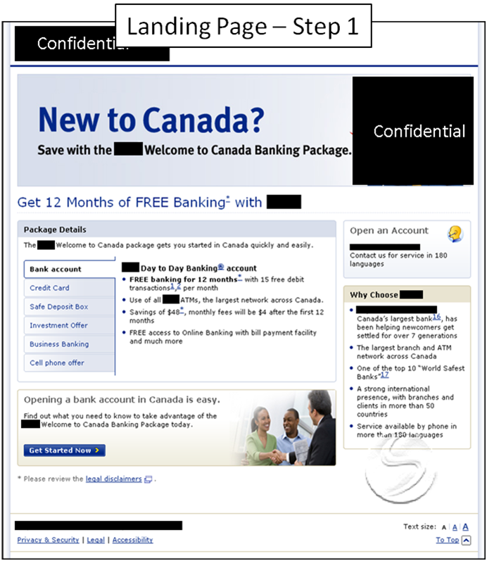
Treatment A:
This original landing page was broken into two steps. In the first step, the user was basically given all of the details about the banking offer.
An interactive tab menu allowed visitors to choose and read about whatever offer benefit or feature most interested them.
The CTA states “Get Started Now” and leads to another page that will inform them how to obtain this offer.


Treatment B
This treatment combined only the most pertinent information contained on the two pages into one landing page.

Which landing page generated a higher conversion rate?
These are two different approaches to writing copy and one of them out-performed the other by about 200%. Which do you think generated more branch locator starts? Why?
- Landing Page Treatment A
- Landing Page Treatment B
Tell us in the comments for a chance to win Inbound Marketing, courtesy of HubSpot.
UPDATE: The Results
At the time of this update, version B was winning with 65% of the votes and version A losing with 35% of the votes. This is a fairly momentous occasion because I think it’s the first time in any of these blog posts that you guys have guessed right!
The winner of the actual test was version B.
It generated a 200% higher conversion rate than version A. Here are the results:

So what was it that made this test so successful? Well I’ll let some of the most intuitive commenters explain it:
The second, hands down. It is simple and direct, offering the user something of value FREE–followed straight on by a link helping me LOCATE it.
-Don Sturgill
Treatment B gets to the point, gives the all the information they need to know in order to proceed and immediately addresses the three most important questions: Where am I? What can I do here? Why should I do it?
-Susan
Treatment B for:
- the unique and more visible CTA
- straight to the point in the benefits
- the idea here is to get a lead after all : the rest will be closed in a branch.
-Simon Febvre
Thank you Don, Susan, and Simon for your comments. You’ve won yourselves a copy of HubSpot’s Inbound Marketing book (you’ll be hearing from us shortly). And thank you to everyone who answered. You all make our job a lot easier! Make sure you read the comments and pay special attention to the marketers who got it right:
- Janani Barath
- Nicole Coons
- Don Sturgill
- Melissa Macaulay Federico
- JoAnn Zarick
- Alberto Lopez
- Susan
- Olivier K’Danet
- Grace
- Simon Febvre
- Michele
- Gina
- Zman
Every once in a while we like to test our audience’s marketing intuition on the MarketingExperiments blog. And we like to sweeten the pot a little bit if we can with a nice prize for three marketers with an uncanny sense for what works. We do this by asking you to predict the outcome of a recent experiment from our lab.
What’s at stake this time?
For starters…your reputation. J
Kidding aside though, if you can correctly predict which copy treatment received the best conversion rate, we’ll not only feature you on our blog tomorrow as a marketing wizard, but the three most intuitive commenters (in our opinion) will receive a free copy of Inbound Marketing, by HubSpot founders Brian Halligan and Dharmesh Shah. HubSpot is providing educational funding for our next web clinic and was kind enough to provide some books to give away in this post.All you need to do enter is leave a comment stating:
1. Which treatment you think won
2. Why you think that
So, here we go…
Experiment: Background and Design
For this experiment, we were working with a large Canadian financial institution offering a special banking package for new immigrants to Canada. To obtain this offer, visitors were led offline to a local branch.
The goal of the experiment was to increase the amount of branch locator starts.
However, there was a bit of a problem. We couldn’t really change the design of the page, all we could change was the copy itself and a bit of the functionality.
With that in mind, we set up an A/B multifactor split test that featured the two landing pages seen below:
Treatment A:
This original landing page was broken into two steps. In the first step, the user was basically given all of the details about the banking offer.
An interactive tab menu allowed visitors to choose and read about whatever offer benefit or feature most interested them.
The CTA states “Get Started Now” and leads to another page that will inform them how to obtain this offer.
I think Landing Page Treatment B got the higher rate of conversions because it provided just the right amount of information though logically I feel the higher conversions rates should have been for Landing Page Treatment A as it provides the user to navigate through menus and get all the required information to make a decision!
I believe Treatment B got the higher conversions because when choosing a new bank I think the location of the bank matters a great deal. Also, if the goal was branch locator starts, Treatment B makes the branch locator tool easier to access. In treatment B, I’m guessing that the enlarged “Bank Locator” button, combined with the messaging focused only on banking enrollment helped to increase branch locator starts.
The second, hands down. It is simple and direct, offering the user something of value FREE–followed straight on by a link helping me LOCATE it.
Treatment A would have a higher conversion rate. The target market is new immigrants to Canada, and they likely have a harder time reading and understanding English. When information is compressed as in Treatment B, it makes sense for a fluent English speaker, but makes translation much more difficult for an immigrant. If the information is spread out and not rushed, it become easier to read and interpret, and therefore would generate better results.
I think Treatment A won, because I believe choosing a bank is a somewhat important, longer term decision. It isn’t a simple, low risk transaction like trying a new beverage. I believe I recall Dr. McGlaughlin mentioning in a webinar that MarketingExperiments research showed that more involved decisions tend to do better with longer form copy.
I also think things like the free guide and taking the time to explain the process of signing up for a new account on page 2 go a long way to reducing friction by increasing the user’s confidence that they’re eligible for an account and have the information to be sufficiently prepared when they go to the branch.
Treatment B does it for me — when the reader has to go to the bank anyway, the sooner you get them to that point the more likely they are to (A) not resent being lead through 2 pages to find out I really have to drive to the bank, and (B) take action while they’re still interested.
I believe Treatment B out performed Treatment A because less is more. Meaning the less clicks you take your visitor through to your call to action the better and utilizing clear, concise and consolidated copy is better than giving all of the details. Too much copy and you run the risk of overwhelming the user. Landing pages are like billboards – you have about 5-7 seconds to make an impression on the user – less is more!
I think Treatment A; it demonstrates to the potential customer that the Bank understands the difficulties for a new person opening a new bank account. It also draws in the reader before dealing with a key objection – the perceived emotional obstacle of finding a branch to a new person – even if you look at the branch locator, it’s still a load of hassle to find it if you’re new to a city.
Plus it says free a lot…
Treatment A generated the higher conversion rate. By focusing on usability, both through the copy and graphical elements, this treatment easily guided the visitor towards a clear call to action – get started on the process of opening the account. By using The interactive tab menu visitors are able to view the information in smaller targeted portions of copy, while still maintaining a level of readability for those who might not be native English speakers. Once the visitor reaches the second page they are once again greeted with copy with graphic treatments that segment it into logical, easy-to-follow steps. In addition, the offering of a free guide to help the visitor through the process not only helps the visitor prepare for their branch visit but also helps to present the institution as a caring and knowledgeable one.
Treatment A wins. Both treatments have compelling benefit in the headline and benefits nicely summarized in bullet points.
But by showing their other features such as “safe deposit, credit card, investment offer, etc”, it let the users know the additional programs that the bank offer to the users.
Also, version A has copy that seems more friendly and helpful to a new comer.
Treatment B wins, as users will most probably spent only a few seconds and it has enough information for customers to click on the Branch Locator.
Treatment B wins for me. A very high percentage of newcomers are not fluent in English. The more they have to read, the more intimidating it is for them. Treatment B gets to the point, gives the all the information they need to know in order to proceed and immediately addresses the three most important questions: Where am I? What can I do here? Why should I do it?
Treatment 2 yields the highest conversion rate for many reasons :
1)The value proposition is stated very clearly directly in the header, which allouds the user to identify quickly the service.
2)The product description and benefits are very clearly presented : it’s easy to read and very understandable.
3)Difficulty experimented by the user is reduced by a clear explanation about the documents needed to complete the objective.
4)Lenght is also reduced including a one-step procedure.
I think Treatment B wins because:
Treatment A
– Doesn’t focus on the customer first and foremost. Copy like “We’re pleased” and “Many newcomers have told us” is unnecessary. Copy should focus on the customer and what they will get out of this.
– Forces the customer through two steps – click through to learn more, and then click Branch Locator . More clicks needed to get to the CTA always increases risks of losing the prospect. Same with the tabs- unnecessary clicks that could lose the reader.
– Has too many call to actions. Good copy has one clear, call to action that the reader knows they’re supposed to take, highlighted as a colorful button or callout.
– Branch Locator is a standard text link, blends in with the rest of the page and copy.
– Step 2 heading is posed as a “how to” instead of a benefit
Treatment B (the winner)
– Is concise, contains all the information you need on a single, easily scannable page. Benefits, the application process, and how to locate a branch. The benefits tell the prospect why, the process breakdown dissipates any concerns / worries, and branch locator gives them the next step to get started.
– The call to action is a bright button that stands out & is the only call to action on the page. The preceding copy is pared down to only the necessary elements that will convince the prospect to click.
– The copy is broken into an easily scannable format – Heading as the benefit, subheading reinforces trust, and the list is easily scannable & highlights the main benefits.
I thought of something else…This is in addition to my previous comment#12…The Most Wanted Response for this ad is simply to get a potential visitor to click on the Branch Locator button. The visitor is only making one decision. Is there enough incentive here for me to click through? As the advertiser, you don’t have to play all the cards in your hand…just enough to get your Most Wanted Response. Play too many cards (provide too much information) and you’ll overplay your hand. Treatment B provides just the right balance.
Treatment B for :
– the unique and more visible CTA
– straight to the point in the benefits
– the idea here is to get a lead after all : the rest will be closed in a branch.
+1 for B!
Treatment B: It’s better targeted to the audience. Leaves out all the tabs about business banking, etc. Talks only about the offer that a new immigrant to Canada is most likely to be interested in. Very clear what they need to have in terms of ID and what they need to do. Easier to follow visually.
I belive that Treatment A generated a higher conversion rate, because in this copy is clearly stated, what is the banking product that one is going to obtain – it’s the bank account.
In Treatment B it’s not so obvious, the offer is: “Get 12 months of FREE banking with…”, in my opinion it’s not explicit.
Treatment B would be the better performing treatment as it is simple, concise and to the point. And only one step for the call to action. As I think all individuals myself included want speed and information quickly when dealing with the internet.
Treatment A provides just enough information for the prospect to understand the gist of what is being offered and the opportunity to take advantage of it. It also offers the prospect who wants more information to find it. Less content does not mean better content. Treatment A gives everyone all they need to understand the offer.
Treatment B has the best value prop. It states benefits and builds cred with proofs about the bank’s capabilities and resources
Thank you to all who voted. The actual results are posted in the body of the blog post if you want to check them out. The winner was version B!
Special thanks to our winners who will be receiving a copy of HubSpot’s Inbound Marketing book:
–@Don Sturgill
–@Susan
–@Simon Febvre
You guys will be hearing from us shortly…