


Bmibaby is a low-cost airline that flies from four UK bases to 34 European destinations, and around 95% of its sales come through its website. Because bmibaby is selling a discount product — airline seats in this case — getting the most value from each customer really impacts the bottom line.
Ian Stewart, Head of Commercial at bmibaby, says, “Anything for me that increases our conversion, that increases the number of people that book flights with us is great.”
One way bmibaby looks to increase its conversion is through regular testing on its website.
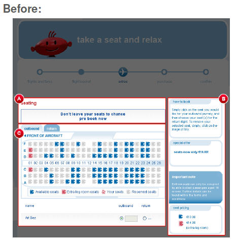
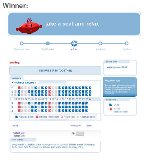
Testing seat reservation
An area where bmibaby looks for additional revenue is seating. During the booking process, one step offers customers the opportunity to choose their seat in advance. This step is optional, but it does provide bmibaby an additional revenue stream. Last year the company decided to perform formal testing on the seat booking step to determine the best combination of messaging, calls-to-action and page layout to effectively increase conversion while avoiding negatively affecting flight bookings.
This test ran for two months and included three elements on the page:
- The call-to-action
- The order and position of the help content
- The position of the seat selector
A number of calls-to-action were tested, including:
- Book your seats together
- Secure your seats together
- Book now and save by choosing your seats
- Don’t leave it to chance — buy your seats now
The winning call-to-action was “secure your seats together.” Bmibaby also found changing the order of the help content affected the page’s performance.
At the conclusion of the testing cycle, the winning page resulted in an 18% increase in seat bookings (at a 95% level of confidence over the control).
Testing highlight low inventory
A second test conducted by bmibaby involved highlighting low inventory. When less than five seats are available on a flight, the prospective customer is shown a “low inventory” message. The purpose of the test was to find out the best way to present this message.
Once again, three elements were tested:
- The use of “strikethrough” font
- The use of color in the header
- The addition of a “!” character next to low inventory flights
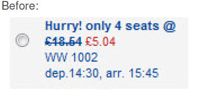
Testing found that the strikethrough font and adding color to the header improved conversion, but the “!” character did not.
Stewart says, “The exclamation mark is one (idea) that didn’t work out. One interesting thing you find in these things, you always go to look for the positives in it, but the negatives are equally important. We’ve made changes to a site or a display that made it look better, but perform worse.”
The winning version:
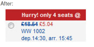
The results for this test were not quite as dramatic as with the seat booking test with the winning version of the low inventory message creating a 2.5% increase in flight booking conversion (at a 95% level of confidence over the control).
However, because of this test, bmibaby did solve an internal debate on whether highlighting low inventory flights was a worthwhile business practice, and it also learned that subtle layout changes — such as adding color to the header — can result in an increase in conversion.
Related resources
E-commerce: How your peers optimize shopping carts and product pages
Homepage Optimization: Radical redesign ideas for multivariable testing
Great! Performing tests is a good way of knowing what works and what doesn’t. And with this particular test, highlighting the low inventory flights definitely made a difference. Very helpful article. Thanks for sharing!