

Optimizing home pages probably demands more from a marketer than any other kind of Web page or process optimization, because it forces the marketer to speak simultaneously to multiple audiences. The concepts of segmentation, relevance and continuity are meaningless when there is no data, by which to segment; no previous messaging, to which to be relevant; and no previous experience, with which to be continuous. The only thing we know is that the customer is, broadly speaking, interested in your product category.
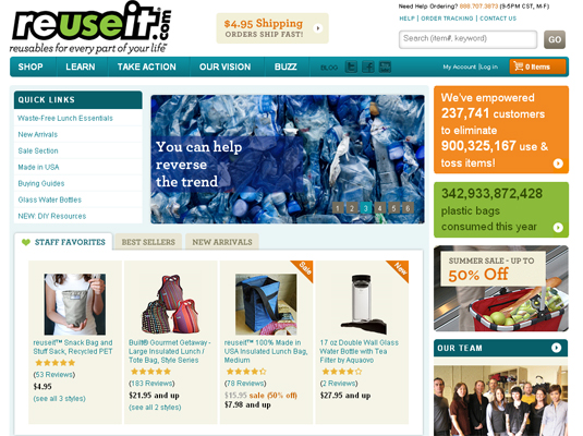
The folks at ReUseIt.com submitted their homepage for live optimization in one of our recent Web clinics, and even though the page didn’t make it into the live event, I wanted to borrow it as a shining example of a good (and it’s good for the planet!) homepage.
Just make everything bigger?
The key to optimizing the prime homepage real estate is prioritization. Homepages always remind me of the time when I was frequently involved in developing direct mail and other print pieces, and the clients insisted on making every element of a postcard-size mailer “bigger.” I think at one point, I suggested that they print their post card on a balloon instead—the perfect medium for making everything bigger by supplying only hot air.
Just like a postcard, a homepage has a size (or as importantly, attention span) limit. No, you don’t have to try to cram everything above the fold, but you do have to put the most important stuff on top. This is where prioritization is essential—everyone in the organization thinks that their stuff is “important.” How do you decide, then?
Have a purpose
First, ask yourself what the purpose of the website is. I will use ReUseIt as an illustration. The way I see it, in the simplest terms, ReUseIt is an e-commerce site. It’s a site with a mission, but its primary purpose is to serve as a storefront. Its secondary purpose is to educate potential customers, and its tertiary purpose is to empower its existing (and potential) customers to help fulfill its broader enviro-conscious mission and, in turn, educate and empower their peers.
To put it in simple, cold-blooded capitalist terms, I see the objectives of the site as follows:
- Sell (obviously)
- Educate (to create customers, to whom they can sell stuff)
- Empower (to keep existing and create new customers, to whom they can sell more stuff)
In addition to the immediate objectives, the site overall and the homepage in particular must support the brand. For companies with a more powerful brand presence, this can mean a greater investment in brand-related imaging on the home page. After all, brand recognition should be the top reason your homepage gets traffic in the first place—advertising and other link traffic should be going to dedicated landing pages.
Turf truce
Second, look at the available real estate, and make sure that the priorities you have identified are allocated a share of visibility accordingly. On ReUseIt.com, the first things a visitor sees are the featured products, “quick links” to the most popular shopping categories, and a “summer sale” ad in the right column. All of these items are above the fold, and are useful both to first-time and returning shoppers.

Note that the other content above the fold is also providing an essential connection with the brand—the image/message loop in the center and the live counters in top right—without confusing the visitor about the purpose of the site. This is clearly a storefront, yet the mission and message of the company are apparent and help connect with the right customer segment.
The secondary and tertiary objectives are thus already subtly addressed at the top of the page, but they become the primary focus as we scroll further down. Newsfeed, relevant facts, videos, the ReUseIt story, the team, etc., all serve to educate and empower ReUseIt’s visitors.

This integration—and proper prioritization—of both shopping and evangelism objectives is what appeals to me in the ReUseIt homepage. Of course, I would run a few tests to refine that balance: if we increase emphasis on shopping by adding more products or using images to illustrate some of the product categories at the top—necessarily, at the expense of the branding content—would we increase sales? It’s important to note that since this retail segment does require a degree of awareness, reducing content that creates and empowers such awareness can have negative long-term impact.
Strength in numbers
To reduce the risk to long-term customer base retention and growth, optimizing the homepage must start with data analysis. In the simplest terms, we need to figure out where visitors are clicking—and where they’re not.
Items that are unlikely to contribute to branding and get no clicks can be easily eliminated, yielding precious space. Items that are heavily trafficked, even though they are further down on the page, should be tested at the top.
Introduce yourself
One item that I thought should be tested further up on the ReUseIt homepage (perhaps, in a more static format) is the “reasons to shop with us” box. The page is ostensibly missing a headline and some intro copy—and the material in this box can help build a conversation.
Many e-commerce sites have much trouble formulating that essential value-proposition-based headline and intro. For ReUseIt, it should be easy. A site with a message and a purpose—not to mention, street teams—can’t be shy about stating a few things up front to the visitor.
Related Resources:
Homepage Design: The five most common pitfalls and how to overcome them
This Just Tested: Could you spot the better homepage if a 59% conversion difference were at stake?
Homepage Optimization: How your peers use keywords and communicate with visitors
First time visitors to ReUseit see a 3-paragraph blurb in a lightbox. Clear your cookies and go to the site to see this.
People going to their old site – reusablebags.com – get redirected to the new site and see the lightbox blurb. The text looks like it is mainly aimed at redirected visitors, rather than total newbies. The cookie name ( “seen_interstitial_pop” ) confirms this.
The blurb is good for redirected people – but could be better for real first timers who could see a different version with no need to explain about the old site.
@John Hyde :: York, England
Thanks for catching this, John! I recall seeing the modal box back when I first opened up the site, but I probably had assumed it was a temporary thing or even a slight glitch–as you pointed out, it’s meant for those being redirected from their original site. It certainly would make sense to test using the modal box more effectively as an opportunity to “introduce yourself.”
Honestly when I first got their I had no idea what they did or why I should shop there. I just saw some products and same catchy marketing speak like “TOGETHER WE CAN MAK EA DIFFERENCE”. What’s that mean to me and why should I shop there?