The homepage is the most valuable piece of real estate for any department in a company. Turf wars over who gets highlighted there, and who doesn’t, can cause a homepage to be so confusing that customers have no idea what to do when they get there.
But, even when interoffice politics are not an issue, marketers are often baffled by how to best optimize the homepage when so many objectives must be communicated.
The question on many a marketer’s mind is this: How can I optimize my homepage for the greatest possible performance, while still meeting the required objectives?
In a recent experiment from our laboratory, marketers from Migraine Treatment Centers of America were faced with the same problem. They had a homepage that was underperforming, and they didn’t know where to begin optimizing.
In the experiment, they tested two treatments. One of the treatments below achieved a 331% increase in leads over the other.
To spice up your day a bit, we’re holding an informal contest to see if you can guess which treatment won the test. The winner of the contest will receive the admiration and respect of their peers and will get a link back to their site from this blog.
All you need to do to enter is examine the two treatments below and leave a comment telling us which treatment you think won the test and why.
The best answer will be honored as a marketing genius on this blog.
Here are the treatments:
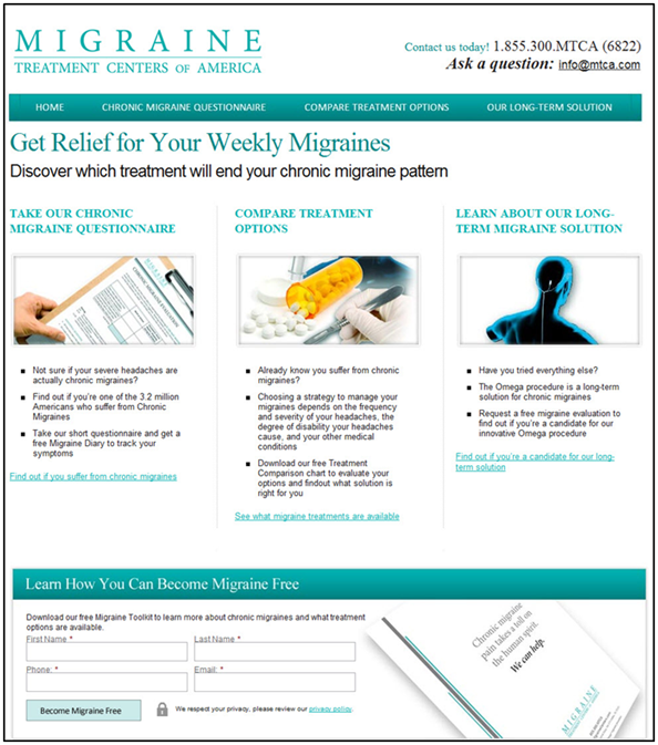
Treatment 1:

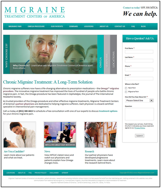
Treatment 2:

*** UPDATE ***
Although we received some great comments, unfortunately, no one picked the right treatment before the starting time of our Web clinic. Therefore, I cannot crown any of our commenter’s as winner of the marketing genius contest this week.
However, you can still get a lift on your learning by watching the full video replay of the Web clinic to see how one of these treatments got a 331% increase in conversion. To be notified when the video replay has been edited and is ready for viewing, you can activate your free subscription today.
Related Resources:
Today’s Web clinic – Homepage Optimization Applied: Learn how to replicate a 331% lift on your own site (special live optimization clinic)
Homepage Optimization: How a more logical eye-path led to 59% increase in conversions
Homepage Optimization: Radical redesign ideas for multivariable testing
Homepage Optimization: No single metric will do
Homepage Testing: 91% conversion lift from new copy and layout


Option A is my guess.
It has a better benefit/empathy-laden headline that implies what the customer will receive from this site/service in return for their ‘click’.
It has a clearer eye-path (although there are 3 evenly weighted options…)
The sub-headlines reinforce the implied benefits and use a phrases/tones that a chronic migraine sufferer could associate with.
Option A wins!
Option 1 because it addresses me and and my problem: ‘your weekly migraines’, and suggests that the site can offer a solution: ‘relief’. It then gives me 3 clear actions to take, which are clear enough for me to click without having to read the text underneath (if I’ve currently got a migraine, this is important). These options also seem trustworthy and scientific – I’m not just being sold something, but rather I can check this is relevant to me, then I can get a balanced view of the options, before being invited to look at this particular solution (which I feel I’ll be educated enough by now to decide on), i.e. I’ve been taken on a journey, or led down a pathway to (I’m guessing) a natural conclusion: that this option is both right for me and the best of all the available options.
Just to add – option 2 fails I feel because it requires me to read and learn, and doesn’t really lead me by the hand through my decision making – far too much thinking needed on my side, and it tries to sell me the product without addressing me and my problem first – in that sense, it’s just one of lots of things I’ve heard about. News and research can be important – they’re the secondary information that I might want to read to verify whether this is a reputable company if I’m hesitating to click ‘buy’, but they wouldn’t be the things that got me to think this is the right product for me.
I like option 1. Why? Better engament and lead conversion value proposition. Speaking to first goal – homepage should engage the user. The three content boxes on option one offer a separate compelling proposition to the user: questionnaire, compare treatments, and learn. As far as conversion value prop, lead generation mechanisms are WAY stronger on treatment 1. In the upper right, there is “ask a question with email”, and in footer area, the lead form is value positive: Learn how you can become migraine free. Option 2’s form offers no real reason to fill out the form other than “ask a question”. Migraine free wins! Give me content wins! And IMO treatment 1 wins.
Treatment 1 has a better eye path, it’s headline focuses on visitor benefits, and it has a strong, engaging CTA on the submission button.
Option 1 because it follows a typical buyer decision process: identify/recognize a problem, compare options, choose a solution. In this case, the choice they make is to give their contact info in exchange for the white paper.
I also say Treatment 1 because it follows the eye-path, clearly addresses “What’s in it for me?” from the reader perspective, introduces a problem and offers a solution to said problem, easy to scan bullets and also, this treatment appears to be SEO optimized. It hits on the topics and points people with migraines would be looking for in search.
I actually went back and looked again at the treatments and I’ve decided to change my vote to Treatment 2. Because Treatment 2 doesn’t focus on the content that the readers already know (“Do I suffer from migraines?”) and instead explains how this company can help address the problem. And the call to action is stronger: Call us for a free consultation about treatment options.
I went and visited the Migraine Treatment Center of America’s web site and was surprised to see that they weren’t using your great preforming home page. I’m wondering why they wouldn’t be using it???? Are they using it for PPC rather then as their primary home page?
Thanks for your question Tom. I asked Jon Powell, Senior Manager, Research and Strategy, MECLABS, your question, and he shed some light on the current testing program for that Research Partner.
“The reader has probably been split to one of the many different versions of their homepage that is being tested. There is a specific customer type they are trying to increase response from without losing the same number of leads among other customer types. Readers would likely find different combinations of page content, navigation, etc, that test to determine the effect of those combinations on getting the ideal lead volume from each group.”