

Homepage optimization is a continuing process. Even after getting a significant lift, opportunities to better serve your customers exist beyond the results of your current testing.
In today’s MarketingExperiments blog post, we’ll use a real homepage as an example to show friction challenges your page might be having, along with five questions you should ask yourself about your pages.
That’s what Graham Arrowsmith, Business Development Director, Listnow, did after making significant changes to his homepage page from watching our Web clinic “Hidden Friction: The 6 silent killers of conversion.”
“I watched the videos, took notes, then tore into redesign,” Graham said.
But, he didn’t stop there. He also asked the MECLABS team of research analysts for optimization advice as well. Let’s first look at the changes Graham made, and then see the additional optimization analysis conducted by Kyle Foster, Research Analyst, MECLABS.
Also, you may find it helpful to have your homepages and landing pages printed out in front of you. We hope this post will give you testing ideas as well, so get your red ink ready to mark your pages up based on ideas you get from these changes and add them to your testing queue.
The Listnow team made the following changes based on Graham’s notes from the “Hidden Friction” Web clinic:
- The team included a call-to-action. (The previous page did not have one.)
- Homepage content was reduced because it was considered a distraction that created confusion.
- The claimed size of their database was lowered from an exaggerated 2M to 1.85M to reflect what is actually available to customers.
- The amount of text on the page was reduced
- Security seals were moved. They were previously buried in content
- Listnow simplified the forms, and considered how much information for which it asked.
The team also looked at the changes it didn’t need to make. The page did not have one of the elements of friction Dr. Flint McGlaughlin, Managing Director and CEO, MECLABS, taught about in the Web clinic: asking for too much information. “Not guilty,” Graham said. The previous Listnow page did not ask for any information from a prospect until they were directed to the sign-up.
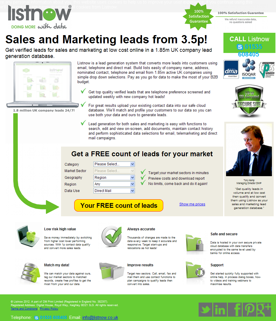
Here is what the Listnow page looks like after Graham and his team made the changes.

Although Listnow is off to a great start, it is important to remember that optimization is not a sprint. It is a marathon. There is always room for more testing and improvements on those results.
After reviewing Listnow’s changes, Kyle had some testing suggestions for the Listnow team based on a Conversion Index Analysis he conducted using the MECLABS Conversion Index heuristic.
Kyle’s analysis also introduces five important questions that Graham, and every marketing team, should ask as they formulate tests.
Question #1: Does our headline deliver value?
Listnow currently uses this headline:

“The headline is the first opportunity to engage the visitor, and it should inform the visitor as to where they are, what they can do here, and why they should do it with Listnow,” Kyle said. He further added that although the headline utilizes a large font and draws the eye, it does not effectively clarify the value of Listnow’s services.
Providing addtional clarity to the headline adds value to the service.
For example, Kyle suggested, “Get verified sales and marketing leads for as low as 3.5p!” which has more clarity than the original, “Sales and Marketing leads from 3.5p!”
The word “get” adds clarity to the headline that lets the visitor know immediately what they can do there.
Kyle also mentioned that the Listnow team should consider testing other headlines that do not lead with price. You can also find help with your headlines in our “Minor Changes, Major Lifts” Web clinic replay.
Question #2: Does our sub-headline and copy provide clarity?

Kyle’s suggestions for sub-headline and copy optimization bring up a very good point about why your sub-header and copy should quickly clarify your value.
“The Internet allows visitors to comparison shop in minutes,” Kyle said. “Visitors should immediately know what they get for clicking and why they shouldn’t return to their search results.”
He recommended the homepage’s sub-headline and the copy that follows should immediately clarify the value of Listnow’s services.
“The use of checkmarks is an effective approach; however, the corresponding value copy should be more concise to make it easier for users to scan and grasp,” Kyle said.
Question #3: Are we burying value?

Kyle described here how the “Buried Treasure Effect” found on Listnow’s page occurs when important value content is buried at the bottom of the page after the main objective. He suggested moving the most relevant copy further up the page.

Another buried treasure that Kyle found was a “Special Introductory Offer” mentioned on the lead report that could be served on the homepage.
Question #4: Do we use too many images?

Kyle introduced an important point about the images, colors and logos that are used in expressing value. He observed that Listnow makes an effort to utilize imagery to communicate their value.
However, he warned, “There may be an overabundance of imagery that distracts users from the most valuable content and the main object.”
He suggested emphasis should be placed on only the most relevant information.
Question #5: Is our call-to-action clear?

Expressing the clarity of value in your call-to-action can have a substantial impact on your desired results.
Kyle’s recommendation for Listnow is to consider changing from “Your Free count of leads” to “Get your FREE lead report!”
By adding “get,” you are adding clarity to what the visitor gets for answering the call-to-action. Kyle explained why the change from “count” to “lead report” adds value to the offer.
“The call-to-action that Listnow is using undermines the depth of the actual report,” Kyle said.
Kyle also suggested the goal here should be to encourage a click, not a sale.
While Graham and his team were not guilty of asking for too much, they may be guilty of asking too soon.
Answering these five questions effectively can help Graham and his team to optimize further. They can also help you formulate tests that will ultimately lead to the results you want.
Related Resources:
Value Proposition: 3 worksheets to help you craft, express and create derivative value props
Calls-to-action Tested: 3 words that increased conversion by 43%
Dear Kyle
It was with some trepidation that I read the Marketing Experiments Blog early on Friday, 13th. Would it upset what was to be a day of celebration at my daughter’s graduation? Well, not in the least.
I would like to thank your team for such positive critique, that will help us better influence the thought patterns of prospective customers.
Here are my 5 responses to the questions we should be asking as marketers:
1. Headlines – Our developers have made H1 and H2 dynamic according to the PPC ad/tweet/email (e.g. http://bit.ly/Nly701). This allows us to test non-price H1s. However, the font is too large to accommodate real communication of the core proposition. We’ll change this.
2. Copy Clarity – A local internet vet told me “to write in Yorkshire speak”! (Yorkshire is the UK’s largest county, with warm hearted, thrifty and direct people). You’d think this was one of the easiest things to put right – surely we know what to say about our product – but I’ve found it challenging to craft the right message to speak exactly to our offer. It’s a list platform, dummy. Or is it a lead generation system? Eventually, I’ll get there.
3. Buried Treasures – Great point. We’ve hidden even more benefits in ‘More Information’ too. I’ve even created a 24 reasons to use Listnow as your lead generation system pdf using copy from the picture bullets. I am also concerned with bounce rate – so I’m thinking of adding more of the buy-reasons on the home page, below the CTA. Another idea is to allow the visitor to segment themselves and call up the information relevant to them – I want a simple list (ok do ABC), I want an online database (great, do DEF)..so much to test!
4. Too many pictures – Agreed, there is too much visual imagery. This was my initial response to where am I, what can I do here, why should I do it. I’ll re-think our core value proposition and do a mini force-field analysis to decide what images support it
5. CTA – actually the report is displayed on the subsequent page, we’d collect their email only if they want the report emailing. However, we are straight into prices, deal and close – Kyle’s right, we are asking too soon. Maybe we need to allow more visitors to ‘get to know us’ take away some of the real value in the counts and maybe question their real interest so we can tailor our pages to the different lead types arriving. But our site is also for those that are ready to buy too and we’ve tried to thin out the clutter on sign up. Again, more to think through.
I hope to follow more of your teachings to help guide Listnow and other products coming up, to connect more with the visitors who have taken the time to see what we are about.
Thank you all, I’m an advocate for what you do.
Special thanks to Kyle.
Kindest regards.
– Graham Arrowsmith, Business Development Director, Listnow
Thank you. really very useful article for marketing teams. Headline is important. It should deliver a value, 2nd thing sub-headline its should be clear, 3rd point we shouldn’t bury our values, its not good to use too many images, and our call to action must be clear. all the 5 points are very important.