The landing page for Desguaces y Piezas was performing quite well; however, the team wasn’t ready to rest on their laurels. By making a few minor changes, they significantly improved the conversion rate and reduced cost per conversion. Let’s look at this story and see how it can help you improve your own conversion rates.
The Background
Desguaces y Piezas is a lead generation site in the auto parts industry. The name roughly translates to “disassembling and parts.”
“Some time ago we were trying to convince a local auto parts company to run some SEO and PPC campaigns for their website,” said Wenceslao Garcia, CEO, Vexlan (the owner of the site).
“The owner told me he got another idea — most of the used auto part companies do not compete with each other because they have different catalogs, and they were (still are) spending so much money to get the same customer. So he suggested aggregating the PPC budget across them. And he was able to convince some other companies.”
The site provides leads to 25 companies across Spain. SEO provides 40% of traffic and PPC delivers the rest. The main form nets 4,000 leads per month, on average.
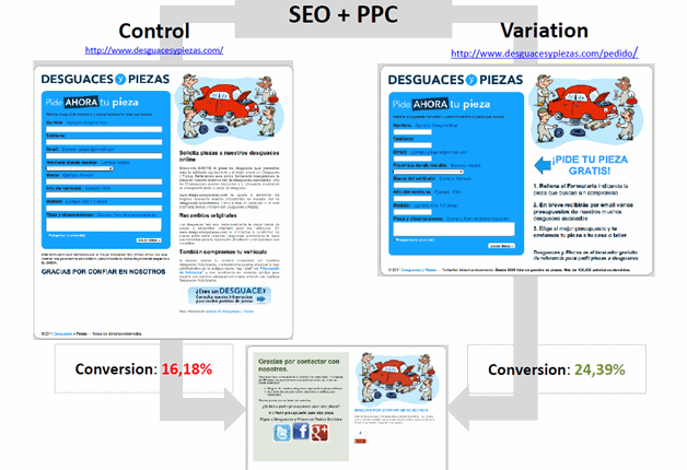
“Before running the test, for some time, we were happy enough with the 16.12% conversion rate. We thought it was a great figure and allowed us to make a decent profit out of it.”
The Test

(Please Note: In Europe, a comma is used on place of a decimal point)
Here are the main changes Wences and his team made to the treatment for this test:
- Remove excessive explanatory text and focus on value to the customer — The team thought that users were looking to get a part directly and were not as interested in knowing about the company’s overall project. However, Wences wasn’t sure if just the landing page, without any copy at all, would give potential customers enough confidence to convert. So, they took a middle road and included stripped down copy, with a three-point explanation focused on the process for the customer, instead of background about the company’s overall project.
- Shortened form fields — The team hypothesized that the control design form looked too long, and they wanted to reduce friction
- Improved the call-to-action
The Results
The treatment improved conversion rate by 50.7% and cut the cost per conversion in half — €0.33 per lead versus €0.70 per lead for the control (for our American readers, those are Euro cents).
“I think the main thing we’ve learned is that we, as marketers, tend to focus on testing structural pieces — such as text, colors, calls-to-action, layout, etc.,” Wences said. “But I think the driver of conversion here was to understand the main differentiation our project had: aggregation of demand and 25 companies to respond at once, so more convenience for the user.”
Related Resources:
SEO Landing Pages: How your peers optimize for traffic and conversion
Landing Page Optimization: Minimizing bounce rate with clarity
Friction: 3 simple optimization tactics to get more customers from headline to call-to-action
Web clinic replay — Hidden Friction – The 6 silent killers of conversion


Great little case study. I might have to try that layout as well, that’s interesting. The form is usually on the right side so by having it on the left, made it actually stand out (for me at least).
Good stuff!
Jeremy Reeves
http://www.3x3Formula.com
Testing these minor changes to see what works best for your company and your landing pages is a great way to improve your conversion rates. This was some valuable information. Thank you for sharing.
Erik Bortzfield
ion interactive
Very good advice for positioning seo conversion congratulations a great post.
A saludito