

As has been the standard for recent MarketingSherpa Summits, leading marketing solutions providers sent several analysts to provide direct, one-to-one consultation for the attendees of B2B Summit 2011. Always an informed, yet creatively-driven group, I sat in a session and observed as Adam Lapp, Associate Director of Optimization, MECLABS (parent company of MarketingExperiments), performed a succinct, but thorough webpage optimization.
The client (anonymized per company request) was a spend management consulting firm, looking to optimize a landing page where users arrive upon clicking through from an email. The email itself was devoid of HTML, as the company chooses to avoid spam filters and failed deliveries by keeping the sends plain text. The email content was fairly simple, only providing a small synopsis of the company’s services before providing a contextual link as the sole call-to-action.
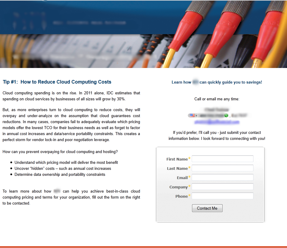
Once the user arrives at the page, s/he is greeted by a simple, clean combination of graphic banner and plain text, seen below:
–

–
While the page’s layout was good at conveying the educational aspects, it needed optimization to achieve the client’s primary goal – to increase the number of users who complete the short form, registering them for a follow-up phone call.
After an initial review of the page, Adam provided a number of salient points that may be hindering conversions for this company.
–
The page does not offer a clear exchange of value
Since the client is asking the visitor to commit time, effort and trust in completing the form, there should be an offering that provides clear value in exchange for the user’s efforts. As it stands, the user is unclear as to what the value of a follow-up phone call would be, and would be more likely to convert if the benefits were stated more explicitly. Statements like “He will be able to answer any questions about XXXX.” or “He can walk you through the steps of cloud computing.” would go a long way toward improving conversion.
–
Be transparent
The user would likely be more trusting of this page if there was a transparent explanation of what a follow-up phone call would entail. Is this a sales call? Informational call? Request for more information about the user? Regardless of intent, transparency would reduce user anxiety about completing the form.
Likewise, there could be anxiety related to the timeframe of the phone call. It is unclear whether this call will occur within minutes, hours or even days. By clarifying a distinct timeframe – or even allowing users to schedule the calls themselves – the anxiety about preparation, having adequate time to speak, etc. is alleviated.
–
Use more action-oriented language
Rather than using the rather innocuous, and unclear “Contact Me” for the call-to-action, incorporating more relevant, active terms, such as, “Set Up a 1:1 Consultation” or “Start Saving More” would clearly state value and better define the desired user action.
–
Highlight the company’s value proposition
The current value prop (anonymized per company request) is currently located next to the logo, somewhat buried within the banner image. Though the image isn’t overly busy, the value proposition is located out of the user’s eyepath, lost amid a wealth of color and design. Moving the value proposition to a more prominent, noticeable location (such as above the body copy) would provide a more natural eyepath, lessening friction and improving the reader’s flow.
Another point that Adam mentioned could support value was the addition of the company’s history and client testimonials – two things that would significantly improve the company’s credibility, reduce anxiety, and ease the user’s concerns about completing the form.
The MECLABS team and other marketing solution providers will be performing one-to-one consultations throughout the second leg of B2B Summit 2011 in San Francisco, October 24-25.
–
Related Resources:
B2B Summit 2011 in San Francisco, October 24-25
Marketing Optimization: Measuring the potential force of your value proposition
Website Optimization: Landing page test leads to 548% increase in conversion
I like the idea of changing up the language on the “contact me” link. I like it a lot, in fact. Using “contact me” is so overwrought and innocuous, that switching to something more intriguing like you suggested would probably result in more clicks – if anything, out of sheer curiosity. It’s all about breaking away from the pack, and this is an excellent way to differentiate your brand.
Emma,
Thanks so much for your reply. In my relatively short tenure with MECLABS, I’ve learned enough to permanently change the way I view anything on the Internet, most notably on call-to-action links and buttons. In the past, I’d glaze over terms like “contact me,” “enter now” or the highly questionable “submit.” Now, I notice the really well done efforts, while glazing over the “by-the-numbers” buttons and links. By adding value statements to a CTA, such as the ones recommended by Adam Lapp, not only does the user’s anxiety lessen, but it also helps the CTA stand out from the umpteen million colorful buttons the user likely sees each day. We’ve covered “Banner Blindness” on these pages. I should check the archives for posts on “Button Blindness” as well.