

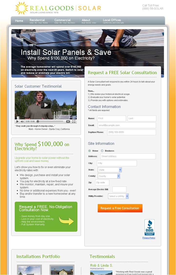
After several months’ hiatus, I was motivated to write an “LPO analysis” blog post by my initial impression of RealGoodsSolar’s landing page. It greeted me with a large photo of solar panels and a worker installing them.

No children in a blooming meadow playing with balloons, no college students posing as they take on global ills, no grandparents with a pensive gaze—all implying the broader point about the importance of environmental awareness and concern about our common future. Instead, this page told me immediately what it was about in a single image and clearly visible and instantly readable headline: Install Solar Panels & Save.
A landing page is not a magazine ad
If I came across as cynical about protecting the environment, that couldn’t be further from the truth. And not just because I’ve helped out Sierra Club with expressing their value proposition to drive membership or because I drive a gasoline-electric hybrid (can’t wait for the Leaf!).
My point is simply that visitors landing on this page had not clicked on a paid ad to meditate on the idea of saving the planet. If they had, they ended up in the wrong place (for a detailed treatment of my Conversion Opportunity Framework diagram, see Maximizing Optimization Opportunities: 3 Simple Visitor Types).
Qualified visitors to this page were looking for solar panels for their homes or commercial properties, and that’s exactly what the page instantly confirmed in their minds and provided a clear way to take the next step.
We are accustomed to magazine ads that are meant to inspire later action or to build brand (inspire even later action)—but landing pages like this one are viewed by motivated visitors who are deciding whether to take action immediately. It behooves marketers to assist their visitors with that decision.

Where bounce rate comes from
Why do some visitors take absolutely no action? Some degree of mismatch between content and motivation is inevitable. For example, someone may be just researching news on the topic, rather than considering a purchase.
However, the most frequent disconnect that has been proven through testing is due to lack of clarity on the landing page. The busy consumer, with a specific motivation in mind, ends up on a page that doesn’t instantly answer that motivation.
Ever find yourself wandering around a big box hardware store or a similar customer disservice monstrosity, not sure whether they have what you need? The difference is that with a brick and mortar store, you’re already there and you can’t switch to a different store with a click of a button. Instead, you endure the incompetence of the store’s floor managers for some time. Online, you click “x” a lot sooner.
So, if your page doesn’t get helpful instantly, answering “Where am I?” and “What can I do here?” then little prevents the visitor from hitting that “x” button. Being relevant is not enough. Relevance must be delivered with clarity.
Related resources
Optimization Summit 2011 – June 1-3
Maximizing Optimization Opportunities: 3 Simple Visitor Types
Landing Page Optimization: What cyclical products can learn from CBS Sports
I totally agree especially your point about lack of clarity and have happily shared your thoughts on my LinkedIn: http://ca.linkedin.com/in/jennybridle
Thanks for a great piece!
Jenny
Great article, I’ve shared with team here as your point on delivered with clarity hits all the buttons
Thanks
Brian
Wonderful blog post! You are exactly correct about clarity of the messaging. If all else fails use the “KISS” system – “Keep It Simple Stupid!” Cluttering the page with non-relative information will take the users attention away from the main call-to-action and thus make it harder to convert.
Thanks.
Scott
Just found this blog. All I can say is it awesome.
LPO is something I’ve been putting off for ages! I think with what I’ve read on here I’m ready to give it another go