

Recently, one of our former students leveraged the power of social media to share his frustrations with the results of his optimization efforts in the Linkedin discussion group of our sister company, MarketingSherpa.
Joel Levitt, who works as a management consultant, is also the owner of a small online business that offers disk storage solutions. Joel attended our Landing Page Optimization and Value Proposition Development training sessions (links are to the online certification courses), and applied what he learned in the sessions to his homepage afterward.
The results he anticipated have been less than optimal because, according to Joel, the metrics he is tracking indicate that his treatment page is performing worse than his original.
“I must have missed something big, but I can’t figure out what it is,” Joel said in his comments on LinkedIn.
So today’s MarketingExperiments blog post is going to help Joel with a few optimization test ideas that he can add to his testing queue – a few quick wins to get his page on the right track. Our hope is that you can use this real-world example to help inspire test ideas for your own sites, as well.
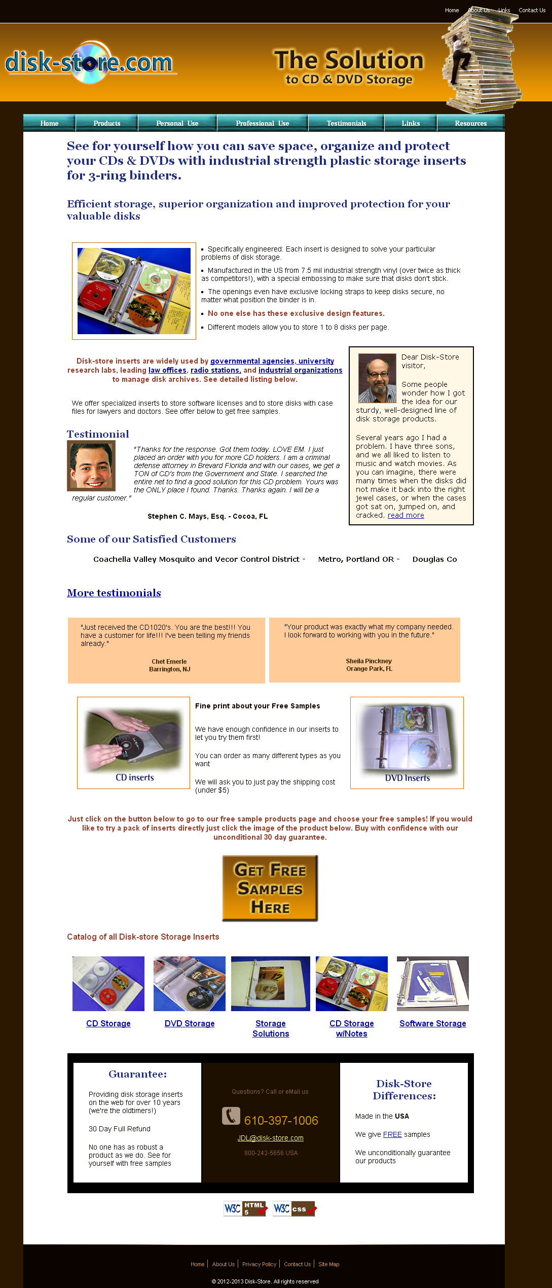
So let’s look at the homepage for Joel’s disk-store.com site:

Joel sent us this screenshot of the disk-store.com site, which I took to a peer review session for test brainstorming. At the session, I asked Lauren Maki, Optimization Manager, MECLABS, if she could provide Joel with a few test ideas to add to his queue. Here were some of her suggestions:
Quick Win Opportunity #1: Color
Lauren pointed out that the color scheme Joel currently uses gives the impression that the site has an outdated design. That may be hindering the site’s value proposition.
“At first glance, the site looks very dated,” Lauren said. “Discordant colors distract from the value you wish to present to your visitors.”
Webpage designers often overlook the element of color and the impact it has on site performance. In a recent Web clinic – “How Colors Impact Conversion” – Flint McGlaughlin, Managing Director, MECLABS, revealed research that explored the relationship between color and conversion. One of the key principles Flint taught in the Web clinic is that marketers should not optimize Web designs, they should optimize thought sequences.
“Most of us don’t know how to use the elements on the page to control the eyes so that the eyes go across a set of visual cues that are synchronized with the ideal sequence of thoughts,” Flint said.
Test Idea: Try testing a white background that uses color to guide the eye-path. Reserve the bolder colors for the headline, call-to-action and most important content.
Quick Win Opportunity #2: Copy
Lauren’s next suggestion was that Joel should try testing the amount of copy on the homepage.
“For such a simple product, there is way too much information that is scattered throughout the page that affects the eye-path,” Lauren said.
When looking to create highly effective copy for items that have low-perceived risk, cost and commitment, research has shown that a short copy approach to a less complex sale generally performs better.
Test Idea: The layout at the top of the page is a good start however, try reducing the number of product images and amount of copy to a single product image with the bullets highlighting only the most valuable features.
This will help guide the visitor’s eyepath and reduce distracting images and copy that do not directly state or support the value proposition.
And speaking of value proposition…
The value and evidentials in those bullets are also where value proposition development will come into play in your testing efforts as you identify the segment of the marketplace in which your ideal customers exists.
To add to Lauren’s suggestions on copy and value proposition, I propose a multifactorial split test in which you test the following:
Control – Current page that attempts to reach both B2C and B2B audiences
Treatment (A) – A landing page with value proposition copy that is B2C-centric
Treatment (B) – A landing page with value proposition copy that is B2B-centric
Quick Win Opportunity #3: Headline

One last test idea Lauren suggested was to optimize the headline.
“The headline is way too large and could be reduced,” Lauren said.
Another key principle that Flint often teaches is on the topic of headlines. This is no surprise given that headlines have been found to be one of the most impactful page elements.
“When it comes to crafting headlines, emphasize what a visitor GETS rather than what they must DO,” Flint says.
Testing Idea: Test a smaller headline that answers:
”Where am I?”
”What can I do here?”
”Why should I do it with you?”
One final test idea for optimizing Joel’s site
When I asked Lauren if she had any final thoughts on the page, she suggested an optimization of the shopping cart checkout process. (Since a change like that is sometimes too complex to label it a “quick win opportunity,” I’m listing this test idea as a bonus.)
“It’s very difficult to do the most important thing here, which is to buy the product,” Lauren said.
She further added, “You should simplify your sales funnel to guide the visitor’s thought process from homepage to final checkout. The current funnel leaves way too much unsupervised thinking for visitors.”
Test Idea: Try combining the free samples and products onto one page. This gives visitors the option to either try the free samples or buy the product on the same page.
Combining these elements onto one product page will reduce the images, competing calls-to-action and confusion in the checkout process.
Related Resources:
Homepage Testing: 91% conversion lift from new copy and layout (via MarketingSherpa)
Copywriting: 5 common headline errors
Headline Writing: How a junior marketer beat the CEO’s headline by 92%
Did Joel give you any indication of how much traffic his site receives? I checked a relevant mix of about a dozen core and long-tail keywords related, and I didn’t see his site in any of the organic results or PPC ads. Lauren’s suggestions are excellent, but he may need to focus on increasing traffic before he can see any significant benefits from implementing them.
Hi Tyler,
Thank you for your comments.
Joel did not provide us any stats on his traffic, however a low traffic level would be beneficial to Joel’s situation until he completes redesign. The more traffic sent into a broken sales funnel… the more ROI that is lost.
It was interesting to read suggestions. I would not have thought of colors being wrong until Lauren mentioned it. Did he go ahead and make the changes? I would like to hear about the results.
Hi Barbara,
Thank you for your comments.
We don’t know if Joel will add any of our suggestions to his testing queue, but you can visit his homepage at http://www.disk-store.com to see if any of the changes we suggested were made.
All great suggestions from Lauren. I would suggest that Joel also focus on revamping a lot of his page titles and meta descriptions to include his most valuable keywords and calls to action.
Having just “Disk-Image” on the homepage title isn’t going to do much in the way of SEO. It doesn’t tell the search engines anything unique about Joel’s business.
Also, the meta description reads “CD and DVD Storage Soluntions”. There’s an obvious typo in there, making them appear less professional right on the search engine result page. That doesn’t instill confidence in the potential visitor.
If they are found on the SERP, they should consider using some sort of call to action like, “Find out more about how Disk-Image can assist you with your cluttered CD and DVD Storage today!”.