

Landing Page Test: Why less equaled (54%) more when reducing friction and highlighting value proposition
“Less is more…”
Whether it’s at MECLABS or my mother’s kitchen, I’ve heard people spout this phrase throughout my 35 years. And when hearing this, more often than not, I’ll thank the person that said it, dismiss it as a trite platitude, and resume my knitting.
Joking aside, in a world that constantly bombards us with promises of “bigger,” “better,” “faster” and “more,” it’s sometimes tough to accept that time-honored practices are often still the best course of action. Yet, as we’ve learned numerous times on these pages, even the most basic marketing tenets still apply, even in an increasingly terse, staccato, digitally communicating world.
And, after a few months of really absorbing the impact of our successful webpage tests, I now know that when it comes to landing pages, less is not only more, it’s often the difference between conversion and abandonment.
–
Background
Our Research Partner (anonymized to protect competitive advantage) is a specialized automotive product retailer, which deals directly with professional technicians and repair outlets. The company produces just one product, but has seen considerable success with it, accumulating numerous industry certifications, and a wealth of positive testimonials from customers.
Still, despite a history of successful online sales since 1999, the company found that conversion rates were remaining lower than expected, even with a considerable marketing push. After investigating the page, our research analysts set out to answer two key questions:
- Which landing page will result in the most conversions?
- Which landing page will have the highest clickthroughs from page to cart?
–
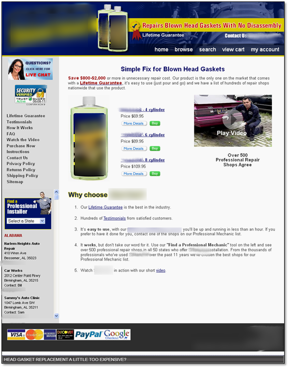
Control: Can you please clearly describe that noise you’re hearing?

Upon first glance, the page seems clean and easy to navigate. But, as you take a closer look, you’ll see that despite the use of negative (white) space to allow the copy and imagery to stand out, there is no distinct eye path or logical thought process for the user to follow.
Though there is a clear value proposition included in the header of the body copy, the user is then drawn in two different directions – to the product image on the left, and the video demonstration on the right. While it makes sense to have video as a supportive element for the value proposition, it does no good to draw visitor attention away from the product purchase links.
To further complicate matters, the user is presented with three purchase options next to the solitary product image. At this point, there has been no less than four calls-to-action, before visitors arrive at statements that support the initial value proposition atop the page.
(Well, they do state, “Over 500 Professional Repair Shops Agree,” beneath the video. But it’s unclear if this refers to the product, the company, or the fact that the NBA will likely not resume until after the holiday season. So let’s omit that for now…)

Regardless, this unnecessary friction only serves to confuse potential customers, likely resulting in page abandonment. The supporting statements – needed earlier – appear underneath the confusion. But they are lengthy, not easily scanned by users, and are buried at the bottom of the page, likely below the fold for most users.
The cart page, meanwhile, does a good job of maintaining a consistent look and feel, which should increase user confidence.
However, there is once again an abundance of calls-to-action (represented by colorful image links that create friction in the user eye path). It is unclear if users are expected to “Buy Now,” or use one of the myriad alternate options for checkout.
Additionally, the user is asked to complete a multi-step checkout process – which can not only increase friction and frustration, but could also lead to cart abandonment.
–
Treatment: A digital lube job does wonders

Our research analysts had a relatively clean slate to work with, as the company also underwent a notable site and logo redesign (unrelated to this test).
For the page in question, our team designed a completely new layout for the product page that reduced friction through a reduced number of calls-to-action, while better clarifying value proposition via more logical thought sequences.
The product image is now the primary focal point of the page, no longer competing with the video testimonial atop the page. A succinct, scannable product description accompanies the image, not only conveying thorough messaging, but also funneling the user’s eye path to a supportive value statement (the money-back guarantee seal) and ultimately, the primary call-to-action.
Additional value statements adorn the left-hand navigation – a relatively useless section on the control – each of which supporting buyer confidence through easily scanned subheads like “Lifetime Guarantee,” “100% Safe & Secure” and “Shop Confidently.”

The lower half of the page continues the supportive value statements with a BBB rating icon, finally ending with a quick explanation of how the product can easily fix your car, both in text and the testimonial video.
The cart page also received a tune-up, as the multiple calls-to-action and somewhat garish checkout page was minimized to a more efficient – and more confidence-inspiring – one-step process.
The primary call-to-action for checkout was given much more prominent placement, using a similar color scheme as the supportive value statement atop the page.
–
–
Results: Maybe Mom was right all along…
In this case “less” did, in fact, prove itself to be “more,” as the removal of the cluttered, unclear calls-to-action gave the page a much-needed boost. The treatment resulted in a conversion lift of 53.9%, at a 95% level of confidence.
The reduction of friction throughout the entire buying process led to a higher rate in clickthroughs, which only served to improve conversions. The single CTA made it easier for the user to choose a product and reduced confusion when making the decision to purchase.
–
Related Resources:
B2B Marketing: Value proposition discussion with Dr. Flint McGlaughlin
Landing Page Optimization: Addressing customer anxiety
Test Your Marketing Intuition: Which landing page achieved a higher conversion rate?
Marketing Optimization: Measuring the potential force of your value proposition
–