

“This is where we bring it all together,” said Dr. Flint McGlaughlin, CEO and Managing Director, MECLABS, during the closing session of the B2B Summit 2012 in Orlando. The session was an interactive live optimization, in which Flint and members of the audience put theory to practice optimizing audience-submitted landing pages. (You can also send us your landing pages for live optimization in today’s Web clinic if you’re interested.)
Today’s MarketingExperiments post will share with you one of the audience submissions from the live optimization session at the B2B Summit 2012 and a few of the optimization opportunities Flint and members of the audience identified to give you ideas to optimize your own landing pages …
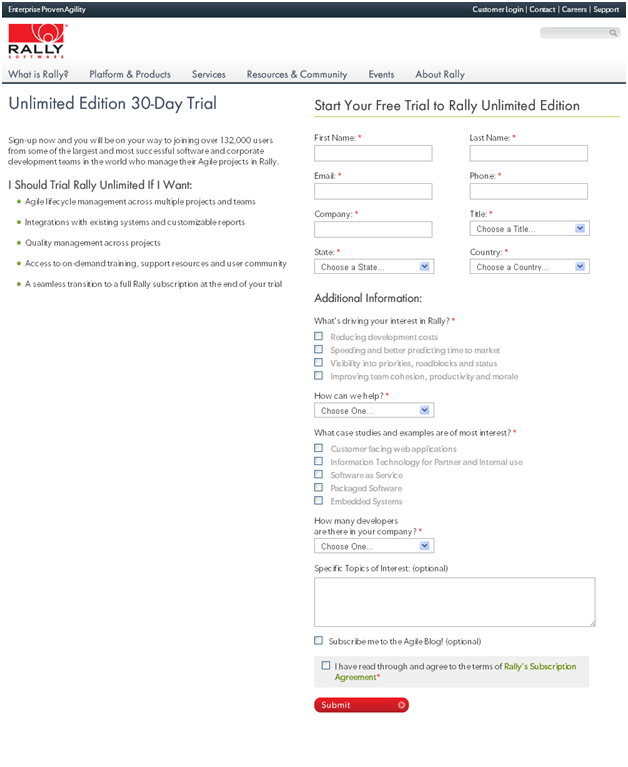
The Landing Page:

This page was submitted by a member of the audience. The objective of the page is to get a lead. During the session, Flint and the audience identified the following four optimization opportunities for this page. (Before reading further, take a quick look at this page and see if you can find some opportunities for optimization.)
Optimization #1: The headline
In an earlier session, Flint pointed out, “A headline should instantly answer the following three questions in the mind of the visitor: ‘Where am I?’ ‘What can I do here?’ and ‘Why should I do it?’”
The headline on this page was the first in line for optimization, and should be tested for a possible quick lift.
Test ideas: It would be worth testing a headline like, “Download a free, full-function 30-day trial to manage Agile projects across multiple teams.” You can add a subhead that says, “Join more than 132,000 users that manage Agile projects in Rally.”
Of course, it’s difficult giving a better test suggestion without knowing more about the product. However, by replacing the dueling headlines with a clear head and subhead, here is how we are trying to answer these questions:
- Where am I? On a free trial download page for an Agile software management project. The landing page did not instantly make clear what the free trial software actually did. There might have been info buried in the copy, or on a page that leads to this page, but you must constantly communicate and support the value of your offer to often distracted customers.
- What can I do here? Get a free, full-functioning trial download. The landing page did a better job at answering this question, and while “Unlimited Edition” has strong implications, it is not as clear as “full function.” That is the difference between writing in the company’s language and in the customer’s language.
- Why should I do it? Because you can manage Agile projects better (that’s the appeal), and more than 132,000 other users already have (there’s the credibility). Never assume potential customers remember the benefit from the step before, or still trust you (especially since in this step of the conversion process, you’re asking for some personal information).
Optimization #2: Form length
A member of the audience pointed out that the “length of the form” created friction. Adjusting the form length, or dialing length up or down to increase or decrease friction, is a method of reducing friction that marketers can exert direct control over (well almost, pending successful buy-ins from Sales and the C-suite).
Test ideas: Multiple members of the audience also noticed that all but two of the form fields on the page were required, which creates plenty of opportunities for future lead gen form testing. Test for overall quality of leads. What affect would it have on overall profitability if you made one of the following changes?
- Make more form fields optional. Then, send more completed forms directly to Sales, while nurturing leads who filled out less of the form.
- Make the form a two-step process, with contact information on the first step and additional information in the second step. You could send leads who completed both steps directly to Sales, and nurture those leads who only completed the first step.
Optimization #3: Columns
When optimizing columns, every marketer should ask themselves, “Can I eliminate any columns on the landing page?”
If any column on your landing page interferes with the visitor’s eye-path, you should consider eliminating it in your optimization efforts.
Another opportunity for optimizing columns is doing away with evenly weighted columns. A set of evenly weighted columns can create competing messages, as Flint pointed out on the page above.
“Does everyone see that?” Flint asked. “It looks like two side-by-side messages instead of one central message.”
Test ideas: Try testing a one-column layout that first communicates the value of the ask and then draws readers down to the form. Alternatively, you could test one main column with a sidebar element that contained information that supported the main value proposition, with the main value still being communicated through the core column.
Optimization #4: Perceived value vs. Perceived cost
Throughout the Summit, Flint used a fulcrum example to illustrate that the perceived value offered on a landing page should exceed the perceived costs that a visitor associates in exchange for the offer.
Test ideas: When the fulcrum example is applied to the page above, it becomes apparent where opportunities for optimization exist after looking at this page from a visitor’s perspective. Try testing ways to increase the perceived value, while decreasing the perceived cost.
You should keep this central principle in mind while crafting all of the above tests.

All of the test ideas above were crafted with a central question in mind: “What would happen if we looked at all of our marketing through the eyes of our customer?” And while we hope the test ideas based on this landing page help spark successful test ideas for your own pages, the core message we’re trying to get across with this blog post (and Flint was trying to achieve with his B2B Summit session) is this – you must step out of your own shoes and think like the customer.
We hope we’ve helped you do that. Flint was encouraged by the progress made at B2B Summit 2012, closing the Summit by saying, “You’re seeing now with different eyes, which is the key.”
Related Resources:
Blandvertising: How you can overcome writing headlines and copy that don’t say anything
Hidden Friction – The 6 silent killers of conversion (Web clinic replay)
Form Optimization: 3 case studies to help convince your boss (and Sales) to reduce form fields