

One of the most effective ways to increase conversion is by decreasing the amount of perceived resistance and aggravation your prospects experience in your lead capture process – or in short, dialing down the levels of friction.
In today’s MarketingExperiments blog post, we’re going to get our hands a little dirty by diving into some evidence-based marketing to learn how the MECLABS research team made two simple changes to a lead capture process that increased lead rates 166%.
What is friction?
Before we get started, let’s get clear on what friction is exactly.
At MarketingExperiments, friction is defined as “a psychological resistance to a given element in a sales or sign-up process.” In other words, it’s a psychological element present in your marketing that prevents prospects from acting on your offer.
It’s also important to mention here that your goal is not to eliminate all friction. Anytime you ask for information, there is going to be at least some amount friction present. Instead, you want test and optimize your way into identifying and mitigating as much friction in your lead capture process as possible.
Now let’s take a look at the research notes for a little background …
Background: A luxury home builder seeking to sell homes to families with a higher-than-average income level
Goal: To increase the number of leads
Primary Research Question: Which color scheme will result in a higher conversion rate?
Approach: A/B multifactor split test
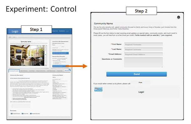
Control

The control featured a two-step lead capture process that started with a “request more information” call-to-action that redirected prospects to a second form field page requiring users to provide their first and last name and email address into the form fields.
Treatment

For the treatment, the team removed the second step completely, changed the form field layout to appear fewer in number, made providing information optional for users and removed the questions and comments field.
Results

What you need to know
By minimizing friction through reducing the number of steps and fields, the treatment outperformed the control by 166%. To learn more about how friction impacts conversion; you can watch the free on-demand MarketingExperiments Web clinic replay of “Hidden Friction: The 6 silent killers of conversion.”
Related Resources:
B2B Marketing: Value proposition discussion with Dr. Flint McGlaughlin
B2B Lead Gen: A/B split test helps increase quote requests 262%
Marketing Analytics: 3 steps to help Sales and Marketing improve productivity
Great concept – simple and direct for sure!
I always love the before and after images you guys put together. Understanding friction has dramatically shifted the way I approach copywriting and page design. Thanks!
Hi Kirsten,
Glad we can help!
-best
John Tackett
Kudos for actually outputting real, valuable content. I do mean that as high praise. It’s rare to come across marketing information that isn’t clearly pulp-trash meant to occupy by attention just long enough to accidentally click an e-book offer.
My questions:
Why was a simple a/b was used here when you’ve actually varied several visual elements between the control/test?
What would you say are your lurking variables and possible fail-points if you were going ‘platonically-empirical’ with this ‘experiment’?)?
thanks for your time!
SJS
When it comes to opt-in types of lead gen, people like simple. If you only have to leave your email vs name and email, you’ll probably get more signups with just the email. And if you have first name and email vs first name, last name, and email, then the first name and email will likely be the winner. I’ve tested a number of these scenarios in the past, and these have almost always been the results I’ve gotten.
It is like selling a certain product. You make sure that the consumers need to know what they have to know to purchase that certain product. Otherwise, if they don’t like your deals or if they find out the disadvantages of the product, they will back out. This is basically the same with lead generation optimization.
@Simon Selene
Hey Simon – In terms of the a/b approach, the truth is that even a multi-variate approach is really just a bunch of a/b style combinations (that’s what the data scientists tell me). The difference here is that this particular combination of changes we are highlighting has an intentional common denominator and connection to a real hypothesis about the visitor (not so in most multi-variate designs), and that’s what makes it transferable in terms of a learning.
You can read more about that in a post I’ve written on creating radical redesigns:
https://www.marketingexperiments.com/blog/research-topics/landing-page-optimization-research-topics/common-denominator-of-radical-redesign.html
Hope this helps
Great concept. What about check out pages? Wondering if 1 big page is better than 2 or 3 smaller pages (shipping info, billing info, etc)?
Hi John,
Thanks for the great question that would certainly make for an interesting test.
Although I don’t know if one big page is better than a few smaller ones, here’s a blog post I wrote a few months back on testing and optimizing steps in a checkout process that may help if you’re interested. https://www.marketingexperiments.com/blog/research-topics/ecommerce/checkout-test-sells-vacations.html.
Thanks again,
John Tackett