

Thank you to InterstateBatteries.com for submitting its View All Batteries page for an optimization review. We hope you find this diagnosis helpful for testing new ideas and improving results.
You’ve probably heard of Interstate Batteries, whether it was while getting your last oil change, paying too much for your last set of tires, or even under your hood. Interstate Batteries is one of the premier automobile battery companies in the country.
But did you know they sell batteries for everything? I certainly did not. In fact, “batteries for every need” is what they told us is their value proposition.
Ironically, the biggest problem they may have to overcome is not on the page below, but rather correcting the misconception that they only sell automobile batteries.
THE CHALLENGE: Improve usability of the View All Batteries page by making it easier for visitors to quickly find the battery they need.
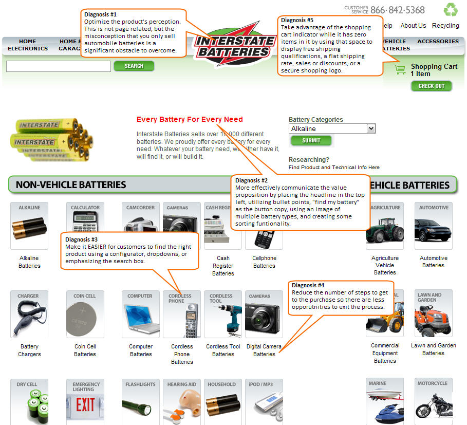
Let’s look at the page to diagnose problem areas and provide actionable recommendations (click to enlarge):

Conversion diagnosis: 5 ways to improve this page’s results
1. Optimize your product
If you’re Interstate Batteries, you have several obstacles to overcome:
- Common misconception that you only sell automobile batteries
- Your company name, URL, and logo conveys that you only sell “interstate” batteries
- Huge competition! (Do you also have batteries to power a drum major bunny?)
Outside of the page, you are going to have to make strides to inform consumers that you do have “batteries for every need.” Whether it’s accomplished with your PR, branding, or advertising departments, this is a product problem that this blog post cannot solve. But it is a very important issue to address as indicated by the MarketingExperiments Optimization Sequence:

Our research has shown it is most important to optimize your product first, then the presentation of your product (your web site), and finally your channels, such as PPC ads and natural search. Improving your product may include its name, perception, quality, and so on.
I’m definitely not recommending changing your name or URL as you have a significant amount of brand equity. Interstate Batteries is well known across many demographics, the logo is memorable, and consumers trust the quality of product. But somehow, consumers must simultaneously identify Interstate Batteries with BOTH your flagship product and also your secondary products.
Take Nike for example. Everyone identifies them as an athletic shoe manufacturer. But at the same time, the vast majority of consumers are acutely aware of the fact that they sell clothing, soccer balls, footballs, watches, and even sunglasses.
2. Effectively communicate the page’s value proposition
You have utilized color (red font) to emphasize that you sell every type of battery. You have quantified the word “every” by stating you sell over 16,000 different batteries. These are both good starts to communicating your value proposition, but it’s incomplete.
You need to take a more holistic approach to expressing your value proposition. This means ensuring that every element of your page either states or supports the value proposition:
- Design
- Copy (including font style)
- Images
- Colors (if you sell natural products, use green)
- Logo
- Price
And every element on your page, those listed above and others not mentioned, must be strategically positioned so that you “supervise” the thought process of the visitor. Whether they are at the top, bottom, or side navigation of the page, something should state or support the value proposition.
Recommendations:
- Headline – Place it at the top left where the eyepath starts and make it a larger font.
- Intro paragraph – Use a bold font to highlight key points such as “16,000 different batteries.” Consider replacing it with three bullet points that are easy to scan.
- Button copy – Do not use “submit”! How about “Find my Battery”?
- Image – Instead of making a visitor work to see all the batteries (scanning horizontally, moving their eyes closer to the screen to see a small image, scrolling), immediately show an image at the top that has 5-10 diverse types of batteries. This will give someone the picture of what’s available.
- Sorting functionality – Take a look at sites like Best Buy, Amazon, or eBay which are all companies that sell a variety of products. One page element that communicates “variety” is a left column that narrows results by type, function, component, price, and more. If I see that you have batteries that cost $5 and batteries that cost $500, I’ll know that you sell a large variety.
3. Make it EASIER for customers to find the right product
Q: What can I do on this page?
A: Take a long time scanning back and forth to figure out exactly what you sell and if you sell what I need.
That’s not a good answer. Instead you want your customers to say “quickly and easily find the battery I need.” It’s part of our job as marketers to make it as easy as possible for someone to buy from us. That means reducing the difficulty and time elapsed to get from point A (motivation to buy a product) to point B (adding that product to cart).
One way to do this is to add the homepage’s “Battery Finder” selection box to this category page. That will give visitors to this page the same opportunity to narrow their choices with a three-step process, especially if they overlooked this feature on the homepage.
Another option is to emphasize the search box as the primary objective of this page. Currently, your search box is tucked away up in the header. And if that’s not enough to make it difficult to find, there are a lot of heavy images drawing the eyepath away from the search box. Test changes that will make the search feature more prominent, such as moving it or setting it off with visual cues, to see if usage increases.
4. Reduce the number of steps to get to purchase
Current process:

Six steps just to find a simple AA battery!
A six-step process, whether it’s for a battery or a sailboat, gives the visitor too much time and opportunity to exit the process. Don’t turn a sprint into a marathon.
Implementing the recommendations in diagnosis 3 will help reduce the number of steps to get to a purchase. You may also consider adding some JavaScript to each one of the links so that all six steps are located on the first page.
Here is one example to test:

Finally, review your metrics platform to see where people are dropping off. If most people exit on the “chemistry” page, then you can speculate that either that word or concept may be confusing to your average customer. In that case, you may want to add some clarification either in the form of copy on the page or a tool tip.
5. Take advantage of your (empty) shopping cart indicator
This page follows the typical approach of ecommerce websites with regard to notifying customers how many items are in their shopping cart. When there are no items in the cart, the shopping cart says no items.

The customer probably knows when they haven’t pressed an “add to cart” button, so this indicator is not providing any value. Instead of letting this space go to waste, take advantage of it by communicating information such as discounts, shipping rate, free shipping, or secure shopping.
We’ve found through testing that clarifying shipping information can significantly reduce shopping cart abandonment rate. This is because many online shoppers will add something to the shopping cart and click into it only to see the shipping price. This strategy manages the customer’s expectations. If they expect to see $5 shipping and instead see $10, then you may lose them — not because of product quality, but simply because of shipping.
Here’s an example to help visualize the strategy:
 or:
or: 
For more tactics and suggestions on how to optimize an eretail website, join us for our Sept. 30 web clinic: Ecommerce Optimization: A holiday playbook for procrastinators.
Wow, what a great snapshot of how to optimize a catalog page. Lot of meat to chew on and think about! Your thoughts on the cart where the best.
One suggestion, I tried to use your tweet button to share but the URL was SOOO long I couldn’t. Would work if the tweet button provided a shortened URL.
Thanks Jim. The cart area is something we’ve tested many times with positive results. It’s such an underutilized space on most e-commerce sites, especially if there are 0 items in the cart.
Hi! Quick question that’s totally off topic. Do you know how to make your site mobile friendly? My blog looks weird when viewing from my iphone4. I’m trying to find a template or plugin that might be able to
resolve this issue. If you have any suggestions, please share.
Appreciate it!