Can something as simple as a change in color have an impact on whether a customer will use a search tool on a page?
Intuitively, we thought it did, but we really couldn’t be sure until we tested. This led us question this particular page for a large media brand:
The Variable Tested: “I want to … ” search box
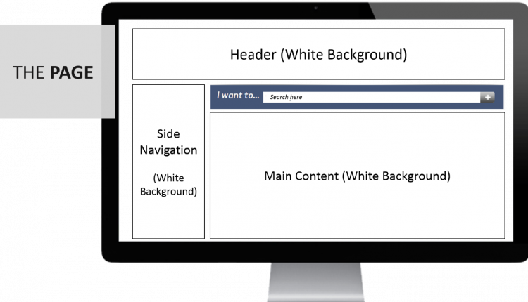
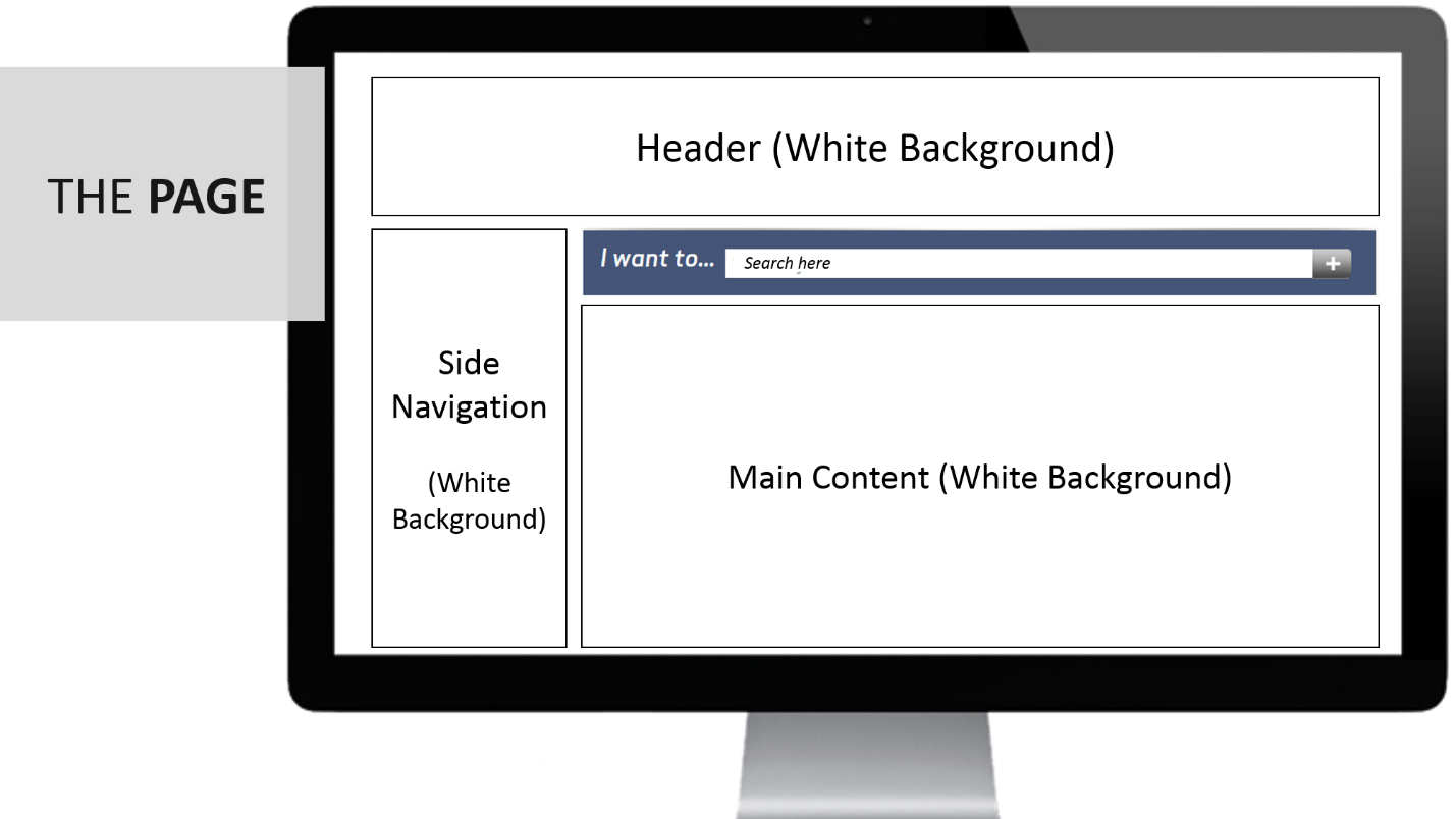
The page was a normal page layout with a white background. However, we wanted to test the impact of color on the search box.
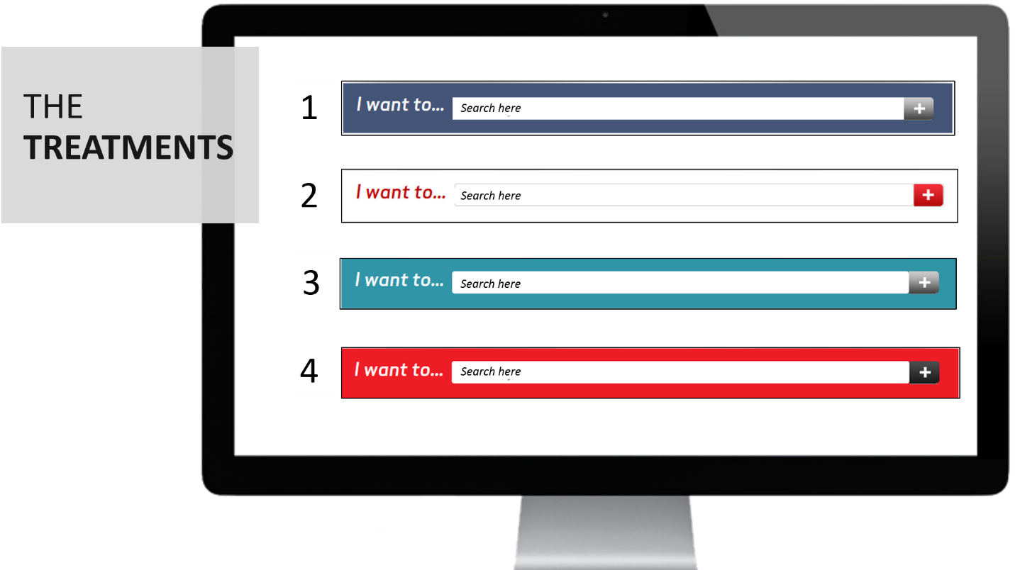
The Treatments: “I want to…” search box color variants
The Results: How did these changes impact clickthrough?
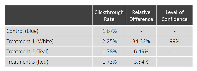
The treatment search box using a white background with red text design (Treatment 1 – example No. 2 in the above graphic) increased search clickthrough rate by 34.32%. Statistically speaking, there was no comparative difference in performance among the other colors.
We gained the following customer insight: The high contrast colors were having an unintended (and negative) effect on customers who would otherwise use the search tool.
All the treatments but Treatment 1 performed the same, and they significantly underperformed when compared to Treatment 1. The search bar with the same background color as the rest of the page (the one that blended in the most) was the winner of the test. What factor caused customers to skip over the higher-contrast search bars? By process of elimination, we can start to understand.
1. The difference was not due to the intrinsic properties of the specific colors
Any meaning customers attach to an abstract color is based on their own subjective or cultural experience. We can guess that the performance difference of the treatment colors was not overall due to cultural perceptions because the red search box did not perform differently from the blue or teal search boxes — two families of colors that typically have opposite cultural meaning for the demographic we tested.
2. The difference was not due to brand affinity
For this particular brand, all the colors fit into the brand guidelines. However, the white background search bar outperformed the others, thus eliminating the possibility of strong brand association.
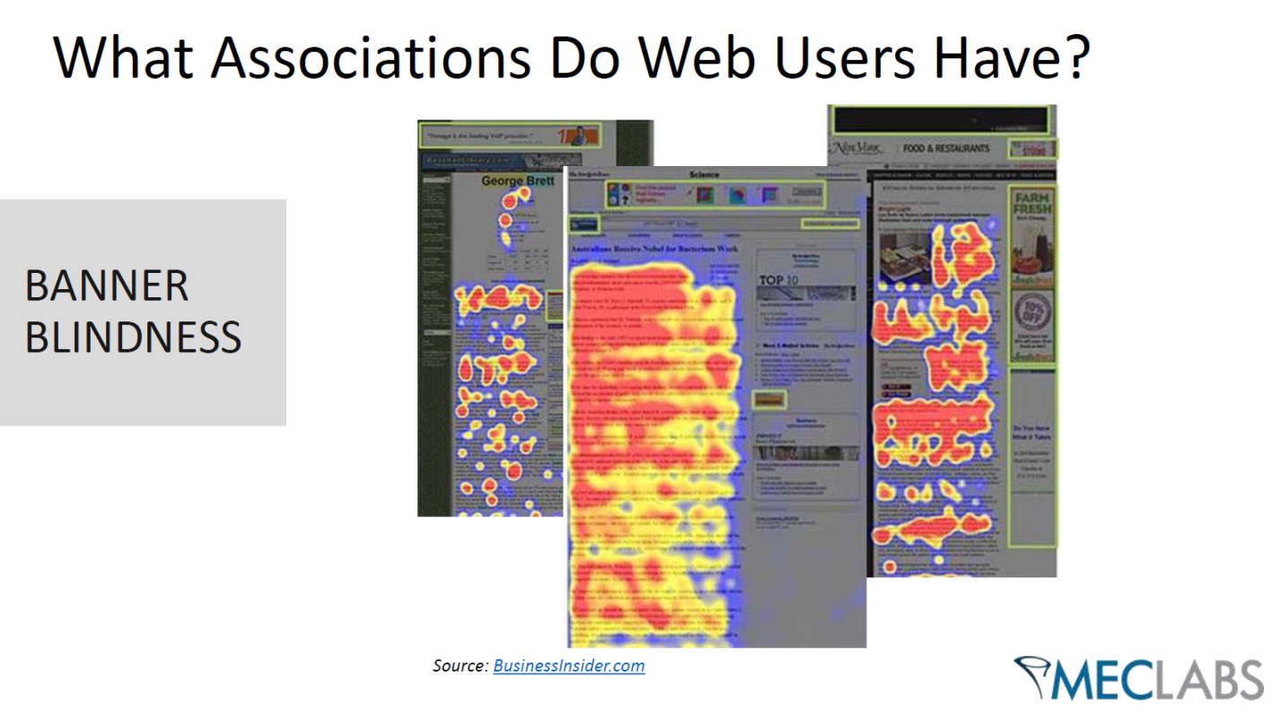
3. The difference was likely because of banner blindness
As we can see in the illustration above, banner blindness is a condition where customers instinctively overlook any element on a page that resembles a banner advertisement.
We think the higher contrasting colors were causing customers to mentally categorize the search box as a banner that was not actually a part of the content of the page.
By using less color contrast, the search box looked more like a tool on the page and less like a banner.
Ultimately, we learned that customers were more inclined to use a feature of a page when they perceive it as a useful tool that is part of the content of the page.
You might also like
On-site Search: How to help your customers find what they want (to buy) [More from the blogs]
Site Search Solutions: 3 methods for implementing search on your site [More from the blogs]
Marketing Experiment: Learn from our split testing mistakes [More from the blogs]


This is really a surprising reason. I know that color matters but i never thought in this way. It’s an interesting article and it’s worth reading.
Thank you for the kind words Danni.
I’m wondering what the results would be with a white background and a different color type.
ie white background and teal type. I think the testers may have overlooked the impact of red type on a white background.
Prior to this, I believed color was a way to direct a viewer’s attention to something you wanted them to do or complete. This research reminds me of how dramatically and drastically our own websites are influenced by the much larger world of the internet. Thanks for doing this research!!