

In the age of free content, how can you capture leads and foster a relationship with people that consume the articles, videos and updates on your site?
Site design and the quality of content you produce can strongly influence the way that people engage with your site.
Using an example from the Harvard Business Review, we can see an example of a layout infused with value for the user.
First, the Harvard Business Review lets users read up to five articles before asking for a commitment. This allows visitors to get a sense of the breadth and quality of content so they can ensure that they’re getting a valuable experience.
Let’s review the overall look, feel and strategy of its registration process and design as well as examine how it impacts the visitor throughout the registration process.
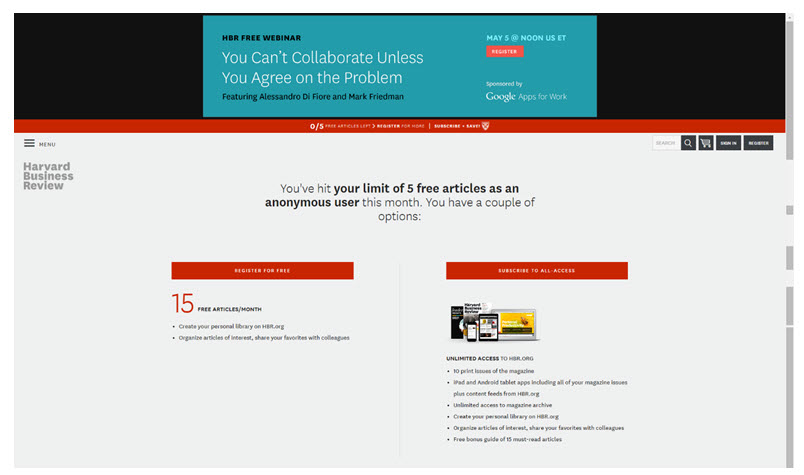
Paywall page
After reading the fifth article, the user is given two options: Register for free in exchange for more information, or subscribe to the all-access version.
Let’s take a look at how the page is laid out.

First, look at the white space.
Can you feel the fresh air?
S – p – a – c – e
The simplicity of the page creates a “no pressure” feeling and lets the visitor know that they aren’t seeing an ad or being urged to make a decision.
However, you can clearly see the two defined calls-to-action, separated by a thin gray line.
Both sides indicate some level of value. However, the paid option has an image and lists several more bullet points worth of advantages over the free option.
Registration page
When you land on the page, you’re immediately hit with the value that you’ll get. The white space is still present, however. Since you’ve selected an option, it’s clearly a one column page with a simple eye path.
The value of registering is clearly communicated at the top of the page. However, the form is interrupted with an option to switch to the paid version before asking you to sign up. It also lets you enable social sign-in for a (nearly) friction-less registration.
The form fields are simple: Last name, email and password. The user is not giving up any unnecessary information to create a free account, such as billing address or credit card information.
You also have the ability to sign in if you already have an account or if you want to view the privacy policy. These options are not distracting from the very clear “Register Now” button — the only high-contrast button on the page.

Behind the wall
Once you have entered your information, a light blue ribbon appears to take you back to the article you were reading when you were interrupted, but you also have the option of fleshing out your profile and preference a bit more.
Because of the use of white space on the page, the form looks easy, and the simple add buttons look like they’ll keep you on the same page, so you can navigate back to your article at your leisure.
It also gives you the option to add more information about yourself, with the promise of suggesting content tailored to your position and company. The way that it’s positioned on the page, though, makes it feel more like an option for highly motivated registrants. However, the promise of delivering value is still present.

My top takeaways from this example
Here’s what I loved about the experience that the Harvard Business Review provided for its customers:
- White space lets visitors breathe and reduces page friction
- Clear, concise and direct messaging guides your audience through the process
- Infusing value near the calls-to-action reduces anxiety
What else did you notice? Feel free to let me know on Twitter or in the comments below.
You can follow Jessica Lorenz, Event Content Manager, MECLABS Institute, on Twitter @JessicaPLorenz.
You might also like
Lead Generation: Is your registration form part of the customer journey? [More from the blogs]
Blogger Intervention: 3 reasons why no one is engaging with your content [More from the blogs]
Email Marketing: Creating a customer profile [More from the blogs]
This is a very good article with a complete analysis. I think the simplicity and use of few colors gives you the message, “we are not trying to seduce you, we are only trying to please you and give you what you want and need”. I believe your takeaways are important to be applied in our site designs. Congratulations and greetings from Guatemala.
Thanks, Claudio!
I agree with you about the colors – it definitely lends itself to the feeling of sophistication.
Hope all is well in Guatemala, thanks for reading 🙂
Nice to read this opinion on webdesign/usability from a non-designer point of view. And I totally agree, white space can be so powerfull!
HBR continues to astonish me.
While they may do a great page, they have ignored those who have subscribed for years, treated no differently to someone they are trying to entice to trial with various linkbait.
In my case, I have subscribed for 20 years, you would think that with the marketing thinking behind them of the Business School they would succeed in actually engaging me rather than ignoring.
Does not matter how good the sizzle, if the steak is tough, eventually you go elsewhere.
its amazing! its a great blog. thanks for sharing with us.
Prime Marketing
I totally agree with you!! Thank you for sharing!!