

When planning a testing and optimization cycle, there are plenty of marketing elements to tackle — landing pages, pay-per-click ad copy, form fields and more. The question is: What test will provide the biggest impact?
A great place to start is to ask your customers.
CrazyEgg, an analytics company that creates heat map data visualizations for websites, did just that when beginning a complete overhaul of its website.
Background
The software-as-a-service company had a website that was dated, had been created in an ad hoc manner with no overall hierarchal structure, and didn’t effectively feature its product or provide visitors with information.
Once CrazyEgg decided to redesign the website, it obtained customer feedback through two groups of surveys:
- It segmented its user base and sent email surveys to find out how satisfied these customers were, how they described the product and how they intended to use the product in the future.
- It also placed pop-up surveys on different pages of its website, with questions geared toward the location of the survey. For example, a survey on the online application page would ask the applicant what products they had previously used.
The new website featured a streamlined design, and a homepage with minimal copy and a large call-to-action (CTA) button. Based on feedback from its customers, this CTA was an obvious place to test.
“We got a bunch of customer feedback and wanted to see if we could improve our conversions by modifying the button copy to match the feedback,” explains Hiten Shah, co-founder, CrazyEgg.
He adds, “Improving the conversion rate here directly impacts revenue, so we thought it’d be a great place to start.”
Treatments
CrazyEgg tested three versions of call-to-action copy with an A/B/C split test:
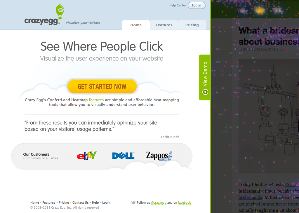
CTA #1

This CTA treatment was chosen as an example of very generic button copy.
CTA #2
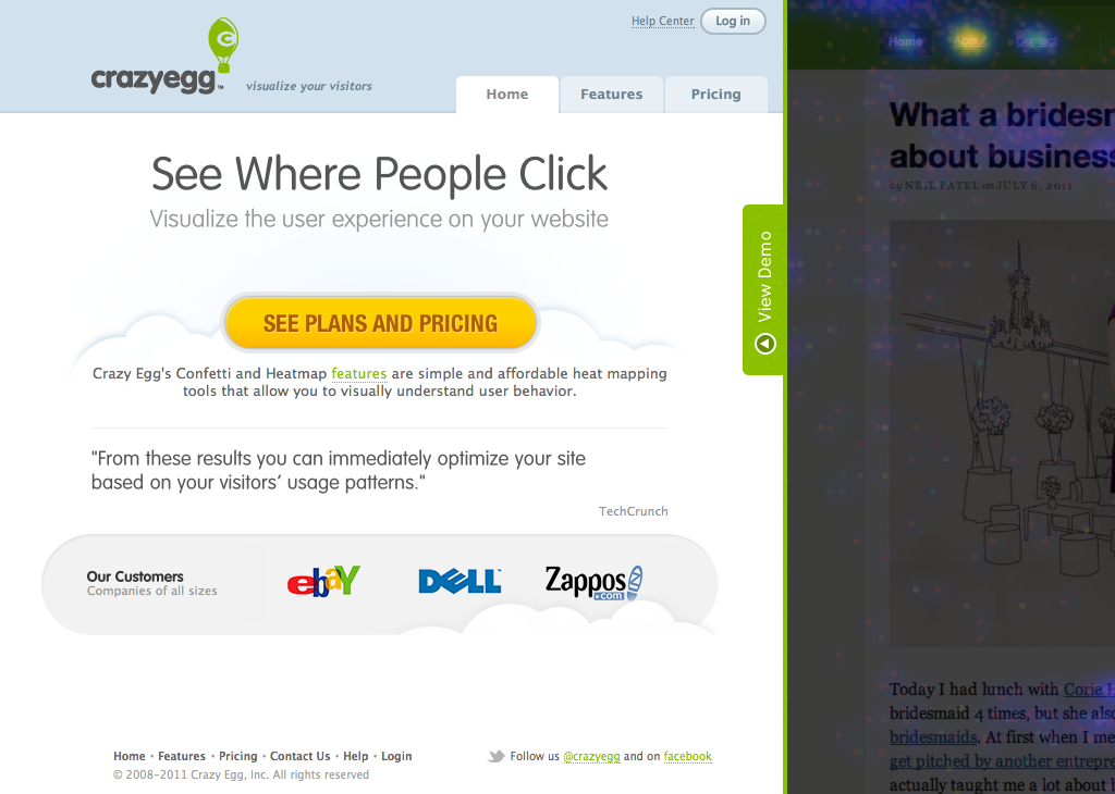
This CTA copy was inspired by tests CrazyEgg noticed other SaaS companies running.
CTA #3
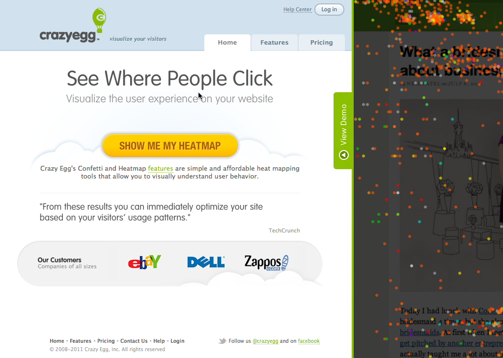
This CTA treatment was based on customer feedback CrazyEgg obtained through its surveys.
The confidence level for this test was 99%.
Results
Conversion rates for the three tested calls-to-action:
- “Get Started Now” — 1.85%
- “See Plans and Pricing” — 2.13%
- “Show Me My Heatmap” — 2.96%
“Show Me My Heatmap” is obviously very specific to CrazyEgg’s product, and outperformed the more generic “Get Started Now” by 60%, and “See Plans and Pricing” by 39%.
The winning treatment was based on customer feedback, and it also works with the flow of copy on the homepage.
About this test, Shah says, “Getting qualitative feedback to inform A/B tests is the way to go. It allows you to get a better idea of how your actual customers describe the product which leads to more informed test.”
He adds that small changes based on customer inputs can have a big impact, and that CrazyEgg is incorporating “voice of the customer” data in more of its marketing efforts.
“We don’t just guess,” Shah states, “We actually take more educated guesses by trying to understand customers better first.”
Related Resources
Website Redesign: Customer surveys and testing help increase conversion by 21.6% (Open access)
Digital Telepathy — vendor for website redesign and testing
Page Tests Lift Site Registrations and Conversions: 3 Examples that Stopped Site-Design Bickering (Members library)
Master the Art of Multivariate Testing: 7 Lessons from Avis Budget Group (Members library)
Marketing Intuition (Contest): Which homepage generated more conversions?
Blog Optimization: Button change leads to 39% increase in comments
Landing Page Optimization: 2 charts describing the best page elements to test and how to test them