


You wouldn’t use a dictionary that wasn’t in alphabetical order, nor would you invite a date to your high rise without telling him or her which apartment was yours. Yet, we still expect homepage visitors to navigate through seas of information and multiple paths, in hopes they’ll find what they need.
We spend a lot of time discussing landing pages because that’s where the action (i.e. conversions) happens. But homepages are sometimes the first interaction prospects have on a website, if not their first exposure to an entire brand. As such, they require similar levels of optimization.
Much like landing pages, following optimization principles is key in conveying a brand’s messaging. We need to strategically define the goals we have for a homepage, and the path we want the user to take.
We initially discussed the following experiment last Fall in our Web Clinic, “Homepages Optimized: How using the homepage as a channel led to a 59% increase in conversion.” However, in a Web clinic, by necessity of trying to convey complex information in a short amount of time during a live event, we usually aren’t able to delve into the entire experiment conducted here in the labs. For simplicity’s sake, we usually focus on a control and one, sometimes two, treatments to very tightly focus the Web clinic around that sessions teachings.
Today on the blog, let’s air it out. Let’s look a little deeper into the experiment, including the control and all three treatments our research analysts tested, to see what we learned.
–
Background
This is a homepage test for a B2B company (anonymized to protect Research Partner competitive advantage) offering email marketing solutions for small and large businesses. The primary objective was to increase conversion for a free trial. The primary research questions for this experiment were:
- Which homepage will have the highest conversion rate?
- Which homepage will result in the highest clickthrough rate?
–
Control:
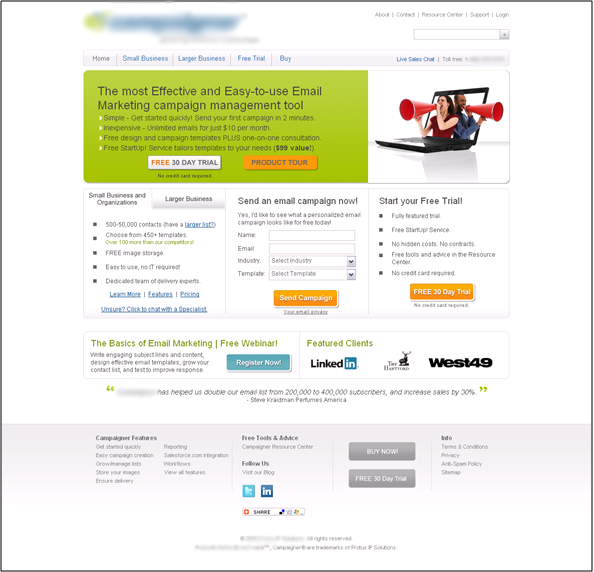 The control page evokes one immediate reaction from users – “What am I supposed to be doing here?”
Okay, maybe that’s a bit exaggerated. But then again, when using this homepage to not only define a brand, but also motivate an action on the part of the user, excess complexity can be a deal breaker. From the outset, we can see that this page is far too copy-heavy, with no clearly identified eye path or primary function.
The user’s eyes are first drawn to the large green box, however, the company chose to not only populate this space with a two-line value proposition, but also included four supporting value statements and two calls-to-action.
(And that’s just the green box…)
Secondly, the eye is drawn to the image to the right of the box. The image, while visually interesting, does not identify this company as an email marketing solutions provider. Likewise, the image does not support the value proposition statement or any of the copy that lies beneath.
Below these visual elements lie three similar-looking columns, replete with forms, bullets and more calls-to-action. Again, the user asks, “What am I supposed to be doing here?”
In this case, the answer would likely be, “Leaving.”
After analyzing the control, the research team decided a radical redesign approach was necessary, in which t hey could address several key factors that shape the thought sequence in the mind of the user:
1. Eye path: Providing visual cues to help the user understand how the content is meant to be consumed
2. Distinguish the objectives: Helping the user understand the difference between competing calls-to-action, minimizing the decision-making process
3. Page flow: Helping the user immediately understand the relationship between different sections of the page
4. Expression of the value proposition(s): Increasing the clarity of the value proposition to keep the user moving further through the process
5. Color: Using color to weigh and prioritize various elements on the page
6. Image relevance: Using images that directly support the value proposition or illustrate some aspect of the core offering (rather than a generic graphic)
–
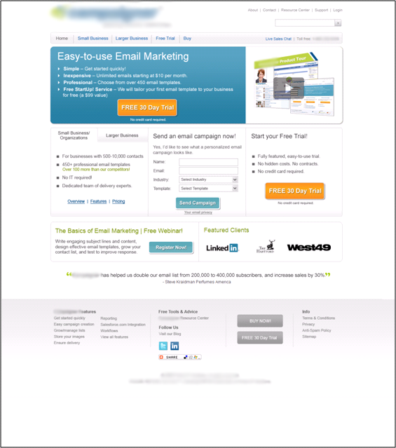
Treatment #1:
 Rather than taking a design mulligan (apologies to readers who didn’t expect me to write this while watching the Masters) and gutting the page, our researchers took a methodical, tiered approach to this radical redesign.
Most noticeable is the shift from the green and brown box and font color to a more impactful blue and orange scheme. The blue background allows the user’s eye to naturally move from the more concise value proposition to the primary call-to-action. Also, we strengthened the headline and sub-headline by reducing its length and making it a more direct (read: more scannable) statement that appealed to the company’s core audience.
By increasing the clarity of the value proposition, our researchers felt it would be more likely that the user would engage with the page and continue toward the call-to-action.
Additionally, note the reduced amount of copy. While not a dramatic reduction, by cutting the text – and subsequently reducing friction – our team was able to focus the user on the calls-to-action, drawing significantly more attention to them than the control.
Our team also removed one of the two calls-to-action from the box at the top of the page, choosing to emphasize the free trial over the product tour. The team weighed these two objectives, but determined that the free trial better represented the company’s primary value proposition, and also was more likely to initiate a clickthrough.
Finally, this treatment swapped the original, generic image with an image of provided email template examples. By using product images, the team created a relevant visual section that supported the primary value proposition.
–
Treatment #2:
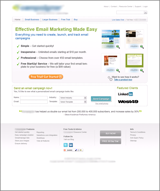 In this treatment, our team focused on enhancing the user’s eye path. By reducing the three-column layout to two columns, the vertical eye path is more clearly defined, and the logical flow of the content is more intuitive. Now, the user follows a singular flow from value proposition to call-to-action.
This treatment also shows a further reduction in body copy. Rather than inundate users with extensive copy more suited for the pages that follow, our team chose to emphasize the value proposition and supporting bullet points, leading more organically to the primary call-to-action.
The color scheme was once again changed in this treatment. Replacing the solid color box with a white/gray gradient allowed the bullet points and value proposition to “pop” more naturally as the user scans down the page. Likewise, having the same color background for both the value statements and the corresponding image allows both elements to complement one another, rather than compete for visual attention.
By making these adjustments, all of the focal value points – including the secondary call-to-action for a sample email campaign – now lie above the fold, and directly in the user’s eye path.
–
Treatment #3:
 The final treatment is, at first glance, nearly identical to the previous. But there was one minor, and important, difference that appealed to the most basic of notions – people love free things.
While all versions of this page offered free content – whether it was a product tour, sample campaign, etc. – it was the addition of a “bonus”-type offer that seemed to resonate with users. In this treatment, the sample email campaign offer, which required more user involvement to provide value, was replaced with an offer of a free webinar registration.
Though subtle, the free webinar invite not only provided value above and beyond the company’s primary offerings, but also added significant credibility to the overall brand. What was once a company trying to sell email marketing solutions was now positioned as an industry thought leader in the eyes of the prospects.
This newfound value is enhanced by the layout. Because the free webinar offer required less real estate on the page, the “featured clients” section was more than doubled in width, highlighting the recognizable logos and furthering the company’s credibility.
–
Results
–
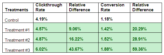
The conversion rate differences for all three treatments were statistically significant at a 95% confidence level. Every one of the tested pages outperformed the control, with the highest (Treatment #3) showing a 59.36% lift in conversions. Through these tests, we determined these radical treatment pages did a better job at providing a more organized and logical user experience.
Through heavily revamped color use, layout and ultimately, eye path, our team was able to bring this company’s value to the forefront. By properly positioning and emphasizing the user’s options, this new homepage was laser-focused on experience, rather than trying to overwhelm the user with information and unclear next steps.
It may be helpful to think of the homepage as a channel. Remember, the objective of the homepage is to make the user’s choices as effortless, yet as informed as possible, so that you can seamlessly move them to the next step in the conversion process.
–
Some final thoughts…
As we see far too often on B2B homepages, companies are trying to accomplish too many things at the same time, forgetting that users might not have the time required to absorb this wealth of information. In short, they’re confusing users with product offers, free trials, company information, etc., instead of simply stating their value and presenting logical next steps.
Doing so will help ensure your visitors never say, “What am I supposed to be doing here?” again.
–
Related Resources
Homepage Optimization: Creating the best design to quickly meet multiple users’ needs
Homepage Design: The five most common pitfalls and how to overcome them
This Just Tested: Could you spot the better homepage if a 59% conversion difference were at stake?
Web Clinic Replay — Homepages Optimized: How using the homepage as a channel led to a 59% increase in conversions
–
Couple of objections:
a) the treatment #1 uses white text on a blue background which is a low readability
b) when you actually look at the eye path, I assume that you’re using some predictive computer generated tool, right? If yes, then you have to provide as input a screenshot made at the most used browser resolution by their visitors. Did you?
TraiaN,
Thanks for writing. We did not use computerized tools for this test. Our eye path treatments were determined by user interface specialists who attempted to understand the user’s thought sequence, and then applied this thinking to layout. Once they determined the most logical user experience though the page, they then positioned content in the clearest and easiest-to-absorb sequence and began testing.
Thanks!
Brad, you’ll be surprised to see how “unlogical” users are 🙂 The only thing I know for sure wrt LPO and CRO is that there are no forecasted results. Until you put something to the test, it’s just guessing 😉
Thanks Brad, this is a very informative and practical suggestion for getting my website redesigned on basis of your recommendations. One more thing I would like to ask is, Does Google prefers sites designed in HTML more over that designed in Flash. You views will be helpful.