


As an avid online shopper, I often wonder why the checkout process is so markedly different and bare-bones when compared to the rest of the shopping experience. Sure, during this process customers aren’t shopping, they’re making the purchase.
But for someone like me – someone who often loses confidence in the final steps of the buying process – a little more resemblance to the look, feel and even emotion (the elements that likely brought me to checkout in the first place) would go a long way toward making that fateful, final click to buy.
Recently, I wrote a blog post covering a seemingly minor revamp of an online landing page that led to more notable results than initially expected. In writing this, I wanted to highlight another test we performed on the same British travel broker site to see if similar tweaks can improve its checkout process.
Background
This experiment involves a United Kingdom-based online ticket broker offering residents a series of exclusive vacation packages for Florida theme parks, tours and attractions. The page tested here is the final steps in the checkout process for purchasing a vacation package via the site.
The goal of the test was to see:
1) Which Checkout process leads to a larger conversion rate?
2) Which Checkout process will lead to higher revenue?
In doing this experiment, the team added images, headline copy, made subtle design changes to the color scheme and layout, while also including more information links.
Control: A functional, if flat, checkout experience
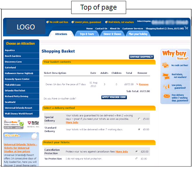
The control (creative samples anonymized to protect Research Partner’s competitive advantage) seemingly contained many aspects of a competent checkout page. There was a design element that, while somewhat unadorned, was consistent with the pages leading to checkout. Likewise, the color scheme was also consistent with earlier pages and contained clearly delineated page sections.
The left-hand navigation also remained from previous pages, which would help reduce anxiety and reassure customers that they aren’t leaving a trusted site for a third-party payment source.
However, let’s look at this page through a broader lens. For starters, once a user clicks to this page, there is no welcoming copy or continued expression of value from the site. There is also no encouragement to shop further, perhaps via additional information links or “add-ons” for the vacation package. This is not only inconsistent with the pages previously viewed by the user, but could also be a potential revenue-killer.
More importantly, at the most critical point in this online buying process, none of the imagery or emotional connection between user and process exists. In other words, none of the factors that helped the user commit – and ultimately convert – are present during the final step. This inconsistency could potentially cause undue anxiety, and possible cart abandonment.
Treatment: Continue selling the experience
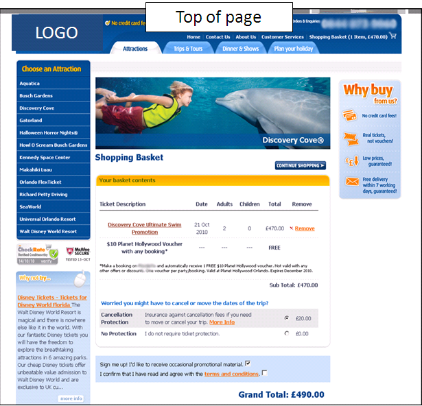
Our research team added copy to the final cart page to reinforce the buyer’s decision to shop at this site. The simple headline copy, as well as the visually appealing links to additional package options, continues the buyer’s connection to the potential purchase – and potential additions to that purchase.
Though no one will confuse theme park add-ons with “impulse buys,” once users are in the buying mindset, links such as these could encourage them to maximize their purchase for the best possible experience.
Our team immediately added a banner/hero image atop the shopping cart contents section. This not only continues the look and feel expressed on previous pages, but also serves to assure buyers that their purchase(s) will deliver an inviting and enjoyable experience, eliminating any last-minute anxiety that could come for such a significant online purchase.
The team also chose to subtly lighten the color scheme and font color treatment, making the page easier to read and scan. Also, the “Why buy…?” box in the right-hand column was slightly shrunk, so as not to create visual conflict with the hero image.
In the cart contents section, there is now a line of content underneath the buyer’s selection that confirms a free bonus offer. Though the user would receive this bonus regardless, having it appear in the cart contents, accompanied by the word “FREE,” increases the appearance of value, subsequently increasing the likelihood of conversion, as well.
Results
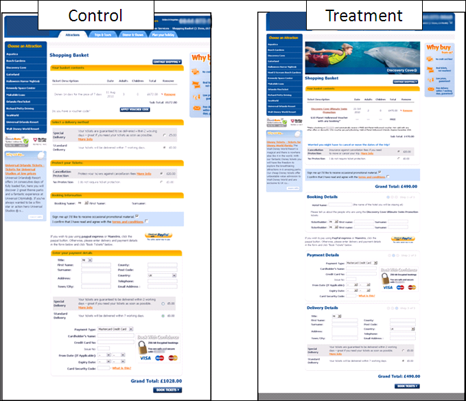
During our five-day test duration, the treatment page went on to produce a 13.83% boost in conversions. Though there is a wealth of variables to consider, it seems that these adjustments went a long way toward making the user feel more confident when purchasing.
When comparing the checkout pages side-by-side, the reduction in use of bold colors alongside the inclusion of a strong, emotional image atop the treatment page created a final step that was more akin to the pages users visit prior to conversion.
As a regular Web shopper, I find that often a site will remove the “experience” from the user experience, when logic would dictate that the user should be more confident and secure during this critical step. Though a five-day test may not provide be-all, end-all evidence to support this point, a 13% boost in that period of time, along with similar findings consistent with this hypothesis during years of experimentation in our labs, indicates that this idea is worth testing on your site.
After all, when making an online purchase as significant as a family vacation package, a little extra comfort and confidence could mean the difference between the user hitting the “buy” button, or hitting that equally comforting “X” in the upper-right hand corner.
Related Resources
What Else Can I Test…On My E-commerce Or Lead Generation Website?
Shopping Cart Abandonment: How not being annoying can get you 67% more cart completions
Online Marketing Research: The MarketingExperiments Quarterly Research Journal, Q3 2010
I had never thought about the checkout process in light of the rest of shopping… Very interesting.
Thanks for your comment. As I mentioned twice in the post, most of my shopping is done online — to the point where differences in shopping cart and checkout processes have become something I’ve looked at with more scrutiny. After seeing these results, I’ll likely continue to do so moving forward.
Brad, what impact do you think “scan line” had in the results? The variation removed some very distracting yellow bars that interrupted the scan of the form.
Brendan, thanks for writing. To be candid, I believe those yellow bars resembled the yellow speed bumps you find in school zones…and had the same effect on the user experience.
Used as section “dividers,” the yellow bars in the control actually served to bury the value statements and calls-to-action in between. By eliminating the yellow “speed bumps” and making subtle (but important) text alterations in the treatment, the user is smoothly guided down the page, through clearly delineated (but not distracting) sections, ending up at the desired call-to-action.
Thanks again!
Very informative and useful article.
A few weeks ago I read an other article about that topic:
http://ux4dotcom.blogspot.com/2011/01/shopping-carts-check-out-there-is-often.html
What a great post! I am just starting out in community management/marketing media and trying to learn how to do it well – resources like this article are very much helpful. As our company is based in the U.S., it’s all a bit new to us. The example above is something that I worry about as well, how to show your own natural enthusiasm and share the fact that your product is beneficial in that case.