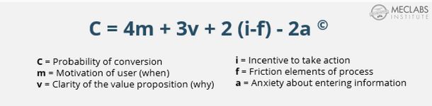
Archive

Posts Tagged ‘friction’

Landing Page Optimization: Identifying friction to increase conversion and win a Nobel Prize

January 10th, 2011 No comments

The 2010 Nobel Prize in Economics was awarded to Peter Diamond, Dale Mortensen and Christopher Pissarides for their research trying to explain why unemployment remains so high in the U.S. and other advanced economies. More specifically, they won for their analysis of markets with search frictions – any factors that keep markets from operating efficiently.

Being the amateur economist I am (CV: 11th grade with Mr. Lamar, I’ve read several issues of The Economist), I was elated to hear about this selection. Theoretical economics is sometimes too, well, theoretical. Supply A meets Demand B and they live happily ever after.

With the notable exception of Dan Ariely, I often wonder if these economists live in the real world or just a magical Shangri-la where everyone always behaves rationally, and mere trifles like food and energy aren’t important aspects in the average family budget (I believe this Eden is called Princeton).

The world I live in doesn’t work that way. Which gets us to your landing page… Read more…

This Just Tested: PPC vs. banner ads?

December 8th, 2010 5 comments

Quality traffic is essential for any marketing campaign. Shoot, it’s essential for any successful business. You could have a highly valuable product (let’s say a real cure for male baldness), at the best price (let’s say for just a shipping address with no strings attached), and the most optimized website presentation on the interwebs (let’s say it has undergone a year of MECLABS testing), but despite these advantages, if there are no address-owning bald men who can find your website, well then your business will look a lot like me trying to drive a stick-shift.

Ok, crazy example, but the point is this: Quality traffic is essential.

The question for marketers is – where can we find the most quality traffic on the Web? Should we work with Pay-Per-Click (PPC)? Is it smart to invest in social media? Will external website banner ads be worth the costs? There are many options out there, but today, I want to bring your attention to an experiment that compared the traffic quality between two of the most common online channels: PPC vs. Banner Ads.

Now, explaining this test will be a little more tedious than usual because it deals with multiple experiments of a unique multi-step conversion funnel. But, rest assured, if you can just get a bird’s eye view of the optimization strategy, that viewpoint will be sufficient for what I am talking about in this post. Read more…

This Just Tested: An aesthetic design that produced 189% more leads

August 11th, 2010 18 comments

So often, beautiful design gets trumped by marketing objectives – and rightly so from a marketing perspective. The graphical elegance of a Web page might be worthy of an art exhibit, but if it doesn’t sell anything but “oohs” and “ahs,” what service does it really provide to anyone?

True, but it is at this point that we tend to divide. It’s them or us. Are you a marketer or a designer? Whose side are you on? As one popular design blog analyzes its relationship with marketing, “You can spell ‘team’ from the word ‘marketing,’ but I’ve yet to see a sense of it in marketing.”

But I think we (marketers) can and should live in both worlds. I believe design can be done in such a way as to actually contribute to the perceived value of an offer without being a distraction. I think marketing, whether they can measure it or not, is leaving money on the table when design is viewed as optional icing on the cake. Yes, I have a dream…

But, feelings aside, we must always default to testing – not our gut instincts. And so I was glad to see a recent experiment bring a little shimmer of hope to those of us who long for the day when these two often opposing worlds come together. Read more…

Ask an Optimizer: How to guide visitor thinking

November 4th, 2009 1 comment

Editor’s note: During our October 28 web clinic about properly guiding visitors to your conversion objectives, researchers Boris Grinkot, Corey Trent, and Heather Andruk fielded several audience questions.

Q: Does left navigation diminish conversion rate?

It all depends on the purpose of the page. For a simple landing page to which you drive prospects from PPC ads, affiliates and banner ads, this additional navigation will likely distract visitors and drive down conversion rates. It ends up being just one more competing objective. The answer to the “What can I do?” question now has multiple answers.

Of course, there are degrees of distraction. Deemphasized navigation with supportive elements such as FAQ is less distracting than very prominent navigation with several drop-downs and hover-over pop-ups.

For a page that is an integral part of your site, navigation is often essential to help guide your users through the overall site. If there is navigation on every other page, having one or two pages without navigation will cause a disconnect and you will likely lose the visitor.

Overall, you must remember that these are just guiding principles developed from our years of research. In the end, the best answer is to test these elements to see how they affect conversion on your specific pages.

Q: How do you know when to offer competing products?

There is no single answer, but we can give you a few good test ideas. If you have secondary products that do not compete with your primary offer, you may try to offer them before a purchase is made. If you have auxiliary offers that may distract from the primary offer, wait until the purchase is complete to offer the upsell. An excellent example is Amazon.com, which is a master at upselling additional products both in the cart and after purchase.

To decide what to test, look at your metrics to see where people enter and exit your site. For example, do they hunt for different features or go straight to purchasing a product? From these metrics, try to decipher what products users may be looking for in addition to what you are currently offering. The metrics can provide actual data to back up your decision about which competing products you want to test, and where you want to offer them.

Q: Do the five elements of directing visitor eyepath apply to B2B sites with long sales cycles?

These are tactical recommendations meant to help guide your visitors’ thought process through a page. The specific product or offer does not matter, since we are not trying to optimize a page; rather optimize the thought process of the visitors to a page. So using shape and color to emphasize your key points, and size to draw attention to your headline only helps more effectively express your value proposition in the conversation you are having with your customer.

Therefore, these elements apply to any page and it is worth noting that they may be especially important for B2B sites. This audience tends to scan pages more frequently than consumer audiences, so using color and shape to help emphasize key points in a way that is easier for your audience to digest is especially relevant.

Q: Are there any tools that can help me select colors?

Yes. Kuler.adobe.com and colorschemedesigner.com can help you choose color palettes.

Q: Should images have humans in them?

It depends on what you’re trying to accomplish with the image. For some products, it makes more sense to show a point-of-view orientation to give visitors the sensory feel of what it is like to use the product, such as showing the driver’s view from a car or the view from a hotel. For others, you need people in the picture to show the product being used.

When you do use people, having a good understanding of your demographic is extremely useful. Use images that your visitors can relate to (e.g., young, middle aged, seniors).

Images of people will also help guide visitor eyepath. The image should be “looking” at where you want the user to go. So for example, if you have an image on the left and copy on the right, be sure the person in the image is looking to the right to direct the user’s eyepath towards the copy.

As you test your pages, keep in mind how powerful images are. In the initial one or two seconds many visitors take to judge your page, your images can connect with them and draw them in or repel and cause them to bounce. Be careful in using stock photography, as consumers are becoming increasingly savvy to its use and may consider it to be misleading – especially if used with believability elements such as a testimonial.

Have additional questions? Other things you’d like to Ask an Optimizer? Use the comments section below or post your questions to our MarketingExperiments Optimization group.

Lead Generation Optimization: Finding the right amount of friction

September 2nd, 2009 3 comments


If you’ve got a B2B website, you’re always looking for ways to generate more leads online. But while recent research shows 71% of B2B marketers view their site as one of the most important marketing tools, only 31% said their site is “highly effective” at generating leads.

That leaves a lot of room for testing and improving business results. However, optimizing for lead generation is not as straightforward as optimizing for conversion rate.

Conversion rate is the final metric that decides whether or not your online process/funnel is working. In contrast, lead generation only tells you a portion of the story. The leads you generate are really the start of a long process of qualification steps, both online and offline. If you don’t pay attention to each step, you will never be able to get the best out of this process.


How to use friction to your advantageAdjusting Your Leads


Think of the process of optimizing for lead generation as two interconnected dials. Each dial represents a step in your online process. One dial increases volume of leads by reducing friction. The second dial increases quality of the lead by increasing friction.

You can increase friction in several ways, such as adding more form fields or steps in the funnel process. Or, you can reduce it by subtracting various page elements or process steps. To adjust your lead flow, turn the dials: more friction will yield higher lead quality; less friction will increase lead volume.

Too much friction can make your visitors quit, but not enough friction will fill your pipeline with leads of a lower quality. So you need to test different approaches to determine what balance works best for your lead generation process.


Before you turn that dial …

Three keys to keep in mind when testing your lead generation process:

  1. Choose the right time to add more friction. Think of your lead generation process as a personal introduction to someone. The moment you meet someone you don’t ask for a lot of personal information. If you do, you scare people away. The same concept applies here. For example, in a recent experiment, we tested moving the phone number field from the first step to the second step. Lead generation rate increased by 68% and the conversion rate remained stable.
  2. Prioritize your requests properly. Think carefully about what information you ask first, second, and so on. It is important to keep a natural flow as you add and subtract friction elements. A good way to check for this with your pages and processes is to review every step and consider two questions: 1) Do we need this information? 2) Do we need it at this stage?
  3. Pay close attention to your final conversion rate. We tested a three-step process against a four-step process. As expected, the three-step process had a higher lead generation rate. However, once the sales team got the leads and started following up on them, they found that leads from the four-step process were more qualified and easier to close. Bottom line: the four-step process had a lower lead generation rate, but ultimately a higher final conversion rate (sales).

To learn more about applying this concept, see our recent research brief, What’s working now in optimization or join our team at our optimization workshop at MarketingSherpa’s B2B Summit.

Time for some spring cleaning on that landing page

April 27th, 2008 3 comments

One of my favorite “Flintisms” is a warning against “unsupervised thinking.”

In essence, it means that when a visitor gets to your landing page, it should be easy to find what they really want. Make sure they know they’re on the right site, and don’t obscure what they came for. Think Alice, always keeping that Brady house in order.

alice.jpg

Simple, right?

Not so fast.

Our TSS team was recently brainstorming ways to help a partner with a very cluttered landing page, “featuring” at least twelve different, competing products, plus an extensive left nav list for a hundred product categories, a deal alert sign-up competing with a search field, warranty purchase options, shipping account logins, shopping cart item counts.

The page looked like a Moroccan bazaar.

“You have a shotgun approach on this page. It takes you everywhere,” Flint said.

Now, some folks enjoy strolling through the Internet equivalent of a Moroccan bazaar, nav’ing and clicking through pages and pages of products they didn’t necessarily come for.

It’s called shopping.

Some folks like it, and some (including me) just want to go in, get what they came for, and get out.

In my humble opinion, the current design was friction-city because of all the competing information blasting visitors.

“They’ll lose to someone with a cleaner Value Proposition,” said Flint. “Why should someone buy from this site and come back again?” AKA, no relationship was established.

Another problem was no—zero—eyepath, due to competing constituencies. It looked to me like LP turf battles had brand managers and co-op manufacturers fighting like The Brady Bunch kids (plus Alice) all trying to get in the front seat of Carol’s 1970 station wagon.

Key questions began to emerge. We needed a framework.

What new page design would result in the best “mind trail”? That is, what are people doing now; what do we want them to do; and what’s in the customer’s mind? Where do we want to send people to make the most money?

This page needed help, and that’s what we’re all about—what will get it done; for the partner, and for the customers. We’re here to eliminate that unsupervised thinking and clean up that confusing clutter.

Stay tuned to find out how we do it.