

Picture the salespeople who get on your nerves. They’re too loud. Too pushy. They try to seem so clever, but that usually backfires.
Just like weak headlines.
Trying too hard to sell is one of the biggest mistakes we make with headlines and subject lines. Another mistake is not consistently applying three key qualities of successful headlines: clarity, relevance, and credibility.
In our September 10, 2008 follow–up clinic on headlines, we revisited those key qualities, examined two new case studies (email and landing page), and conducted an interactive live critique of subject lines and landing page headlines submitted by attendees.
Editor’s Note: You can find the first part of this two-part clinic here: Optimizing Your Headlines: How changing
a few words can help (or hurt) results
In addition to the print–friendly research brief below, you can:
Part I Review: The “Secret” of Compelling Headlines
One fundamental principle of headlines that isn’t really a secret, but is too often overlooked .
The objective of your headline is not to sell, but to connect with your reader.
With revenue and deadline pressures, plus the fight to cut through the clutter and get the attention of prospects, it’s easy to lose sight of that objective. That’s why we still see so many headlines using the old “sell the sizzle” approach.
Problem is, post–modern consumers are tired of the sizzle. We’re all bombarded by more than 600 marketing messages per week. We’re more skeptical of sketchy claims. We’re tired of empty hype and fake enthusiasm. And we’re so ready to hit delete or the “Report Spam” button, or click away, that headlines and subject lines have a tougher job than ever.
So instead of responding with a harder sell, think of headlines as the first step in a process:
- The headline draws your reader into the next line (subhead).
- The subhead connects them to the first paragraph (copy).
- The first paragraph engages them with your offer.
Take some of the pressure off your headlines. Don’t expect them to carry the entire load. Craft them to convince your readers to dig deeper and take the next step.
Three Qualities of Winning Headlines
There are numerous techniques and tips for headlines, yet there is still no “silver bullet” formula for writing a winner every time. Today’s winning headline can easily become tomorrow’s loser. That’s why it’s so important to test and use a wide range of styles to discover what works in certain instances, and what doesn’t work in others.
While we don’t advocate one specific headline method or a rigid set of best practices, our research suggests that there are three qualities that tend to increase the performance of headlines:
- Clarity
- Relevance
- Credibility
Consider the aforementioned objective (connecting with the reader) and think of some headlines that have prompted you to act and read more. Chances are, those headlines succeeded in applying these three qualities.
Remove one of the qualities and watch the power of the headline diminish.
What good is a clear, credible headline if it’s irrelevant to the reader? Or a relevant, clear headline that seems implausible? Example: “How to generate 9,004% more sales leads in one hour!”
Clarity, relevance, and credibility work together to build a foundation for stronger headlines. Having that core in place makes it easier to determine the most effective language, tone, and style.
Let’s review real headline and subject line tests that illustrate these ideas.
Case Study: Optimizing Landing Page Headlines
Goal: Our research partner wanted to increase sign–ups for a subscription–based alert service.
Primary research question: Which headline would achieve the highest conversion rate?
Approach: We conducted a test using six different headlines on the landing page. Other page elements remained unchanged.
Other considerations: What lessons could we draw from the results about the impact of different headline styles and formats?
The Landing Page Headlines We Tested
The subscription service allowed parents to find out if registered sex offenders lived in their area. The six page headlines we tested:
- There are More Than 491,720 Registered Sex Offenders in the U.S…
- Does a sexual offender live in your neighborhood?
- Identify Sex Offenders Today – Be Aware, Be Alert & Be Safe
- Protect Your Children, Identify Sexual Offenders in Your Area
- Identify Registered Sex Offenders Living Near You
- Search the National Sex Offender Database
Results
| Test – Headlines | |||
|---|---|---|---|
| Variable (Headlines 1–6) | Page Views | Orders | Conversion |
| 1. There are More Than 491,720 Registered Sex Offenders in the U.S…. |
3084
|
13
|
0.42%
|
| 2. Does a sexual offender live in your neighborhood? |
3046
|
17
|
0.56%
|
| 3. Identify Sex Offenders Today – Be Aware, Be Alert & Be Safe |
3021
|
14
|
0.46%
|
| 4. Protect Your Children, Identify Sexual Offenders in Your Area |
3060
|
17
|
0.56%
|
| 5. Identify Registered Sex Offenders Living Near You |
3084
|
23
|
0.75%
|
| 6. Search the National Sex Offender Database |
3046
|
15
|
0.49%
|
What you need to understand: The fifth headline – “Identify Registered Sex Offenders Living Near You” – converted 34% better than the next best headline.
Conclusions
The winning headline was a concise call to action that implied an important benefit. It was relevant to the target audience. And in the context of the landing page, it was very credible.
The winner also defied some common best practices for headlines, such as:
- It didn’t state the benefits as directly as #3 (“Be Aware, Be Alert & Be Safe”) or #4 (“Protect Your Children”)
- It wasn’t as specific as #1 (“491,720 Registered Sex Offenders in the U.S.”)
Additional observations:
- The winner used a more direct “you” – not “your area” or “neighborhood” – and can connect with a wider audience by not specifying “your children”.
- The question headline (“Does a sexual offender live in your neighborhood?”) had the second–best performance. In this case, the yes–or–no question format is effective because it taps into powerful emotions – fear and anger – and is not an obvious question like, “Want to increase sales by 32% this year?”
Key Points:
- It’s wise to apply best practices, but don’t be afraid to bend or break the “rules” with your headlines, while keeping the three qualities in mind.
- Make “wild cards” a consistent part of the testing mix; you may find surprising results compared to your typical headline styles.
Case Study: Optimizing Email Subject Lines
Goal: Another research partner wanted to increase the open rate of its email alerts. Subscribers opted to receive these email alerts about SEC filings from various companies.
Primary research question: Which subject line will produce the highest e–mail open rate?
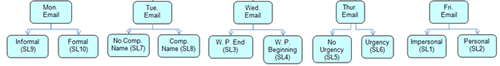
Approach: This test ran 10 subject lines in pairs each day of the week. The same pairs were run on the same day of the week throughout the test to mitigate validity threats. We tested a number of stylistic variations in the subject line to identify the strongest styles and formats.
Other considerations: The test measured the open rate, clickthrough rate, and rate of email recipients that visited the site on the same day (conversion rate).
Email Subject Line Test Structure

Test pairs were determined by style variables:
- Formal vs. informal
- With research partner’s name vs. without
- Word placement (beginning vs. end)
- Urgency vs. no urgency
- Impersonal vs. personal
The Email Subject Lines We Tested
This is how the subject line copy was formatted with the customer–selected information shown in brackets:
1*: SECFilings.com Alert for: [Company Name]: [Form Type]
2: Your Alert for [Company Name]: Form [Form Type] now available at SECFilings.com
3: SECFilings.com Alert: [Form Type] report for [Company Name]
4: [Company Name] Alert: [Form Type] report from SECFilings.com
5: [Company Name] [Form Type] Alert
6: Just Filed: [Company Name] Form [Form Type] on [Form Date]
7: Alert for: [Company Name]: [Form Type]
8*: SECFilings.com Alert for: [Company Name]: [Form Type]
9: You asked us to tell you when [Company Name] filed form [Form Type]
10: Your notification of [Company Name] filing form [Form Type]
* SL1 & SL8 both used the control subject line, due to the variation pairings
Here are examples of how these subject lines would actually read if a subscriber had elected to receive 8–K alerts for Apple:
1*: SECFilings.com Alert for: Apple: 8–K
2: Your Alert for Apple: Form 8–K now available at SECFilings.com
3: SECFilings.com Alert: 8–K report for Apple
4: Apple Alert: 8–K report from SECFilings.com
5: Apple 8–K Alert
6: Just Filed: Apple Form 8–K on 8/26/2008
7: Alert for: Apple: 8–K
8 *: SECFilings.com Alert for: Apple: 8–K
9: You asked us to tell you when Apple filed form 8–K
10: Your notification of Apple filing form 8–K
Results
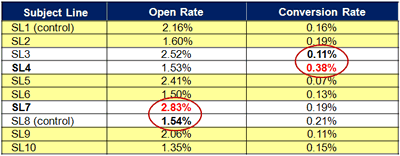 What you need to understand: SL7, an alert that didn’t use the partner’s name, outperformed the control by 84.05% in open rate. SL4, containing alert information and research partner name, outperformed the control by 44.74% in conversion.
Conclusions
Let’s examine how we can use these results to determine follow–up tests.
Two different subject lines gave the best performance for two different objectives. This requires further strategic analysis:
- What is the best objective, open rate or conversion?
- Determine the business impact of each
- Quantify value of the relative increase in open rate and conversion.
- Compare these results to determine the value of highest ROI impact.
Use follow–up tests to optimize further, dig deeper:
- Best Objective: Open Rate
- Test the best subject lines by open rate in each pair against the control to determine the strongest subject line; optimize by testing “from” line.
- Best Objective: Conversion
- Test the best subject lines by conversion in each pair against the control to determine the strongest subject line; focus on body copy elements.
Key Points:
- Keep an eye on objectives when testing. Example: Don’t let low open rates eclipse a higher conversion rate. Focus on prime movers that will increase ROI.
- Use follow–up tests strategically to gain deeper insights, rather than simply testing different word combinations.
- Identify and test distinct variations in headline styles, such as: personal vs. impersonal, formal vs. informal, urgency vs. no urgency, questions vs. declarative statements, long vs. short, headline case vs. sentence case, etc.
Live Optimization: Review of Attendee–Submitted Email Subject Lines
Subject Line #1 –– Original:
Want the Best Prices on Top Kitchen Essentials? Central’s New Catalog Has Them!
Areas to watch:
- Vague offer: “Best prices” could be more specific. Consider a percentage.
- Obvious question: A clear yes. Everybody wants the best price.
- Capitalization: Obvious marketing promotion. Beware of this in emails.
- Punctuation: Exclamation point screams fake enthusiasm and sales hype.
- Length: Could be shorter, more powerful. Don’t try to do too much.
- No call to action: Question followed by declarative statement. Action is implied but not directly requested.
Subject line test ideas:
- Save XX% on kitchen essentials – see our new catalog
- Which of our 43,000+ products does your restaurant need now?
- Rekindle your creativity in the kitchen
Subject Line #2 –– Original:
Accelerate Oracle Applications by 90x
Areas to watch:
- Capitalization: May fit due to product, but test sentence case as well.
- Tone/language: A lot of multisyllabic verbiage in this headline. Try crisp words.
- Punctuation: Not required, but it might add some visual interest.
- Length: Short, compact, and punchy is often good. Test against longer versions to see what audience prefers.
Subject line test ideas:
- How to speed up Oracle applications by XXX%
- Why Oracle applications can run so slow (and how to fix it)
- Fed up with slow systems? Here’s a better way
Live Optimization: Review of Attendee–Submitted Landing Pages
Landing Page 1: OSHA Campus
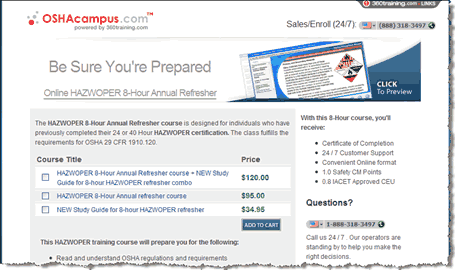
Analysis (Aaron Rosenthal)
- If eight hours is particularly fast, compared to say, 40 hours, to get your certification, then reinforce that and use language like, “half the time” or “one–third the time” with fractions or percentages to drive the point home.
- Also, if this is an optional course, the headline needs to do a better job of pointing out the benefits of getting your certification again. If the course is mandatory, it should do a better job of communicating the difference in getting the certification from you as opposed to another provider.
Analysis (Hunter Boyle)
- The headline, “Be Sure You’re Prepared” has a sense of urgency and implies a benefit, but it could be more specific. Depending on the audience’s highest priorities, you might test language like, “Be Ready For _______” and fill in the blank with top–performing PPC keywords that drive traffic to the page.
- You might also test variations such as a shorter, bare–bones headline (Stay Prepared), against a question (Are You Prepared?), or reduce the image on the right and test a longer headline (5 Reasons To Refresh Your HAZWOPER Certification With Us).
Landing Page 2: Smith Mountain Lake
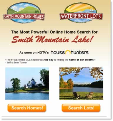
Analysis (Jimmy Ellis)
- I don’t know what the benefit of using this search is compared to anyone else’s, so there’s a lack of credibility.
- The headline states, “The most powerful” – but you have to quantify that if you possibly can, like how many homes or other details that differentiate this search.
- Looking at the total design, to convince people that they should use this search versus another one, you want to just cut the extra steps and get them searching before trying to convince them of something.
Analysis (Hunter Boyle)
- From a design standpoint, we’ve done a lot of research that shows the problems with using competing objectives with equal weight. This page splits right down the middle, from the two logos to the photos and search buttons that are the same color and size. Emphasize the stronger option, or try to consolidate in a way that makes one clear eye path and call to action.
- Also, as Jimmy mentioned, the page requires visitors to take an extra step by clicking through to get to the actual search function. Test putting the search function right on this page, with a selection option for Homes, Lots, or Both, and other important options as needed, or a link to an Advanced Search page. And consider a headline that doesn’t try to pump up the search engine’s power, but speaks to the users’ motivations, such as, “Your Dream Home Is Just A Few Clicks Away” (related to the testimonial quote).
Landing Page 3: fpweb.net
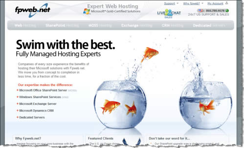
Analysis (Flint McGlaughlin)
- The images may be cute but they are too big. The font in the first paragraph is a problem; the light grey on white can hardly be read. It’s too small, has no bolding, and gets lost in the eye path.
Analysis (Jimmy Ellis)
- First of all, the image has to be of hosting and not of the fish. This is a branding headline that’s trying to make a mental connection that they are the best, it’s actually a web hosting program, but that combination is not doing anything for the customer.
- Move that last sentence in the copy paragraph – “We move you from cost to completion in less time for a fraction of the cost” – up to be the subhead.
- Answer the questions your customers ask, like: How much less time? What fraction of the cost? How are you going to save me the time and money by using your fully managed hosting solutions? Give some quantitative things that tell how your offering is going to benefit the consumer instead of this branding-based headline.
Summary
- The objective of a headline is not to sell, but to reach out and connect with the reader, and pull him or her into reading more.
- 3 qualities of winning headlines: Clarity, Relevance, Credibility
- Don’t hesitate to bend or break the “rules” when testing.
- Keep an eye on your best objectives (open rates vs. conversions) and focus testing on prime movers with the biggest potential ROI.
- Use follow–up tests strategically to gain deeper insights, rather than simply testing different word combinations.
Related Marketing Experiments Reports
- Optimizing Your Headlines: How changing a few words can help (or hurt) conversions
- Site Headlines Tested
- The Power of Small Changes
- PPC AD Copy Tested
- Optimizing PPC part 2
- Optimizing PPC Ads part 1
- Transparent Marketing
Literature Review
As part of our research, we have prepared a review of the best Internet
resources on this topic. Rating System
These sites were rated for usefulness and clarity, but alas, the rating
is purely subjective.
* = Decent | ** = Good | *** = Excellent | **** = Indispensable
- How to get half a million people to visit your blog ****
- How to Write Magnetic Headlines ***
- Writing Effective Headlines ***
- Who Needs Headlines? ***
- This Boring Headline Is Written for Google **
- Passive Voice Is Redeemed For Web Headings **
- Test Shows Promotional Content Beats Informational: 89% More CTRs; 5 Times More Revenue **
- How To Write Great Headlines **
Credits:
Managing Editor — Hunter Boyle
Copy Editor — Frank Green
Contributor(s) — Flint McGlaughlin
Aaron Rosenthal
Jimmy Ellis
Bob Kemper
Andy Mott
Production — Mel Harris
Austin
McCraw
Cliff
Rainer
Amanda Mehlhoff