

On a recent MarketingSherpa webinar, sponsored by Paramore, I discussed statistical analytics techniques with Benjamin Fillip, Data Analyst, MECLABS …
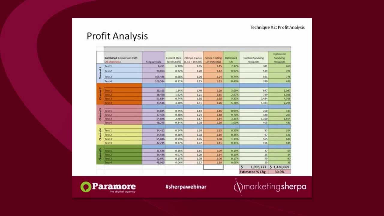
Ben chose the techniques to feature on “Four Techniques to Improve Analytics Based on Customer Knowledge” from his experience working with MECLABS Research Partners. These are the same four techniques the MECLABS team of data scientists typically uses at the beginning of a Research Partnership to help guide testing and optimization.
Be Al Roker, not Tom Brokaw
Recent research in the MarketingSherpa 2013 Marketing Analytics Benchmark Report indicates 48% of marketers are using analytics platforms to customize reports, but only 24% are creating and testing hypotheses.
In this webinar, we challenged you to use analytics like the weatherman, not the news anchor.
Sure, the news anchor gives you an abundance of valuable information … but it already happened. This is analogous to having too great of a focus on solely using analytics to generate reports of what already happened. Sure, that can be helpful, however …
Here’s how Shawn Burns, Global Vice President of Digital Marketing, SAP, explained the challenge in a recent article in Target Marketing, “You’re about as likely to make the news by reading the newspaper as you are to make change by reading a Web analytics report.”
True value lies in determining what is likely to happen in the future – the job of the weatherman.
Using the analytics techniques in this webinar to inform your A/B testing is one way to build a customer theory, understand what your customers want and have a better chance at predicting customer behavior.
Again, I’ll quote Shawn … “The moment you’re able to render two different versions of your website simultaneously and just let your customers select with their mouses what they prefer, you’re literally enacting change.”
Should you watch this webinar replay?
Here is some feedback from the audience to help you determine if you should invest 30 minutes in watching this webinar replay …
“I really liked digging into particular modeling techniques but this was way too brief. I’d like to sit through a much longer session.” – Christine
“I liked the examples of how to use regression analysis.” – Jesse
“Good details but almost too in the weeds.” – Jeff
“Concepts easy to grasp for a non-statistician – I couldn’t begin to set one of these up – but I could easily understand the value of this type of analysis. Thanks for not being too geeky.” – Sandy
“Decision tree exhibits. Selling into board members or CEOs often requires this sort of visual support rather than just regression graphs.” – Jeremy
“I’m not the kind of analytics guy, just trying to understand the minimum. But I was able to understand the content on the theory level, not on a practical level.” – Yassin
“The case study, but that’s more my speed than the statistics. I need to branch out!” – Katie
“I liked the 30-minute sessions. This makes the presenter go straight to the point. As I’m sure, a lot of people are busy. So, short presentations are good.” – Carissa
Related Resources:
A/B Testing: Split tests are meaningless without the proper sample size
A/B Split Testing on Facebook Tabs
A/B Testing: Learn about testing hypotheses from a 200% increase in chocolate consumption
Shopping Cart Optimization: 4 tips from your peers
Customer Theory: How we learned from a previous test to drive a 40% increase in CTR