

“Too long.”
“Get rid of the phone number!”
“Can you remove the fields?”
These are common responses from marketers who attend our Web clinics on lead generation, and they are all excellent suggestions for optimizing lead generation forms.
But what if you’re one of the marketers in an organization where changes to your lead gen form would be an act just shy of declaring war on your sales team?
In this MarketingExperiments Blog post, I want to share the results of a recent experiment presented by Austin McCraw, Ben Huppertz and Ben Filip, all of MECLABS, in which one company generated more leads without significantly reducing the number of fields.
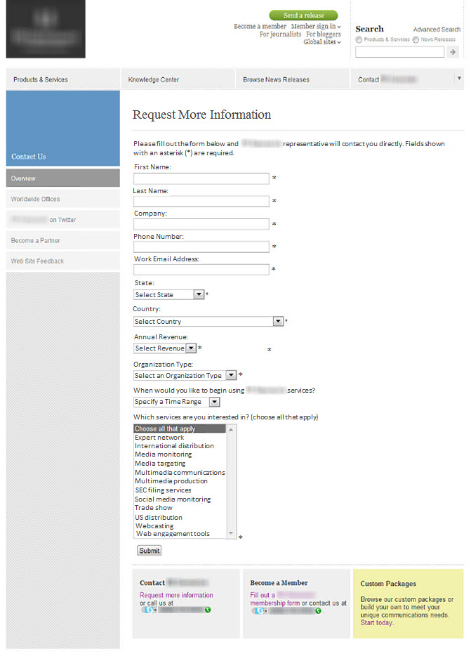
Background: A large news syndication company.
Goal: To increase the overall number of leads on a “Request More Information” form.
Research Question: Which form design will result in the highest number of new member sign-ups?
Test Design: A/B split test
Control

In the Web clinic, Austin explained the control page featured 11 form fields in total with 10 required. The page also had left sidebar navigation followed by three additional calls-to-action at the bottom.
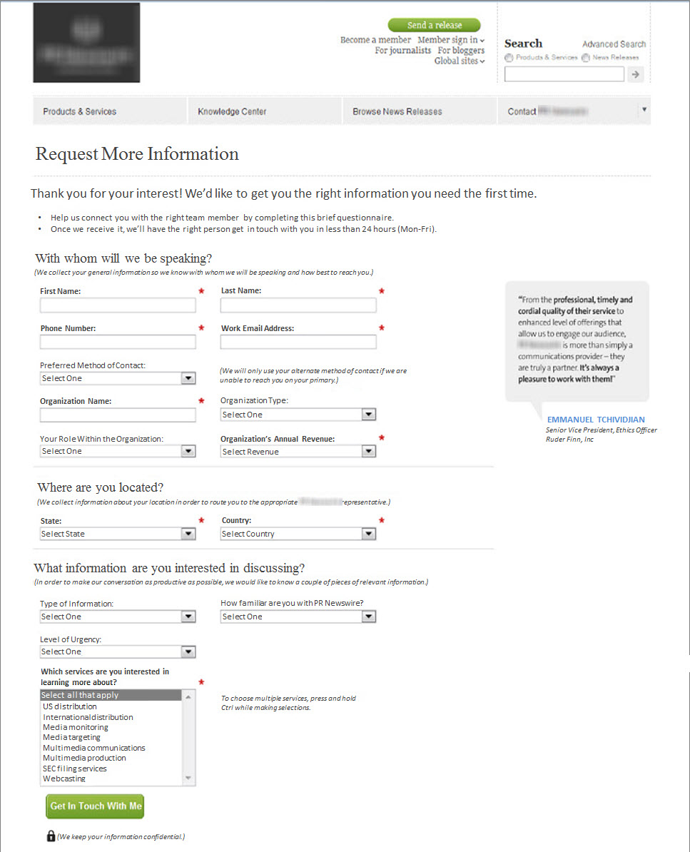
Treatment A

Treatment A added four more form fields for a total of 15 fields (nine required) and eliminated both the navigation and additional CTAs at the bottom of the page. It also added a customer testimonial on the right.
Treatment B

For Treatment B, the form fields were reduced to 10 fields (all required).
Results
Treatment A outperformed both the control and treatment, increasing lead rate 109%.
Austin revealed that by eliminating the navigation elements and additional CTAs on the page, both treatments were able to outperform the control.
But why was Treatment A the winner?
What you need to understand
By guiding the visitor through the form by increasing the process-level value proposition, the research team was able to counterbalance the additional friction in the form and capture higher quality leads without sacrificing quantity.
Editor’s Note: MarketingExperiments defines friction as an element of psychological resistance that impacts the probability of conversion.
“When we considered the objective of the page, our analysts hypothesized that by helping the customer through the form, we could set the expectation for a productive in-person conversation,” Austin explained.
To learn more from Austin and the team about the anomalies discovered in this experiment, including seven questions every marketer should ask themselves about Web forms, you can watch the free on-demand replay of “Optimizing Web Forms.”
You may also like
CTA Optimization: Button copy test increases click rate 95% [More from the blogs]
Landing Page Optimization: Multi-product page increases revenue 70% [More from the blogs]
Online Testing: 3 test options, 3 possible discoveries, 1 live test from Email Summit 2014 [More from the blogs]