

Give a man an optimized landing page and he converts for a day.
Teach a man how to optimize his own landing pages and he can plan, make changes, test, analyze and increase conversions for years to come.
With apologies to Lao Tzu, since that same idea permeates our web clinics, workshops, and research briefs, we wanted to highlight the gains achieved by our B2C audience — and continue the cycle of learning.
Our April 22 clinic featured tests and optimization ideas that yielded increases up to 300%, a look ahead to future test recommendations, and a special audience contest.
In addition to the print–friendly research brief below, you can:
MarketingExperiments Conversion Sequence:
This equation is the central principle behind our web clinics and is covered in depth in our workshops.
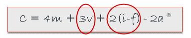 Wherein:
“C” = Probability of conversion.
“m” = Motivation of user (when).
“v” = Clarity of the value proposition.
“i” = Incentive to take action.
“f” = Friction elements of process.
“a” = Anxiety about entering information.
The MarketingExperiments Conversion Sequence expresses the conceptual foundation for the principles of landing page optimization, established by conducting and evaluating experiments across a broad spectrum of industries and products.
A note about sequential testing:
The four organizations featured below achieved their results using sequential tests. This method of testing is a popular option because it typically involves launching a redesign and comparing its performance to past results, and it doesnt require special testing tools or software. However, the potential for certain validity threats is greater than A/B and multivariate testing. In these case studies, the companies took great care to minimize those validity threats in the tests and the analysis.
[We cover this area in much more detail in our Fundamentals of Online Testing on-demand course.]
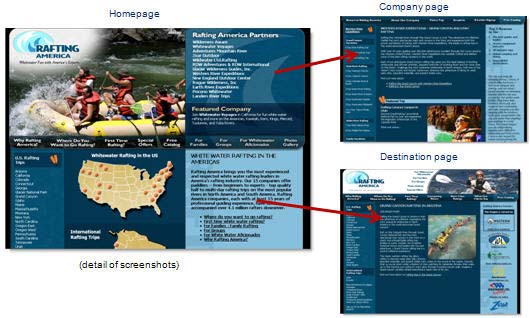
Case Study #1: Rafting America
Background:
This site is a directory that provides news and information about whitewater rafting trips, equipment, outfitters, and more. From the homepage, visitors have the option of visiting pages for destinations and for the 20 outfitters registered with the site.
The problem:
Seventy percent of visitors were clicking through to destination or outfitter content pages, but many were not registering to receive brochures.
The goal:
The site sought to increase the number of brochure requests (to be sent by mail from whitewater rafting outfitters).
Tests conducted by:
Ryan Hutchings, Executive Director, Rafting America
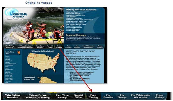
Control (original) pages:
The original page layout did help prospects explore a region theyre interested in or learn more about a specific tour guide or trip. However, the percentage of brochure requests did not meet expectations.
Analysis:
- No clear call to action or value proposition
- Finding the catalog request tab is difficult (friction)
- Registering requires an extra step from prospects (friction)
The page offers many links to more specific information but no single link is prioritized over the others. If the objective of the page is brochure requests, for that objective to succeed, that link must appear more prominently.
Posting questions on a landing page but making prospects click through to another page for the answer may simply reinforce prospect questions and leave them unsatisfied and confused.
Applying the Conversion Sequence:
The goal of the original site design — educating or informing a diverse audience — created a number of different choices, yet this also allowed for too much unsupervised thinking and friction.
Hutchings used the Conversion Sequence to adapt the site to make brochure registration a more prominent option.
In the redesign, the site addressed:
- Probability of conversion
- Motivation
- Clarity of Value Proposition
- Friction
Optimized path:
On the revised version of the page, the company and destination pages use the right-hand column to clearly ask a visitor to fill out a brochure request form. The questions still remain as links on the site but now they supplement a specific action that will contribute to prospects’ greater knowledge of, and interest in, whitewater rafting.
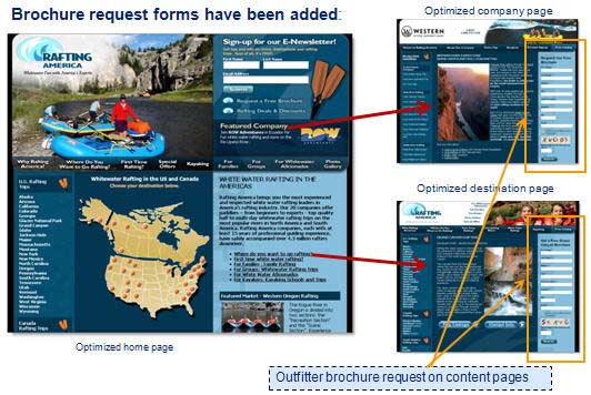
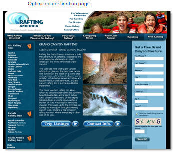
Optimized destination page:
On this page, the form is easily accessible but also emphasizes the sites value proposition. In other words, the form supports the primary content on the page.
Analysis:
The most significant change on the optimized pages was the addition of on-page forms prospects could complete to receive an email newsletter or direct mail brochures. Friction has been reduced by adding a clear call to action.
Additional changes included:
- Company or destination description provide an implied value proposition and credibility for the brochure request
- Pages channel the visitors thought process from a motivation to learn more about rafting trips to wanting the brochure
- Pages eliminate the friction of needing to take additional steps to find a catalog request form
Results:
| Version | # of leads (rounded) |
|---|---|
| Original (2007) | 6,000 |
| Treatment (2008) | 13,000 |
| Relative Difference: | 116% |
What you need to understand: While the site traffic was largely consistent year over year, the changes outlined above contributed to a 116% increase in leads.
Key Point: One of the most effective ways to evaluate your pages is to consider the objective and align all page elements to guide visitors to the intended action.
“The revisions we made helped us see an underlying theme in everything we did, and defined the best way to convince our prospects.” — Ryan Hutchings
Suggestions for future tests:
- Newsletter sign-up, brochures, and deals are all competing requests
- Test distinguishing them more clearly with statements of value proposition
- Test putting the brochure request form on the home page below content that builds the value proposition
Content Page:
- Test a 2-step form (email capture)
- Test vertical eye path
- Test switching to drop-downs on forms wherever possible
Case Study #2: Entertainment.com
Background:
Entertainment.com is an online subscription version of the coupon book offering discounts on a variety of purchases in many American cities.
The problem:
While the established process was working, the participants could see potential for improvement.
The goal:
Radical redesign of the offer page and registration process.
Tests conducted by:
Christina Burke, Marketing Manager, Consumer Acquisition, and colleague Julie McNally, Entertainment.com
Like Rafting America, this site also had to appeal to a diverse audience, introducing newcomers to the offer while providing intriguing information for existing customers.
Control (original) pages:
The name of the product — coupon book — implies the valuable offers within. However, the landing page and the registration path are crowded with information that obscures the benefits of the product.
Analysis:
- Horizontal lines and graphics create eye path that conflicts with vertical
- Are all the form fields necessary? Can they be reorganized to reduce perceived length?
- Incentive and credibility indicators not emphasized
- Little continuity between landing page and registration pages
Applying the Conversion Sequence:
In the redesign, the site addressed three primary elements from the conversion sequence:
- Clarity of Value proposition
- Anxiety
- Friction
Your pages must communicate your value proposition clearly and answer three key questions for visitors:
- “Where am I?”
- “What can I do/get/buy here?”
- “Why should I participate?”
After defining the product, it is also essential to make clear the reasons why the product or offer is the most appropriate choice for your ideal prospect. Introducing the product and the objective of the site are goals that can be quickly accomplished and, in reality, probably take up very little real estate on the page. In optimization efforts, consider how your pages can best address the third question, Why should I?.
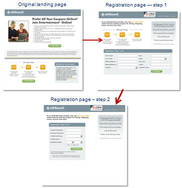
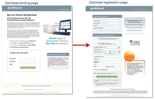
Optimized path:
The optimized pages made the process shorter and easier and, therefore, more clear.
Original registration path vs. optimized registration path:
If the process of moving from step to step in a registration path is not clear, prospects may leave at every new step, causing a loss in conversions.
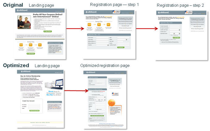
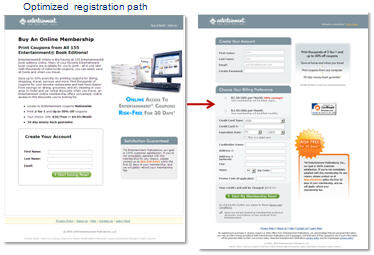
The changes made to this registration path included combining form fields onto one page, changing the image and adding a caption, and emphasizing the 30-day guarantee through graphics and placement.
Optimized registration path:
The changes strengthen and clarify the value proposition with a revised headline, a subheadline, image, caption, and explanatory copy.
Analysis:
Further improvements included:
- Added monthly or yearly payment option
- Moved email capture to first page
- Placed incentive and credibility indicators next to credit card field
Results:
In a sequential test, the optimized treatment increased product registration by 30% and book registration by 21%.
Key Point: Allow a focus on clearly expressing your offer to guide redesign of pages or process flow.
“I was told by so many people that landing page design was simply guess work, but when you learn certain fundamentals to improve any landing page, you don’t have to guess anymore.” — Christina Burke
Suggestions for future tests:
The form on the first page may not be part of a basket recovery process. If you are capturing information on the first page and not using it to recover orders, the information has little value to you and only increases friction for prospects.
Even with the nature of the product clarified, the subhead is meaningless if a customer is not already familiar with the Entertainment Book offer. If a visitor is not familiar with the book, the site may need to answer the following questions:
- What is an entertainment book?
- What are entertainment book editions?
On the redesign, though the headline has no value proposition, the next variation could test a headline similar to the image caption on the right. Other test suggestions include:
- Adding a specific number of coupons customers will have access to
- Test a “true” 30 day free trial.
- Test one price (just annual or just monthly) to see if simplifying decision improves conversion.
- Landing page says ($30/yr or $4.95/month), and order forms say ($2.50 per month or $4.95/month)
- Form call to action could re-emphasize value prop such as Start Printing Coupons Online.
Case Study #3: University of New England
Background:
Compass Knowledge Group attended a MarketingExperiments workshop. One of Compasss clients is the University of New England, an accredited school with undergraduate and graduate programs. This site is directed towards a specific audience: teachers, principals, and aids seeking to achieve higher levels of knowledge and certification.
The problem:
The university’s PPC campaign for a Master’s degree program had been on hold due to low ROI.
The goal:
Redesign the landing page and increase lead capture rate.
Tests conducted by:
Matt Celano, Director of Marketing, Website Conversion, Compass Knowledge Group
Control (original) landing page:
In its original incarnation, this page allowed for a great deal of unsupervised thinking on the part of prospects visiting the page. The ad is for the MSEd degree, while the page appears to offer information about multiple levels of certification, decreasing a prospects motivation and muddying the clarity of the value proposition. In addition, the connection between the PPC ad and the page was lost.
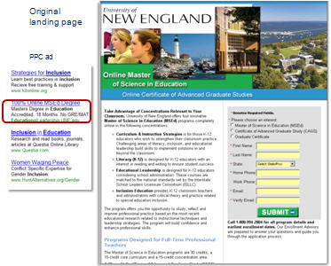
Analysis:
- Header and content are difficult to read and process (friction)
- Unsupervised thinking: purpose of form is not stated
- Long form with required fields triggers high anxiety
- Form call to action offers no benefit (value proposition)
Applying the Conversion Sequence:
Celano used the conversion sequence to design a landing page for a specific segment of this audience.
In the redesign, the site addressed:
- Motivation
- Clarity of value proposition
- Anxiety
Optimized landing page:
The revised page is now specifically focused on the MSEd degree, which is exactly what a visitor coming from the PPC ad searched for.
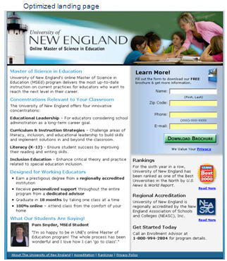
Analysis:
- Form headline, subheadline and button clearly communicate a value proposition: free brochure
- The masthead is more readable, left-aligned and with black text on white background
- The content is highly readable with sub-headings and bolding used to emphasize key terms
- Reduced friction and anxiety in the form by reducing the number and sensitivity of fields
- Credibility indicators, testimonial, and privacy link reduced anxiety
- Removed the confusing choice of certification types in the form
Results:
| Landing Page | Conversion Rate | Cost per Click |
|---|---|---|
| Original | 2.71% | $5.26 |
| Optimized | 4.90% | $2.98 |
| Relative Difference: | 80.81% | -43.3% |
| Landing Page | Clicks | Conversions |
|---|---|---|
| Original | 665 | 18 |
| Optimized | 1469 | 72 |
| Relative Difference | 121% | 300% |
What you need to understand: Optimizing the landing page and increasing its relevance to users reduced cost per click by 43.3% and increased lead volume by 300%.
After making the landing page more relevant to the PPC ad, the site was able to lower its cost per click. This allowed them to turn back on keywords they had previously turned off due to low performance. With those additional keywords, the site saw an increase in the number of clicks received.
Key Point: By increasing the performance of your landing page, you can boost your bottom line in two ways: your increased conversion will yield more leads, and the resulting lower cost per click can also generate more traffic for the same budget.
“What really struck me was being able to run ads and keywords we had turned off because cost-per-lead was too high or click-rates were too low,” Celano said. “The results completely changed the dynamics of that channel for us.”
Suggestions for future tests:
Since one landing page specifically optimized for degree and certificate concentration was successful, possible future tests will create more specific landing pages that have even greater relevance to PPC ads — for example, a photo of a principal instead of a teacher for traffic derived from “principal license” ads.
Other suggested tests include:
- A/B split testing to compare results against the sequential test results and isolate additional factors
- Testing stronger testimonials, single-column design, and an incentive
- “more information” is not a strong enough value proposition
The conversion results of paid search campaigns typically erode over time because of competitive encroachment. However, a higher landing page conversion rate gives you an enormous ROI advantage over your competitors.
Case Study #4: Front Porch Pets
Background:
This ecommerce company provides healthy alternatives to traditional rawhide dog chews and treats.
The problem:
Ads linking directly to the companys product page had low conversion rates.
The goal:
Creation of a specific landing page. The company submitted its first redesign to our web clinic on optimizing PPC ads and continued to optimize that page afterwards.
Tests conducted by:
Brian Borna, Lead Web Developer, Front Porch Pets
Three variations on a page:
The sequence of these pages shows the ongoing optimization process that this site has undertaken.
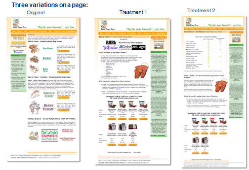
With each iteration of the page, the site sought to promote a variety of products. In the original design, the site focused primarily on displaying that variety. In treatment 1, the first redesign, the site placed credibility indicators near the top of the page. In the second treatment, the site used a features matrix to demonstrate the advantages of their treats compared to traditional chews.
Analysis of treatment 1:
In response to the performance of the original page, the site made changes based on the Conversion Sequence and then submitted treatment 1 to a live optimization web clinic analyzing the continuity between PPC ads and landing pages.
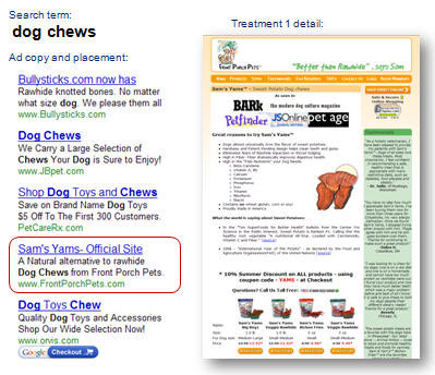
Optimization suggestions from that clinic included:
- Testing a headline for continuity and clarity of value proposition
- Emphasizing product benefits
- Improving credibility indicators
- Refining product display format
While treatment 1 was structured around elements of the Conversion Sequence, in their next redesign, the site focused specifically on increasing relevance.
Applying the Conversion Sequence:
In the redesign, the site addressed:
- Clarity of value proposition
- Motivation
Optimized landing page:
This revision tested recommendations from the live optimization critique. In this treatment there is much greater continuity between the sites PPC ad and landing page.
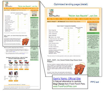
Now, both the ad and the page stress that the treats are all natural. Also, a visitor clicking from ad to page can immediately see the brand name repeated on the page, assuaging any anxiety that she or he might be in the wrong place.
- Added features matrix
- Increased continuity between ad and page, and on page
- Emphasized value proposition of product
Testing sequence:
Borna was careful to emphasize each metric represents two-month averages for the Control, Treatment 1 and Treatment 2. In his report to us he chose months that had approximately the same amount of traffic and that had not seen unusual spikes in traffic due to seasonality media coverage, or other external events.
- Control: Sept/Oct 07
- Treatment 1: Sept/Oct 08
- Treatment 2: Feb/March 09
Results:
| Conversions | Conv. rate |
|---|---|
| Control | 11.53% |
| Treatment 1 | 15.07% |
| Treatment 2 | 20.97% |
| Relative Difference (control vs. T2): | 81.87% |
What you need to understand: Treatment 2 outperformed the control by a relative difference of 81.87%.
Key Point: Use eye path and page elements on your landing pages to create single-page funnels that help prospects move through the decision making process.
‘After applying these changes and seeing the results, we have a clearer vision of what really works and how to prove it with testing.” — Brian Borna
Suggestions for future testing:
Think about the three most important things you want to communicate to the consumer, and then use bullet points to highlight them.
- Remove the box from the headline
- Place a button at the bottom of chart
- The button to shop is orange so it blends in with the top navigation; make it stand out with a different color
- Add subheadlines to the products at the bottom of the page
- Provide a coupon code for a discount at checkout (incentive)
- Radical idea: redesign the entire look and feel to appear more official, like a veterinary site
A complex product offering or a comparative analysis can sometimes be most clearly presented to prospects through use of a features matrix. However, be careful that the features matrix does not diffuse the effectiveness of your call to action. Also, use the criteria embedded within the matrix to emphasize the top selling points of your offer.
Key steps you can take:
- Review your page elements; evaluate whether they contribute to the clarity of your offer.
- Make your primary objective (the action you want users to take) accessible to visitors throughout their exploration of your pages or processes.
- Take advantage of increased landing page performance to revitalize your PPC campaigns.
- View each page as an opportunity for conversion — no single page on your site should carry the whole burden.
- Combine the examples of others with your own knowledge of your site and your ideal prospects to craft specific, actionable optimization plans.
- Use eye path and page elements on your landing pages to create funnels that help prospects move through the decision making process.
- If you are conducting sequential tests, pay close attention to minimizing validity threats posed by traffic spikes, changing preferences over time, and other factors.
Related MarketingExperiments Reports:
- Marketing Blueprint 2009
- Optimizing Offer Pages
- Lessons Learned
- Value Proposition
- Clarity Trumps Persuasion
- Simple Tests, Significant Gains
- Optimizing eCommerce Pages
Credits:
Managing Editor — Hunter Boyle
Writer(s) — Anna Jacobson
Contributor(s) — Hunter Boyle
Jimmy Ellis
Boris Grinkot
Adam Lapp
Production — Austin McCraw
Cliff Rainer
Landon Calabello