

We examine research findings to discover what factors determine the efficacy of online marketing email copy.
Which will perform better, a landing page that has one clear objective or one that has multiple objectives?
As marketers, we are continually faced with the dilemma of determining what to show customer prospects when they arrive at our sites.
Should we present them with just one offer or option, or give them several and let them choose?
In this brief, we use recent research with real-world companies to illustrate 5 fundamental principles of landing page design that will help you answer this question for your own site and pages.
EDITOR’S NOTE: You can listen to a recording of the clinic by using either of the links below.
How does having more than one objective to a page affect its performance?
Email has become an extremely powerful marketing tool. In fact, U.S. firms spent more than $400 million in 2006.
Our research has identified 6 distinct factors of email marketing campaign effectiveness. Not surprisingly, body copy is among the factors with the greatest impact (highest coefficient).
In the first part of this brief, we focused on writing effective email copy. In part 2 we build upon those principles and show you how to optimize your envelope fields and employ the power of urgency.
Case Study #1
Test Design
We conducted an experiment for an online retailer of computer equipment and accessories. The goal was to increase sales by increasing the flow of visitors into their product “configurator.”
A “configurator” is a software-enabled step-by-step process that allows prospects to find exactly the product(s) they are looking for in the shortest amount of time with minimal effort.
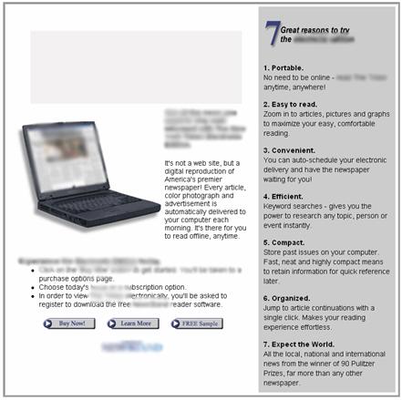
Original Page
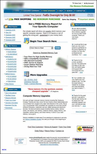
(Some elements of the page have been intentionally blurred for anonymity.)
Notice that in the center column the visitor is presented with two options that are roughly equally weighted.

If the visitor is looking for memory for a computer or a digital camera, there is ambiguity about which option to choose.
Since selecting among ambiguous choices is a potential source of anxiety, we decided to test removing it.
Furthermore, the graphic elements (the yellow arrow, computer box, and people icon in the center column) are not used to draw the visitor toward the primary objective of the page in order to carry the visitor through to the ultimate goal. Also present are some off-page links that take the visitor away from the page and even the site.
And the heavily weighted headers in the left and right navigation columns draw attention away from the primary objective.
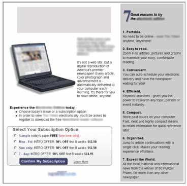
Here is the page as we optimized it:
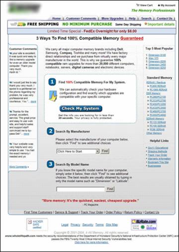
First, we de-emphasized the traditional left navigation by moving it to the far right column. Be very careful about using navigation on a landing page. Eliminate elements that distract the eye path flow from the objective. Less IS more. You could put navigation at the bottom if you have to have it.
We replaced the navigation column with testimonials.
We removed the image headers above each section and added a larger call-to-action button with a drop shadow.
We added a light gray gradient behind the body, enhanced the primary objective in white with a clean border to make it stand out on the page, and add a larger call-to-action button.
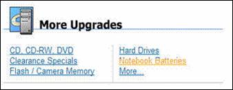
Finally, we removed the “More Upgrades” section.
Results
This is what we discovered:
| Case Study #1 | |
|---|---|
| Landing Page | Conversion |
| Original | 3.61% |
| Optimized | 4.30% |
| Increase | 19.11% |
What you need to understand: Focusing the landing page on the primary objective, the product configurator, increased conversion by more than 19%.
Case Study #2
Test Design
We conducted an experiment for the publisher of a very large national newspaper. The goal was to increase online subscriptions.
The offer page was already well designed. It had a good general layout with a vertical flow, no distractions from the natural eye path, and excellent use of color and shape to guide the visitor to the call to action.
We focused only on the call to action.
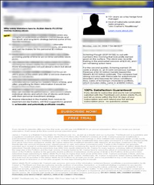
Original Page
(Again, the logo and name are intentionally obscured.)
We were concerned that visitors were presented with multiple equally weighted options and would be stalled by uncertainty about which option to choose:

Furthermore, the “Learn More” and “Free Sample,” buttons led to alternate pages which risked interrupting forward momentum and lengthening the order process.
Here is the optimized page:
Contrast and color are used to add weight and draw the eye to the call to action.
The optimized page is now focused on a single action option: “Confirm My Subscription.”

Note also that by including the subscription option selection here an entire step was eliminated, reducing the number of clicks; i.e., opportunities to abandon the order process.
Here is what we discovered:
| Case Study #2 | |
|---|---|
| Landing Page | Conversion |
| Original | 0.80% |
| Optimized | 1.32% |
| Increase | 65.00% |
What you need to understand: By clarifying the offer and providing only one call-to-action option (button), conversion increased by 65%.
Case Study #3
Test Design
We conducted a 17 day experiment on a large scale paid subscription website. The goal was to increase the click-through rate.
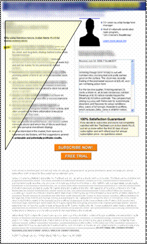
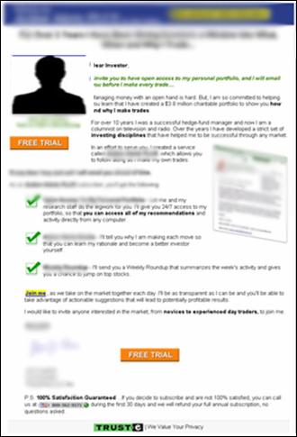
Here is the original page:
Clearly, the objective of this page is a click on either “FREE TRIAL” or “SUBSCRIBE NOW.”
Here we were concerned about three factors. First, as we saw in the initial case study, two equally weighted options without sufficient information to make a decision presented an ambiguous choice, which would cause anxiety and make the visitor pause.
Second, we believed that the two-column body copy design would interfere with the flow of attention toward the call to action, particularly with the prominent photo image at the top of the second column.
Finally, the lengthy block of fine print enumerating the offer terms and conditions, located immediately below the call(s) to action, we believed was a serious source of customer anxiety and so a threat to click-through.
Here is a heat map of the natural eye path for this type of page:

Note the red areas. On the page image below you can see a triangle that represents the hottest spot on most commercial offer pages.
The original design, though, draws attention back up toward the photo and away from the call to action.

Consequently, we designed the optimized page below:
This page has a single objective, presented at both the starting and the destination points. Everything on the page drives toward the primary objective.
Note the vertical flow and that the photo is placed so that it does not interrupt the vertical momentum.
The color and shape of the green checkmarks also serve to draw the eye toward the call to action.
Results
Here is what we found:
| Case Study #3 | |
|---|---|
| Landing Page | Conversion |
| Original | 13.80% |
| Optimized | 22.91% |
| Increase | 66.01% |
What you need to understand: Focusing on one objective and redesigning the page to flow naturally toward that objective resulted in an increase in click-through rate of 66%.
Research Findings: Observations and Principles
5 Key Principles for Maximizing Landing Page Clarity:
- Focus on one objective for each page. Drive everything on the page to that one objective.
- Sales pages should use a vertical flow through the center of the page. For commercial offer pages, vertical single-column body copy through the center of the page consistently performs better than other layouts and should always be tested.
- Left or right columns should be used to support movement toward the objective such as testimonials (to reduce anxiety at clicking the Order button).
- Eliminate elements that may distract eye path from flow toward the objective.
- Remove page elements such as photos and graphic images that do not support the primary objective.
- Use visual elements (size, motion, color, position, and shape) to draw attention toward the call to action.
- Avoid using off-page links. Use passive pop-ups or launch new browser windows when needed to provide details or supplemental decision information. Once visitors have left the page, their forward momentum is interrupted and must be re-established even if they do return.
Here is an exercise you can perform to evaluate your own site. First, print out your landing page. Sit back and look at it. You will see everything in a new light.
Next get an acetate transparency sheet and lay it over your page. With a colored marking pen label your primary objective (Obj.1), then your secondary (Obj.2), etc.
What are your eyes drawn to? What are the elements on the page that capture your attention? You could use a percentage scale and rate how much each element contributes to supporting the primary objective.
If your objective is an email sign-up, then weight that heavily. But you may find that 70% of your attention is drawn to a peripheral graphic, or that critical objectives in a headline are being missed because of banner blindness.
You can take the landing page and acetates and ask others in your office to do the same thing.
Then ask yourself one simple question: Is every element of this page—images, layout, copy—contributing to the primary objective?
Particularly when designing landing pages for commercial offers, it is essential to clearly define your objective and design the entire page around achieving that objective.
As we saw in each of the case studies, establishing the purpose of each page, eliminating competing offers, and removing elements that may impede the flow from arrival to a clear call to action consistently improve page performance.
Keep in mind that simply having a single objective is not synonymous with having a clear objective. Use the 5 key principles and force yourself to identify the central objective for each of your site’s landing pages. Then build the habit of developing every page with one clear objective and making sure every element of the page serves that objective.
So, how does having more than one objective to a page affect its performance? The experiments in this brief are consistent with a large body of research conducted over a long period of time in concluding that pages that are focused on one primary objective significantly outperform those that do not.
Related MarketingExperiments Reports:
- A/B Split Testing
- Conversion Rate Optimization
- Essential Metrics for Online Marketers
- Ideal Subscription Path Tested
- Offer Pricing Tested
- ‘Optimize Your Landing Pages Using Marketing Experiments’
Patent Pending Conversion Formula - Optimizing Landing Pages
- Optimizing Site Design
- Optimizing Subscription Pathways
- Order Process Tested
- Page Weight Tested
As part of our research, we have prepared a review of the best Internet resources on this topic.
Rating System
These sites were rated for usefulness and clarity, but alas, the rating is purely subjective.
* = Decent | ** = Good | *** = Excellent | **** = Indispensable
- Landing Page Optimization—From CTR to ROI ***
- Mequoda Sales Letter Landing Page Scorecard ***
- The Perfect Landing Page ***
- Vocabulary: “Landing page” ***
- Do Your Metrics Measure UP? **
- Generating Traffic: Optimizing Your Landing Pages **
- Get More Visitors Flying to Your Site Using Landing Pages **
- Measuring Landing Pages: What You Don´t Know Would Make A Great Book **
- Where Are Your Visitors Landing? 5 Things Every Landing Page Must Possess **
- Advice on Writing a Landing Page *
- The Importance of Landing Pages on Blogs *
- Landing Page Testing & Tuning
- Optimizing Your Landing Page for Better Conversions *
- Stop the Drift Between Conversions and Sales *
- Top 5 Bad Things about Landing Pages *
Credits:
Editor(s) — Bob Kemper
Writer(s) — Adam Lapp
Bob Kemper
Contributor(s) — Jimmy Ellis
Frank Green
Flint McGlaughlin
Nick Usborne
HTML Designer — Cliff Rainer