

When it comes to how color design affects a site’s performance, simple changes can produce a significant lift.
So, in today’s MarketingExperiments blog post, we’re going to look at how the MECLABS research team used a background color test on a landing page to increase account sign-ups 10%.
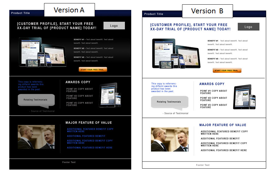
Background: A large sports entertainment provider seeking to increase conversion on its main landing page
Goal: To increase premium account sign-ups
Primary Research Question: Which color scheme will result in a higher conversion rate?
Approach: A/B single factor split test
Control and treatment side by side

The control was a design with a dark background and white text, and the treatment was an almost exact color inverse.
Results

What you need to know
By simply changing the background color to white, the treatment was easier to read and provided greater color flexibility with headlines and secondary information resulting in a 10.66% increase in conversion.
To learn more about this test and how color impacts conversion, watch our free on-demand Web clinic replay of “How Do Website Colors Impact Conversion?”
Related Resources:
Web Usability: Long landing page nets 220% more leads than above the fold call-to-action
Online Testing: 6 test ideas to optimize the value of testimonials on your site
I really enjoyed this post – in fact the majority of your posts on this site! It’s nice to have the empirical evidence condensed into such a short post.
I think more people should carry out tests like this on their own sites. What may look pretty or attractive may not be the most user friendly solution, so why not carry out the experimental and let the data speak for itself.
Hi Gemma,
Thank you for the kind words. I agree. Nothing makes a better argument for change than valid data.
I loved that blog post. Just by looking at the two different color treatments, I automatically chose white. I’m definitely sharing this post with others..thanks!
Woah! very informative post, color plays an important roll in web media.
We did a similar A/B study on our landing page and found an even larger conversion rate (21% increase) with the white background. We are currently in the process of changing our complete website to a white backgroung
Hi Gus,
Thank you for your comments.
Keep us posted on your testing!
Hi john! I have to say that I really enjoyed reading your blog article. The background color of a landing page is very important. A bad landing page background color can mean the difference between failure and success. There are two specific ways that color theory relates to designing a successful landing page:
Contrasting color combinations and readability
Psychological color associations
As a sequel of what you said above I would like to add that driving people to your landing page it’s the hardest part. Apart from the background color, a landing page must – keep the form field as short as possible, use compelling headlines, use a clear and unambiguous call-to-action (CTA). Here are some of our thoughts http://www.nnc-services.com/blog/b2b-marketing/how-to-drive-higher-conversions-to-your-landing-page/.
John, this is golden. Your content is very good and I’ve bookmarked several articles. I am always looking for info on conversions and increasing them on my website. This is a real eye-opener. Thanks!
Jordan.
Hi Jordan,
Thank you for you comments.
I’m glad we could help.
-best,
John Tackett