

Email Marketing: Increase clicks and conversions with obvious links and consistent messaging
Nothing can be assumed when you’re sending an email. You cannot assume recipients know where to click. You cannot assume they realize that the landing page and the email are connected. When you make these assumptions, you’re really hoping the audience will “figure it out.”
But your audience does not want to “figure it out.” Sure, some of them will get it. But others will not realize your image is hyperlinked. Or they will not realize they are on the right landing page, and will leave instead. To avoid this, eliminate what Dr. Flint McGlaughlin, Managing Director, MECLABS, calls “unsupervised thinking.”
This phrase came to mind repeatedly during the Actionable Design Insights session at ExactTarget Connections 2011. After teaching our Email Marketing LEAPS Advanced Practices Workshop earlier in the week at Connections, I sat in the audience on Wednesday to hear best practice advice from Kristina Huffman, Sr. Design Consultant at ExactTarget, and real marketing examples from Laura Schraeder, Email Marketing Specialist at Helzberg Diamonds.
Below are just a few of the many takeaways on email design highlighted during the session:
Consistently brand your channels
There is much research indicating that landing pages must reinforce the tone, messages, and branding of the channels that drive their traffic. Doing this comforts visitors, communicates that they’re on the right page, and makes them more likely to convert.
This applies no matter where the landing page is hosted. For example, Schraeder noted a campaign her team ran to encourage more of its email audience to follow her company on Facebook, Twitter and YouTube.
“A lot of companies will do ‘like us and we’ll give you 10% off,’ or give some kind of offer. We have some constraints on our business that do not really allow us to do offers like that,” Schraeder says. “We racked our brains for offers, and then we just realized that people like our jewelry. That’s what they want to see. That’s why they subscribe to our emails, so let’s just stick to what we know and what we’re good at.”
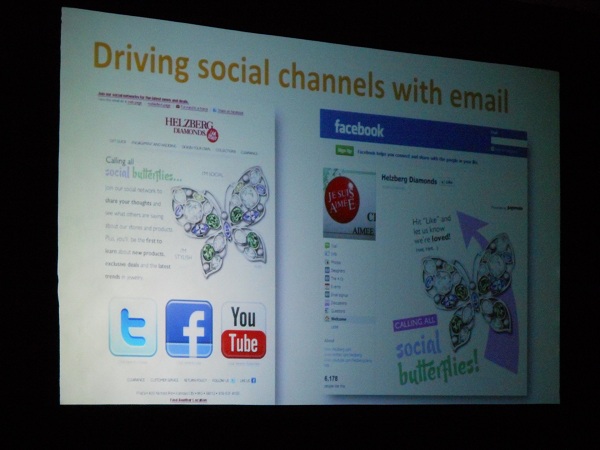
Below, to the left, you can see a grainy image of the email from my admittedly terrible camera, taken during the presentation. The email’s headline reads “Calling All Social Butterflies.” Its copy encourages recipients to follow the brand in social channels where they can share their thoughts, see what others are saying, and see the newest products and deals.
–

–
Notice the large image of the butterfly jewelry in the email. It is also included on the Facebook landing page for this message (clearer image below).
–

–
This email drove a more than 600% increase in Facebook followers for Helzberg Diamonds in a single week.
“We stuck with what we knew, we stuck with the jewelry and let that speak for itself. So the actual insight from this is to not let the channel overpower your message … Stick with what works for your brand,” Schraeder said.
–
Make buttons even more obvious
Buttons can get lost in sleek email designs, blurring into the background and imagery. It can be helpful to add a small touch to make them more obvious.
For example, Schraeder shared an email test her team ran (grainy image included below). As you can see (maybe), the first email included two regular buttons, and the second email included buttons that had small triangles to enhance their clickable appearance.
–

–
CTR on the first email:
- Button one: 13.6%
- Button two: 4.0%
CTR on the second email:
- Button one: 17.1%
- Button two: 4.9%
“From this test alone, it increased our clicks by 25%, going from the plain button to a button with the arrow,” Schraeder said.
—
Make clickable elements obvious
Again, you cannot assume anything, and you definitely cannot assume your audience knows where to click. If they have to take time to think about how to take action, you are losing them.
“You really have to let your users know where you want them to click… If they don’t know where to click, then they’re not going to clickthrough and buy. So you want to make sure you’re using visual cues to indicate that clickability,” Schraeder said.
Three best practices Huffman shared for making your links more obvious:
–
1. Basic blue links for text
The classic blue and underlined hyperlink is the most effective design for a text link. Everyone intuitively knows that it is clickable. However, some marketers, Huffman noted, have their hands tied by branding guidelines that force them to use other styles.
“If you style guide indicates something different, I could encourage you to test it and to let the data speak if you do have to have that battle,” she said.
–
2. Borders on images
Even adding depth to an image by giving it a shaded border can help communicate that it is clickable.
“We have found in testing that image with borders around them look more clickable … and are going to get a little more attention,” Huffman said.
This, of course, does not apply in all situations, Huffman said, such as for emails that are entirely based on a single, large image.
–
3. Play buttons on videos
Image-based links to videos have been shown to attract more clicks when they look like an embedded version of the clip. They should include a large, triangle-shaped play button in their center, Huffman said.
–
Related Resources:
Final Week for Entries: MarketingSherpa’s 2012 Email Marketing Awards
Email Marketing: How Microsoft increased product engagement using email
Email marketing: Improve conversions with better landing pages
Email Test: Shorter copy brings 100% more total clickthroughs
–