

In today’s Web clinic at 4:00 p.m. EDT – “The Usability Myth: 4 surprising discoveries we made after testing the most common usability principles” – Flint McGlaughlin, Managing Director, MECLABS, will seek to use our research to answer your usability questions, such as:
- What is Web usability?
- How does it relate to conversion optimization?
- How can it be useful?
- How does it get in the way of true conversion optimization efforts?
But first, we wanted to learn some Web usability insights from the MarketingExperiments community …
Watch users interact with your website
Until you see users interact with your site/app, you can’t know for sure where usability pitfalls lie. That might sound like a no-brainer, but many people forget that. It’s always an eye-opening experience. Remote usability does work well especially if you can see the particpants’ expression (webcam) and mouse movements/keyboard entry.
– Nancy McCrave, User Experience Designer, Catalyst
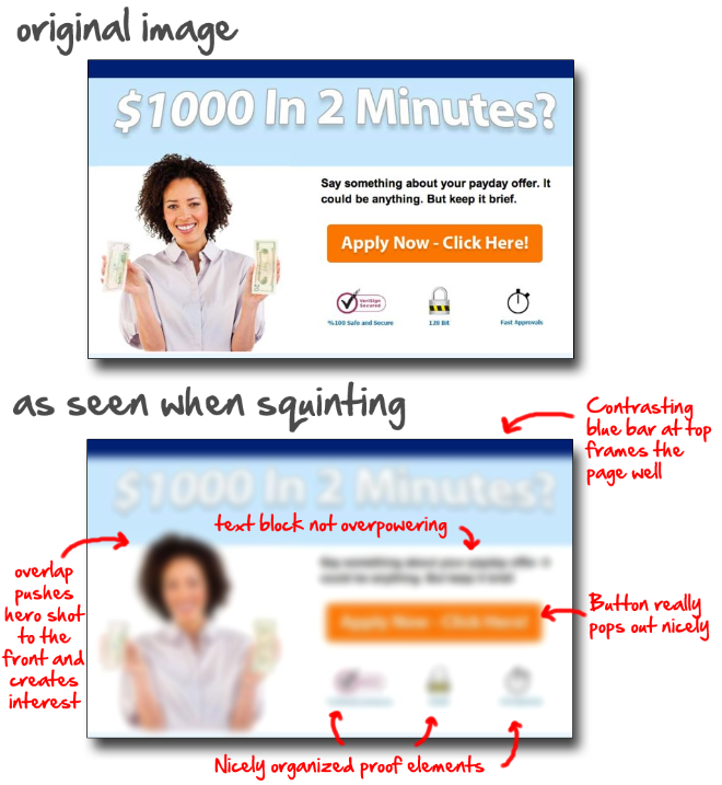
The Squint Technique
I use something I call the “Squint Technique” for quickly testing page layout.
Squinting allows you to see the layout and the major elements – hero shot, call-to-action, buttons – without being distracted by the details to see if your new page is laid out well and has a clear eye-path.
Here’s what I mean:

You can see how the squint technique helps you ensure that your new page or pop up is laid out well and has a nice clear eye-path down to the call-to-action …
Also, use heat maps to see how users interact with your page. I used to use crazyegg.com for this when I was cranking out the SEO sites. Then I switched to a WordPress plugin for it. Currently, I’m not using heat maps on my [landing pages], but I really should.
– Corey Bornmann, Founder, AffPortal.com
Basic usability standards
I’m stunned by how many sites still don’t meet basic usability standards. I just visited a site that was white text on black background, and all the main navigation links were in italics to boot!
How many sites make it impossible to find a phone number (or any contact details), or the site search box?
And, how many still contain calls-to-action that instruct the user to find a link (e.g., “click on the link at the top of the screen”), as opposed to just providing it right there?
– Philippa Gamse, Professor of Digital Marketing and Social Media, Hult International Business School
Make it easy for the customer
Usability improvements to any interface can have substantial ROI impacts. If people can find what they are looking for easily and move through transactions seamlessly, you’ll have a pleased customer, who is more likely to return in the future and recommend your service to others.
– Jill Hewitt, User Experience Designer, Catalyst
Related Resources:
The Usability Myth: 4 surprising discoveries we made after testing the most common usability principles – Wednesday, March 27, 2013, 4:00 – 4:35 p.m. EDT (20:00 – 20:35 UTC)
Online Testing: 6 test ideas to optimize the value of testimonials on your site
Landing Page Optimization: 262% increase in lead rate
A/B Testing: Changing 3 words results in 43% increase in funded accounts
Homepage Optimization: Further test ideas for a page that converts 4 times higher
I really enjoyed the simplicity of these test – Particularly the quint test and watching someone interact with your website. So simple yet so effective.
And Philippa I am completely with you – It still astounds me how such obvious usability hindrances are still being used!
Among other things, I’ve used the squint technique for basic elements, and it works pretty well. Or, if I’m working with a group of people and a printed version of the site, I flip the page upside down. Once they stop reading the text, they see what really stands out. And sometimes, the answers surprise us all.
There is no better tool than market research. Having someone use your site and then give you feedback is a great way to improve. If you do it enough, you will be left with a really amazing experience, rather than just a website.
I have never heard of this. I have seen other tests where they rate viewers eye movement almost like a heat sensor on the page. The squint test however, is very simple and it seems like it would be a very effective way to test. Thanks for the insight!
I’m an artist and this is common technique used when picking up the important lighting elements in a picture. I’ve never though of using it for ad creation though. Thanks for sharing.
This method basically forces your eyes into a sort of bottom-up low vision salience mapping. Your eyes do this automatically normally as the scene in front of them changes . As the designer you could use this method as a impromptu “heat mapping” but you still have make sure as the creator or business stakeholder that you are viewing through “user lenses” with a users task.