

If we had used “638% gain” in this clinic’s title, would you have believed it?
One of our featured B2B marketers actually removed that gain from his website because many prospects didn’t buy it. The clients that saw the gains reported no such issues.
Our second “Success Stories” clinic put our B2B audience in the spotlight, with four new case studies showing how marketers are increasing ROI by applying the Conversion Sequence to their websites, PPC and email campaigns.
This research brief reviews those strategies and gains, includes recommendations for future tests, and distills the takeaway ideas to help you earn your own bragging rights.
In addition to the print–friendly research brief below, you can:
MarketingExperiments Conversion Sequence:
This equation is the central principle behind our web clinics and is covered in depth in our training courses and workshops.
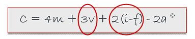 Wherein:
“C” = Probability of conversion.
“m” = Motivation of user (when).
“v” = Clarity of the value proposition.
“i” = Incentive to take action.
“f” = Friction elements of process.
“a” = Anxiety about entering information.
The MarketingExperiments Conversion Sequence expresses the conceptual foundation for the principles of landing page optimization, established by conducting and evaluating experiments across a broad spectrum of industries and products.
Each of the following four case studies demonstrate how marketers applied the Conversion Sequence according to their specific optimization needs.
A note about sequential testing:
Three of the four organizations featured below achieved their results using sequential tests and improvements. This method of testing is a popular option because it typically involves launching a redesign and comparing its performance to past results, and it doesn’t require special testing tools or software. However, the potential for certain validity threats is greater than A/B and multivariate testing. In these case studies, the companies took care to minimize those validity threats in their analysis of the results.
[We cover this area in much more detail in our Fundamentals of Online Testing on-demand course.]
Case Study #1: Thread Logic
Background:
The problem:
While the established process was working, the company sought to improve its ability to educate customers about the logo design and submission process.
The goal:
To implement a logo submission form and logo evaluation process.
Tests conducted by:
Jeff Taxdahl, CEO, Thread Logic
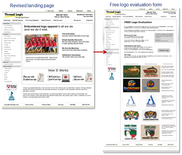
The sequence: from landing page to logo submission form:
In Jeff Taxdahl’s experience, customers seeking logos experienced both anxiety and friction. Having a custom logo made is, for most businesses, a very rare process. Prospects did not know how the logo submission process worked and could not always imagine how their logo would transfer from paper to cloth.In response to receiving many customer questions, Taxdahl implemented a free logo submission process. He also believed that the process might act as a type of lead generation for his company.
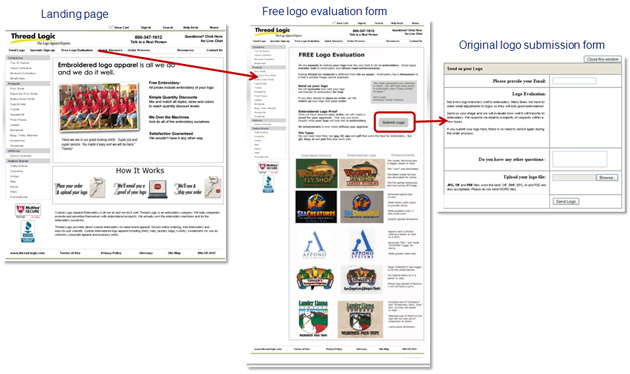
Prospects that came to the landing page could click on the free logo evaluation link and then fill out a form with additional questions about the process of logo submission, adaptation or creation. While the link almost immediately attracted traffic, Taxdahl and his team were not satisfied with the quality of responses they were receiving from the form.
From form to email:
Optimization efforts began through changing the logo submission form to a personalized email.
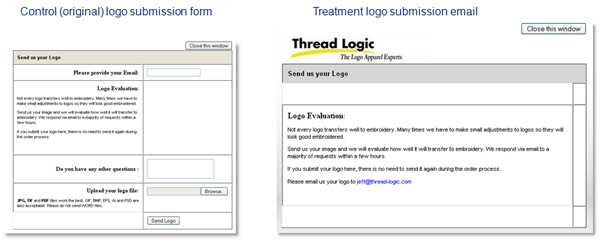
As previously mentioned, the control form eases anxiety by offering prospects the opportunity to send a logo, ask additional questions, and upload their logo.In the treatment, instead of filling out a form, prospects send an email with their logo to a personalized address. It would seem as though the email process includes more effort on the part of the prospect and therefore increases friction but the results tell a different story.Results:
| Version | Avg. unique visitors per month | Avg. logo submissions per month | Conversion rate |
|---|---|---|---|
| Control | 4,995 | 273 | 4.06% |
| Treatment | 4,805 | 404 | 8.40% |
| Relative Difference | 106.8% | ||
What you need to understand: The treatment outperformed the control by a relative difference of 106.8%. The significant change was replacing the form with a personalized email.
One of the core principles taught in many of our clinics is that prospects prefer to make a personal connection before engaging in a transaction. The email’s higher conversion rate suggests that a more familiar, more personal approach has a significant impact on easing anxiety. Personalization counterbalanced the inconvenience of the effort prospects would have to make to email a logo.In addition, the personalized form created an unexpected benefit. As Taxdahl said, “People won’t write a message on an anonymous form but they will write a message to Jeff. The personalized email encourages them to provide more information and that, in turn, helps us provide better information back to them.”In other words, because the site received more fulsome information from prospects, the quality of their customer service increased and that had an impact on the number of orders.This initiative, and its resulting success, came in part because Jeff Taxdahl and his team re-evaluated the definition of conversion. When they stopped identifying conversion only in terms of making a sale, the team was able to focus on developing lead generation aspects of the site.In Taxdahl’s words, “It was through one of your seminars that I began defining conversion in a different way. Before I only considered a sale as a conversion. But if we can give people an opportunity to engage us at no cost and if we do well and respond intelligently, then that is a form of conversion and maybe the next step will be placing an order. We are still converting about 40% of these free logo submission requests into orders.”Key Point: Ensure that your lead generation efforts are open-ended conversations that provide you with opportunities to increase your lead quantity and your quality of service.Suggestions for future tests:
- Make a distinction between submit logo and free logo evaluation
- Test a different call to action button: color and text
- Test placement of call to action buttoncolorful images below cta distract
- Images need headline: “samples,” or create samples page
- Limit bold text
Our team recommended that future tests of the logo evaluation form measure how to express the offer most effectively, through both copy and examples.
Case Study #2: Senior Market Advisor
Background:
Wiesner Media is a publishing company producing a variety of industry-specific magazines dedicated to serving the information needs of business decision makers and financial service providers.
The problem:
Email and internet subscriptions were declining for Senior Market Advisor, a magazine serving financial service providers working with an older demographic.
The goal:
The site sought to increase the subscription rate by redesigning their landing page.
Tests conducted by:
Sarah Frazier, Director of Production and Circulation, Energy Central (previously VP, Circulation/Digital Intelligence, Wiesner Media) and Joe Haddock, VP, Summit Business Media
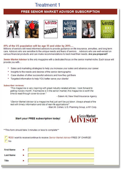
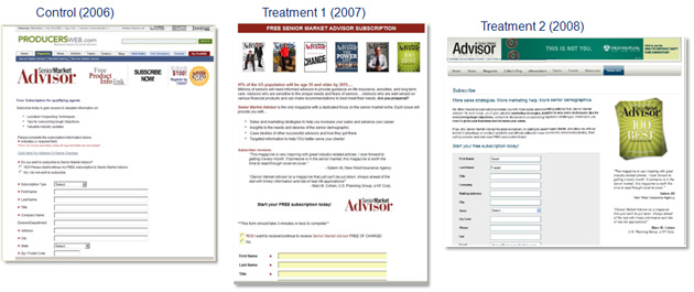
The first iteration:
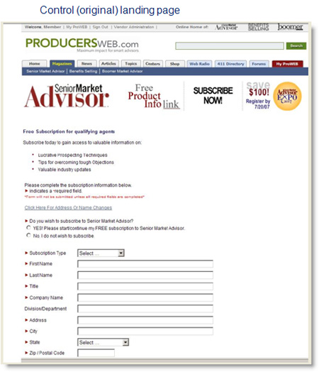
2006 landing page design:
One of the first things our analysts pointed out was the fact that the Producer’s Web headline at the top of the page probably made prospects seeking Senior Market Advisor uncertain whether they were in the right place. Additional friction came due to the landing page’s long form field section. While the multiple fields were required to determine which subscribers met the magazine’s criteria, the magazine’s low subscription rate indicated that prospects were deterred by all the friction on the page.
Analysis:
This page is focused entirely on qualifying subscribers and capturing their information and gave little support for the value proposition of the offer: what prospects will GET.
- Form length creates friction
- The yes/no option is unnecessary
- Both renewing and new visitors get the same options (change of address, no pre-populated fields)
The second iteration:
2007 landing page design:
In the redesign, the page had more supporting graphics, gave more information and shortened the form.
Analysis:
This page expresses the value proposition much more strongly through headline, magazine covers, and intro paragraph. Other page elements have also been improved:
- Testimonials support the value proposition and reduce anxiety about the credibility of the offer
- Shorter form reduced friction
With this improved treatment, subscriptions stopped declining but they remained flat.
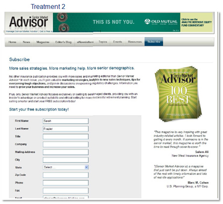
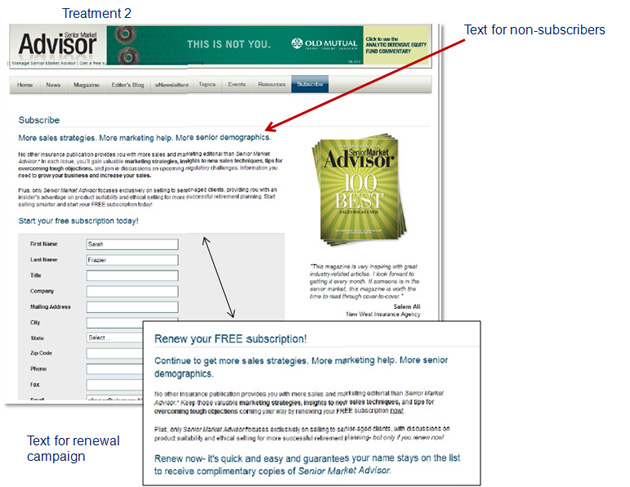
2008 landing page design:
In 2008 Sarah Frazier and Joseph Haddock attended a MarketingExperiments Landing Page Optimization Workshop. In mid 2008 they launched a new page with design inspired by Conversion Sequence principles.

While this page was accessible through many channels (links on partner pages, banner ads, email), the renewal page is only accessible via a link in the email. Frazier took away from the LPO the idea to tailor the top message on the page according to the marketing angle of the campaign.
Another strategy visible on these pages suggests that separating your value proposition and calls to action from the supporting copy can be an effective way to mirror your visitor’s thought process.
Landing page timeline:
Results:
In the first four months after its implementation, treatment 2 outperformed treatment 1 with a 21% increase in net subscriptions for email and internet.
In an interview, Frazier explained the value of this increase to the company, “This increase over this four-month period represents an $8,000 savings to us that we didn’t have to spend on more expensive mediums, like telemarketing.”
Analysis:
The ability to customize the expression of this page’s value proposition based on prospect motivation is essential to this page’s effectiveness.
In addition:
- Continuity of message from email campaign strengthens the value proposition for repeat subscribers
- Shortened primary copy and a narrower column reduce friction
- Clear headline, sub-headline, and call to action reduce friction
- Strong graphic on the right may skew eye path
- Ad and navigation in header distract from page’s objective
Suggestions for future tests:
- Strengthen the headline for prospects (“Subscribe” does not communicate value)
- Test breaking up the copy into short bullet points and paragraph text to make it even easier to process “at a glance”
- Test a two-step form, where you substantially reduce friction by only capturing a sub-set of the information that will allow you to re-market to those that don’t complete both steps
Key Point: Look for effective ways to sequence your customers’ thought process, such as customizing your message and keeping your form fields to the minimum required.
In B2B marketing, a certain amount of expertise and intention on the part of the prospect is often assumed. A trained financial advisor seeking a subscription to a financial publication is, after all, not your casual shopper. However, simply because prospects are professionals looking for goods and services that support their work initiatives does not mean that page design can afford to be any less vigilant regarding unsupervised thinking. Regardless of the professionalism or experience level of your audience, your page must offer structure to your visitor.
The second case study followed the development of an established landing page over several years. Marketers who are working with a number of pages or wearing many hats within a small organization must often take optimization at a slower pace, but the persistence does pay off.
Case Study #3: Clixo
Background:
Clixo is an internet marketing agency based in Denver, CO, focused on strategic search engine optimization. Their client, BlueFolder, an award winning software service, offers free trial sign-ups that are then converted into sales by their sales staff.
The problem:
The site was experiencing a low conversion rate (5%) on their free trial sign-up page.
The goal:
The site sought to increase conversion without increasing their ad spend.
Submitted by:
Matt Dombrow, Master of Clickability, Clixo
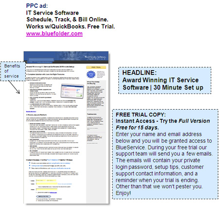
Original homepage:
When BlueFolder first partnered with Clixo, they asked the agency to review this landing page’s performance while Clixo was engaged in the discovery process about overall aspects of the site.
The keywords for the PPC campaign included: scheduling software, work order software, IT service software, help desk service software, IT scheduling software.
Homepage:
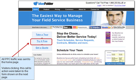
All traffic from all sources came to this free trial page, whether it was from IT departments, sales, or other services. One of the first things Dombrow noticed was the free trial form had a different URL from any of the channels. Instead of Blue Folder, the URL read Blue Service.
Homepage and free trial sign up form (control):
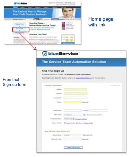
Analysis:
Because the homepage is not designed for the specific objective of getting new free trials, the free trial offer competed with every other element presented on the page. This caused friction, reducing the number of people that clicked through and the potential to get additional free trials.
This offer, like the free logo evaluation from Thread Logic, suffered from a lack of clarity about details and deliverables.
- The free trial form page leads with “The Service Team Automation Solution” and does not mention free trial
- The actual form is labeled “Contact Information” causing anxiety. Why do you need to contact me for a free trial?
- Additional info and fields are included that could be removed or relocated later in the process to reduce friction and anxiety.
Control vs. treatment:
In the redesign of the site’s free trial form, Dombrow’s team focused on several elements of the Conversion Sequence.
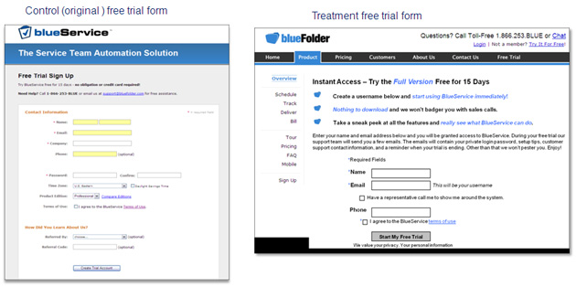
- Clarity of Value Proposition
- Continuity (a subset of Value Proposition)
- Friction
- Anxiety
After the redesign, the headline had direct connection to the call to action on the homepage. Revised intro text explained the trial and the reasons prospects might receive any further communications from Blue Folder, additional text which reduced anxiety.
Other friction-reducing efforts included cutting 11 form fields to just three, making the sign up process feel much more like a free trial and less like a full scale registration for a significant commitment. Also helpful in easing friction and anxiety was changed button text: “Start My Free Trial” feels much more free than “Create Test Account.”
Results:
| Conversions | Unique visitors | Free trial sign ups | Conversion rate |
|---|---|---|---|
| Control | 256 | 130 | 4.89% |
| Treatment 1 | 1884 | 180 | 9.55% |
| Relative Difference | 95.29% | ||
What you need to understand:Treatment 1 outperformed the control by a relative difference of 95.29%. This yielded record paid subscription sales without an increase in paid search spend.
The next step was the creation of targeted landing pages.
After this test, Clixo completely revamped Blue Folder’s PPC campaign. Previously, all keywords directed visitors to the “general” homepage of the site and IT-related keywords had not been strong performers.
Dombrow and his team created a linear path with a targeted landing page specifically for IT prospects. Keywords included: IT service software, help desk service software, and IT scheduling software.
Targeted landing page:
Having a dedicated landing page completely removed a step in the process so 100% of traffic went to this page instead of having to go through the distractions of the homepage.
Analysis:
- Headline leads with primary keywordsincreased relevance with the landing page when customers click (Service Software)
- Lead with “award winning” service which has more credibility and supported in the right nav
- No extra nav, extra elements, or distractions from starting your free trial on the page
- Free trial form embedded at bottom of the page (no additional clicks needed)
Results:
Directing keyword-specific traffic to a dedicated landing page increased the conversion while it decreased the ad spend. While this concept might seem elementary, a recent landing page survey conducted by MarketingSherpa indicated that only 41% of B2B sites actually use dedicated landing pages.
However, if your site currently relies on its homepage, how do you decide where to begin in the creation of dedicated pages?
| Conversions | Conversion rate | Cost per conversion |
|---|---|---|
| Control (homepage) | 2.99 | $305.15 |
| Treatment (Targeted landing page) | 10.58 | $80.45 |
| Relative Difference | 254% | -73.63% |
What you need to understand:The targeted landing page outperformed the homepage by a relative difference of 254%.
Key Point: Let low-performing keywords from PPC traffic directed to your homepage guide the creation of targeted landing pages.
Dombrow and his team turned a weakness of the site into strength. They recognized that their client’s offer had value to an audience that its inefficient keyword-to-homepage campaign had not reached. Rather than ignoring low performing keywords, they sought to create a channel that made a direct, relevant connection between search terms and Blue Folder’s specific offer.
As Dombrow said, “Working with BlueFolder taught me the power of micro-segmentation. Selecting targeted keywords and creating highly targeted landing pages allowed me to really get into the head of the specific prospects we were attracting from paid search. This level of intimacy led to conversations that convert.”
Developing conversations with your prospects is also the focus of the fourth case study.
Case Study #4: BuzzBuilder Pro
Background:
This company provides automated lead generation and lead tracking software for salespeople. One aspect of their service is lead generation focused email campaigns that help sales set appointments with C-level prospects.
The problem:
Their client Ceridian, a company offering HR and Payroll software, was using this email lead generation tool but had a low open and response rate.
The goal:
The site tested subject lines, first sentences, and an email series.
Tests conducted by:
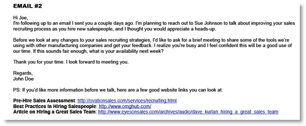
Jake Atwood, CEO/Founder, Ovation Sales and BuzzBuilder Pro
This email came from an email campaign created by a Fortune 500 company, Ceridian. Their company offers HR and Payroll software and they were targeting CFOs and VPs of HR for the mid-market (companies between 500-5,000 employees).
Atwood reported that sales reps from Ceridian were very discouraged about the efficacy of email as a lead generation tool. Many of them said, “I don’t bother sending emails. Nobody ever responds. It’s a waste of time.”
First email (control):
This email was written by the marketing department at Ceridian.
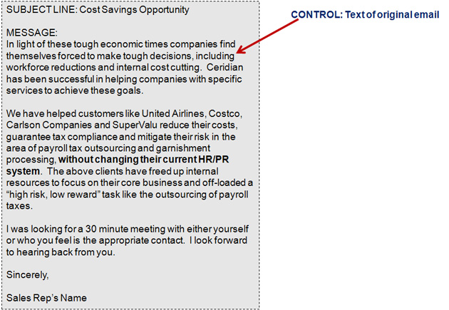
- Open rate: 6.5%, Response rate: 4.2%
This email text does not begin a conversation with prospects. The first paragraph speaks generally of tough times and other companies but does not directly address any issues the company Ceridian is trying to contact might have.
Ceridian misses an opportunity to state a clear value proposition, instead focusing on Ceridian’s own strengths. While the mention of Fortune 500s that Ceridian has worked with might create name recognition, in this framework, name-dropping alone does not create third-party credibility. Finally, the passive voice in which the email is written does not compel emotion or response.
Second email (treatment 1):
In their first test, the team looked for ways to improve open rate and response rate:

With the redesign, the team addressed the following elements from the Conversion Sequence:
- Clarity of value proposition
- Friction
- Incentive
The first body sentence was influenced by Cialdini’s Law of Social Proof: referencing people known to the prospect would increase interest in the email. In an interview, Atwood mentioned a recent Gartner Group study identifying that in our current economy, an average of eight people are involved in any business decision. Ceridian had three people involved in making a decision about using their services: the CEO, the CFO, and the VP of human resources, so the email copy referenced those three key decision makers.
In addition, the links at the bottom of the email provide a subtle way to track prospect interest and give sales a way to nurture long term leads.
Contrast the first sentences in each email to see the difference in tone and message.
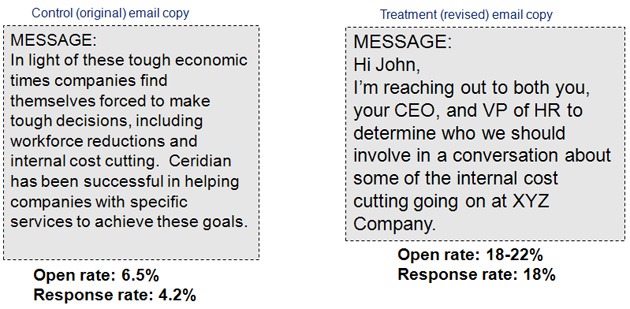
As Atwood said, “I applied MarketingExperiments’ landing page optimization concepts to my emailstripping the text downso that instead of offering competing benefits that gave prospects an excuse to delete, I focused my message around a core problem of interest to the prospect.”
When full names are available, actual names of people in CEO, CFO, and VP of HR positions can be inserted in the email. This addition would make the second email even more of a beginning of a personal conversation between the sender and the recipient.
Jake Atwood also pointed out that in this age of increasing technology and availability, marketers must consider the medium through which many prospects will receive the message. Most CEOs who are checking email are doing so on a Blackberrydevices where users have to scroll down a lotso it is particularly important to engage readers in the first sentence.
Third email (treatment 2):
Seeking ways to enhance credibility and establish a personal connection, Jake Atwood and his team developed a “teaser” email sent prior to the primary message asking for an appointment.
The subject line for the teaser email: “[Company Name] Company Conversation.”
Note: Both emails featured in this case study are examples, not copies of actual emails.
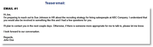
The “teaser email”:
- Begins name recognition for the sales rep
- Confirms that the email is sent to a decision maker
- Creates curiosity and anticipation regarding the primary email.
Now, instead of a single email, the team developed an email series: first, the “teaser” and then, the second “primary” email. The primary email subject line: “Meeting regarding [Company Name] Company”
This second test retained some of the features of the previous test, including the bottom links, but added explanatory copy to the links for clarity.
Results:
| Version | Open rate | Response rate |
|---|---|---|
| Control (original primary message) | 6.5% | 4.2% |
| Treatment (primary messages/2nd email in series) | 48% | 31% |
| Relative Difference | 638.4% | |
What you need to understand:The treatment outperformed the control by a relative difference of 638%.
The sequenced emails involved prospects in a conversation in a gradual and respectful manner. They prepared the ground for contact so that when it came, it was not seen as an interruption but an expected connection from a familiar source.
“A series of email messages produces more than four times the results of a single blast,” said Atwood. “People don’t want a relationship with a company. They want it with another person.”
Atwood and his team also found that they would occasionally send emails to the wrong people or be mistaken in identifying a problem a prospect’s company might be experiencing. However, when that happened, the people they did contact via the teaser email would contact them to correct the mistake. And, in that case, these “corrective” conversations were opportunities for the sales staff to develop new leads.
Key Point: Apply the theory of landing page optimization to lead generation. Answer the three primary questions: Where am I? What can I do here? Why should I do it?
“By applying this thought-sequenced approach to generating leads through email, we’ve had clients experience upwards of 500% increase in response rate and conversion,” said Atwood. “I used to put it on the website but I don’t anymore because nobody believed it.”
– Jake Atwood
Key Takeaways:
- Look for ways to talk with prospects that allow you to discover more about their needs and provide increased quality of service.
- Approach low-performing keywords or site elements as potential areas of opportunity, not simply items to be deleted or replaced quickly.
- When working with different mediums (email vs. content pages), test how different aspects of your value proposition resonate with specific audiences.
Related MarketingExperiments Reports:
- Marketing Blueprint 2009
- Optimizing Offer Pages
- Lessons Learned
- Value Proposition
- Clarity Trumps Persuasion
- Simple Tests, Significant Gains
- Optimizing eCommerce Pages
Credits:
Managing Editor — Hunter Boyle
Writer — Anna Jacobson
Contributor(s) — Hunter Boyle
Jimmy Ellis
Boris Grinkot
Bob Kemper
Aaron Rosenthal
Production — Austin McCraw
Cliff Rainer
Landon Calabello