

Can copy and design changes alone significantly lift the performance of free trial offer pages?
Many online services offer a free trial as their primary incentive to attract new subscribers.
Generally, a free trial offer works well.
However, this led us to ask the question, “If free trial offers work well, does their success make us complacent about the effectiveness of the offer pages or pathways we are using right now?”
To put it another way, without changing the offer itself, is it possible to significantly lift the performance of these pages simply by making design and copy improvements?
Many companies have had a great deal of success using free trial offers. This success has caused companies to become complacent in terms of the copy and technical improvements that are possible on these types of pages. Many times companies are happy and comfortable with the gain they get from moving to a free trial offer and do not realize that there is much room for improvement.
In this brief we will be looking at tests we conducted for two separate research partners.
By studying both examples we can gain a broader understanding of which elements on a free trial offer page contribute to increased conversion rates.
Case Study 1 – Improving conversion with a long, letter-style offer page
One of our research partners is Investopedia.com, a site devoted to providing information on personal finance and investing.
A primary source of revenue for the company is paid subscriptions to their Investopedia Advisor newsletter.
They had been using the same free trial offer page for some time, with reasonable conversions.
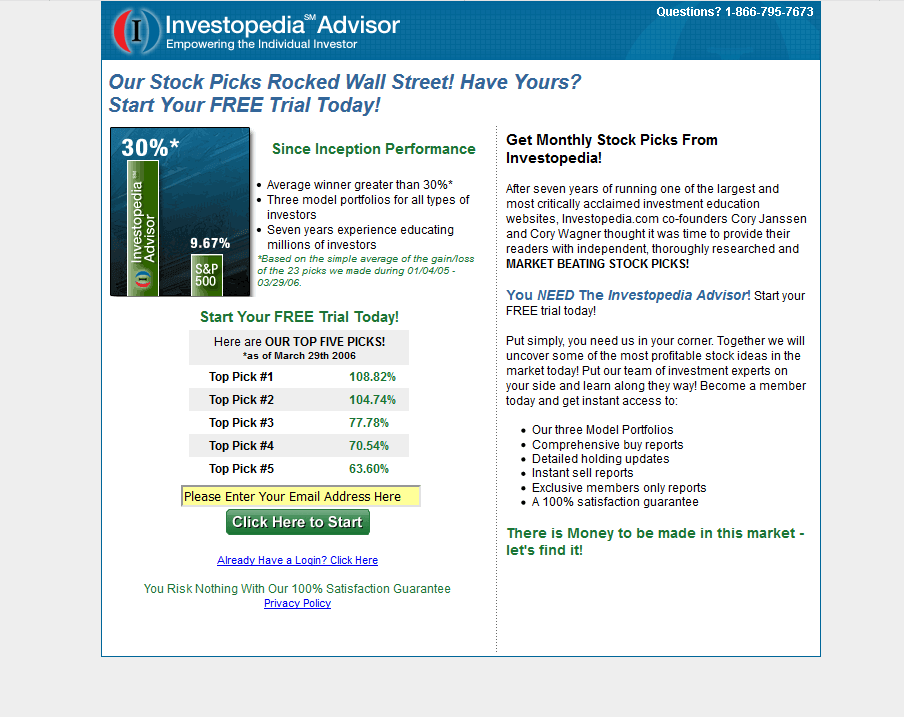
Here is that original offer page:
We began by reviewing three separate sources of information in order to start optimizing the message and design:
- We reviewed our own research results from other partners who had been faced with similar challenges.
- We reviewed competitive sites in order to draw from the learning of other companies in the same market.
- We dug deep within the Investopedia site itself in search of an appropriate “voice” and any strong messages which might not have been used in the original offer page.
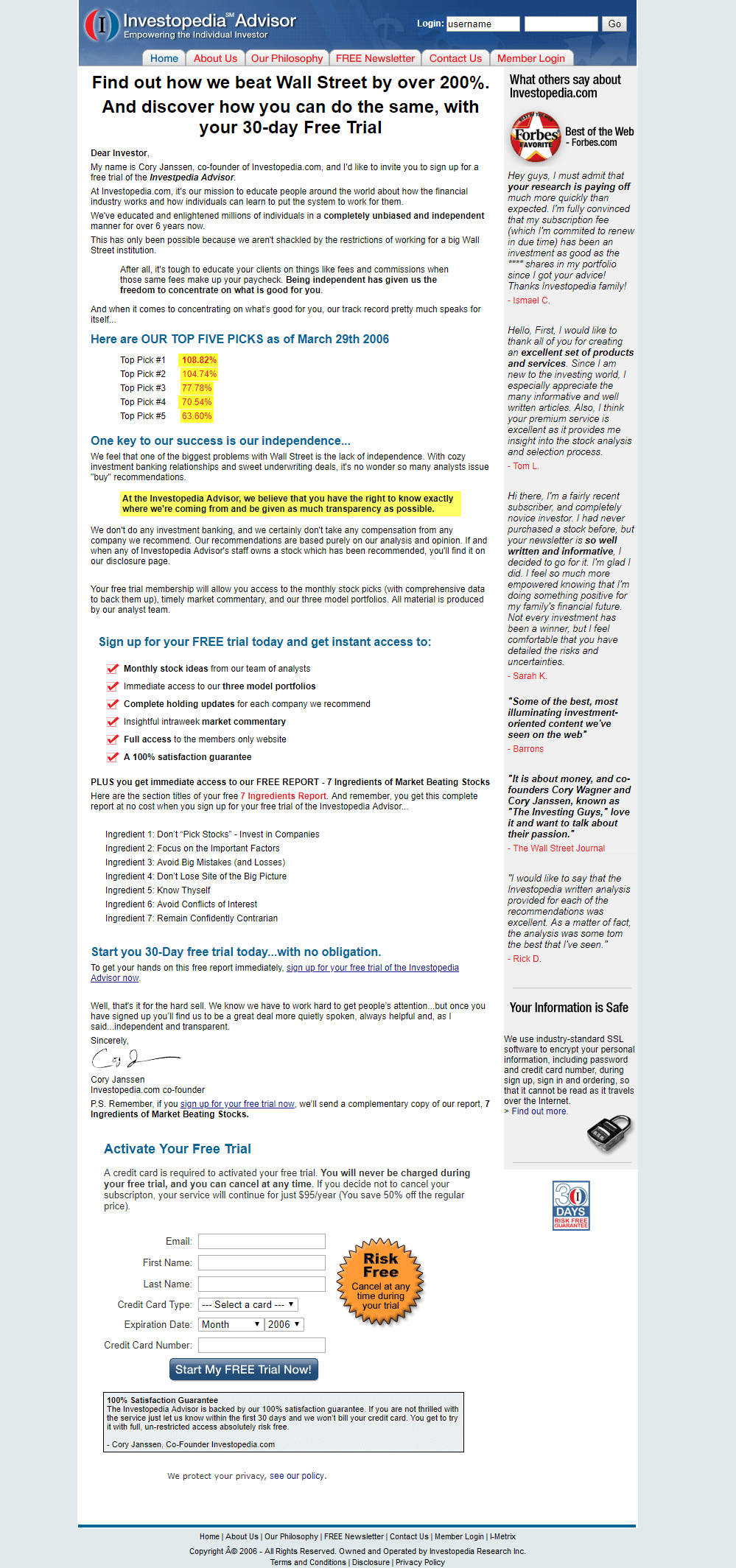
Here is the new page we created:
We then tested the original page against our new, optimized page.
Before we look at the data from that test, here are the results of the survey we invited you all to complete before this call.
First, we asked you to identify which page you felt performed the best:
| Survey Results – Question 1 | ||
|---|---|---|
| Votes | Percentage | |
| Original page | 67 | 24.28% |
| New page | 209 | 75.72% |
Next, we asked you to estimate by what percentage the winning page outperformed the other:
| Survey Results – Question 2 | ||
|---|---|---|
| % Increase | Votes | Percentage |
| Over 5% | 17 | 6.20% |
| Over 25% | 105 | 38.32% |
| Over 50% | 92 | 33.58% |
| Over 75% | 20 | 7.3% |
| Over 100% | 40 | 14.60% |
Now here are the actual results:
| Investopedia Free Trial Offer page test results | |||
|---|---|---|---|
| Free Trial Offer | # of Visits | # of Orders | Conversion |
| Original page | 904 | 12 | 1.33% |
| Optimized page | 972 | 22 | 2.52% |
What You Need To UNDERSTAND: Simply by improving the design and copy of the page, conversions increased by 89.47%.
This was a variable cluster test, meaning we changed a group of variables in order to maximize results. To identify which new elements had the greatest impact on improving conversion we would have to run some follow-up A/B split tests, or a multivariate test.
Here are what we consider to be the most significant changes we made:
- We changed the layout, so the principal sales message was all contained within a single, uninterrupted, vertical column. The optional information, such as testimonials and security seals, were moved to the right-hand column. This way, even if visitors do not specifically read the testimonials, they still notice that the whole page has testimonials down its side. This allowed the sales message to flow uninterrupted without sacrificing credibility. The center column was used for the message and the right column for supporting elements.
- We changed the headline to include a specific stock pick performance number. And suggested, directly, that the reader could achieve the same. (In contrast to the unqualified, subjective approach of saying “Our Stock Picks Rocked Wall Street.”)
- We increased the length of the copy, to ensure that prospects had all the information they might need in order to feel comfortable and confident about taking the free trial.
- We wrote the sales copy in the form of a letter, with an opening salutation, and signature.
- We used more subheads, indents, check marks and lists in order to break up the message into separate, easy-to-read sections.
- We repeatedly emphasized that the free trial was risk free.
- We added a powerful endorsement with the addition of the Forbes “Best of the Web” seal.
- We added numerous testimonials from satisfied subscribers.
- We changed the text on the “buy” button to be more specific and descriptive.
- Also, and this could be viewed as a barrier, we asked readers for more personal information and their credit card information.
Case Study 2 – Improving conversions with a short, benefit-centered offer page.
In the case of the second research partner, who prefers not to be named, we again were tasked with taking an existing offer page and exploring ways to optimize its performance.
As with the Investopedia page, we worked with the existing offer and simply explored ways in which to improve the page by making changes to the layout and copy.
In this case, rather than choosing to write a much longer page, we simply worked with the information from the existing page and wrote and presented it in a different way…but with a little less copy.
Here are the results:
| Free Trial Offer page test results | |||
|---|---|---|---|
| Traffic | Orders | Conversion Rate | |
| Original Page | 30,520 | 128 | 0.419% |
| Optimized Page | 30,116 | 352 | 1.169% |
What You Need To UNDERSTAND: The new free trial offer page increased conversions by 178.998%
Again, this was a variable cluster test, so we don’t yet know which changes had the most impact.
However, here is a list of the changes we felt were most important.
- We confined all the copy and graphic elements within one short column.
- We removed all photos and graphics which did not directly support our sales message. In other words, if the graphic was irrelevant to the message, we discarded it.
- We included the free trial offer message in the headline.
- In the body of the copy we say little about the company, its heritage, reliability and history. Instead we “spoke to the reader” about what he or she would get from the free trial. The copy is reader-centric, not company-centric. It is benefit-centric, not information-centric.
- The headline and sub-heads all start with an active verb.
- We placed the sign-up form directly in the line of sight at the end of the sales message.
- We built confidence by emphasizing that the free trial was risk-free – and placed that message directly next to the sign–up form. In other words, we positioned the message to be in the place where its impact would be needed most.
Guidelines – Guidelines for optimizing your own free trial offer pages.
In both the tests above we achieved significant improvements over the original versions.
By looking at both of the new pages together, it is interesting to note both the similarities and differences between them.
| Similarities & Differences between the Optimized pages | ||
|---|---|---|
| Investopedia | 2nd Partner | |
| Single column | Yes | Yes |
| Longer copy | Yes | No |
| Letter style copy | Yes | No |
| Reader/benefit centered | Yes | Yes |
| Guaranteed/Risk free | Yes | Yes |
| Free Trial in headline | Yes | Yes |
| Third party endorsement (Forbes) | Yes | No |
| Testimonials | Yes | No |
| “Buy Now” as graphic button | Yes | Yes |
While it is important not to draw too many conclusions from a comparison between just two pages, we feel one can reasonable recommend:
- Write your free trial offer pages within a single column.
- Emphasize the free trial in the headline and elsewhere.
- Write your copy in a manner that is centered on the reader and on benefits to the reader.
- Find ways to reassure your readers and make them feel confident that they can take your trial without any risk or obligation.
- Include a strong, graphic-based call to action directly in the line of sight at the end of your sales copy.
With regard to the length of copy, this is something that will vary from service to service and product to product. You may also want to test different copy lengths and see which version performs the best.
A simple, but sometime hard-to-follow rule of thumb for copy length is this: Your page text should be as long as it takes to deliver all the information a reader needs in order to feel sufficiently informed and comfortable about moving forward. And not one word longer.
Related MarketingExperiments Reports:
- Free Trial Offers Tested
- Optimizing Landing Pages 2006
- Optimizing Landing Pages 2006 – Pt.2
- Optimizing Subscription Pathways Tested
As part of our research, we have prepared a review of the best Internet resources on this topic.
Rating System
These sites were rated for usefulness and clarity, but alas, the rating is purely subjective.
* = Decent | ** = Good | *** = Excellent | **** = Indispensable
- Do free game trials work? ***
- Boosting B-to-B Newsletter Subscriptions: How NHI Breaks From the Ranks & Succeeds By Using Free Trials ***
- How a Niche B-to-B Database Publisher Sells Online Subscriptions With a Free Web Site ***
- Free Trials Work! How to Get More Users In the Door…& Keep Them In! ***
- Free Trials **
- Trial Offers: The Deal Is in the Details **
- Vertrue Points Out What You Need To Know To Make Trial Offers Work For You **
Credits:
Editor — Flint McGlaughlin
Writer — Nick Usborne
Contributors — Jimmy Ellis
Aaron Rosenthal
HTML Designer — Cliff Rainer