

We’re pleased with what we’ve been able to share with you during 2007: research results that anyone can use to optimize Landing Pages, PPC campaigns, search, emails, and testing itself. We sincerely hope you have benefited.
In this Brief we will look back at a few highlights from 2007 and then forward to 2008 with observations, predictions, and recommendations for growing demand for your products in the coming year.
You can listen to a recording of the clinic here:
2008 Internet Marketing Strategy: Are You Prepared?
2007’s Most Significant Research
We recently polled our employees involved in science and research activities at MarketingExperiments, asking a variety of questions.
They told us that the importance of Continuity and Congruence was the most significant research finding of MarketingExperiments testing in 2007, more precisely:
- The significant impact of confusing page elements, and
- The importance of context to ads.
When we asked our subscribers what they thought the most important finding was of 2007, here’s what they had to say:
“The most important thing weve learned is the importance of testing.
“Intuition is good, but you can’t rely on it. Everything on the Web can be tested, so why not take advantage of the ‘compound interest’ factor that can improve every step of your sales funnel?
“I have started converting my boss (with success) and the rest of the team (with more or less success) to the notion of the elements of performance of a Web page and that of AB Test.”
—Shycon Design
“2008 is a big year for me as a Web intelligence specialist and you already have helped me in a great way.
“Keep experimenting (on) what really works. I will surely listen, learn, and engage!”
—Frederick Gilbert, RONA.ca
When we asked our staff what the single most important Webinar and Brief produced by MarketingExperiments journal was in 2007, they chose these:
- A Clinical Assessment of Your Landing Pages (10.10.07)
- And a 3-way tie between:
- “Improving Conversion by Applying Continuity and Congruence” (10.24.07)
- “Is Your Sign-up Process Costing You Leads or Maximizing Them?” (9.26.07)
- “Getting Significant Improvements Even When You Cant Complete Your Tests” (8.15.07)
What made these findings salient?
Let’s look first at what was considered the most significant research finding: How applying Continuity and Congruence improves conversion.
- Continuity: ensuring that each step in the conversion process either states or supports the Value Proposition. Site Flow Disruption caused by discontinuity increases Friction and Anxiety and hurts Conversion.
- Congruence: ensuring that every element of your pagedesign, copy, images, colors, logo, priceeither states or supports the Value Proposition.
Here are the examples we used in our October 2007 Web Clinic and journal Brief to illustrate our research findings….
Control treatment (before optimization for Continuity):
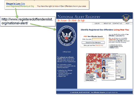
- We changed the banner, headline, and body to ensure Continuity with the PPC ad.
- Now each step of the path expresses a clear and consistent Value Proposition.
- This Treatment page produced a 63% higher conversion rate than the Control page.
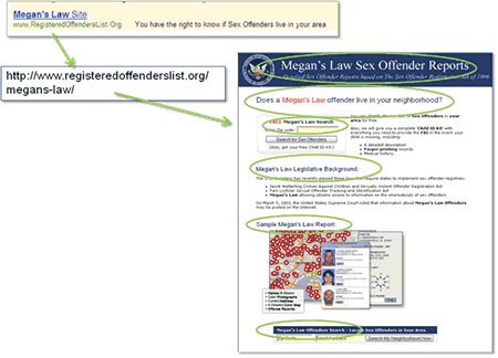
Experimental Treatment (optimized for Congruence):
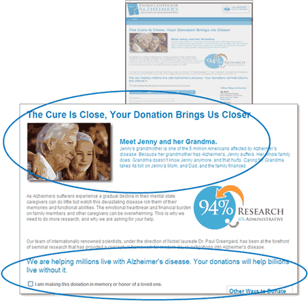
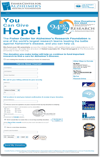
- Every element of this pagethe new headline, new copy, new imageas well as the donation page, where a testimonial from the founder was added, is now congruent with an intense, emotional tone that touches people and invites them to donate.
- Its focus is now intimate vs. institutional: It makes the donation more personal to the donor.
- A one-time donation was also set as the default to reduce Anxiety.
- The Treatment increased conversion by 54% over the Control. There was also a 33.09% increase in total donations.
Let’s look at another research area identified by our staff as key: The importance of a well-articulated Value Proposition.
- Value Proposition: The primary reason that the ideal prospect should purchase from you rather than your competitor.
- After customer motivation, clarity of Value Proposition is the most important factor in determining whether a customer buys from you or not.
- When expectation does not match presentation, potential customers are interrupted by an inconsistent experience.
Let us look at the examples from our August 2007 Web Clinic: “How Businesses Achieve Breakthrough Conversion by Synchronizing Value Proposition and Page Design” …
When there is not a good match between expectation and presentation, potential customers are interrupted by an inconsistent experience. This increases the likelihood of site flow disruption.
For most consumers, credit agencies are perceived as large, professional organizations that convey trust and authority.
Looking at this Landing Page, associated with this PPC ad, do you believe that this company could repair or restore your credit, or educate you about your credit?
- Would you trust someone who says he represents a professional credit organization if he’s dressed shabbily, especially if you’ve never heard of him before? The stated Value Proposition says one thing, this Web site says another, so the two are incongruent.
- There is disruption between the Value Proposition implied in the PPC ad and the expression of it on the page.
- The design elements on this page fail to convey either the implied or stated Value Propositions.
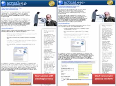
Here’s a side-by-side example from that same Clinic.
A Control vs. Treatment design meant to optimize the presentation of Value Proposition for a reference book publisher seeking to increase the rate of new subscriptions by offering a free trial:
Results
| Version | Visitors | Free Subs | Conv. Rate |
|---|---|---|---|
| Control | 112,137 | 459 | 0.41% |
| Optimized | 13,726 | 114 | 0.83% |
| Relative Difference | 103% | ||
What you need to understand: By effectively communicating the Value Proposition throughout each step of the process for this publisherby using continuity and congruencewe achieved a 103% increase in conversion.
Let’s turn now to another area considered significant by our analysts: what we learned about successful lead generation/lead capture.
- First, determine the information you would like to capture for each customer.
- Then determine the absolute minimum amount of information you need to capture “up-front” in your initial steps in order to reduce Anxiety and increase Conversion.
- Don’t ask for the additional information you would “like” to collect until customers reach the confirmation page, or after the initial step.
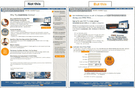
Let’s look at an example of our research findings from our Sept. clinic: “Is Your Sign-Up Process Costing You Leads and Conversions or Maximizing Them?”
Four designs were tested for an Online personality testing organization:
- Long and short offer pages asking for just an email address.
- Long and short offer pages asking for more personal information.
| Online Personality Testing Study | Conv.Rate | Leads |
|---|---|---|
| #1 Short copyemail capture | 25.40% | 426 |
| #2 Long copyemail capture | 23.14% | 346 |
| #3 Short copypersonal info form | 19.95% | 291 |
| #4 Long copypersonal info form | 16.52% | 100 |
| Difference between 1 and 4 | 8.88% | 326 |
What you need to understand:The treatment requiring the least personal information, fewest fields, and shortest copy was 326% better at lead generation than the longest treatment (426 vs. 100).
Now that weve identified a few of the critical findings of 2007, let’s look ahead to 2008. Where will MarketingExperiments focus?
Our core research focus in 2008 will be in these areas:
- Landing Pages
- Subscription Path
- Lead Generation
- eCommerce
- Order Processes
- Advertising
- Social Media
Now to what is probably of most concern to our subscribers: Our expert opinion on what will really matter in 2008, the six most important steps you need to take to ensure overall marketing success in the new year.
1. Implement truly reliable metrics.
- Can you track all of the right information, at the right levels?
- Can you perform timely and valid optimization tests?
Put tools in place now to effectively evaluate your current condition, track and evaluate response to your campaigns and measure progress towards your 2008 goals.
- Take time to keep score.
- Watch for patterns.
- Learn from your mistakes.
- Improve upon your successes.
Get the metrics right and you will do much better with marketing.
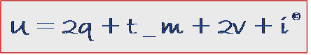
2. Improve your capacity to test.
- Ensure that you have the necessary tools, talent, and resources allocated to perform “Useful” tests.
- Refer to the MarketingExperiments utility formula, and to the free Briefs posted on our Web site, specifically related to Site Conversion and Landing Page Optimization:
3. Reorder your marketing priorities.
Refer to the MarketingExperiments Optimization formula, and again, to the Briefs on our site; for example, “Validity ThreatsBeyond Sample Size” (Aug. 2007), and “Getting Significant Improvements Even When You Cant Complete Your Tests” (Aug. 2007).

- First, focus on optimizing your Product (OPr)
- Product attributes: Quality, usability, etc.
- Value Proposition
- Then, optimize the communication of your Value Proposition (OPrn)
- Landing Page optimization
- Sales path optimization
- Email copy optimization
- Finally, drive as much profitable traffic as possible to your optimized site (OCnn)
4. Conduct a thorough competitive analysis.
Marketers are becoming smarter, so competitive advantage is harder. Everything is online. It’s never been so easy to see what your competition is doing from a presentation perspective. We offer a free competitive analysis tool on our Web site:
MarketingExperiments.com
- Assess your current competitive situation
- Who are your competitors?
- What are your core strengths/weaknesses?
- What current and emerging opportunities and threats are imposed by the competitive environment?
- Use this information to critically evaluate your value proposition.
Related MarketingExperiments Briefs:
- “Online Competitive Analysis Tested” (Jan. 2005)
- “In Search of a Value Proposition” (Apr. 2006)
- “Optimizing Site Design” (Feb. 2007)
5. Explore and test new media.
When we polled our staff, asking, “What are the most significant changes in marketing technology or tactics from a year ago?” new and emerging media were high on their radars.
- Social networks. Even if you’re not ready for a presence there, go there; find your customers and observe them. Listen to what they’re saying.
- According to a 2007 Deloitte survey of 2,200 U.S. consumers between the ages of 13 and 75, 85% of Gen Xers said they are influenced by someone’s recommendation.
- Mobile Landing Pages and Mobile ad placement. Optimization for mobile will be different than for PCs. Begin to monitor and test now.
If you haven’t started a blog, post one. If you haven’t produced a video, try it.
“Old” marketing media such as email will still be vital and a huge opportunity in 2008, though issues with deliverability will continue to be a challenge.
6. Revolutionize the way you communicate.
Put yourself in the shoes of the person who is being barraged every day, every hour, everywhere, with marketing messages. Whom should customers listen to? Whom should they trust? Customers want and need to base their decisions on honest claims, and it is our job to get both honesty and integrity right.
To this end, in our January 9, 2008, Web Clinic Dr. Flint McGlaughlin first officially unveiled a customer-oriented first person “statement of need” in the form of “The Prospects Protest (A Problem)” and “The MarketingExperiments’ Creed (A Response),” for the consideration of marketers worldwide. The response has been overwhelmingly positive.
The Prospect’s Protest (A Problem)
- I am not a target; I am a person: Don’t market to me, communicate with me.
- Don’t wear out my name, and don’t call me “friend,” until we know each other.
- When you say “sell,” I hear “hype.” Clarity trumps persuasion. Don’t sell; say.
- I don’t buy from companies; I buy from people. And here’s a clue:
I dislike companies for the same reason I dislike people.
Stop bragging. It’s disgusting. - And why is your marketing “voice” different from your real “voice”? The people. I trust don’t patronize me.
- In all cases, where the quality of the information is debatable, I will always resort to the quality of the source. My trust is not for sale. You need to earn it.
- Dazzle me gradually: Tell me what you can’t do, and I might believe you when you tell me what you can do.
- In case you still don’t “get it,” I don’t trust you. Your copy is arrogant, your motives seem selfish, and your claims sound inflated. If you want to change how I buy, first change how you market.
The MarketingExperiments’ Creed (A Response)
ARTICLE ONE: We believe that people buy from people; that people don’t buy from companies, from stores, or from Websites; people buy from people. Marketing is not about programs; it is about relationships.
ARTICLE TWO: We believe that brand is just reputation; marketing is just conversation, and buying is an act of trust. Trust is earned with two elements: 1) integrity and 2) effectiveness. Both demand that you put the interest of the customer first.
ARTICLE THREE: We believe that testing trumps speculation and that clarity trumps persuasion. Marketers need to base their decisions on honest data, and customers need to base their decisions on honest claims.
Summary
- Implement truly reliable metrics. Get the right tools, the right training to collect and understand your metrics.
- Improve your capacity to test. Test, optimize, and test again.
- Re-order your marketing priorities and re-evaluate yourself and your Value Proposition.
- Conduct a fresh and thorough competitive analysis.
- Explore and test new media, especially social networks.
- Email and PPC are going to be more complicated than ever. Invest the time, talent, and testing effort to get them right.
- Re-evaluate your current and potential customers and most importantly, revolutionize how you communicate with them.
Related Marketing Experiments Reports
- MarketingExperiments WebinarA Clinical Assessment of Your Landing Pages (Part 1)
- MarketingExperiments WebinarA Clinical Assessment of Your Landing Pages (Part 2)
- Landing Page Optimization: Improving Conversion 50-60% by Applying Continuity and Congruence
- Lead Generation: Is Your Sign-Up Process Costing You Leads and Conversions or Maximizing Them?
- Landing Page Conversion: Getting Significant Improvements Even When You Cant Complete Your Tests
- Optimization Testing Tested: Validity Threats Beyond Sample Size
- In Search of a Value Proposition
- Optimizing Site Design
- Online Competitive Analysis Tested
Credits:
Editor(s) Frank Green
Bob Kemper
Writer(s) Peg Davis
Bob Kemper
Flint McGlaughlin
Contributor(s) Flint McGlaughlin
Bob Kemper
HTML Designer Cliff Rainer
Mel Harris
Email Designer Holly Hicks