

In the invitation for the October 10, 2007 MarketingExperiments live Webinar, participants were offered the opportunity to submit their own Landing Pages for real-time assessment by the MarketingExperiments optimization team.
Dr. Flint McGlaughlin and optimization specialists Jimmy Ellis and Aaron Rosenthal reviewed each page, identifying areas where applying research best practices and key concepts of Landing Page Optimization could result in significant improvements in page performance for these Websites.
We asked those who submitted their sites to describe, in one or two sentences, their primary Value Proposition: Why should a customer buy from them rather than from their competitors?
We also asked them to describe the Value Proposition of the specific offer on the page they submitted, and what optimization steps they have already taken, if any.
This brief illustrates the foundational concepts and principles of Landing Page Optimization as applied by the MarketingExperiments specialists in their analysis and recommendations for the participants’ Websites.
Editor’s Note: We recently released the audio recording of our clinic on this topic. You can listen to a recording of this clinic here:
The assessments were based on the MarketingExperiments Conversion Index:
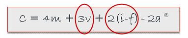
Each variable in the Conversion Index represents a key factor affecting the probability that a customer arriving on the Landing Page will take the desired action; that is, the probability of “Conversion.” Essentially, the formula is saying that the probability of Conversion is a function of the Motivation of the prospective customer (m), the degree of clarity with which the page expresses the Value Proposition (v), the net impact of the Incentive for the prospect to continue (i), less the Friction elements of the sale process (f), and the degree of Anxiety (a) that the page creates in the mind of the prospect. The coefficients represent the relative “volatility,” or degree of impact that the relative efficacy of each factor has on Conversion probability.
Landing Page 1
http://www.uptimesoftware.com/servermonitoring.php
Value Proposition submitted: Enterprise Strength, Easy to use, More Affordable, Deploy in 15 minutes or less.
Landing Page Value Proposition submitted: Multiplatform, Enterprise Strength, Easy to use, More Affordable, Deploy in 15 minutes or less.
Optimization steps already taken:
- A/B tests.
- Removing the menu has not worked; prospects are technical and need lots of information.
- Screenshot helped.
Additional information provided: Page is designed to get visitors to download the trial software and give them the information they need before they download.
The product is not an instant sale: Average sale is between $20k and $100k.

Analysis (Jimmy Ellis)
- Call to action is too low on the page. You have to navigate through the gray barrier bar to get to the more heavily weighted Call to Action, and the link is not underlined.
- The free trial is not expressed prominently enough. It is not in the headline, the sub-head or in the bullet list of key offer benefits. It should be much more visible. This is a major problem/opportunity.
- Link for “product tour” or “download” has no underline. It does not look clickable.
- Though the area of the gray bar has a lot good information, it is comparatively hidden.
- The content on the gray bar requires a mouse-over, which is not intuitive.
- Lay the content out vertically, so people can read it naturally, left to right, top to bottom, proceed down the page.
- State the problem first, then the solution.
- Everything now says “download trial”. . . it does not feel free at all. The download link and most of the copy needs to scream “FREE TRIAL.”
- Instead of having to click to download the trial, embed a “quick sign–up” form in this offer page to remove a step and super-clarify the call to action.
Analysis (Aaron Rosenthal)
- It is very difficult for somebody first visiting this page to actually spot the product tour or free trial offer in the banner.
- If you move the call to action to the main content you will drive a lot of more visitors through those links.
Landing Page 2
http://www.doublewhammypass.com/info/0708pass.asp
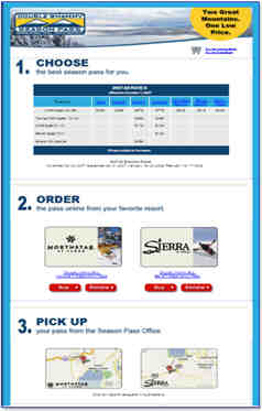
Landing Page Value Proposition submitted: The landing page was created to promote the sale of the Double Whammy season pass. The season pass is very competitive in price and is the only dual mountain season pass that allow users to ski/ride North and South shore.
Optimization steps already taken:
- Created a landing page instead of driving users to the general Double Whammy website: www.doublewhammypass.com because they didn’t want users to get distracted by too much information and wanted them to convert.
- Used the Step 1, 2, 3 to show users how simple and quick it is to purchase and be the owner of a season pass.
Analysis (Jimmy Ellis)
- The headline is not clear (the copy in the yellow semi-circle is what should be the headline). The headline should present the value of the double whammy season pass: two mountains for one low price with a percentage discount/savings, if possible.
- Section 1 says “choose” but there is no actual selection: You cannot actually pick one from the chart.
- Section 2 has multiple choices that are actually selling the same thing.
- Why offer two when a pass from either is basically the same?
- Test using just one.
Analysis (Flint McGlaughlin)
- Before you ask a visitor to take steps, a perceived relationship must be developed: “This is who I am; this is where you are; this is what you can do here; here is how to do it.” That must be part of the greeting text.
- People who hit this page may think they are in the wrong place on the site and hit the Back button; then you have lost them.
- There is too much unsupervised thinking. Do not make visitors think too hard to get through the process. If you are asking a visitor to choose, help them know exactly how to make the choice rapidly. Do the hard thinking for them.
Landing Page 3
http://www.snow-maker.com/index.html
Landing Page Value Proposition submitted: Simple home snowmaking machines for home use at about half the cost of comparable machines due to the use of common, easy-to-find parts and non-flashy designs.
Optimization Steps already taken:
- Headline is designed to show Value Proposition without showing right away that they have competition.
- Video to introduce basic concept of snowmaking, show why they might want to, and get them excited about it in less than a minute with all the info they might want to know.
- “Guarantee” seal is placed prominently to emphasize this is not an experiment, that they really can make snow.
Additional information provided: The goal of the main page was to get them excited, inform them of basic requirements without discouraging them, and get them to visit the snowmakers.html page to view their options.

Analysis (Jimmy Ellis)
- The headline is far down the page.
- It does not immediately capture the customer’s attention.
- The “Make $now” guarantee is not clickable.
- The dollar sign in the logo makes you think about spending money which produces Anxiety.
- You have to click to get to the order, which does not capture an email address for basket recovery.
- If you are not trying to capture customer information, then combine information from the second page with this page.
- We have not had good test results with video.
- Test a copy and image-based page versus the video page.
- You have to click the “Check’em Out” button to go to the next page, to choose a different model. Put those three options or models on this page, reducing the number of clicks, shortening the process, making it more clear, and giving more product details.
Analysis (Aaron Rosenthal)
- Take your best performing product and test that as the primary objective; streamlining to a single product or at most two products.
Analysis (Flint McGlaughlin)
- So far video, in most cases, has worked better as a supplement, and not in the central eye path in the way of the thought process through to the sale.
- As an option for visitors that have the bandwidth and the desire to look at video online, you can use video as a key element on the right hand side as part of your testimonial mix.
Landing Page 4
http://www.skylighter.com/specialOffer.asp?offer=22FP06FK8BO:227
Business Value Proposition submitted: Over 750 products and 80 projects for making fireworks and pyrotechnics.
Landing Page Value Proposition submitted: The easiest to understand book for beginning fireworks builders, with projects for making fireworks arranged in a building block fashion, no technical jargon, and a complete list of chemicals and tools needed for each project.
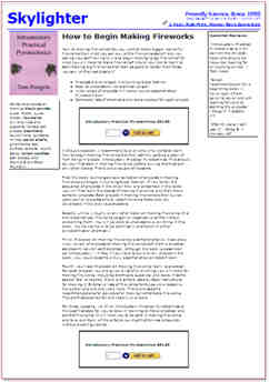
Optimization steps already taken: Originally had a text block surrounded by normal navigation with a text link to buy the book. They completely changed the page, getting rid of the site navigation.
Additional information: They sell a lot of this book, but still do not sell many directly through the Landing Page.
Analysis (Jimmy Ellis)
- The introductory graphic of the product should be in the main body copy. Typically you would put that image right below the headline, on the left hand side of the copy. It looks like a banner ad.
- The cart looks like it is from Amazon. It might cause visitors to wonder why they do not go to Amazon directly.
- Left side of page looks like navigation, but it is not.
- No sub-headlines or bolded copy to lead the customer down the page.
- Copy changes from intro bullets to copy below the “add to cart” box are confusing.
- Copy says “I” but there is no picture or person to reference.
- If you say this is the “best and easiest” book for making fireworks, you may need a lot of testimonials (credibility indicators). Someone who is not qualified may have a difficult time making a buying decision, depending on the traffic’s origination.
Analysis (Aaron Rosenthal)
- It is difficult for a user to digest a page designed with three-columns. Consolidate the information in the left and right columns into to a single column to go with a two-column design.
Analysis (Flint McGlaughlin)
- Make the text full of bold bullet points.
- Include a personal note from the author, addressed in a conversational style, about how the book came about, asking visitors politely to buy the book. The letter would have a signature at the end. The author should also ask buyers to write to him about whether the book has helped and welcome comments and insights to improve the next edition. The honesty, the humility, and the natural tone of the dialog would communicate and connect with the right reader.
- Paragraphs are too wide and long for the page. The paragraphs should be shorter.
- Embed the graphic of the book in the text, and make it three dimensional, not flat.
- Embed testimonials in the text as an italicized sub-paragraph, indented with column ends that help strengthen the point in the text about the book.
- Include a statement from the author, what the book is about.
- Give samples of the chapters, of the contents. The table of contents should dictate how the offer page unfolds.
Do not put a border around the buttons. There should be nothing on the page to interrupt the smooth flow of eye path (attention) through the natural process of ordering. Every element on the page should serve a specific purpose, or it should not be there.
Landing Page 5
http://www.the-efficient-golfer.com/
Business Value Proposition submitted: Learn from our book how to videotape your golf swing, analyze it and use those measurements to lower your handicap – using the methods of a golf biomechanics expert.
Optimization steps already taken:
- Page re-design (layout and “look”)
- Add testimonials
- Text copy edits.

Landing Page Submitted
(Screenshot was shortened)
Analysis (Jimmy Ellis)
- This is an example of a very good page.
- Left align the sub-headlines (that’s how people read).
- Make a graphic “seal” for your guarantee because it stands out more and looks more official.
- Highlight key words in testimonials to draw the customer through the copy instead of ignoring it.
- Use testimonials from the most-well known professional golfers possible to lend credibility to the offer. Test using a letter-format for that testimonial.
- Test using the author’s information much higher on the page. The up-front credibility will add weight to the benefits of the product.
Analysis (Aaron Rosenthal)
- Use a high-quality 3-D graphic to make that book pop, really jump-off the page.
- Use underlining only when it is for a hyperlink. When you want to emphasize elements in your copy, on your page, use bolding, use emphasis tag, italics. Bring it out that way.
- Move up the guarantee, and make it bigger when you get down to the call to action.
- Try removing all the credit card symbols, eliminating Anxiety around the call to action button.
Analysis (Flint McGlaughlin)
- Improve the graphic of the book cover. It looks too much like a poster.
- Include a personalized, testimonial letter from a professional golfer.
Landing Page 6
http://www.servepath.com/land/dedicated-servers/index015.shtm
Value Proposition submitted: We will work with our customers to build customized dedicated server hosting solutions designed to attend their specific needs.
Optimization steps already taken: Have modified Landing Page copy but without any testing based on real data.
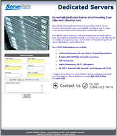
Analysis (Jimmy Ellis)
- The layout is confusing.
- On the left you have a large image and the form. A customer is going to start there, but nothing in that section helps the customer decide to use your service.
- The customer simply does not know where to start.
- Under the main image you have the lead capture form, but after looking at the image and proceeding down―the natural way people read a page ―they hit the form without any compelling reason.
- Contact you for what?
- The form needs to be at the end of the main body copy.
- After being confused by the left side of the page, they will most likely go back up to the top where they see the huge “dedicated servers.”
- It really does not have a headline, logo, or tag line, so once again, it is confusing.
- What is the one reason I should buy from you compared to the thousands of other providers?
Analysis (Flint McGlaughlin)
- The current value proposition is not strong enough. It does not express the reason someone should buy from you rather than any one of your competitors; at least one dimension of value where you exceed them.
This Landing Page was also analyzed:

Analysis (Flint McGlaughlin)
- There is too much real estate at the top of the page.
- The explanations on the left and right (lower page) look like banner ads. The third column on the right also looks like a banner ad.
- No dialog has been established with me.
- At no point have my eyes been directed to anything key.
- There is no e-mail capture mechanism.
- Even if somehow I work through navigation, I have to discover where to go to actually request services or learn more. Every page of your site contributes to the central objective of the website. It would not hurt the corporate caché of this site to have a clear eye path on this page.
Analysis (Jimmy Ellis)
- You have no idea what these guys are about.
- There is no lead capture.
- There is no headline.
- It is a visually appealing site, it is clean and looks professional, but lacks effectiveness.
Landing Page 7
Value Proposition submitted: MEP Jobs is the leading online job board and resume bank for professionals in the mechanical, electrical and plumbing industries. Our customers benefit from our highly focused jobseeker acquisition campaigns blending volume with quality, thus providing a robust supply of qualified talent.
Landing Page Value Proposition submitted: MEP Jobs will give you the opportunity to get in front of a concentrated group of industry specific employers who are looking for your skills.
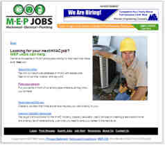
Analysis (Jimmy Ellis)
- The Value Proposition is not clear.
- The banner at top is distracting from the primary objective and taking customers off of the page.
- There is no credibility anywhere on the site.
- Tell me about how MEP Jobs has helped other people; how many potential employers are on your site; how many resumes are posted on the site.
- “Weight” where you want these customers to go. Right now there are 4 evenly weighted text links.
- Most likely in this niche, you want to get people searching as soon as possible without forcing them make a choice.
- Your search box on the home page most likely will outperform this page.
Analysis (Flint McGlaughlin)
- There is no Value Proposition. It does not give me the single most important reason I should buy from you. Emphasize the one reason why I should give you my business as opposed to any one of your competitors. Say that to me in a single quantitative statement that I can trust instantly.
- The banner is deflecting people from the key information.
- What is the objective of the page? Make every single thing on the page contribute towards that objective.
- Test the graphic until you have the most appealing graphic in terms of conversion.
- Space does matter and does impact conversion. People may come to the page, not like the space, and leave.
- Do more than ask a question. Explain exactly who you are and exactly what you do, then drive visitors through the links like bullets within the text, pointing out exactly where they need to go.
- Try something such as: “There are four different ways you can use this site. If you are looking for a job, you can click here,” etc. The page has too many objectives. Too many options hurts performance. Split the traffic.
- Put an e-mail capture form into the page and try to get people back that you can remarket to.
Summary
- Conversion Index. Use the MarketingExperiments Conversion Index to structure your thinking and approach to evaluating and optimizing your landing pages.
- Value Proposition. Begin by ensuring you can clearly and succinctly state the Value Propositions of both your business and the specific primary offer of the landing page that you are optimizing. To make sure, you should print out both and keep them in front of you while you are looking at the page.
- Competition. Look at and consider competitors’ Landing Pages. You cannot effectively evaluate your offer without the context of the others that your customers will compare it against in making their purchase decisions.
- Metrics. Use your Web data to guide your evaluation of your landing page for each of the conversion elements. For example, where customers are clicking on the page and where they are abandoning the sale process should be strong indications of where the sources of Friction and Anxiety are concentrated.
- Test. No optimization analysis is complete until you have turned theory and speculation into demonstrated performance. Take the principles and processes learned and demonstrated here, design test “treatment” pages and test them to Discover What Really Works® for your business.
Related MarketingExperiments Reports:
- Landing Page Optimization: How Businesses Achieve Breakthrough Conversion by Synchronizing Value Proposition and Page Design
- Optimizing Site Design
- Optimizing Free Trial Offers: Can Copy and Design Changes Alone Significantly Lift the Performance of Free Trial Offer Pages?
- Online Competitive Analysis Tested
- Landing Page Confusion: How Does Having More Than One Objective to a Page Affect its Performance?
- Site design tested: Reducing Customer Anxiety
As part of our research, we have prepared a review of the best Internet resources on this topic.
Rating System
These sites were rated for usefulness and clarity, but alas, the rating is purely subjective.
* = Decent | ** = Good | *** = Excellent | **** = Indispensable
- Landing Page Optimization Webinar (Omniture/MarketingExperiments) ****
- Online Value Proposition ***
- How Do You Develop a Unique Value Proposition? ***
- Free Google (beta) Website Optimizer Tool ***
- 10 Landing Page Optimization Tactics **
Credits:
Editor(s) — Frank Green
Bob Kemper
Writer(s) — Jimmy Ellis
Peg Davis
Bob Kemper
Contributor(s) — Jimmy Ellis
Aaron Rosenthal
Flint McGlaughlin
Bob Kemper
HTML Designer — Cliff Rainer
Email Designer — Holly Hicks