

Landing Page Optimization
How Businesses Achieve Breakthrough Conversion by Synchronizing Value Proposition and Page Design
How can you avoid sending conflicting messages about your value proposition and protect your landing pages from flow disruption?
Professional marketers have long known how essential it is to have a unique and compelling value proposition and how critical it is to be able to express it concisely.
Marketers must also understand how to protect landing pages against the #1 threat to conversion: Site flow disruption.
In this clinic we will reveal how two dangerous forms of disruption—Discontinuity and Incongruence—can keep customers from responding to your value proposition.
Every aspect of your Website is communicating your value proposition, either well or not so well. Are you sending conflicting messages that can hurt conversion?
Editor’s Note: We recently released the audio recording of our clinic on this topic. You can listen to a recording of this clinic here:
Importance of Value Proposition
Our conversion formula shows that after motivation, clarity of the value proposition is the most important factor in determining whether a customer buys from you or not.
Essentially, value proposition is the primary reason the ideal prospect—the people you serve best—should purchase from you rather than your competitor. You must match your competition on every point or dimension of value except one, and on that point you must exceed them. This secures you in the market, this is the reason your business deserves to exist.
In essence, companies need to spend more time building a great value proposition than marketing a poor one.
After identifying a unique and compelling value proposition, you must ensure that you express it throughout your sales process in a clear, consistent, and compelling way.
Eliminate disruption and you can maximize conversion.
Example 1
When there is a mismatch between expectation and presentation, potential customers are interrupted by an inconsistent experience. This increases the likelihood of site flow disruption.
Let’s look at an example of what this term means.
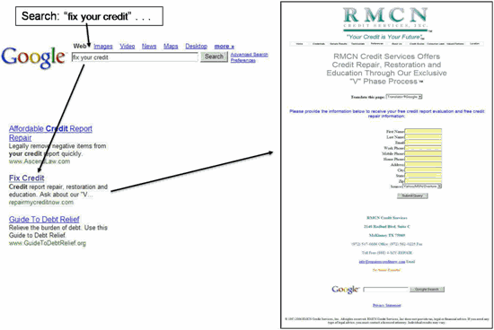
For most consumers, “credit agencies” are perceived as large, professional organizations that convey trust and authority. Many are banks, credit card companies, or law firms.
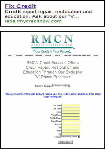
Do you believe that this company could repair or restore your credit or educate you about your credit?
- In this case a disruption occurred between the value proposition implied in the ad and the expression of it on this page.
- The design elements on this page fail to convey either the implied or stated value propositions.
Flow Disruption
Once on your landing page, the prospect must encounter a consistent, continuous value proposition on every page.
If you break it—if you disrupt it—you lose the prospect..
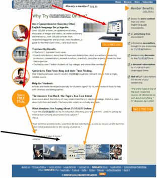
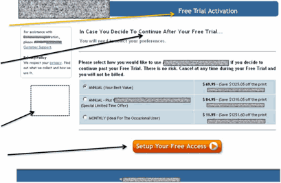
Let’s look at another example, in which a reference book publisher seeks to increase the rate of new subscriptions by offering a free trial.
This is an example of what we believe is the customer’s eye path on the original offer page. It takes you to strong images, but doesn’t lead you through the copy, which should be the most effective “selling” information on the page.
| The red lines represent the primary eye path a customer would take—going from headline right to the strong images and free trial buttons.
The headline fails to communicate the value proposition. Customers do not know what they are getting before they see the “free trial” buttons. There is no button in the customer’s eye path through the copy which would be at the very end of the page illustrated by the black arrow to the right. The right column, containing the free trial offer value proposition, is not in the eye path. |
 |
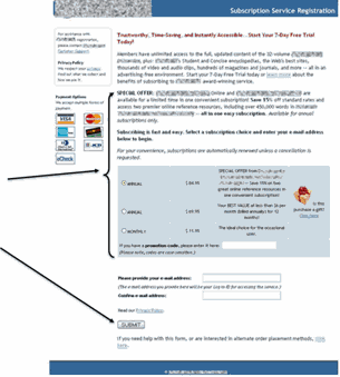
| The second page in this order process does not feel as though you are starting a free trial, even though it says “7-Day Free Trial” in the headline.
Credit cards give an instant impression that it is a “paid offer” and not a free trial. It even says “payment options” above the cards. |
 |
| Special Offer copy, credit cards, and paid options all feel like this is a purchase.
Submit button implies “give me your info” instead of “start your free trial.” |
 |
The company had a solid value proposition and a free trial of their product. But it was not communicated effectively.
The two great sources of disruption in value proposition expression are Discontinuity and Incongruence.
Discontinuity is the failure to ensure each step of the site conversion process either states or supports the value proposition.
Incongruence is the failure to ensure all elements of the page are consistent with one another in either stating or supporting the value proposition. For example inconsistency among:
- Design features
- Colors, fonts, images
- Credibility indicators
- Guarantees, warranties, value-added incentives
Value proposition is rendered by more elements than just the text you use in your banner or as a part of your logo. The colors you choose, the page design style, the fonts you select, the images you use all serve to either support or dilute the expression of your value proposition.
In both of the previous examples the clarity of the value proposition was diminished by failing to consistently express it throughout the conversion process.
Key point: Every time you ask a prospect to take action, you imply a value proposition.
In the minds of many marketers, a value proposition is limited to a single sentence declaration. But in truth, every element of your site is communicating a value proposition — whether explicitly or implicitly.
Example of Discontinuity
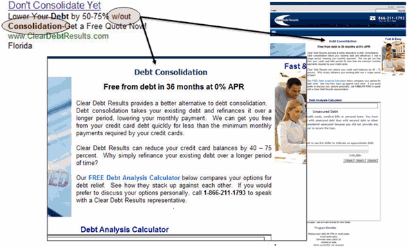
Though the page copy eventually clarifies this as an alternative to debt consolidation, the headline instantly disrupts the continuity of value proposition expression. That is, the paid search ad screams “Don’t consolidate!” and promises to lower your debt “w/out Consolidation,” but when you get to the page, what is the first thing you see? A headline, bold and alone, saying “Debt Consolidation.” This is the epitome of discontinuity and interferes with effective expression of the value proposition.
Example of Incongruence
The value proposition for the product below could be stated as: Investigate, know, and be safe by accessing the same information that law enforcement professionals and private investigators use, without paying commercial prices.
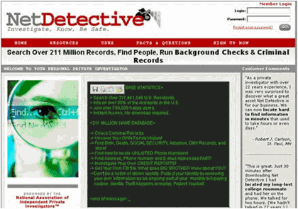
- The site does not look “official” or match the perception of “law enforcement.”
- The headline does not strongly engender a feeling of professional quality service.
- The color scheme does not “feel” official.
- The image looks like “stock” photography.
Incongruence: Not all elements of the page work in concert to support the value proposition.
Now, let’s look at the page after it’s been optimized for congruence:

- Red, white, blue color scheme supports the “official” element of the value proposition.
- American flag and seal also contribute to the official feel.
- Mention of law enforcement professionals in the headline reinforces the official and professional feel.
- Black and white picture looks more professional and less like stock photography.
All elements of the page are congruent and support the value proposition.

Offer Page Performance—Control vs. “Official”
| Offer Page | Conversion Rate | % Change |
|---|---|---|
| Control | 2.69% | |
| Official Offer | 3.03% | 12.64% |
What you need to understand: The conversion rate for the official-looking offer page was 12.7% higher than the control page. The projected gain translates to more than $350,000 per year with no increase in the marketing budget.
Now, let’s return to Example 2 and apply the principles of congruence and continuity to the publisher’s free trial offer process.
 |
 |
| Not this. . . | but this. |
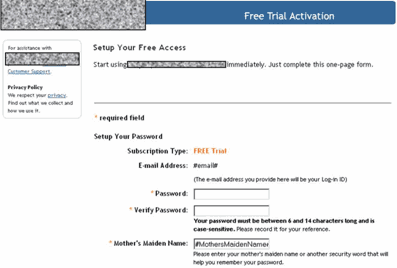
| Optimized Page 2
Header text has been changed from “subscription registration” to “free trial activation.” Headline re-emphasizes that the customer pays only “if they decide to continue.”We remind them that they can cancel at any time. Credit cards and “paid” copy are removed. “Setup Your Free Access” button incentivizes them to continue so they can start using the service for free. |
 |
| Optimized Page 3
Instead of “create account,” we used “Setup Your Free Access.” This reduces anxiety and supports what a customer actually wants to do: start using the site. “Subscription Type” reinforces the value proposition. |
 |
Results
| Version | Visitors | Free Subscriptions | Conversion Rate |
|---|---|---|---|
| Control | 112,137 | 459 | 0.41% |
| Optimized | 13,726 | 114 | 0.83% |
| Difference: | 103% |
What you need to understand: By optimizing the page to effectively communicate their value proposition throughout every step of the process—using continuity and congruence—we achieved a 103% increase in conversion.
Key Concepts Summary
- Every time you ask a customer prospect to take action, you imply a value proposition.
- Two dangerous forms of disruption—Discontinuity and Incongruence—can keep customers from responding to your value proposition.
- Ensure each step of the site conversion process either states or supports and advances the value proposition.
- Ensure all elements of the page are consistent with one another in either demonstrating or supporting the value proposition.
- Eliminate disruption; maximize conversion.
Succeeding in any business venture requires that you have a winning value proposition and the ability to effectively express it. Provide a continuous value proposition on every page and you can eliminate the #1 threat to conversion: site flow disruption.
Related MarketingExperiments Reports:
- In Search of a Value Proposition
- Optimizing Landing Pages
- Optimizing Free Trial Offers: Can Copy and Design Changes Alone Significantly Lift the Performance of Free Trial Offer Pages?
- Online Competitive Analysis Tested
- Landing Page Confusion: How Does Having More Than One Objective to a Page Affect its Performance?
- Site design tested: Reducing Customer Anxiety
As part of our research, we have prepared a review of the best Internet resources on this topic.
Rating System
These sites were rated for usefulness and clarity, but alas, the rating is purely subjective.
* = Decent | ** = Good | *** = Excellent | **** = Indispensable
- Online Value Proposition ***
- How Do You Develop a Unique Value Proposition? ***
- Competitive Positioning: An Introduction **
- Nobody Buys a Value Proposition **
- Marketing Tips from the Trenches: How to Pick a Value Proposition **
Credits:
Editor(s) — Frank Green
Bob Kemper
Writer(s) — Bob Kemper
Peg Davis
Jimmy Ellis
Contributor(s) — Jimmy Ellis
Bob Kemper
Flint McGlaughlin
Gaby Diaz
HTML Designer — Cliff Rainer