

Website Messaging: How clarity once again trumped persuasion to the tune of a 200% boost in conversion rate

“Clarity trumps persuasion.”
— Dr. Flint McLaughlin, Managing Director (CEO), MECLABS
The above statement has become somewhat of a mantra around the MECLABS offices. Not only because it’s quotable, but also because of just how applicable it is across all facets of marketing. Whether discussing a simple print ad or a complex integrated campaign, at the end of the day our goal as marketers is clear – tell people what you offer and why they should buy from you. If you’re clear in your messaging, there’s no need for persuasive tactics that don’t directly support your value proposition.
Still, it’s somewhat ironic that simplifying a marketing message can be such a complicated process. In this post, we’ll be looking into a recent test conducted on the website of a large international financial services company, pointing out why even the most basic offerings were diluted by an overly complicated process and unclear calls-to-action.
–
Background
Our research partner is a major Canadian financial services institution (anonymized to protect Research Partner competitive advantage), which services more than 18 million clients, positioning the bank as one of the largest in the world. With a broad scope of services offered to both its local and international clients, its primary messaging needed to be clear and catered to each of its audiences.
For this test, we will be analyzing a page intended to get new Canadian residents interested in establishing checking and/or credit card accounts with the bank. We addressed this through testing the page’s messaging – in this case, whether potential clients view the credit card or checking account offer as the most important aspect of doing business with the bank – as well as the page’s overall layout and user experience.
Our goal was to determine:
- Which messaging emphasis would result in a higher conversion rate?
- Would reducing the number of user steps (alongside a heavier emphasis on the calls-to-action) result in a higher conversion rate?
The control page presented two variables to consider when testing:
–
Control: I just emigrated to Canada and boy are my clicking fingers tired!
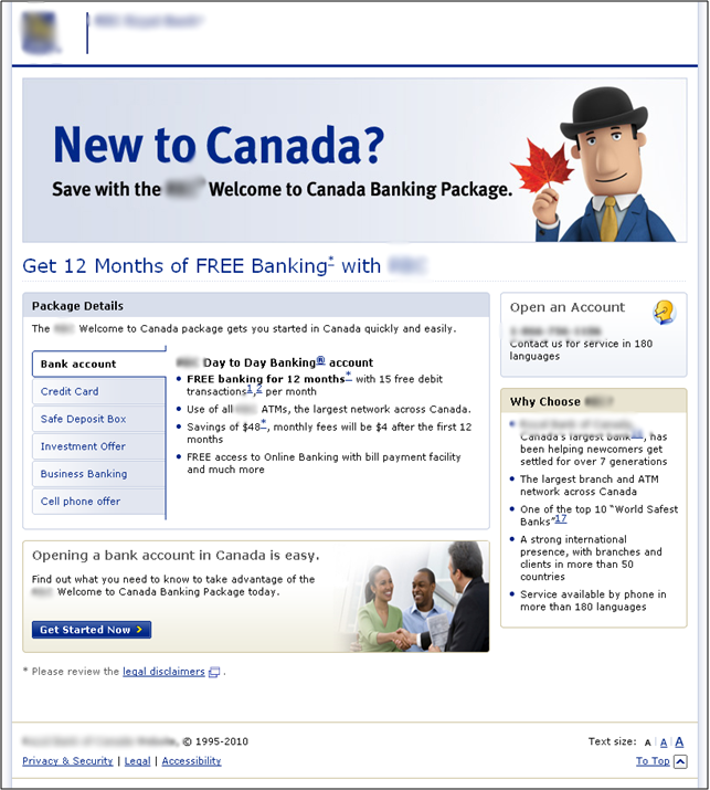
The control layout opens with a well-defined target, asking visitors if they’re “New to Canada?” followed by two fairly clear value statements – first, “Save with the XXX Welcome to Canada Banking Package” followed beneath by “Get 12 Months of FREE Banking with XXX.”
Simple enough, right? Putting myself in the user’s shoes, I’d probably end up at this page because I recently arrived in Canada and need to establish a basic bank account. And for a moment, the headline and two supporting statements make me feel right at home. But then, things quickly become confusing.
Though the headline targets those who want to open a basic bank account, the tabs beneath introduce a number of new ideas seemingly unrelated to the initial focus. The bank account tab heads the list, but is followed beneath by “Credit Card,” “Safe Deposit Box,” “Enrollment Offer,” “Business Banking” and the somewhat cryptic “Cell Phone Offer.”
While all of the these terms (well, maybe not “Cell Phone Offer”) could certainly be a part of opening a bank account, the layout and graphical treatment leads the user to believe that these are separate, unrelated entities. Likewise, this becomes confusing for users because the complicated array of options and tabs belies the simplicity promised by the headline. What should have been a one-click process becomes much more complicated and click-heavy by breaking out the page in such a manner.
By the time the user reaches the call-to-action (ironically labeled “Get Started Now”) s/he has already been exposed to a wealth of information, making the intended action(s) unclear.
–
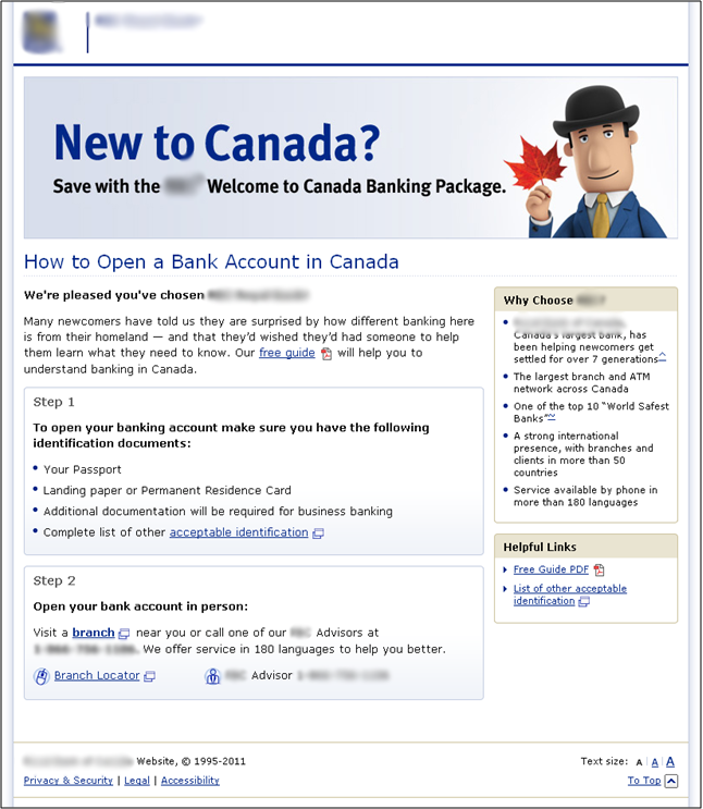
Treatment #1: A little less leaf, a little more maple
 Though I’m regularly exposed to MECLABS page tests, I have yet to see a page that better exemplified the term, “addition by subtraction.”
As mentioned earlier, the goal of this test was two-fold. Basically, if either treatment yielded higher conversion, it suggested that the multi-step process/layout increased friction and as such, hurt conversion. Likewise, whichever treatment yielded higher conversion than the other suggested which part of the free banking package is most valuable to consumers in this audience.
Treatment #1 gets right down to brass tacks. By eliminating the somewhat confusing menu layout and instead focusing on what the headline promised all along, this treatment offers a very smooth, informative experience that considerably reduces friction and directs users to a very clear call-to-action.
From the headline through the intended action, the page contains a focused eye-path, with easily seen subheads along the way that further the initial value statements. There is no visual clutter, and though a tad text-heavy, the page is both detailed and scannable, using bolded subheads, clear bullets and thoughtfully laid out copy to lead users to the call-to-action, sans confusion or misdirection.
I’m feeling more welcome already.
–
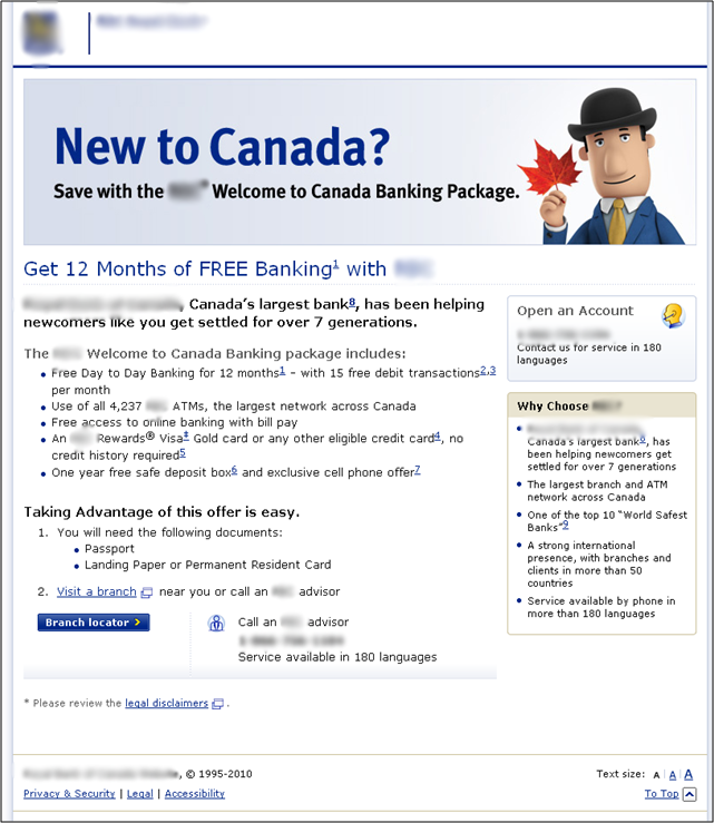
Treatment #2: I’m sorry, we don’t take American Express
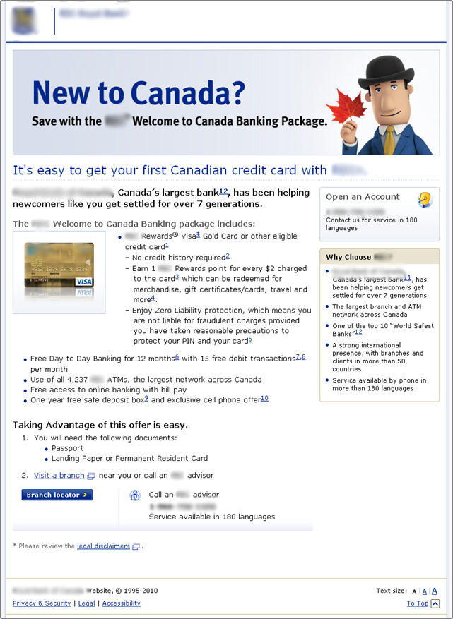 The second, more subjective portion of the test occurred when we aimed to find out whether new customers were more interested in either credit card or checking account information. As you can see, our team stayed very close to the first treatment, in terms of layout, copy length and overall visual presentation.
The only significant change in this treatment is the addition of the Visa card image, which breaks up the still-lengthy text, but also shunts the copy both downward and toward the right column, which breaks up the eye-path, possibly increasing friction.
Also, the credit card offer – while part of the bank’s introductory package for new residents – does not connect to the value proposition introduced in the page header as well as the checking account offer.
Ultimately, despite showing a touch less clarity about the offerings, this treatment still accomplishes its goal of reducing the number of steps required to learn about a particular offer, and maintains a steady flow toward the call-to-action.
–
Results
It warrants mention that these results reached a near 100 percent level of confidence (99.984%, to be exact).
More importantly, both treatments dramatically improved conversions over the control. Treatment #1 achieved a 200 percent lift over the control. Treatment #2 also performed extremely well, posting a 184 percent lift over the control, yet it appeared that more people wanted this page to help them conduct the most basic bank activities.
Is this cut-and-dry, concrete proof? No. But both elements of this multivariate test show that people didn’t come to this page for a boatload of options and unrelated text. They arrived here to perform a simple task, devoid of any additional offers or promotions. After sifting through all of the numbers and percentages above, we can deduce one thing – distinct, relevant calls-to-action were needed on this page.
If I was a fly on the wall at this bank’s website design sessions, I guarantee at least one of the major ongoing discussions was about presenting users with a wealth of options – not only to show the breadth and scope of the institution, but also to give users a “hub” in which to conduct as much business with the bank as realistically possible per visit.
I opened this piece by stating, “Clarity trumps persuasion” — not just because it sounds cool (t-shirts and novelty mugs will be available soon) but also because it is almost universally applicable across marketing practices. In this case, the bank was trying to persuade users to explore the site by presenting them with myriad offers, options and calls-to-action. Instead, it seemingly created confusion, friction and – based on the significantly lower conversion rate – frustration on the part of the user.
Yes, giving users options can be a good practice, but not at the expense of clarity…especially when the options in question do not clearly follow the value first offered to the user.
–
Related Resources
B2C Testing: A discount airline looks to increase conversion
Homepage Optimization: How a more logical eye-path led to 59% increase in conversions