


 In college, I had a journalism professor who said, “Make your headline twice as powerful as the event.” This is sage advice if you’re covering the Kardashian beat for a weekly tabloid, but it doesn’t seem to directly apply to today’s marketers.
(Apologies to any members of the Kardashian marketing team who may have been offended by the previous comment. You’ve done a terrific job promoting whatever it is that made them famous.)
But maybe it is applicable, after all. Despite a marketer’s goal of thoroughly conveying value on a landing page through well-crafted body text and use of images, there often remains a need for a powerful “hook” to further motivate a potential customer.
(Just recently, MarketingExperiments held a Web clinic that covered this very subject.)
When it comes to landing pages, one would think that it would be much easier to get users to convert, as they have already expressed a certain amount of interest via search or email clickthrough. But these users still need to be quickly reminded of why their clicks landed them there in the first place.
In the following test, you’ll see that a continuation of the value proposition was deftly handled with the addition of a few short, powerful words, alongside a much-needed change in the way our partner asked for information.–
–
Background
Our research partner is a leading online survey company that provides its registered members with opportunities to complete surveys in exchange for rewards, such as cash and gift vouchers. In order to participate in the company’s offerings, users were asked to complete a lengthy, one-page registration form, asking for both required and optional information.
Our research team’s goal for this test was to:
- Determine which panelist registration page would have a higher conversion rate
- Increase qualified survey panelist registrations
In addition, our team altered the graphical representation of the incentive, and made some slight, but necessary copy changes.
–
Control: By a show of hands, who needs a break?
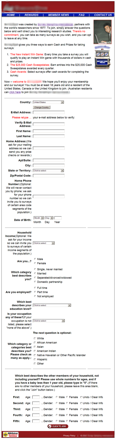
The control page (anonymized to protect research partner competitive advantage) opens with a short “About Us”-type section, where it highlights the company’s affiliation with a larger, international survey organization. While this was likely included to establish credibility among visitors, it creates almost immediate friction due to its awkward placement and the inclusion of an outbound link in the first sentence. There is no continuation of value proposition, and no immediate delivery on what was promised in the call-to-action.
The second sentence begins the registration process, but is buried between the link from the first sentence and a section that is presented in red font. These two different colored elements only serve as a distraction to the user, and drive attention away from the task at hand.
It is only in the second paragraph, beneath five lines of unclear copy, that the value proposition is discussed. Here, the various prizes and rewards are discussed in moderate length, but are, again, somewhat buried beneath less significant copy.
The fourth paragraph then serves to welcome the user to the registration form – an awkward placement that could have worked better atop the page.
After users get past these chunky blocks of text, they are greeted with a stark, lengthy collection of personal information fields to complete, containing both required and optional sections.
The entire questionnaire requires the visitor to make three complete mouse scrolls to reach the end of the page. Coupled with the white background, this length makes for an intimidating, somewhat off-putting page that could potentially drive away potential registrations.
For those hardy souls who endured the entire questionnaire without getting up to stretch their legs, a simple “thank you” page completed the registration process.
–
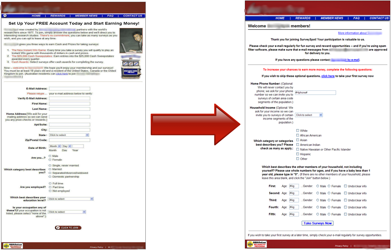
Treatment: Oh, right. THAT’S why I’m here…
The team’s first priority was to somehow cull the same amount of information for users, without subjecting them to a seemingly endless page of questions.
To address this, the team first broke the questionnaire into two separate pages – required and optional – with the required section obviously presented to the user first. By doing so, the landing page is much more succinct, direct and less intimidating than the control.
–
–
If users complete the first page of required questions, they hit a simple, clearly marked “continue” button at the bottom of the page, and move on to an even shorter page with the “optional” questions. Even though the same questions are asked, the two-page system reduces anxiety, allowing the user to focus more on the value proposition, and less on the tedium.
(Though, coming from someone who has dabbled in these survey sites, anyone who is turned off by the length of the registration form probably won’t make too much money once the actual surveys start rolling in. But, I digress…)
Despite the concern of page length, the more pressing changes came when the team addressed the lack of headlines. Our researchers felt that the control page wasn’t delivering on the value proposition that initially encouraged users to click through, and decided to test a series of ten headlines to sit above the existing copy.
The headlines were:
–
- Set Up Your FREE Account Today and Start Earning Money!
- Get Paid to Take FREE Surveys
- Take Online Surveys From Home and Win Cash & Prizes
- Get Paid to Fill Out Online Surveys
- Surveys – Quick, Easy and FREE
- Join the XXXXXX Community and Have Your Opinions Count
- Win Cash & Prizes for Online Surveys
- Get Rewarded for Your Opinion
- You’re Invited to Join the XXXXXX Community and to Earn Rewards For Your Opinions
- Here’s Your First Survey, and an Invitation to Join Our Research Community
–
By adding in any of these headlines, the user is immediately greeted with a statement reaffirming some, if not all elements of the value offered within. And, in turn, the copy beneath now reads more appropriately, as it serves as supporting text for the value proposition, rather than an introduction to the registration process.
Each of the ten tested headlines aimed to appeal to values that were deemed important to the audience. Whether a user is attracted to the idea of “FREE” membership, desires to be a part of an active online community, or is simply enticed by the idea of cash rewards for relatively little effort, these headlines created an immediate connection to the value that originally prompted users to arrive at this page, easing anxiety and encouraging them to continue the process.
–
Results:
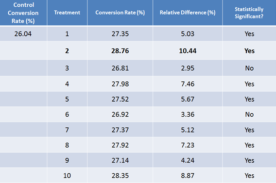
Unsurprisingly, the addition of value statements and reduction in length served this page well, as all 10 optimized treatments showed better conversion rate performance than the control. What is surprising is how eight of the 10 generated validated differences in conversions.
–
–
It appears that two key factors had the most impact on the conversion rate increase. The first was dividing registration form fields into two pages, which seemed to considerably reduce both friction and anxiety.
But the most significant results came from the “Get Paid to Take FREE Surveys” headline, which showed a statistically significant lift of 10.44%. This headline appealed to people on the most base level – their wallets. By telling people directly that they will earn money without investing money, this succinct headline appeared to deliver this company’s message loud and clear.
It should also be noted that this headline stated what actions the user would need to take to earn money – an element missing from some of the less successful headlines tested by our team.
In the end, they all outperformed the headline-free control. Adding any one of them clarifies the value proposition of the page in a simple and direct way. It quickly attracts, engages and sets expectations for the user. Instead of the users landing on the page and floundering through the copy, the headline sets an agenda and communicates what users can expect right away.
–
Related Resources
Copywriting: 10 headlines tested
Optimizing Copy: The 7 most common copywriting mistakes we see marketers make
Headline Optimization: 2 common headline mistakes and how to make them work
I have had success with the two page format for free trial products as well. Did you have any way of testing the various headlines to see if some resonate more with specific target segments? I don’t know what information you have on the “users” prior to completion of the form but I wonder if different headlines might be more effective based on the source used to engage the user or other information you might have about people as they come to the landing page.