


How aggressive are your email marketing goals for the year ahead?
Are you optimistic about growing your lists and response rates, or hedging your bets due to the economic downturn?
As marketers face increasing pressure to improve ROI, email presents a quandary: It’s still a low-cost, high-return channel, but with social media, spam filtering, and other factors taking a bite, its growth potential is in question.
To get the most from email marketing efforts, marketers need to focus on optimizing the entire process, from capture to conversion. In our January 21, 2009 clinic, we explored how you can grow your opt-in list with a better email capture, and optimize body copy elements to increase email conversion rates.
Email list growth projections for 2009
Our sister company, MarketingSherpa, recently surveyed marketers about their email list growth rate projections for the year. Here are the survey results, sorted into B2B and B2C segments.
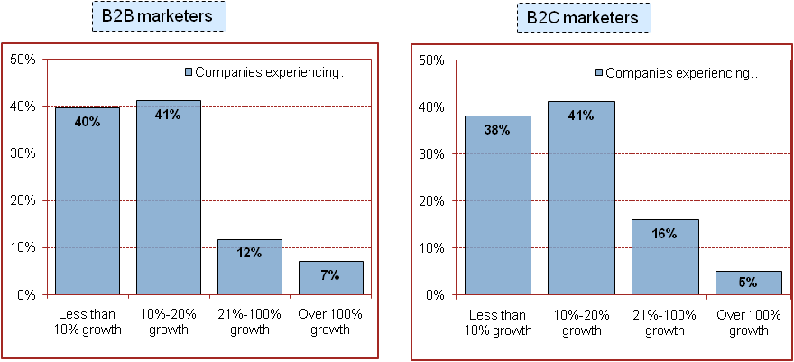
Overall, the results look remarkably similar between both segments. The majority of both B2B and B2C marketers projected increases of 20% or less. However, additional parsing of the survey showed that the most optimistic respondents were mainly from new businesses starting with small lists and counting on big gains. This gap suggests that as an email list matures, marketers temper their expectations for growth, whereas marketers managing new or emerging lists tend to aim much higher.
This raises some intriguing questions, such as: What strategies and ideas can marketers with established lists learn (or relearn) from their peers with startup lists? What role does having a positive growth mind set play in setting expectations?
Optimizing the email capture process to grow your list
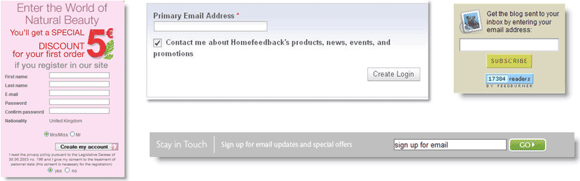
Email capture forms come in all shapes and sizes, as the examples below demonstrate, and they can appear in any number of places in a longer sign-up process. One thing most email capture forms have in common? Plenty of potential for optimization.
Email capture forms can affect ROI as much as several other email elements that typically attract more attention (subject lines, send dates, offers). Changing the placement and presentation of the form can make a significant impact — and can often do so with modest revisions, as the following two case studies demonstrate.
Case Study 1: Email Capture
This research partner is a finance site offering several levels of subscription for market information updates.
The Goal:
Increase email sign-ups (leads for paid subscription memberships).
Primary Research Question:
Which page will achieve a higher email capture rate?
The Approach:
Modify key elements on the email capture page to encourage sign-ups.
Additional Observations:
The overall structure of the page was left intact.
Control: Email Capture
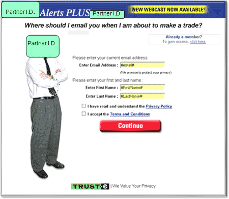
The original version of this sign-up page included checkboxes for the site’s privacy policy and terms and conditions, right above the button. The top of the page also featured a web cast promotional graphic.
Treatment: Optimized Email Capture
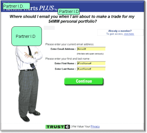
The goal of the revised capture page was twofold: to reduce friction and emphasize the benefits of the call to action.
Removing the webcast promotion and checkboxes helped to narrow the focus of the page. The button color was also changed from red to green.
| Email Address Capture | Conv. Rate |
|---|---|
| Control | 7.32% |
| Treatment | 10.95% |
| Relative Difference49.53% | |
What you need to understand: The treatment outperformed the control by 49.53%.
These relatively minor changes produced a dramatic increase in email addresses captured. By removing the friction-inducing elements from above the button, and altering the color of the button itself, the page became more attractive to prospects and in turn, generated more emails for long-term sales.
Key point: Optimizing email capture gives you additional chances to engage your prospects — opportunities that would be lost if visitors abandon your site or form.
Review of clinic participant’s email capture process
Email capture was particularly relevant for HomeFeedback.com, a real estate software site that depends on capture to grow its list and update free trial users on other offers. For this clinic, the VP of Marketing submitted screenshots of their past optimization efforts and newly optimized, as-yet-untested pages.
As part of its ongoing optimization process, HomeFeedback.com tested this two-step registration path below. The previous registration path was a five-step process that required a credit card for a free trial.
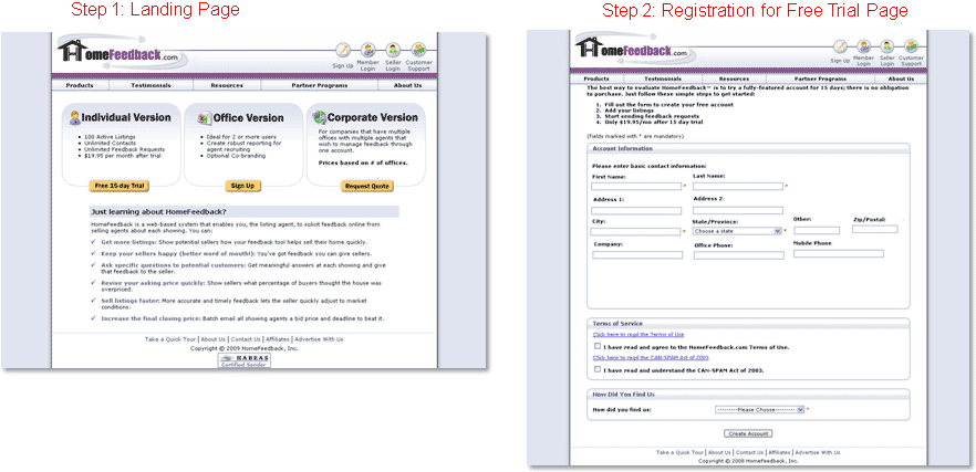
When the path was five steps, only 7% of the traffic completed the registration process. Changes to the path — making it two steps, and removing the credit card requirement — significantly cut the bounce rate and increased sign-up rate to 25%.
However, Justin Mayerick, VP of Marketing at HomeFeedback.com, wondered if, while sign-ups were increasing, the quality of sign-ups was declining. Prospects that had already entered their credit card were more likely to upgrade their free trial to a full subscription than prospects that had only to sign up for the trial. Gains made by the shorter form without the credit card requirement might turn into losses in the final ROI accounting.
Following the recommendation of a past web clinic on free trials, Mayerick decided to reintroduce the credit card requirement into the registration path.
But, to offset the increased friction and anxiety caused by credit card entry forms, he also placed an email capture page before the credit card requirement.
These steps recall a principle introduced at the January 7, 2009 web clinic: the conversion fulcrum. In that clinic, marketers were encouraged to view their pages as a balancing act between incentives and dis-incentives, reasons to convert and reasons to abandon the page. While an email capture is not immediately an incentive, it opens the gateway to future incentives: since an email has been captured, prospects can be re-marketed to with a variety of offers.
The Next Test: Email Capture
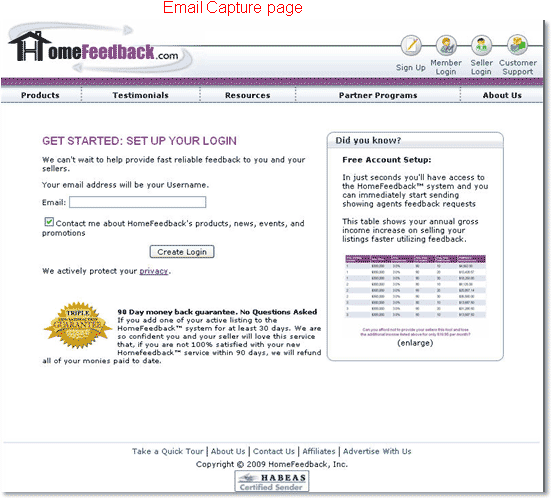
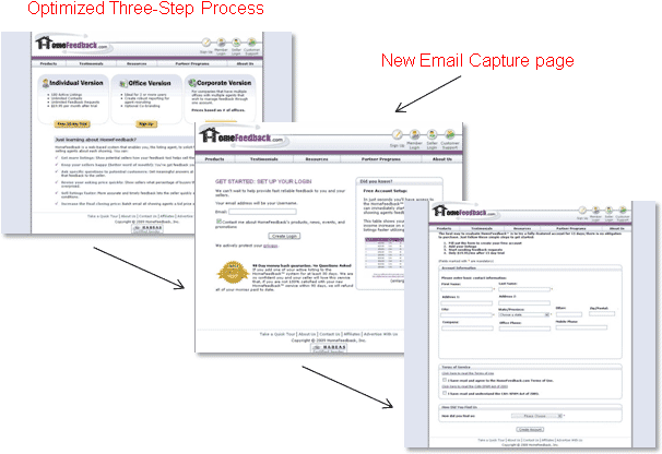
Homefeedback.com inserted this email capture page between Steps 1 and 2, turning the two-step process into a three-step process.
Features of email capture page included:
- Headline emphasizing call to action
- Features matrix
- Money-back incentive
- Credibility indicator
The site tested this email capture process for three months. Prospects that entered their email in the capture field but did not complete registration of the three-step path were sent a follow-up email offering a seven-day free trial.
Results
May 2008: 432 follow-ups, 84 additional registrations
June 2008: 431 follow-ups, 49 additional registrations
July 2008: 269 follow-ups, 40 additional registrations
HomeFeedback’s capture process gained the site 175 new registrants that likely would not have signed up without this additional step.
Despite the added friction of the required credit card, adding the email capture step mitigated abandonment, grew the list, and increased the number of registrants who upgraded to subscription.
Interestingly, Case Study 1’s capture page and HomeFeedback’s capture page are a study in contrasts. Where the case study’s optimization strove to pare down the page so that email capture was the page’s focus, HomeFeedback’s optimization included page elements emphasizing the potential rewards of free trial and subscription. Despite their differences, or perhaps because of them, each page was effective in converting its ideal prospects to the desired action.
The range of difference between them establishes the diversity of practice available when designing your capture page or process.
Live Optimization
In the live optimization segment of the clinic, we analyzed next steps in HomeFeedback’s drive for improvement. Note that there’s been a change in the name of the company and the products they offer.
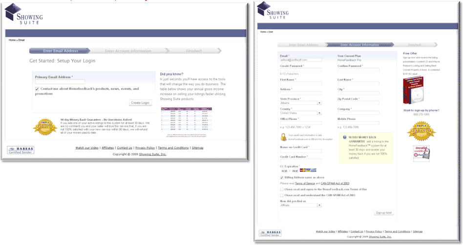
Dr. Flint McGlaughlin: Deploy your email capture early in your registration path or submission process. In any process try to capture emails early and follow up with a series of timed emails, sent from customer service, not marketing. That way, you’ll be able to shift away from friction that inhibits conversion and toward an increase for your site.
The audience suggests that your form has too many fields. One question here is whether it is better to have multiple fields or multiple pages. Remember that with an early capture, you already have their email address and can market to them again but every time you ask someone to click to a new page, you lose 50 percent of your audience. So, be careful about stretching the process out to reduce the fields.
Another reason your field length isn’t really a problem is that the fields are organized. An address entry form may look like a lot of fields but it is the kind of information people expect to see together. In other words, it is a “thought cluster,” a sequence of logically connected information. So, you can have a lot of fields together if they don’t require new information or a different category of thinking. Organizing your fields into thought clusters makes them mentally ergonomic.
Jimmy Ellis: One change I’d propose is to put the email capture on the first page, the credit card requirement on the second page with just the most basic information required for the card and then add a third page to capture the physical address — give it a heading something like, “Tell Us Where to Send Your Information.” That way the sequence is complete at page two and some of the anxiety-inducing forms requiring personal information become part of the incentive of getting your stuff sent to you.
Another thing to consider is to shrink the size of the form by putting the labels to the left of the fields. Arranging them horizontally instead of vertically will reduce your form’s section height by half. Finally, I’d suggest that you move some of the seals on the right hand side of your page to the center of the page so they can be more effective counteracting any anxiety caused by the credit card entry.
Key Point: If you have limited resources, limited budget and not much leeway to change emails, making the most of your email’s potential includes finding a balance between optimizing capture and optimizing conversion.
Body Copy and Calls to Action
While there are several potential areas to test that can improve email response (opens, clicks, conversions), this clinic focused on two case studies that optimized email body copy and calls to action.
Research suggests that the most effective emails often use a single call to action, the following case study tested whether strategically adding additional calls to action to an email with strong central content would make it more — or less — relevant to a wide audience.
Case Study 2: Email Calls To Action Test
This research partner is an ecommerce site focusing on special occasion gifts.
The Goal:
To increase clickthrough and conversion.
Primary Research Question:
Which email design will yield the highest clickthrough rate (overall and for specific featured products)?
The Approach:
The test ran three treatments against the control.
Additional Observations:
Which email design will yield the highest conversion rate?
Test Design
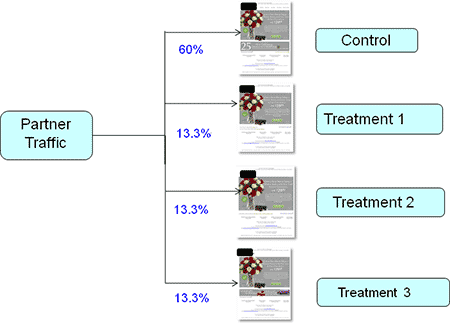
In the control and the treatments, the central offer of 18-stem Winter Roses, FREE vase and FREE chocolates–only $29.99! remained unchanged. The challenge came in attempting to simplify the page without making dynamic changes to the content.
All three treatments removed the top navbar and varied the format and content of the bottom links.
Control

Some friction-inducing features of the control include:
- Top navbar incorporates too many competing objectives
- Bottom banner interrupts eye path
- Unclear that bottom banner is a link
The control is caught in a type of Catch-22: in its current form, the links detract from the central offer and the central offer detracts from the links.
Control vs. Treatments
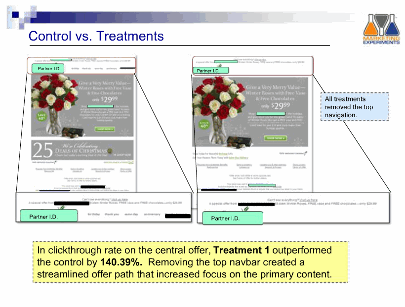
In clickthrough rate on the central offer, Treatment 1 outperformed the control by 140.39%.
Removing the top navbar created a streamlined offer path focused on the primary content.
Treatments 1-3: Link strategies
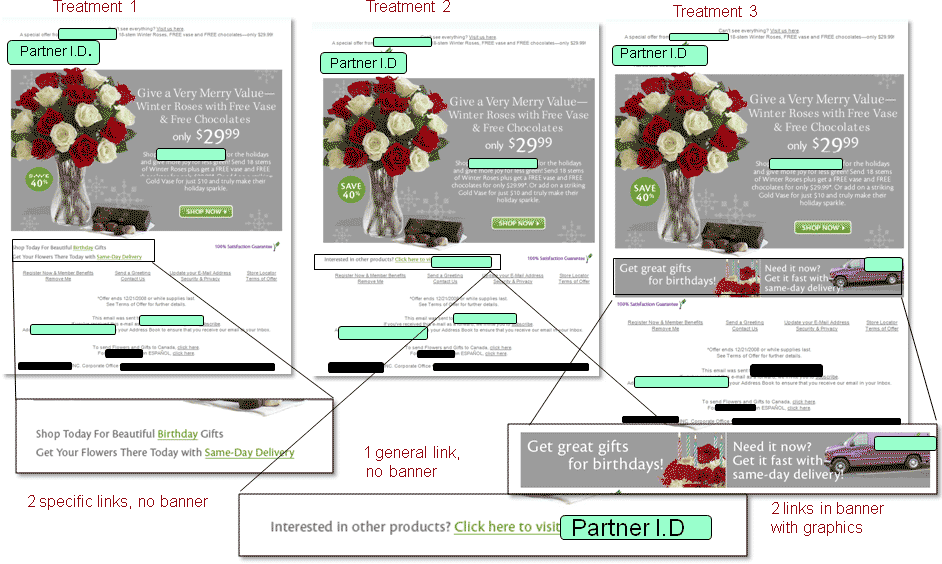
The treatments presented three approaches to listing bottom links. On the control, only the small “Shop Now” indicates that the bottom banner is a functional link. In contrast, Treatments 1 and 2 use different-colored, underlined copy to emphasize that bottom text is a link. Where the control and Treatment 2 offer very general links, Treatment 1 and Treatment 3’s links for birthday offerings and same-day shipping are among the top revenue generators for this site.
Results
| Email Design | Conv. Rate |
|---|---|
| Control | 15.74% |
| Treatment | 24.69% |
| Relative Difference56.82% | |
What you need to understand: Treatment 1 outperformed the control in overall clickthrough by 9.42% and in conversion rate by 56.82%.
Calls to action have the power to enhance the relevance and urgency of your emails or diffuse them. In this test, the added links allowed users to see offers but did not distract from the primary message.
Key Point: Consider how you’re using calls to action in your emails, such as the number of options and how they are presented. While research suggests fewer calls to action can increase response, that’s not always the case — think ecommerce emails — and is an area worth testing.
Summary
- Evaluate your email capture pages and processes regularly to determine which elements may be impeding list growth.
- Position your email capture before page elements that are likely to induce friction or anxiety.
- If you must have multiple calls to action, ensure that one — the primary objective of the page, or preferred option — is dominant, and others are present only as contingency.
- Remember that your objective is not only maximizing clickthrough, but ROI — by generating response from your ideal prospects.
If optimizing your email process is part of your strategy for 2009, or if email is just now becoming a priority, consider an approach to optimization that incorporates developing the quality of your list and your body copy.
Related Marketing Experiments’ Reports:
- Marketing Blueprint 2009
- Value Proposition
- Optimizing Headlines and Subject Lines
- Clarity Trumps Persuasion
- Finding the Ideal Incentive
- Email Optimization
- Lead Generation
- Email Marketing Tested, Part 1
- Email Marketing Tested, Part 2
As part of our research, we have prepared a review of the best Internet
resources on this topic. Rating System
These sites were rated for usefulness and clarity, but alas, the rating is purely subjective.
* = Decent | ** = Good | *** = Excellent | **** = Indispensable
- 20 Valentine’s Day Marketing Ideas for Ecommerce ****
- Takeaways from ETail 2008 ****
- Move your message from inbox to in mind ***
- New Survey Data: Email’s ROI Makes Tactic Key for Marketers in 2009**
- Can Email Survive Social Media’s Rise? **
- Bribing People to Send You Emails with $50 Gift Cards **
Credits:
Managing Editor — Hunter Boyle
Writer(s) — Anna Jacobson
Contributor(s) — Flint McGlaughlin
Jimmy Ellis
Bob Kemper
Adam Lapp
Heather Andruk
Production — Austin McCraw
Cliff Rainer
Amanda Mehlhoff
Testing Protocol(s) — TP2010
TP2038
TP2026