

One of the greatest challenges to developing your offer pages is proving to jaded prospects that the rewards outweigh the risks.
But you can tip the balance in your favor.
The key is creating offer pages that minimize Friction and Anxiety and emphasize Value Proposition and Incentive.
In our January 7, 2009 clinic, we used a pervasive case study to illustrate several steps in the process of optimizing an offer page. The featured site is a subscription model. However, the optimization process and strategies could easily be applied to lead generation or ecommerce sites as well.
Testing with clear intentions
Several of our previous clinics emphasized the importance of testing with an eye toward follow-up tests. Creating follow-up tests is more effective when you structure the optimization process around a set of organizing principles, such as the MarketingExperiments Conversion Sequence.
For this clinic, we looked at two tests conducted with the same research partner.
Case Study 1: Increasing New Sales
Case Study 2: Increasing Upsell (Free to Paid Membership)
The first test aimed at increasing the conversion rate of new members. The second test was geared toward converting existing free memberships to paid subscriptions.
Looking at the two tests in sequence revealed the extent to which friction and anxiety impeded the conversion rate of both offer processes.
Case Study 1: Increasing New Sales
The site is an online artists’ community with a free membership offering basic services, and an upgraded, paid subscription membership.
The Goal: Increase sales of paid subscription memberships to new members.
Primary Research Question: Which subscription order path will yield the highest conversion rate?
The Approach: Reduce Friction and Anxiety (two of the key elements impeding conversion) on the offer and sign-up pages.
Additional Observations: The initial subscription path required users to open an email message, click a link in that email, and launch a new browser window.
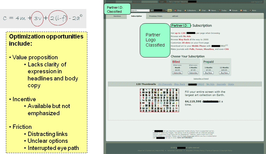
Control—Original Order Path
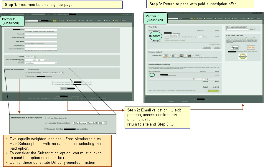
Perhaps the greatest problem in these pages is that it’s not easy to understand why a paid membership is better than a free membership. For prospects to learn more about paid subscriptions, they must click and expand a selection box—a process many might overlook and that might deter many others.
Much of the friction on this path came from the email validation step. Prospects had to exit the registration process, access a confirmation email, and return to the site to complete Step 3. In addition, prospects faced equally weighted choices and a series of tiled boxes that created the impression of registration as a cumbersome process.
Treatment—Optimized Order Path
Removing the email validation step was the most substantial change in this treatment, but other changes included clarifying the available options and simplifying the payment page.
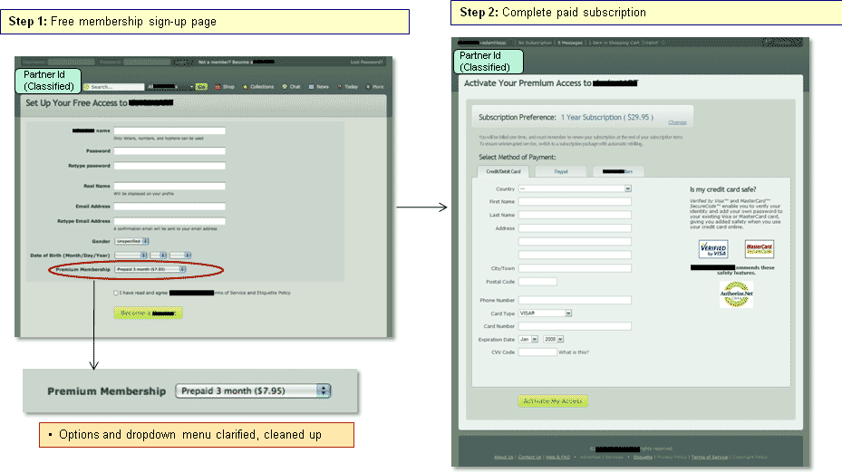
The goal of the optimized order path was to reduce “unsupervised thinking.” With the control, it is unclear which level of membership prospects are signing up for. However, the entire tone of the optimized page changed when free membership became the primary focus. Membership upgrade is only offered at the bottom of the page, after prospects have become engaged with free membership. By offering only one type of membership to consider at a time, the path and prospects’ thought process becomes more streamlined and directed.
Results:
| Order Path | Conv. Rate |
|---|---|
| Control | 0.16% |
| Treatment 1 | 0.13% |
| Relative Difference:89.23% | |
What you need to understand: The treatment outperformed the control by 89.23%.
Reducing friction and simplifying the offer page and path significantly increased paid memberships — even when new visitors had the option to join for free.
What accounted for these results?
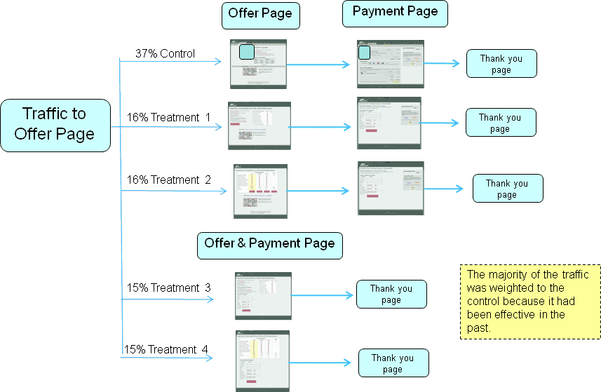
The MarketingExperiments Conversion Sequence helps to identify areas of a page or process that need to be optimized.
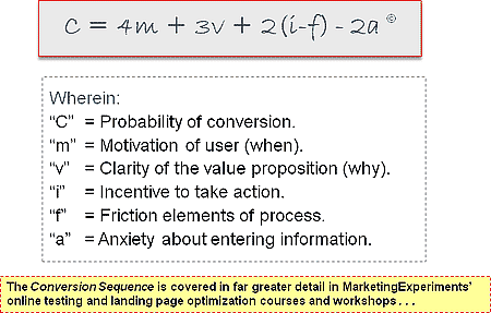
When motivation, value, incentive, and various impediments to conversion are clearly defined, it becomes easier to see how each concept is expressed on your pages and how to approach optimization.
Here’s another way to visualize how prospects experience pages:
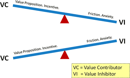
This simple graphic captures one of the essential concepts behind conversion.
Instead of being a balancing act, creating offer pages is an un-balancing act. Your goal is pages that dramatically accentuate the positive.
Each red triangle represents a fulcrum, the point of balance on which a prospect’s actions depend. The probability of conversion is affected by both positive (value contributors) and negative factors (value inhibitors). As the top “seesaw” shows, if the friction and anxiety on a page is too great, the page is unevenly weighted so that prospects are dissuaded from conversion. However, the second “seesaw” indicates that if the value proposition and incentive outweigh the friction, conversion is more likely.
Understanding the underlying methodology behind optimization makes the difference between a gain and the highest possible gain. The probability of conversion is affected by certain factors—desire, annoyance, or concern, etc.—that occur not on your pages but in the mind of the person you’re communicating with.
As a result, optimization is not simply changing offer page elements, but doing so to better engage with your prospect’s thought process.
Optimizing for conversions
Analysis of the order path using the MarketingExperiments Conversion Sequence established the nature and priorities for optimization and testing so that the fulcrum would tip in our partner’s favor. In essence, the problem with the site’s original pages was that value inhibitors outweighed value contributors.
Among the elements of the conversion sequence, this site’s greatest opportunity lay in reducing friction and clarifying the value proposition.
On the second path, our tests sought further gains by emphasizing the benefits of paid subscription membership (clarifying the value proposition) and consolidating steps (reducing friction) for a more streamlined process.
Let’s look at how we optimized to improve these areas in a follow-up test. The concept of the fulcrum suggested that if we reduced friction, then the weight of the value proposition as it was might outweigh any residual friction and anxiety.
If you can tip the balance on one side of the fulcrum, you may see the whole performance of your pages change.
Case Study 2: Converting Free Members to Paid
The Goal: Increase sales of paid subscription membership to current free members.
Primary Research Question: Which subscription path will produce a higher conversion rate?
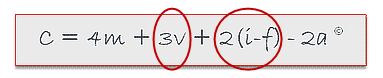
The Approach: The test ran four treatments against the control of the subscription path. The control was the partner’s original subscription and payment page with the email validation step removed.
Additional Observations: All treatments used charts in an effort to compare and clarify offers, as well as express the value proposition. However, each treatment had a slightly different conversion strategy.
Test Design
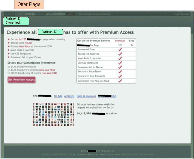
Control: Offer Page
The control’s headline creates anxiety by suggesting the costs of subscription. Confusing copy in the subheads does not clearly convey the value proposition or provide a reason to choose one membership path over another.
Equally weighted options on the offer page
The control page offers two categories with four equally weighted payment options in Step 1 (see image).

This creates unsupervised thinking and friction by not helping prospects make a purchase decision.
It may seem that different payment structures and copy clarify the offer, but the benefits of choosing one term over another are not made clear. Billed could mean the same thing as prepaid and subscribing and buying both require payment.
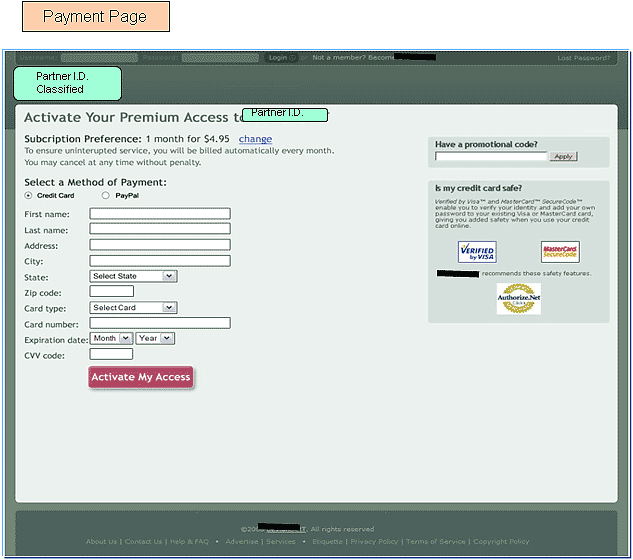
Control: Payment Page
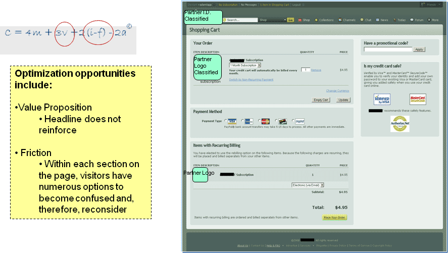
Though the divisions on the page are meant to be helpful, each new tile visually suggests a new decision making process. Prospects arriving at this page are given several opportunities to reconsider and abandon the process.
Conversion results for the control

This chart suggests that friction and anxiety are substantial problems with the control: 62% of those converting from the control offer pages chose the 3-month prepaid membership, the lowest-risk, lowest-maintenance option.
Test structure and strategy
While the common goals of each treatment were to minimize friction and clarify value proposition and incentive, each treatment used a different approach. In this way, the test could offer greater insight into the preferences of the site’s ideal prospects.
Strategy for Treatment 1: Increase the clarity of the value proposition.
In this strategy, many of the optimization changes were copy revisions enhancing the value proposition.
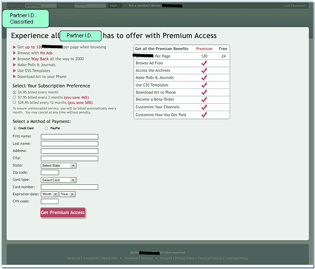
Treatment 1: Offer Page
The revised headline clarified the value proposition, renaming paid membership as “Premium Access” and letting that enticing term indicate the benefits. The bullet points on the body copy gave structure and flow to benefits information, while the chart used bright check marks to contrast paid and free options. A large, colorful button reiterates the headline.
Treatment 1: Payment Page
In this second step, the headline and button carry over from the first page. Friction is reduced with a simplified eye path and streamlined payment options.
Revised copy and streamlined page architecture are relatively easy changes to make. In most cases, optimizing your pages does not have to include a complex overhaul. Simple changes can do more to identify and highlight your page’s primary objective.
Strategy for Treatment 2: Increase the clarity of the value proposition with a features matrix
In the first treatment, the chart was a supporting element; here it takes center stage.
The payment page is the same as Treatment 1.
Treatment 2: Offer Page
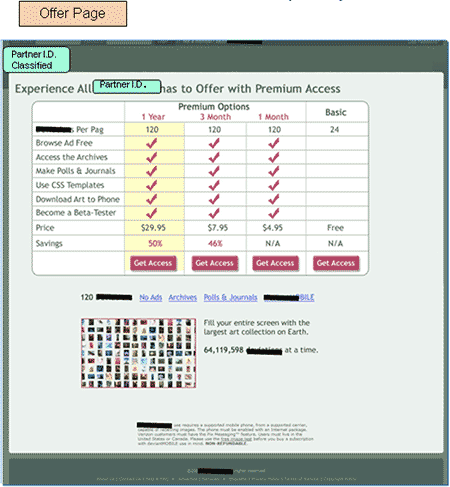
While a features matrix has proven successful in many tests, the number of options presented by this chart may outweigh the benefits. This chart highlights the annual prepaid membership and shows the savings for two membership categories.
Comparing the two-step paths
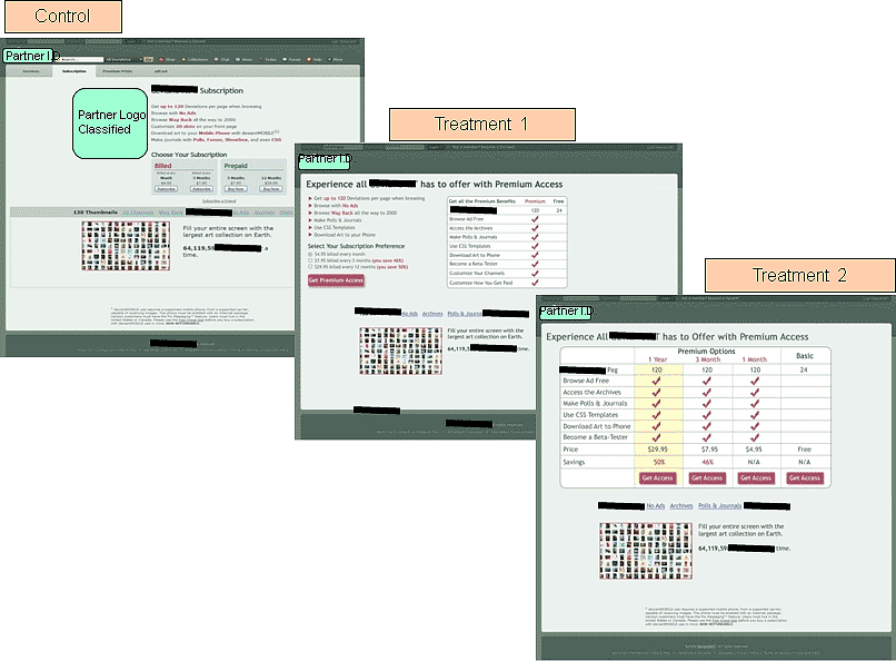
The Control, Treatment 1 and Treatment 2 are all two-step paths. Where Treatment 1 uses a bulleted list and a simple features matrix, Treatment 2 substitutes a four-column features matrix.
The charts display the difference between membership levels in different ways. Treatment 1 emphasizes the benefits that come with a paid membership. Treatment 2 uses percentages to show the long-term savings incurred by choosing the two higher membership levels.
If you’re using a features matrix, structure it so prospects can differentiate between the benefits provided by your various offers.
Strategy for Treatment 3: Consolidate offer and payment pages into a single step
When a primary goal of optimization is streamlining your process, then you must ask the following question: If a two-step offer page works well, will a one-step offer page work better?
Treatment 3: Offer/Payment Page
Treatment 3 combines offer and payment by inserting a simple payment form on the same page as the subscription rate and comparison information. In essence, it merges both pages of Treatment 1 into a single page.
Strategy for Treatment 4: Make the default the monthly options with recurring payments
Treatment 4 combines many of the changes applied in Treatments 1-3. It also includes a default option to encourage the 3-month recurring payment.
Treatment 4: Offer/Payment Page
In the same way that Treatment 3 “condensed” Treatment 1, Treatment 4 merges the elements from the two-step Treatment 2 into a single page.

Historically, prepaid subscriptions have been the most popular option.
To simplify the chart, the 3-month payment options were consolidated. If prospects clicked on the 3-month recurring option, a pop-up window presented the 3-month prepaid option.
Setting the 3-month recurrent payment as the default option increased the average order value by 1.25% and had a significant impact on subscription revenue.
Comparing the single-step treatments
The charts in these single-step treatments emphasize different aspects of the site’s offer.
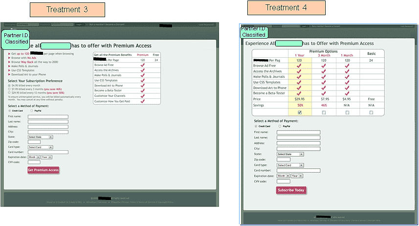
Treatment 3’s chart contrasts the difference between free and paid membership, confirming the claims of the bulleted list. Treatment 4’s chart uses a yellow highlight and percentages to emphasize savings.
Which treatment was the winner?
During the clinic, we polled our audience to find out which treatment they thought performed best. From the 522 responses, here is the breakdown:

The vast majority of respondents favored the single-step treatments. Among the voters, 48% percent chose Treatment 3 as the winning treatment and 36% chose Treatment 4.
| Subscription Path | Conv. Rate |
|---|---|
| Control | 0.41% |
| Treatment 1 | 0.97% |
| Treatment 2 | 0.74% |
| Treatment 3 | 1.03% |
| Treatment 4 | 0.94% |
| Relative Difference (Control vs. T3:148% | |
What you need to understand: Treatment 3 outperformed the control by 148%.
All four treatments outperformed the control. The new treatment designs eased friction, countermanded anxiety, and clarified the value proposition so that the value of paid subscription outweighed prospects’ fear or indifference.
However, in Treatment 3, by combining a clarified value proposition with a radically shortened subscription path, the number of new subscribers for the longest prepaid subscription term and for recurring subscriptions increased.
In Treatment 4, the highlighted column on the comparison chart and the placement of the annual membership in the far left column helped increase orders of annual subscriptions by 33%. But, that advantage was outweighed by the simplicity of Treatment 3’s offer structure.
Control vs. Treatment 3: A closer look
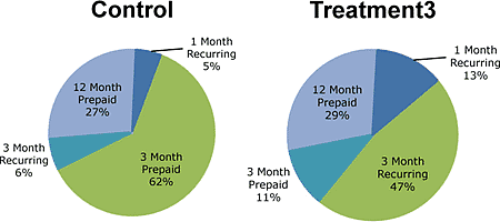
Restructuring the offer so that the benefits of paid membership were more apparent not only motivated more prospects to convert, it also encouraged them to convert to membership at a greater level of financial commitment.
One prominent improvement is between the types of 3-month membership. With the control, 6% of prospects chose the recurring membership. With Treatment 3, that number soared to 47%. The one-month recurring membership also rose from 5% to 13% with Treatment 3. These increases represent ongoing revenue, so the improvements could have an even greater potential long-term impact on the bottom line than can be measured at present.
Summary
- Clarity trumps persuasion. For a quality offer, you should focus more on lucid expression than on persuasive copy.
- Emphasize the benefits. An offer/response interaction comprises a cost incurred in exchange for a benefit. When expressing your offer, you should be transparent about both, but emphasize the benefit in headlines, sub-heads and calls-to-action (e.g., links, button text, etc.)
- Minimize Friction through simplification of page and order path designs. Adjust the number of steps, and the nature and complexity of requested inputs to control Friction.
- Overcome Anxiety in the conversion path by addressing and over-correcting for sources of concern, such as removal of any “payment-related” terms along the conversion path of a free trial offer.
Related Marketing Experiments’ Reports:
- Marketing Blueprint 2009
- Value Proposition
- Optimizing Headlines and Subject Lines
- Clarity Trumps Persuasion
- Improving Conversion by 162%
- Landing Page Optimization: Finding Ideal Price Points
- Landing Page Optimization: Improving Conversion by 50-60%
- Increasing Conversion
- Landing Page Optimization: How Businesses Achieve Breakthrough Conversion
- Creating Effective Incentives
- Landing Page Optimization Tested
- Landing Page Confusion
- Optimizing Site Design
As part of our research, we have prepared a review of the best Internet
resources on this topic. Rating System
These sites were rated for usefulness and clarity, but alas, the rating is purely subjective.
* = Decent | ** = Good | *** = Excellent | **** = Indispensable
- Reducing Customer Anxiety about Products on Product Pages ****
- Ease Anxiety and Reduce Cart Abandonment ***
- How to Reduce Purchase Anxiety ***
- Reducing Friction **
- Best Practices for Content Optimization **
- Value Proposition Model **
- Shorter is Better **
- Friction Model *
Credits:
Managing Editor — Hunter Boyle
Writer(s) — Anna Jacobson
Contributor(s) — Flint McGlaughlin
Aaron Rosenthal
Bob Kemper
Gaby Diaz
Adam Lapp
Production — Austin McCraw
Cliff Rainer
Amanda Mehlhoff
Testing Protocol(s) — TP1151
TP1169