


At MarketingExperiments, our research shows that the highest performing site pages match exactly the motivation of a visitor, and that on retail websites most visitors fall into one of two categories:
- Hunters. They already know what they want and are looking for the quickest, easiest, and safest way to get it and go.
- Browsers. They may have ideas about a purchase but need more convincing, or they’re simply “window shopping.”
The problem most online retail sites face today? Their homepages have been developed without a clear understanding of the motivations and sequences of thought in the minds of these visitors.
During our May 7, 2008, web clinic, our expert optimization team looked at homepages and Value Propositions from five eCommerce sites and made recommendations to improve those sites’ ability to stop, engage, and effectively communicate with both Hunters and Browsers.
Editor’s Note: We recently released the audio recording of our clinic on this topic. You can listen to a recording of this clinic here:
Background
To optimize conversion on a retail site, we must not only understand the elements and factors on the page, we must attempt to understand the “logical sequence of thought” in the mind of each type of visitor.
To give Hunters a reason to stop the hunt and buy, the site’s design should answer these questions related to a Hunter’s sequence of thought:
- Is this the place?
- Where is it (the thing that I’m hunting for)?
- Is this really the best price for it?
- Is it safe to buy from this site?
To get Browsers to switch to buying mode, a site should answer these questions related to a Browser’s sequence of thought:
- Can you solve my problem or fill my need?
- Why should I buy here instead of from your competitor?
- What incentive are you offering me to buy right now?
- Can I trust you?
When a page effectively answers these questions with its design, it’s more likely to connect and achieve a higher conversion rate.
Our research also shows that basing a page element’s weight on its relative importance to the overall objective is another effective strategy for retail sites.
In the example below, the objective was to attract and “capture” Hunters looking for computer memory upgrades:
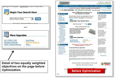
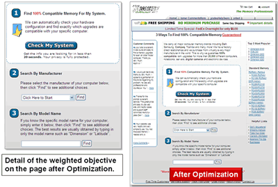
In the optimized version we:
- De–emphasized navigation, moving it to the far right and replacing the left nav bar with testimonials.
- Made the primary objective stand out with a bordered white box against the gray page.
- Removed the competing “More Upgrades” section.
- Added a larger call–to–action button.
What you need to understand: By focusing the optimized page on the primary objective, conversions increased by more than 19%.
Key points:
- Consider the specific motivation of eCommerce site visitors before selecting changes to test.
- If a visitor is a Hunter, lead them quickly to what they came for and eliminate elements that distract the eye path flow from the objective. Less is more.
- If a visitor is a Browser, step up the “appeal factors” and feature products with the highest demand and profit margins. Emphasize selection and related choices.
- Avoid competing objectives and evenly weighted options.
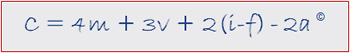
In the MarketingExperiments Conversion Index (above) there are four additional elements that are critical to increasing conversion:
- The clarity with which Value Proposition (v) is expressed. After Motivation (m), it’s the most important factor in determining whether a customer buys from a site or not.
- Incentives (i) used to mitigate Friction–producing (f) elements in the conversion process.
- Anxiety–causing (a) elements, such as asking for personal and credit card information.
Applying the principles of the Hunter vs. Browser thought sequence and the Conversion Index, the optimization team — Dr. Flint McGlaughlin, MarketingExperiments Director; Jimmy Ellis, Director of Optimization Research; and Aaron Rosenthal, Director of Channels Research — analyzed the following eCommerce homepages.
Review of Submitted Sites
Home Page 1: http://www.greenfeet.com
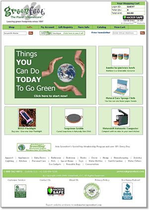
Value Proposition submitted: “A green company online since 1997, exceptional customer service, customers can be confident in placing orders because we utilize Hacker Safe.”
Analysis (Flint McGlaughlin)
- Reconsider the slogan at the top of the page.
- Greet them with a great headline, something like “Welcome to www.greenfeet.com. Since 1997, we have been helping customers do X, Y, and Z. You may want to check out our X, Y, and Z.” Stress the Value Proposition.
- In the greeting text include several links to other things within the site. The goal of the homepage is to get a click, to get them to click deeper into the sites.
- Feature more products; make them smaller; feature the products that are being searched for most on your site and have the highest profit margins.
- Move the e–mail sign–up. It’s doing you no good where it is now. There’s no Value Proposition associated with that little e–mail sign–up form.
- Put navigation on the left side of the page rather than just at the bottom.
Analysis (Jimmy Ellis)
- There are a lot of green stores out there right now. Why should a visitor buy here instead of somewhere else? Help me understand which products to buy. Help me find the best products to suit my needs.
- The page says “Things you can do to go green today,” but I didn’t come here to learn how to go green. If I’m shopping for environmentally friendly products, I’m already green.
- Start with a headline that clearly states at least one reason to stay on your site for another 10 seconds and dig a little bit.
- Try to quickly answer this question: “How do I shop on your site?”
- Take your top performing eight or 10 products and put them on the home page so visitors are more likely to find a best seller.
Analysis (Aaron Rosenthal)
- Instead of a great Value Proposition, you’ve given us a great statement about your company and its supporting information.
- You also need to convey the Value Propositions of the individual products in order to help visitors make a buying decision.
- When customers come to the page, let them know they are on the right site and why they should trust you with their money and time. Tell them why they shouldn’t leave and why they don’t need to check your competitors.
- Guide the customers through the shopping process. Don’t just show them five products on the landing page, show them the most popular product or the “editor’s favorites.” Tell them a story about one of your most heavily used products.
Home Page 2: http://www.narscosmetics.com
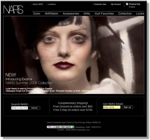
Value Proposition submitted: “Bring a high quality cosmetics product that allows women to use their imagination to bring out their inner beauty.”
Analysis (Flint McGlaughlin)
- Reduce the size of the real estate and test another image. A strong face as the primary means of greeting visitors gets a strong reaction that polarizes conversion rates. Never put up a face photo that hasn’t been thoroughly tested. It needs to be the right face.
- Start with text that tells visitors where they are and the reason they should stop. What is it about your business that’s special?
- Feature key products on this page.
- Change the three–column approach at the bottom. We have found over and over again that it creates too many options, too much unsupervised thinking, and mitigates conversion.
Analysis (Aaron Rosenthal)
- You’re greeting visitors with an overpowering image and you’re not leading them in with a headline.
- You havent underlined your links in your navigation. You don’t want customers to have to hunt for information about your company.
- The first text that they read is “Introducing Exotica.” It does not introduce what NARS does and how you can help them.
Analysis (Jimmy Ellis)
- The image is so overpowering, visitors may have no clue that it’s about cosmetics. The natural eyepath skips over the ad to the bottom of the page because the ad is so heavy and strong.
- It’s not apparent how to shop here. It doesn’t look like a store. It does not help me find the cosmetic product that I’m looking for quickly.
- There are some benefits (shipping), but why are your products better than the other 2,000 cosmetic companies in the industry? That’s what a visitor is looking for: Why they should shop with you.
Home Page 3: http://www.coolthings.com.au

Value Proposition submitted: “Get the coolest Gifts, Gadgets, Gizmos, Games and Toys available in Australia in one place on the Internet.”
Analysis (Aaron Rosenthal)
- Communication needs to be optimized for each channel and the motivations of the visitors arriving from it. Communicating with your email list is different from communicating with those who signed up for your free VIP gift. What you say to a visitor who came through organic search is different from what you say to someone who came from an affiliate website.
- You’re wasting space by including credibility indicators in your top banner. Make sure testimonials or third party credibility indicators are in the right place in the primary eye path.
- Move the credit cards out of the footer on your home page. Those aren’t credibility indicators. They are just reminding visitors that your site is not going to offer anything free. Test removing them from your site altogether.
Analysis (Jimmy Ellis)
- The Value Proposition needs work.
- The offer at the top of the page for a second Airzooka attracts attention, but why are the five images in the middle of the page featured? What’s special about them? You haven’t told me why I should buy them.
- The links don’t look like links. They are all low caps, there is no underlining.
Analysis (Flint McGlaughlin)
- When you have huge graphics at the top of the page you hurt your ability to establish a relationship. Instead, get text in there with a great headline. Explain what it is that makes you the unique place to make these purchases. Have embedded links within that text.
- Don’t use hard bars because they stop the eyes. Use something softer that gets visitors to continue through the products.
- Put more products on the page and give people many reasons to click.
- Change the left nav and don’t use white text on blue. We have seen over and over again that it doesn’t convert well.
- Put the free shipping and special offers in a different place. Use the space where they are now to get them engaged.
- Once you get more people to click into the site, your next challenge is to get them to complete the conversion process.
Home Page 4: http://www.downandfeathercompany.com
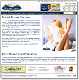
Value Proposition submitted: “We don’t harm the birds to acquire the down and we allow our customers the ability to have their pillow firmness adjusted for one year from the date of purchase for FREE. No one else in the industry provides such service. Pillows are very personal and difficult enough to select at a big box retailer much less over the Internet sight unseen. Quite simply the finest down bedding in the world.”
Example PPC ad:

Analysis (Aaron Rosenthal)
- Your PPC ad is just like the information on the home page: You haven’t given me a Value Proposition or reason to buy. The top PPC ad (Overstock.com) says I’m going to save 50–70%. The following ad promotes a discount on FedEx shipping. You haven’t given me enough reason to click on your ad versus your competitor’s.
- The first line of your Value Proposition says “We don’t harm the birds.” If that’s what makes you unique, use it on the Landing Page as your Value Proposition and test it in the ad copy itself.
- If that’s not a motivator, you also offer a free firmness adjustment for your pillows for one year. Test that as well.
Analysis (Jimmy Ellis)
- I just searched for down pillows, so where’s my down pillow? I just see a lady reading a book. This says nothing about the Value Proposition.
- Start with a good headline in a much bigger font.
- The navigation doesn’t look right because it’s white text with no underlines. It doesn’t look like links.
- The paragraphs are bad because they are hiding good points; I can’t just scan and see them. Add an introduction, one or two sentences, to draw a visitor into three to five bullet points that really hammer home your Value Proposition, then direct the customer where to go. I read through the whole page. Where do I go now? I still don’t know how to find my pillow.
Analysis (Flint McGlaughlin)
- The navigation in the banner is completely lost and the navigation below looks like bullet points for an ad.
Home Page 5: http://www.officefurniture.com
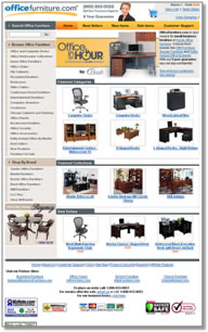
Value Proposition submitted: “Large selection of small and home office furniture at low prices.”
Analysis (Flint McGlaughlin)
- What is the point of the big desk graphic at the top? It is another waste of space. I don’t know what “office in an hour” means. I don’t need to see a desk if I came to buy a chair. You just sent me away before I even got into the rest of the site.
- All that “stuff” at the bottom of the page is in the wrong sequence of thought: It belongs on the check–out page. At this stage in the game people aren’t worried about the rate, the Better Business Bureau, or which credit cards you accept.
Analysis (Jimmy Ellis)
- If I’m a Hunter, I know what I want to buy, and I probably want a certain brand. Help Hunters find the navigation on your site. Get them to that product as soon as possible if you can’t land them on the specific page from the first click on an ad. Put navigation in the prime, main space of the page or across the whole top of the page.
- If you want to stop Browsers, have a lot of feature categories, but state them differently. Show them the lowest prices, the best sellers, the most popular. Convert them from Browsers to buyers by enticing them with great deals.
Summary
- The highest performing eCommerce pages match up exactly with customer Motivation.
- Use this eCommerce Page Optimization Checklist before you test changes:With the Hunter vs. Browser thought sequences in mind, use these questions to frame your site’s optimization efforts:
- Which type of visitor — Hunter or Browser — is this page trying to serve? (Consider channels and traffic sources.)
- What are the weighted objectives of this page?
- How does this page stop the visitor and connect with them?
- Does this page instantly communicate my Value Proposition
to visitors? - How does this page attract my visitor deeper into my product mix as it relates to the weighted objectives?
- When a site taps into the thought sequences of Hunters and Browsers it’s more likely to “connect” and achieve higher conversion rates.
- Avoid competing objectives and evenly weighted options.
- Use the analysis from this brief to identify areas for improvement on your own site, and refer to the MarketingExperiments research archives and Compendium to guide your testing and treatment efforts.
- A complete, end–to–end training program on website optimization is available through the MarketingExperiments Professional Certification program. Distinct courses are designed for both subscription and eCommerce sites. Contact registrar@marketingexperiments.com for more information and course schedules.
Related Marketing Experiments Reports
- Optimizing Your Landing Pages Part One
- Optimizing Your Landing Pages Part Two
- A Clinical Assessment of Your Landing Pages Part One
- A Clinical Assessment of Your Landing Pages — Part Two
- Improving Conversion by 162%: How to Overcome Value Inhibitors
- Landing Page Optimization: How Businesses Achieve Breakthrough Conversion by Synchronizing Value Proposition and Page Design
- Landing Page Optimization: Improving Conversion 50-60% by Applying Continuity and Congruence
- Measuring What Matters: How simplifying your metrics can increase Marketing ROI by up to 75%
As part of our research, we have prepared a review of the best Internet resources on this topic.
Rating System
These sites were rated for usefulness and clarity, but alas, the rating is purely subjective.
* = Decent | ** = Good | *** = Excellent | **** = Indispensable
- Landing Page Optimization Webinar (Omniture/MarketingExperiments) ****
- How Do You Develop a Unique Value Proposition? ***
- Free Google (beta) Website Optimizer Tool ***
Credits
Managing Editor — Hunter Boyle
Writer — Peg Davis
Copy Editor — Frank Green
Contributor(s) — Flint McGlaughlin
Jimmy Ellis
Aaron Rosenthal
HTML Designer(s) — Cliff Rainer
Mel Harris
Email Designer — Holly Hicks