


Optimization best practices don’t come with an iron-clad guarantee.
Enter the “wild card” — the unknown performance factor.
In optimization, wild cards are those outlier treatments that can, and do, surprise us by outperforming all attempts at surpassing them.
Our question: is it possible to discover transferable principles behind these outliers and use them to enhance the performance of our own designs?
In our March 11, 2009 clinic, we reviewed a wild card example from a clinic participant, analyzed a variety of case studies and examples, and looked at ways to apply what weve learned from these tests:
- why “on the fly” optimization can surpass deliberate designs
- when changing one element results in unanticipated success
- how to incorporate these concepts into radical redesigns for your own testing
Mapping these design principles can help marketers apply the low-probability, high-impact effect of wild cards to boost their own ROI.
Part I: Why “on the fly” optimizations can outperform more elaborate designs

Participant review: XBanker
Ryan Hutchings, an attendee of MarketingExperiments web clinics, submitted the following example.
Background:
The company’s PPC campaign was not producing many leads, and lead quality was poor. In the initial phase of the campaign, traffic was being sent directly to the companys home page but few visitors were converting.
Their goal:
To see if directing PPC traffic to a specific landing page would increase lead quality or quantity.
Their approach:
Test landing page design variations using sequential A/B tests. However, to get the most gains from this test, the company needed to generate some metrics for comparison.
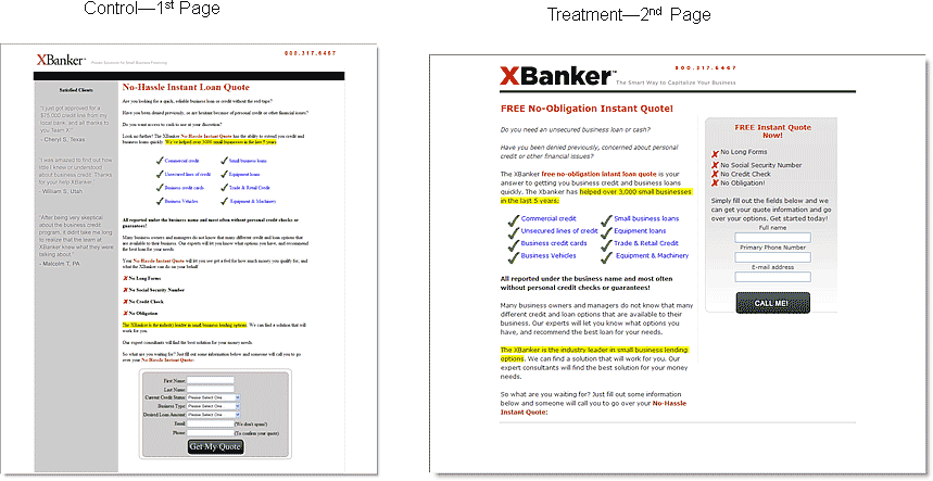
The next step was to quickly mock-up a placeholder landing page to establish baseline metrics. The page created to establish this baseline was, of the three treatments reviewed, the page that received the least amount of time and energy on the companys part.
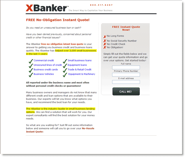
Participant review: first landing page
XBankers placeholder landing page follows several principles of the MarketingExperiments Conversion Sequence. The eyepath of the page is very direct, with prospects offered little distraction in the form of links or side navbar options. In addition, the request for quote form lies directly in the eyepath, with the copy on the button re-emphasizing the top headline.

Analysis:
Our analysts team noted some of their concerns with this speedily built control page:
- Design of page may not match prospects perceptions of a prosperous lender — resulting in anxiety
- Green checks and red x-marks send conflicting messages
- Text in left navbar difficult to read due to low contrast
- Page copy lacks specificity
- Email capture form asks for too much information
While the call to action was clear, the overall look and feel of the page was deemed to be one that might discourage prospects by failing to thoroughly assuage anxiety.
As the next phase of the review, we examined two treatment pages developed for A/B tests against the control. The offer remained the same but each treatment page emphasized different features of the conversion sequence.
Landing page for first A/B split test:
The first test treatment experimented with a two-column design, placing the request for quote in the right column.
Analysis of changes:
Overall, there were substantial improvements to the page. The value proposition has been refined for clarity and the expanded copy provided more supporting information. Shortening the capture form and changing the button copy created a page with less friction and a more personal approach.
Which page won the first A/B Split test?
For the first test, traffic was evenly divided between the two pages. During the clinic, participants were asked to predict the winning treatment and audience preference clearly aligned with the second page.
Results:
The control outperformed the treatment by a relative difference in conversion of 85.51%
After such strong results, XBanker took a different approach for the next treatment test.
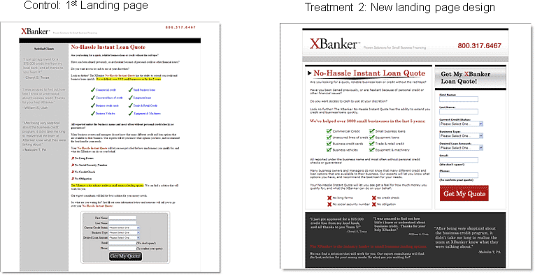
New landing page treatment for second A/B split test:
The next treatment used more color and emphasized the two-column design to convey the offer. The audience concurred that it looked more sophisticated than the control.

Analysis of changes:
Instead of highlighting offers and quantifiable specifics, the new treatment relied on red text to create a flow between headlines, sub-headlines, testimonials and button copy. All emphasized text reiterated the value proposition. Refined graphics maintained continuity between the previous check and x system. Other improvements over the control included a darker grey background that made the testimonials and form fields easier to read, especially the inclusion of more noticeable drop-down menus in the form fields.
Which page won the second A/B split test?
In their comments, the clinic audience indicated that the primary advantages of this treatment over the control included a clearer call to action, placed above the fold, and many rated this page more visually appealing, making the offer more enticing and credible to prospects. The audience again weighed in with greater support for the treatment.
Results:
The control outperformed the second treatment by 51.52%.
While the two test treatments were both considered by many of our clinic attendees (objective viewers uninvolved in the development of the pages) to be more visually appealing, the control consistently outperformed its “fancier” successors.
One explanation for the missed prediction is the tendency for many marketers to think in terms of so-called rules — keep it above the fold, emphasize the headline, place an image on the left. Reliance on rules must be moderated by an understanding of how pages are perceived by a target audience and awareness of the sequence of thought visitors go through each time they encounter a page.
The treatments performed at a lower conversion rate because neither page mirrored the prospects thought sequence as well as the original landing page.
Key point: Placeholder or template pages are often more clear in their presentation of an offer, identifying the essentials of an offer in more direct ways, tapping into prospect motivation, and resulting in higher conversions.
Principles of redesign:
An essential question to consider when designing a treatment is, “What motivates the treatment that you design?”
Many people are inspired by page designs that they like while others work from a list of optimization techniques or, ideally, by applying rigorous scientific principles and testing. No matter what theory you work from, it is certain that page designs will be subject to ongoing revision.
Many would argue that redesigning a page is easier than designing a page from scratch. Yet, creating a first page inherently has fewer limitations than redesigning a page which must both maintain continuity with an established offer and present information in a fresh way.
Redesigning and optimizing your pages can be distilled into three basic processes:
- You can add page elements
- You can subtract page elements
- You can change page elements.
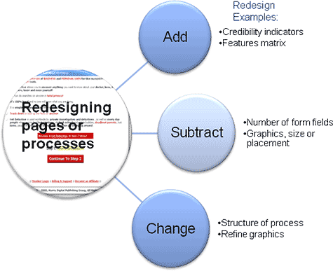
Adding elements can improve performance by easing anxiety through the increased visibility of credibility indicators or features matrices, page elements that help visitors make a decision to convert. On the other hand, subtracting elements is also a powerful way to improve performance, particularly in a page that doesnt have an extensive sell process or where the required action on the part of the visitor is minimal. A third option is to change what you already have.
Elements of change:
There are two kinds of change that can take place: incremental and radical.

Incremental change involves taking a current category and improving quality within that category. For example, making incremental change to a classic long copy sales page includes improving the copy on the page but not fundamentally changing the length of the copy.
On the other hand, radical change requires transforming the form of an offer entirely. An example of radical change would be to move from a long copy sales page to a series of emails and not begin the sales process until the third email. The essence of the offer may not change, but the altered structure of the offer may reveal its value to prospects more clearly.
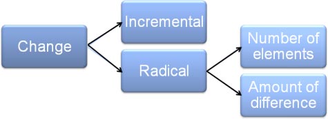
A radical redesign is radical for two reasons.
First, because of the number of elements that get changed, all at once. Variable cluster changes are productive ways to affect the beginning stages of a redesign. Earlier optimization theory recommended changing only one element at a time, but our recent research suggests that changing single elements is a step that should be taken later in the optimization process when refinements producing more incremental gains are desired.
A second form of redesign is the amount of difference between one treatment and another. Even if youre working with an all-time winner that seems evergreen in its success, you should consider bolstering your testing with wild cards, radical redesigns.
The second and third parts of this clinic review applications of this theory explicating the rationale behind making changes to offers, pages, or processes.
Part II: When changing one element results in unanticipated success
In the following case study, we reviewed how a radical redesign gave unexpected insights into offer structure and presentation.
Case study 1: Basket recovery process
Background:
NetDetective.net, provider of a searchable database of 211 million names, was seeing a drop in rate of new database subscribers.
Goal:
Increase conversion to match or exceed previous rate of new subscriber sign up.
Approach:
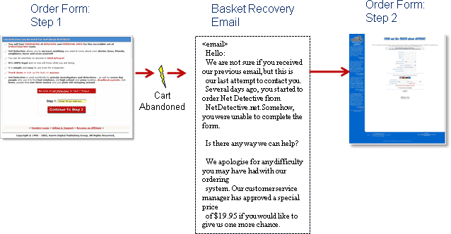
Implement a basket recovery process and encourage prospects who abandoned to complete their orders.
The treatment changed the number of elements and the amount of difference in a radical redesign of the checkout process.
Analysis:
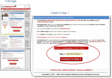
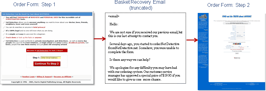
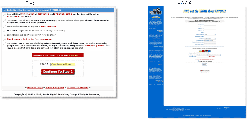
The original process on the landing page went from a button that simply said Continue straight to an order form. Including an email capture addressed prospects that, for a variety of reasons, were not able to complete the form.
The one-step process was replaced with a two-step process. Some elements of the radical redesign included substituting Order Now call to action with Become a Net Detective in Just 2 Easy Steps! The up-front email capture in Step 1 enabled a basket recovery process for abandoned orders that included an email containing a link sending prospects directly to the second, payment, step of the process.
Recovery email:
Several best practices were used when designing a recovery email to re-engage prospects who had abandoned the order process.
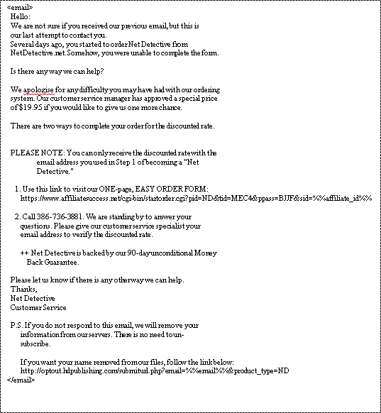
Analysis of recovery email (new element):
- The format is a personal letter.
- The copy prominently includes a discount as incentive to return to the process.
- Providing a link directly to Step 2 eases friction.
- Including the phone number of a customer service rep reduces anxiety, reassuring prospects that there will be a real person available to help them.
- The P.S. line identifies this email as the last communication from the company and therefore the prospects last chance to enroll. This both reduces anxiety and adds urgency to the offer.
So, if prospects abandoned the process, the sequence featured below was the intended sequence. However, the response to these changes was much different than predicted
Results:
The tiny change in the call to action on the landing page — from 1-step to 2-steps — increased conversion.
| Site Conversion Rate | Conv. Rate |
|---|---|
| Before Basket Recovery | 0.49% |
| After Basket Recovery | 0.73% |
| Relative Difference49.0% | |
What you need to understand: Adding the basket-recovery mechanism necessitated the change in checkout process. The conversion rate of the site itself rose by 49% before any recovery emails were sent.
This result helped us discover valuable information about the optimization process.
Analysis: The text and two-step system was a more effective call to action than “Order Now.” A change in the number of elements (steps) resulted in a positive change in how prospects perceived the offer. Before any email follow-up messages were sent to recover abandoned orders, conversion was up by nearly 50%.
Key point: In the process of testing, you will sometimes encounter accidental successes that can further improve your conversion funnel (registration process, shopping cart, lead gen, product education).
Part III: How to benefit from wild cards: apply incremental and/or radical change

Reviewing three examples of radical redesign as applied to landing pages, subject lines, and email, helps to reveal how this concept can be applied to diverse elements in the sales process.
Example 1: Wild cards in landing pages
One long-term optimization goal for this partner was to optimize the seven-day free trial order process to generate more sign-ups.
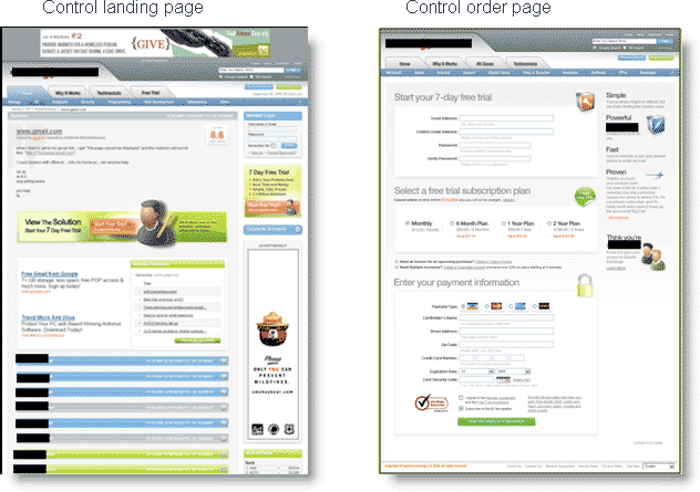
The primary objective for the first test was to increase clickthrough rate from landing page to order page. Once that objective was established, further optimization could focus on developing an offer page that appealed to prospects motivations and increased overall conversion rate.
The treatments varied from incremental changes to radical redesigns
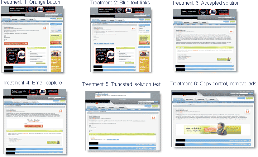
Treatments 1 and 2 are examples of incremental change. Changing the color of buttons and text links does not substantially change the structure of the offer.
However, treatments 5 and 6 were the most radical redesigns. For treatment 5, providing only the first half of a possible answer gave prospects strong incentive to move down the funnel. Treatment 6 created a more streamlined page, driving prospect focus to the call to action framed in the center of the page.
When the conversion rates of the six treatments were reviewed, one of the more radical redesigns significantly outperformed the other treatments.
| Clickthrough Rate | Conv. Rate |
|---|---|
| Control | 2.25% |
| Treatment 1 | 3.22% |
| Treatment 2 | 3.43% |
| Treatment 3 | 2.70% |
| Treatment 4 | 2.87% |
| Treatment 5 | 4.02% |
| Treatment 6 | 2.32% |
| Relative Difference (T% vs. control)78.66% | |
What you need to understand: The page with the truncated answer — the most radical redesign — received the highest prospect interest and outperformed the control in clickthrough rate by a relative difference of 78.66%.
Key point: When testing alternative treatments, include one or two designs, simply to challenge your own preconceived notions about the elements of successful optimization.
If youre only testing incremental changes, youre likely to see only incremental results.
Example 2: Wild card elements in subject lines
In this test, traffic was split between four variations of an email subject line for an ecommerce site.

Emails with these subject lines were sent to customers who had previously purchased from the site.
Which subject line most adheres to best practices? How does each subject line incorporate the elements of change?
- The control expresses the customer service emphasis of the site.
- Treatment 1 adds an incentive to thank you for customer loyalty.
- Treatment 2 subtracts, paring the offer down to the bare minimum.
- Treatment 3 changes a thank you to a welcome message and adds an incentive.
Which subject line yielded the highest conversion rate?
| Subject Line | Conv. Rate |
|---|---|
| Control | 13.00% |
| Treatment 1 | 17.00% |
| Treatment 2 | 9.23% |
| Treatment 3 | 10.16% |
| Relative Difference (T1 vs. control)31.05% | |
What you need to understand: Treatment 1 outperformed the control by 31.05%. While treatment 2 had the most direct offer, treatment 1 succeeded by adding customer service to the incentive.
Adding a tone of gratitude to offers, especially with returning customers, is a principle that can be applied to almost all marketing efforts.
Key Takeaways:
- Look to your first, or prototype pages, to see if thats where you might have made the clearest expression of your offer.
- Optimize, and pause. Consider whether incremental changes to your process have already affected your overall conversion.
- Change the number of elements or the amount of difference to create redesigns that vary dramatically from your control treatment (e.g., both elaborate and minimalist treatments).
- Time and traffic permitting, incorporate a design you have doubts about — the design that feels too strong for you may be the one that best reaches your prospects.
The continuous cycle of improvement that is optimization provides the potential for stagnation, as marketers that focus on small adjustments, for their pains, frequently receive only small gains. Marketers who are willing to find a balance between incremental changes and radical redesign may find greater satisfaction and greater returns.
Related MarketingExperiments Reports:
- B2C Landing Pages
- Marketing Blueprint 2009
- Optimizing Offer Pages
- Lessons Learned
- Value Proposition
- Optimizing Headlines and Subject Lines
- Clarity Trumps Persuasion
- Email Optimization
Credits:
Managing Editor — Hunter Boyle
Writer(s) — Anna Jacobson
Contributor(s) — Flint McGlaughlin
Jimmy Ellis
Aaron Rosenthal
Production — Austin McCraw
Cliff Rainer
Amanda Mehlhoff
Test Protocols:
TP2038
TP2026
TP1216
TP2047